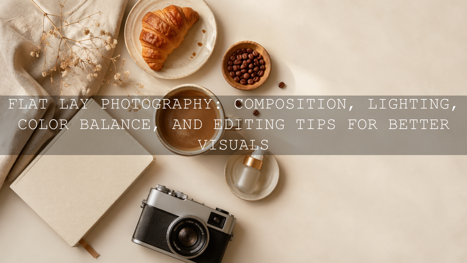
Flat Lay Photography: Composition, Lighting, Color Balance, and Editing Tips for Better Visuals
Flat lay photography is one of the most useful styles for product photos, food styling, Instagram content, website banners, and creative brand storytelling. A strong flat lay is not just a top-down photo. It is a carefully arranged image where composition, lighting, color balance, props, and editing all work together to create a clean and professional result.
Here’s why this matters. When someone sees your photo on Instagram, Pinterest, Shopify, Etsy, or a restaurant menu, they decide very quickly whether the image feels trustworthy, premium, and worth their attention. A well-planned flat lay can make a simple coffee cup, skincare product, notebook, food plate, or creative workspace feel more intentional and desirable.
If you want a faster way to create polished flat lays with warm tones, clean whites, and consistent color, start with the AI-Optimized Aesthetic Coffee Shop Warm Film Lightroom Presets for cozy lifestyle scenes, then browse the full Lightroom Presets for Lightroom Mobile & Desktop collection to build a flexible editing workflow. You can naturally build your toolkit with the Buy 3, Get 9 FREE offer.
Why Flat Lay Composition Makes the Biggest Difference
Composition is the foundation of flat lay photography. Before you think about presets or color grading, you need to decide where each object belongs and what story the image should tell. A flat lay without structure can feel messy, even if the props are beautiful. A simple arrangement with clear spacing can feel premium, even with only a few items.
When I test flat lay edits for AAAPresets, I usually start by looking at the photo without editing first. If the eye does not know where to go, no preset can fully fix the image. Editing can improve color, contrast, and mood, but composition creates the first impression.
Use One Clear Hero Subject
Every flat lay needs a main subject. This could be a product box, coffee cup, notebook, camera, plate of food, jewelry piece, skincare bottle, or printed photo. Your hero subject should be the object people notice first.
Place your main subject where it feels natural, then build around it with supporting items. For example, if your hero subject is a coffee cup, you might add a book, spoon, linen cloth, and small pastry. If your hero subject is a skincare bottle, you might add a towel, flower, mirror, or neutral background.
Follow the Rule of Thirds for Natural Balance
The rule of thirds helps you avoid placing everything directly in the center. Imagine the frame divided into nine equal parts with two vertical lines and two horizontal lines. Placing the main subject near one of the intersections can make the image feel more balanced and natural.
This works especially well for Instagram carousel covers, Pinterest pins, product banners, and blog feature images because it leaves breathing space around the subject. That empty space can make the image feel cleaner and more expensive.
Use Negative Space to Create a Premium Look
Negative space is the empty area around your subject. Many beginners try to fill every corner of the frame, but strong flat lays often leave room for the photo to breathe. This is especially important for product photography, minimal lifestyle content, and website images.
For clean product flat lays, try using a plain white, cream, beige, grey, wooden, or soft fabric background. If the image feels too empty, add one small texture such as linen, paper, leaves, coffee beans, or a soft shadow instead of adding too many props.
Create Visual Flow With Lines and Shapes
Leading lines help guide the viewer’s eye through the image. In flat lay photography, these lines can come from book edges, table lines, cutlery, pens, makeup brushes, ribbons, packaging, or fabric folds.
For example, a diagonal spoon can lead the eye toward a dessert. A notebook edge can point toward a pen. A row of small objects can create movement across the frame. The goal is not to make the image look forced. The goal is to make the viewer’s eye move naturally.
Tell a Small Story With Props
A good flat lay feels like a moment, not just a collection of objects. Before you shoot, ask yourself what the image is saying. Is it a cozy morning? A clean workspace? A luxury skincare routine? A restaurant table scene? A wedding detail shot?
For a cozy café flat lay, warm coffee, soft shadows, brown tones, a pastry, and a textured napkin can tell the story. For a clean studio product flat lay, white space, sharp packaging, controlled highlights, and minimal props may work better. If you create product content often, this guide on Lightroom presets for e-commerce and product photography is a helpful next read.
Flat Lay Lighting: How to Make Your Photos Look Clean and Natural
Light can completely change the mood of a flat lay. The same setup can look soft and premium near a window, harsh and cheap under direct flash, or moody and cinematic with controlled side light. For most flat lay photography, soft light is the safest and most flattering choice.
Use Soft Window Light First
Natural window light is one of the easiest ways to create beautiful flat lays. Place your setup near a window, but avoid strong direct sunlight unless you want dramatic shadows. If the sun is too harsh, use a sheer curtain, white cloth, or diffuser to soften the light.
Soft side light works especially well because it gives your objects gentle shadow and depth. Top light can work too, but it may make the image look flatter. Side lighting often makes textures, paper, fabric, food, and packaging look more three-dimensional.
Control Shadows With a Simple Reflector
A reflector does not need to be expensive. A white foam board, white paper, or white cardboard can bounce light back into the darker side of the image. Place it opposite your window to soften shadows.
Pro tip: If your flat lay looks too contrasty, move the reflector closer. If the image looks too flat, move it farther away. This gives you control without changing your whole setup.
Avoid Mixed Lighting
Mixed lighting is one of the biggest reasons flat lays look strange. For example, window light might be cool and blue, while indoor bulbs might be warm and yellow. When both hit the same scene, white balance becomes harder to correct.
Turn off unnecessary room lights when shooting near a window. If you must use artificial light, use one main light source and keep the color temperature consistent. This makes editing easier and helps your presets behave more predictably.
Use Artificial Light When You Need Consistency
Natural light is beautiful, but it changes throughout the day. If you shoot product photos for a store, restaurant, or brand campaign, artificial light can help you create consistent results. A softbox, LED panel with diffusion, or umbrella light can mimic soft window light when placed correctly.
Keep the light large and close enough to stay soft, but not so close that it creates uneven brightness. For product flat lays, watch shiny surfaces carefully. Glass, metal, plastic packaging, and glossy labels can reflect light in distracting ways.
Color Balance: The Secret to Professional Flat Lay Photography
Color balance is what makes whites look clean, food look appetizing, skin tones look natural, and products look accurate. A flat lay can have perfect composition and lighting, but if the white balance is too yellow, too blue, or too green, the image can still feel unprofessional.
Adobe explains that Lightroom white balance can be adjusted with preset options, a neutral selector, and Temperature and Tint sliders in its Lightroom tone and color controls. This is important for flat lay photography because many scenes include white paper, packaging, plates, table surfaces, and fabric that should not carry an unwanted color cast.
Shoot RAW When Possible
RAW files give you more flexibility when adjusting exposure, white balance, highlights, shadows, and color. JPEG files can still be edited, but RAW gives you more room to correct mistakes without damaging the image as quickly.
If you shoot with a camera, use RAW for serious product, food, or commercial flat lays. If you shoot with a phone, use the highest quality camera setting available and avoid overusing built-in filters before editing.
Check White Objects First
Look at the whites in your image. Are they truly white, or do they look yellow, blue, green, or pink? In flat lays, white paper, ceramic plates, product boxes, tablecloths, and backgrounds often reveal color problems quickly.
Pro tip: Fix white balance before heavy color grading. If the base color is wrong, your preset may exaggerate the problem. A warm preset on an already yellow image can make the photo look too orange. A cool preset on a blue image can make it feel cold and lifeless.
Build a Color Palette Before You Shoot
Strong flat lays usually have a limited color palette. Instead of mixing too many colors, choose two or three main tones and use props that support them. For example:
- Warm café palette: brown, cream, caramel, soft gold, and warm white.
- Clean product palette: white, light grey, beige, silver, and one brand accent color.
- Natural lifestyle palette: wood, linen, green leaves, cream, and muted earth tones.
- Luxury beauty palette: ivory, black, soft pink, champagne, and gold accents.
If you need help choosing colors, the Adobe Color wheel and harmony rules can help you plan complementary, analogous, monochromatic, or muted palettes before styling your flat lay.
Presets vs Manual Editing for Flat Lay Photos
Both presets and manual editing have a place in flat lay photography. The best workflow is not choosing one and ignoring the other. The strongest results usually come from using presets as a fast starting point, then making small manual adjustments for the exact photo.
When Presets Help Most
Lightroom presets are especially helpful when you need consistency across many images. Adobe describes presets as predefined settings that can adjust exposure, contrast, saturation, color grading, and more in its official Lightroom presets guide. For flat lays, that means you can create a similar look across your Instagram feed, Shopify product photos, Pinterest pins, blog images, or restaurant content.
Presets help most when you want to:
- Create a consistent brand style across many images.
- Speed up editing for social media and e-commerce.
- Apply a warm, clean, moody, bright, or cinematic look quickly.
- Use the same editing direction across phone and desktop workflows.
When Manual Editing Still Matters
Manual editing matters because every photo has different light, exposure, background color, and prop placement. After applying a preset, you may still need to adjust exposure, highlights, shadows, white balance, cropping, texture, and sharpening.
For example, I tested a warm coffee preset on a café flat lay shot beside a window. The preset gave the image a beautiful warm film tone, but I still lowered highlights slightly because the white cup was too bright. That small manual adjustment made the edit feel more natural and professional.
The Best Workflow
- Fix crop and straightness first.
- Correct exposure and white balance.
- Apply your chosen Lightroom preset.
- Fine-tune highlights, shadows, contrast, and color.
- Use masking or local adjustments if one area needs special attention.
- Export based on the platform, such as Shopify, Instagram, Pinterest, or website banners.
If you want to understand how AI-optimized presets can support faster and more consistent edits, read this guide on what AI-optimized Lightroom presets are and how they improve edits.
Choosing the Right Lightroom Presets for Flat Lays
The best preset depends on the story, product, lighting, and brand style. A food flat lay needs different color treatment than a clean cosmetics flat lay. A cozy café image needs different warmth than a white-background e-commerce image.
Warm Café and Lifestyle Flat Lays
For coffee, desserts, books, home lifestyle content, and cozy interiors, warm tones usually work beautifully. The AI-Optimized Aesthetic Coffee Shop Warm Film Lightroom Presets are a strong fit for soft browns, creamy highlights, warm film tones, and inviting café-style visuals.

Use this style when you want the image to feel emotional, relaxed, and lifestyle-focused. It works well for café brands, food bloggers, creators, and photographers who want a warm story-driven look.
Clean Product and Studio Flat Lays
For e-commerce, home studio, beauty products, stationery, packaging, and clean brand photography, you usually want bright whites, controlled contrast, and accurate color. The AI-Optimized Home Studio Clean Lightroom Presets are useful for giving flat lays a polished studio feel without making them look over-edited.

This is especially helpful for sellers who want their product photos to look consistent across a store. For more detailed product work, you may also like this guide on editing sharp beauty product close-ups.
Bright White and Minimal Flat Lays
If your brand style is clean, modern, bright, and minimal, the Bright Clean White Lightroom Presets Pack can help create crisp backgrounds and softer product presentation. This type of look works well for flat lays with white paper, minimal props, stationery, planners, skincare packaging, and neutral lifestyle products.
The key is to keep highlights bright without losing important detail. Do not push exposure so far that product labels, fabric texture, or white plates lose definition.
Detailed Close-Up Flat Lays
Some flat lays focus on small details, such as jewelry, flowers, food texture, product labels, fabric, watches, cosmetics, or handmade items. In this case, the AI-Optimized Macro Photography Lightroom Preset can help enhance detail, color separation, and close-up texture.

Use sharpening carefully. Sharp labels, jewelry edges, and fabric detail can look premium, but over-sharpening smooth backgrounds or soft food textures can make the image feel harsh.
Step-by-Step Flat Lay Editing Workflow
Let’s break it down into a simple Lightroom workflow you can use for most flat lay photos.
1. Crop for the Platform
Start with the final use in mind. Instagram square, Pinterest vertical pins, Shopify product images, website banners, and blog covers all need different framing. A strong flat lay can lose impact if it is cropped badly after editing.
For website banners, leave clean space around the subject. For Instagram carousels, keep the hero object large enough to stop the scroll. For product listings, avoid cutting off important details.
2. Correct White Balance
Use a white or neutral object in the image as a guide. Adjust Temperature and Tint until the photo looks natural. If the image is food-related, avoid making it too cool because food often looks more appetizing with controlled warmth.
3. Apply Your Preset
Choose a preset that matches the image mood. Warm presets work well for café and lifestyle flat lays. Clean presets work better for studio and product images. Minimal presets are useful for calm, bright branding.
You can explore more style options in the AI-Optimized Lightroom Presets for Mobile and Desktop collection.
4. Fine-Tune Exposure and Contrast
Flat lays often need small exposure adjustments after applying a preset. Increase exposure if the image feels dull. Reduce highlights if white surfaces are too bright. Lift shadows if dark props lose detail.
Pro tip: Do not increase contrast too much on product flat lays. Strong contrast can look cinematic, but it may hide important product texture or label details.
5. Adjust Individual Colors
If one color dominates too much, adjust it carefully. For example, reduce orange saturation if wooden backgrounds look too strong. Lower yellow saturation if indoor lighting makes white paper look dirty. Increase luminance gently if a product color needs to stand out.
For deeper editing knowledge, this guide on mastering white balance for natural colors is directly relevant.
6. Use Local Adjustments When Needed
Sometimes one area needs attention without changing the full image. You might brighten a product label, soften a shadow, reduce glare on packaging, or sharpen only the main subject. Adobe’s Lightroom masking guide for local adjustments is useful when you want more control over specific parts of the image.
7. Export Cleanly
After editing, export based on where the image will be used. For Shopify and blog images, keep the file clean and sharp. For Instagram or Pinterest, make sure the crop and subject placement work well on mobile screens.
Common Flat Lay Photography Mistakes to Avoid
Flat lays look simple, but small mistakes can make them feel amateur. Here are the most common problems and how to fix them.
- Too many props: Remove anything that does not support the story.
- Wrong white balance: Fix color casts before applying a strong preset.
- Harsh light: Diffuse direct sunlight or move the setup into softer light.
- No hero subject: Make one item clearly more important than the rest.
- Cluttered edges: Check the corners before shooting and crop distractions.
- Over-editing: Keep texture, color, and contrast polished but believable.
If you want to avoid editing errors before they become habits, this article on common photo editing mistakes and how to fix them using presets will help you build a cleaner workflow.
Related Reading
- Lightroom Presets vs Photoshop Actions: Which Is Better for Editing?
- Mastering White Balance: Achieving Natural Colors in Your Photos
- The Best Lightroom Presets for E-commerce and Product Photography
- Master the Art of Sharp Beauty Product Close-Ups in 2026
Final Thoughts on Better Flat Lay Photography
Great flat lay photography comes from intention. Start with a clear subject, arrange props with purpose, use soft light, correct your color balance, and edit with restraint. The best flat lays do not feel crowded or random. They feel styled, balanced, and easy to understand.
If you want your flat lays to look more consistent across your website, social media, product listings, and content campaigns, try the AI-Optimized Aesthetic Coffee Shop Warm Film Lightroom Presets for warm lifestyle scenes, the AI-Optimized Home Studio Clean Lightroom Presets for clean product setups, or the Bright Clean White Lightroom Presets Pack for bright minimal flat lays. You can also browse the full Lightroom Presets for Lightroom Mobile & Desktop collection and use the Buy 3, Get 9 FREE offer to build a complete editing toolkit.
FAQs About Flat Lay Photography
What is flat lay photography?
Flat lay photography is a top-down style where objects are arranged on a surface and photographed from above. It is commonly used for product photos, food styling, lifestyle content, Instagram posts, Pinterest graphics, and e-commerce visuals.
What lighting is best for flat lay photography?
Soft window light is usually the best starting point for flat lay photography because it creates natural shadows and clean color. If natural light is not available, use a softbox or diffused LED light to create a similar effect.
How do I make flat lays look professional?
Use one clear hero subject, keep props intentional, leave enough negative space, control white balance, and apply a consistent editing style. A good Lightroom preset can speed up the process, but small manual adjustments are still important.
Are Lightroom presets good for flat lay editing?
Yes. Lightroom presets are useful for flat lay editing because they help create consistent tone, color, contrast, and mood across multiple images. They work best when used as a starting point and then fine-tuned for each photo.
What colors work best for flat lay photography?
The best colors depend on your brand and subject. Warm browns and creams work well for café and lifestyle flat lays, while whites, greys, and soft neutrals work well for clean product photography. A limited color palette usually looks more professional than too many competing colors.
Written by Asanka — creator of AAAPresets (10,000+ customers).
Leave a comment
This site is protected by hCaptcha and the hCaptcha Privacy Policy and Terms of Service apply.