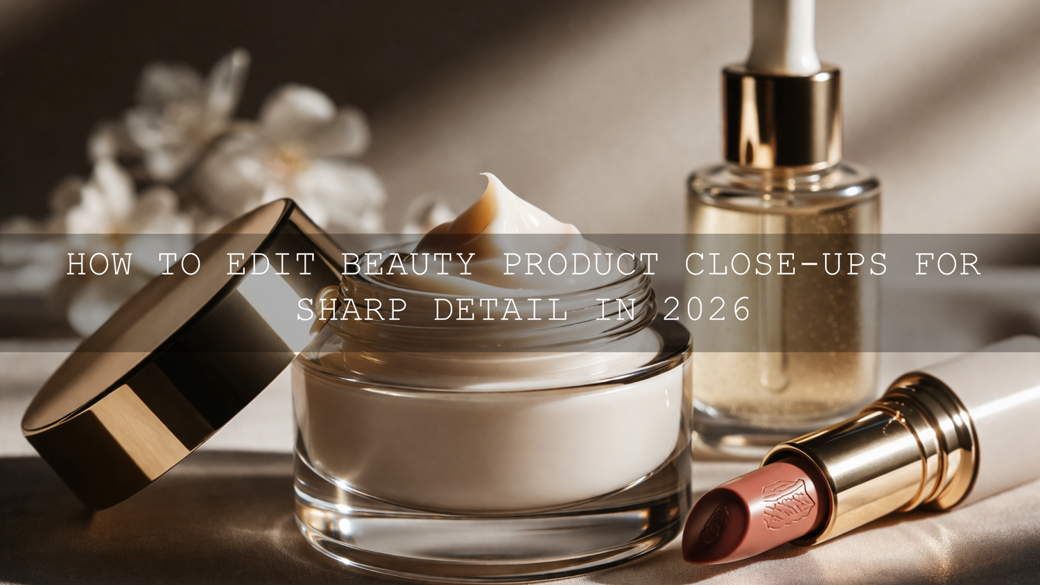
How to Edit Beauty Product Close-Ups for Sharp Detail in 2026
Beauty product close-up editing in 2026 is not about pushing every slider harder. It is about making small, deliberate choices that create sharp detail, clean color, and a premium finish customers can trust. Whether you are working on lipstick photography, skincare product photography, jewelry product photography, or polished e-commerce detail shots, the goal is the same: make the texture, craftsmanship, and finish look clear without making the image feel harsh or over-processed.
That matters because close-up product photography often does the selling. A customer may scroll past a wider campaign image, but they pause when they can clearly see the shimmer in a highlighter, the smooth edge of a lipstick bullet, the glass finish of a serum bottle, or the sparkle in a gemstone. If you want a fast starting point, try the AI-Optimized Soft Cinematic Contrast Beauty Lightroom Presets and browse the Portrait Photography Lightroom Presets collection to build a clean beauty editing workflow faster. You can also build your toolkit with Buy 3, Get 9 FREE.
Here’s why this matters: sharp detail alone does not create a luxury result. Sharpness has to work together with color accuracy, highlight control, contrast, and selective editing. When those pieces are balanced well, your close-ups look refined, believable, and high-converting.
Start with Capture Quality Before You Start Beauty Photo Editing
The best beauty product close-ups are usually won before the file even reaches Lightroom or Camera Raw. Editing can improve a strong frame, but it cannot fully rescue missed focus, dirty packaging, unstable lighting, or blown highlights on reflective surfaces.
For beauty and skincare products, start with soft but directional light. You want texture and shape, but you do not want hard reflections destroying packaging detail. Jewelry needs even more care because metal and stones can look amazing one second and messy the next. Clean the product thoroughly, keep fingerprints away, and simplify the background so the product stays dominant.
I have tested this kind of workflow on tight jewelry crops and glossy skincare bottle shots, and the biggest difference almost always comes from the capture stage: cleaner reflections, better focus placement, and more controlled highlights make editing much easier later. If you are also building broader e-commerce visuals, this guide on the best Lightroom presets for e-commerce and product photography is a useful companion read.
Build a Strong Base Edit Before You Chase Extra Sharpness
One of the biggest mistakes in product photography sharpness is sharpening too early. If exposure, white balance, and tonal balance are off, extra sharpening only makes the problems more obvious. Start by correcting the file first. Then refine detail.
A strong base edit usually includes:
- Correct white balance so creams, silvers, golds, and packaging tones look believable
- Balanced exposure so labels and reflective surfaces keep detail
- Controlled highlights so gloss looks premium instead of blown out
- Clean shadows so darker packaging still feels rich and readable
- Subtle contrast that separates the subject from the background
If your product color needs to stay accurate for e-commerce, it helps to understand how profiles affect the starting point. This article on Adobe Color vs. Camera Matching profiles is especially useful when your preset or RAW file looks different than expected.
Use Presets to Speed Up Beauty Product Close-Up Editing
Presets are most useful when they give you a polished starting point, not when they replace judgment. For beauty and product work, I usually recommend starting with a look that improves contrast and clarity gently, then fine-tuning around the product itself.
If your shoot leans more editorial, the AI-Optimized Soft Cinematic Contrast Beauty Lightroom Presets are a strong base because they help create soft highlight roll-off, cleaner tonal separation, and a polished finish that works well for makeup, skincare, and beauty branding. If your frame is more detail-driven, especially with reflective accessories and gemstones, the Jewelry Product Photography Lightroom Presets are a more direct fit for bringing out sparkle, edge definition, and metal clarity.
For creators who edit across devices, the Lightroom Presets for Lightroom Mobile & Desktop collection is useful when you want one consistent workflow from desktop product edits to quick mobile refinements.
Presets vs Manual Editing for Beauty Product Close-Ups
Both approaches work. The real question is how you want to spend your time.
- Presets are best when you need speed, consistency, and a repeatable brand look across many product images.
- Manual editing is best when one hero image needs extra control over reflections, label readability, color accuracy, or local detail.
- The best workflow for most beauty sellers is preset first, manual refinement second.
That hybrid method is what I keep coming back to. On one shoot, I used a beauty preset as the base for a serum campaign, then manually reduced hotspot reflections on the bottle cap, lifted label clarity, and softened background texture. The preset saved time. The manual edits made the image feel finished.
Step-by-Step Workflow for Sharp, Clean, High-Converting Close-Ups
- Correct exposure and white balance first. Make sure the product looks believable before adding punch.
- Set your profile and base contrast. Keep the file clean and neutral before applying creative adjustments.
- Apply a preset lightly. Choose a beauty or jewelry preset that matches the product type, then adjust intensity if needed.
- Refine highlights and shadows. Recover blown shine and protect darker packaging detail.
- Sharpen selectively. Focus on edges, engraving, sparkle, labels, and product texture instead of the whole frame.
- Use texture and clarity with restraint. Add definition without making the image crunchy.
- Zoom to 100% before exporting. This is where you catch halos, noisy shadows, and overdone edits.
How to Sharpen Product Photos Without Making Them Look Harsh
The Detail panel is where a lot of close-up magic happens. Adobe’s own guidance on sharpening photos in Lightroom is worth reviewing because it reinforces a simple truth: sharpening should be judged at 1:1 view, not from a zoomed-out preview.
When editing beauty product close-ups, increase sharpening slowly. Then use masking so the sharpening lands where it helps most. Edges of packaging, typography, gemstones, metallic trim, powder texture, or the rim of a glass bottle usually benefit. Smooth backgrounds, skin, and soft gradients usually do not.
This is one of the easiest ways to make an image feel more premium. Instead of sharpening everything, you create the impression of precision exactly where the customer is supposed to look.
Use Texture, Clarity, and Local Adjustments the Smart Way
Sharp detail is not created by sharpening alone. Often, the better move is to combine moderate sharpening with subtle texture and clarity adjustments. Adobe’s explanation of Texture and detail controls in Lightroom is helpful here because texture and clarity affect detail differently.
In practical terms:
- Texture is great for bringing out fine surface detail like powder, embossed packaging, matte finishes, or subtle brush strokes in makeup.
- Clarity adds more midtone contrast and can make edges feel more defined, but too much can make beauty products look aggressive.
- Masking and local adjustments help you target a label, cap, gemstone, or applicator without damaging the whole photo.
For beauty product shots, I usually keep global clarity conservative and use local edits where the product needs emphasis. That is how you keep the image clean while still making the hero detail stand out.
Noise Reduction and Detail Preservation Need to Stay Balanced
Close-up product files often look clean at first glance, but once you start sharpening, shadow noise and color speckling can become more obvious. This happens a lot in darker luxury edits or underexposed studio frames. Adobe’s Camera Raw sharpening and noise reduction guide is useful because it shows how luminance and color noise should be treated differently.
The key is balance. Too little noise reduction and your shadows look dirty. Too much and the product loses the fine detail that made the close-up valuable in the first place. When I am editing packaging with subtle texture, I would rather leave a touch of natural grain than smooth everything into plastic.
Color Still Sells, Even in a Sharpness-Focused Edit
Sharpness gets attention, but color closes trust. Customers buying beauty products care about tone, undertone, finish, and consistency. A lipstick that shifts too orange or a serum bottle that goes too cyan can make the image feel unreliable.
That is why I recommend building your palette carefully, especially when you are balancing warm skin tones, neutral packaging, gold accents, and reflective surfaces in the same frame. Adobe’s Color harmony rules and color wheel can help you think more clearly about complementary accents, neutrals, and restrained luxury palettes when styling and editing beauty product images.
If your work extends into brand lookbooks and catalog visuals, you may also like this guide to polishing lookbook images for online shops and catalogs. It connects product polish with stronger overall store presentation.
When Video Needs the Same Premium Finish
Beauty brands are not just selling through still images anymore. Reels, tutorials, product demos, and short-form ads need the same polished look. If you want your motion content to match your photo work, the Soft Contrast Beauty LUTs are a strong fit for clean skin, controlled highlights, and a refined beauty finish. If you want wider creative range for campaigns, the Bestselling LUTs Collection gives you more cinematic options across different styles.
That is especially useful when you want your product detail shots, model imagery, and social video clips to feel like one visual system instead of separate pieces made at different times.
Common Mistakes That Make Beauty Product Close-Ups Look Cheap
- Over-sharpening the entire frame instead of sharpening the product selectively
- Ignoring dust, fingerprints, and label imperfections
- Pushing clarity too far on glossy packaging
- Leaving reflections uncontrolled on glass or metal
- Letting white balance drift so product colors feel inaccurate
- Crushing shadows until packaging detail disappears
- Using one preset without any local refinement
If you want to experiment more creatively without breaking your workflow, this article on stacking presets for unique results is useful, especially when you want to combine a clean product base with a subtle finishing look.
Related Reading
- The best Lightroom presets for e-commerce and product photography
- Master true-to-color editing for online shop photography
- How to polish lookbook images for online shops and catalogs
- Why Adobe Color and camera profiles can change your product edits
Final Thoughts on Beauty Product Close-Up Editing
The best close-up beauty images feel sharp because the editing is controlled, not because every setting is pushed to the maximum. Better capture, careful highlight management, selective sharpening, cleaner color, and thoughtful local adjustments will do more for your product photos than aggressive global edits ever will.
If you want to speed up that workflow, start with the AI-Optimized Soft Cinematic Contrast Beauty Lightroom Presets for editorial beauty work or the Jewelry Product Photography Lightroom Presets for sparkle, metal, and accessory detail. Then explore the Lightroom Mobile & Desktop Presets collection if you want a wider editing toolkit, and visit the Contact page if you need help choosing the right pack. Buy 3, Get 9 FREE makes it easy to build a workflow that covers both product photos and beauty video content.
FAQ
What is the best way to sharpen beauty product close-ups in Lightroom?
Start with exposure and white balance, then use the Detail panel for moderate sharpening and masking. Apply sharpening mainly to edges, labels, textures, and reflective details instead of the entire image.
Should I use clarity or texture for skincare and makeup product photos?
Texture is usually safer for fine surface detail like matte packaging, powders, and embossed labels. Clarity can help too, but too much often makes beauty images feel harsh.
Are presets enough for e-commerce beauty product photography?
Presets are a great starting point for speed and consistency, but most strong hero shots still need manual refinement for reflections, local sharpness, and color accuracy.
How do I keep product colors accurate while editing?
Use a clean base exposure, correct white balance first, and avoid heavy color shifts that change undertones. Review packaging neutrals, metallic tones, and label colors before export.
Can the same editing approach work for beauty video content?
Yes. The same principles apply: clean exposure, controlled highlights, believable color, and a restrained finishing look. LUTs help you match your video content to your still-photo brand style.
Written by Asanka — creator of AAAPresets (10,000+ customers).
Leave a comment
This site is protected by hCaptcha and the hCaptcha Privacy Policy and Terms of Service apply.