
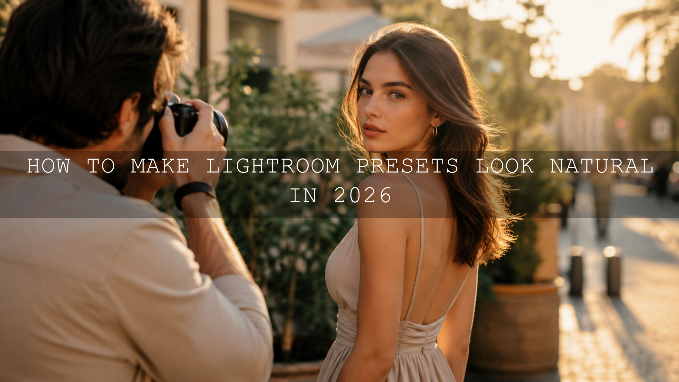
How to Make One Preset Pack Work in Different Lighting
Lightroom presets for different lighting can absolutely work well when you understand one simple truth: a preset is a starting point, not a finished edit. The same preset pack can look clean in golden hour, too harsh in midday sun, too yellow indoors, or too flat on a cloudy day because every photo begins with different exposure, white balance, contrast, and color conditions.
Here’s why this matters: if you learn how to adapt Lightroom presets instead of replacing them every time the light changes, you can build a more consistent editing style across portraits, travel photos, wedding galleries, street shots, product images, and social media content. Adobe explains in its official guide to editing photos with presets in Lightroom that presets can apply saved settings and that the Amount slider can adjust preset intensity. That means you have control after the preset is applied.
For a flexible editing workflow, start with the 1000+ Master Lightroom Presets Bundle and browse more styles in the Lightroom Presets for Lightroom Mobile & Desktop collection. Try these presets today — Buy 3, Get 9 FREE — then use the steps below to make one preset pack work across harsh sun, cloudy skies, indoor light, golden hour, and low-light scenes.
Why Presets Look Different in Every Lighting Condition
Many photographers feel frustrated when a preset looks amazing on one photo and completely wrong on another. The problem is usually not the preset itself. The problem is the starting photo.
A preset applies a saved combination of adjustments, but your camera file may already be bright, dark, warm, cool, flat, contrasty, noisy, or color-shifted. When those starting conditions change, the same preset reacts differently.
For example, a warm cinematic preset may look beautiful on a soft sunset portrait. But if you apply that same preset to an indoor café photo with yellow ceiling lights, the skin tones may become too orange. A clean bright preset may look fresh on a cloudy lifestyle photo, but it may blow out highlights on a harsh midday beach shot.
I have tested the same preset style across wedding portraits, outdoor travel photos, and indoor product-style shots, and the biggest difference almost always comes from three things: exposure, white balance, and contrast. Once those are corrected, the preset usually becomes much easier to control.
Presets vs Manual Editing: What Is the Real Difference?
Lightroom presets and manual editing are not enemies. They work best together.
- Presets give you speed, style, color direction, consistency, and a strong creative base.
- Manual editing gives you precision, correction, balance, and control for the specific lighting in each image.
Think of a preset as your editing recipe and manual adjustments as the final seasoning. The preset builds the mood. Your small slider changes make that mood fit the photo.
This is especially important when using one preset pack in different lighting. The goal is not to force every image into the exact same slider settings. The goal is to create a consistent visual identity while still respecting the natural light in each photo.
Choose a Versatile Preset Pack First
If you want one preset pack to work across different lighting conditions, choose a pack with range. A very specific preset pack can still be useful, but it may need more correction when the lighting does not match the style it was designed for.
A versatile preset pack usually includes a mix of clean, warm, moody, bright, cinematic, natural, and soft looks. This gives you more starting points for different scenes.
Look for Balanced Presets
Balanced presets are easier to adapt because they do not push every slider to an extreme. They usually protect skin tones better, keep contrast under control, and leave room for personal adjustment.
For all-around editing, the 1000+ Master Lightroom Presets Bundle is a strong choice because it gives you many style directions for portraits, travel, weddings, lifestyle, landscapes, street photos, and social media edits.
Use Scene-Specific Presets When Needed
Sometimes one broad bundle is enough. Other times, a more specific preset helps you start closer to the final look. For indoor photos, a clean studio-style pack like AI-Optimized Aesthetic Home Studio Clean Lightroom Presets can help reduce dullness and improve a bright, minimal look. For warm sunset portraits, Honey Golden Hour Lightroom Presets can give you a warmer starting mood.
The key is to choose the closest creative base first, then fine-tune the photo after applying the preset.
The Best Lightroom Settings to Adjust After Applying a Preset
After applying a preset, do not judge it immediately. First, check the foundation sliders. These are the controls that help presets work across different lighting conditions.
1. Exposure
Exposure is the first slider to check because it controls the overall brightness of the image. If a preset makes the photo too bright or too dark, fix exposure before changing color.
- If the image is too bright: lower Exposure slightly, then reduce Highlights if the bright areas are losing detail.
- If the image is too dark: raise Exposure carefully, then lift Shadows only as much as needed.
- If the subject looks correct but the background is wrong: use masking instead of changing the whole image.
Adobe’s Lightroom editing controls for desktop explain how profiles and editing controls help shape the color and tone of a photo. In practice, exposure correction is the fastest way to make a preset feel more natural.
2. White Balance
White balance is one of the most important settings when adapting Lightroom presets for different lighting. It controls whether your photo feels warm, cool, green, or magenta.
Adobe’s Lightroom Edit panel guide explains that the White Balance Selector can be used to choose a neutral area and automatically correct Temperature and Tint. This is very useful when a preset looks too yellow, too blue, too green, or too pink.
- Too yellow or orange: move Temperature slightly cooler.
- Too blue: move Temperature slightly warmer.
- Too green: move Tint toward magenta.
- Too pink or purple: move Tint toward green.
Pro tip: always judge white balance by skin tones, white clothing, gray walls, or neutral objects in the frame. Green grass and blue skies are not always reliable for white balance because they already have strong natural color.
3. Highlights and Shadows
Highlights and Shadows help you recover detail after the preset changes contrast. They are especially important in harsh sun, wedding photos, outdoor portraits, and bright travel scenes.
- Lower Highlights when skies, dresses, faces, or reflective surfaces look too bright.
- Lift Shadows when hair, clothing, backgrounds, or darker skin tones lose detail.
- Avoid extreme shadow recovery if the photo was captured at high ISO because it can reveal noise.
If a preset makes the image too dramatic, do not delete the preset right away. First, reduce Highlights, lift Shadows slightly, and lower Contrast. Many “bad preset” results are just tonal balance problems.
4. Contrast and Tone Curve
Contrast controls how much separation exists between bright and dark areas. The Tone Curve gives you more detailed control over that separation.
Harsh sunlight already has strong contrast. If your preset adds even more, the photo can look too heavy. Cloudy light is naturally soft and flat. If your preset is too gentle, the photo may need more contrast or a soft S-curve.
- For harsh light: reduce Contrast and soften the curve.
- For cloudy light: add mild Contrast or a gentle S-curve.
- For golden hour: protect highlights while keeping shadow depth.
- For indoor light: avoid crushing blacks too much because dark areas can become muddy.
5. Color Mixer and Saturation
The Color Mixer, also known as HSL, helps you control individual colors. This is where you fix greens that look too yellow, skies that look too teal, or skin tones that look too orange.
When adapting one preset pack across different lighting, the Color Mixer is often more useful than global Saturation. Instead of making the whole photo less colorful, you can target only the problem color.
- Skin too orange: slightly reduce Orange Saturation or adjust Orange Hue.
- Grass too yellow: shift Yellow or Green Hue carefully toward a cleaner green.
- Sky too intense: lower Blue Saturation or Blue Luminance depending on the look.
- Photo too dull: raise Vibrance slightly before using global Saturation.
Vibrance is often safer than Saturation because it can add life without making already strong colors too aggressive.
How to Adapt Presets in Harsh Midday Sun
Harsh midday sun is one of the hardest lighting conditions for presets because it creates bright highlights, deep shadows, strong reflections, and intense colors. A preset that looked soft in golden hour may become too crunchy in direct sun.
- Apply the closest natural or clean preset from your pack.
- Lower Exposure slightly if the photo feels too bright.
- Pull down Highlights to recover sky, skin, clothing, and reflective areas.
- Lift Shadows carefully to restore detail without making the image look flat.
- Reduce Contrast if the preset makes the light too harsh.
- Check White Balance because midday light can sometimes look slightly blue.
- Reduce Vibrance or Saturation if colors look too strong.
Example: if a travel photo shot at noon looks too sharp and contrasty after applying a cinematic preset, try lowering Contrast, reducing Highlights, and lifting Shadows before changing the preset. The original style may still work once the light is balanced.
How to Adapt Presets for Indoor Lighting
Indoor lighting is tricky because it often includes mixed light sources. You may have window light, yellow bulbs, LED lights, colored walls, and screen glow all affecting the same photo.
This is why indoor preset edits often look too yellow, too green, or too muddy. If this happens, start with white balance before touching anything else.
- Apply the preset.
- Use the White Balance Selector on a neutral area if possible.
- Cool down Temperature if the photo is too yellow or orange.
- Adjust Tint if skin or walls look green or magenta.
- Raise Exposure slightly if the room feels too dim.
- Lift Shadows carefully, but watch for noise.
- Use Masking to brighten only the subject if the background should stay moody.
If you often edit indoor content, read why presets look bad indoors and how to fix indoor lighting. It gives you a more focused workflow for artificial light, color casts, and skin tone correction.
How to Adapt Presets for Cloudy and Overcast Photos
Cloudy light is soft, but it can make photos look flat. A preset may not look “wrong,” but the image can feel low-energy because the original scene lacks contrast.
For overcast photos, your job is usually to add depth without making the edit look fake.
- Apply the preset.
- Increase Exposure slightly if the photo feels dull.
- Add a little Contrast or use a gentle S-curve.
- Warm up White Balance if the photo looks too blue.
- Add a small amount of Vibrance to bring back color.
- Use Dehaze lightly if the image needs more separation.
Pro tip: do not overdo clarity on cloudy portraits. It can make skin texture look too rough. A softer contrast adjustment usually looks more premium.
How to Adapt Presets for Golden Hour
Golden hour is beautiful, but it can also become too warm when you apply a warm preset. This is common with sunset portraits, wedding couple photos, beach photos, and travel content.
The goal is to keep the golden mood without turning everything orange.
- Apply your warm or cinematic preset.
- Check skin tones first.
- Cool Temperature slightly if the image looks too orange.
- Lower Highlights if the sun or sky is clipping.
- Lift Shadows only enough to keep detail.
- Reduce Orange Saturation if skin tones look too strong.
A preset should enhance golden hour, not overpower it. If the light was already warm in-camera, you may need less preset intensity. Use the Amount slider when available, then fine-tune Temperature and Orange Saturation.
How to Adapt Presets for Low-Light Photos
Low-light photos need a softer approach. If you push exposure and shadows too hard, the image can become noisy, muddy, or unnatural.
Start by accepting the mood of the scene. Not every low-light photo needs to become bright. Sometimes the best edit keeps the atmosphere while gently improving subject visibility.
- Raise Exposure slightly, not aggressively.
- Lift Shadows only where detail is important.
- Use Noise Reduction if shadows become grainy.
- Reduce Saturation if artificial colors become too strong.
- Use Masking to brighten faces, products, or key subjects.
For more detail recovery tips, read why presets make photos too dark and how to recover detail.
Use Masking When Global Adjustments Are Not Enough
Sometimes the full image does not need correction. Only the face, sky, background, dress, product, or shadow area needs help. This is where Lightroom masking becomes powerful.
Adobe’s guide to masking in Lightroom explains how masks can select subjects, skies, backgrounds, landscapes, objects, and people for local adjustments. This helps you keep the preset style while correcting only the part of the photo that needs attention.
- Face too dark: use a subject or people mask and raise Exposure slightly.
- Sky too bright: use a sky mask and lower Highlights.
- Background too distracting: use a background mask and reduce Clarity or Saturation.
- Product photo too flat: use a subject mask and add mild Contrast or Texture.
This is one of the biggest differences between beginner preset editing and professional-looking preset editing. Beginners change the whole image. Strong editors adjust only what needs to change.
A Simple Workflow for Using One Preset Pack Anywhere
Here is a repeatable workflow you can use every time a preset looks slightly off:
- Choose the closest preset style. Do not force a dark moody preset onto a bright clean image unless that is your creative goal.
- Set exposure first. Make sure the photo is not too bright or too dark.
- Fix white balance. Check skin, whites, grays, and neutral objects.
- Balance highlights and shadows. Recover detail without flattening the photo.
- Adjust contrast. Match the mood to the original lighting.
- Fine-tune color. Use Color Mixer for skin, greens, blues, and warm tones.
- Use masking. Correct only the subject, sky, or background if needed.
- Reduce preset intensity. Use the Amount slider if the preset feels too strong.
- Save your adjusted version. Build your own sunny, indoor, cloudy, and golden hour variations.
If you want to understand why the same preset changes from photo to photo, read why Lightroom presets look different on every photo. It pairs well with this workflow.
Create Your Own Lighting-Based Preset Variations
Once you find adjustments that work, save them as new preset variations. This helps you build a faster workflow from one main preset pack.
You could create:
- Sunny Day Clean Edit
- Golden Hour Warm Portrait
- Indoor Café Natural Color
- Cloudy Day Soft Contrast
- Low-Light Moody Detail
These custom versions keep your editing style consistent while making your workflow faster. You are not starting from zero every time. You are building your own preset system based on real lighting conditions.
Common Preset Mistakes to Avoid
When photographers struggle with presets, the issue is often one of these mistakes:
- Using the wrong preset for the lighting. A beach preset may not fit a dark indoor café without correction.
- Ignoring white balance. This is the fastest way to ruin skin tones.
- Over-lifting shadows. This can create noise and a faded look.
- Using too much saturation. Strong color is not always better color.
- Editing every photo the same way. Consistency does not mean identical slider values.
- Not using masking. Local adjustments often solve problems better than global changes.
For mobile creators, mastering Lightroom Mobile presets for any lighting is a helpful next read because it focuses on quick, practical adjustments on your phone.
Related Reading
- Mastering Lightroom Mobile presets for any lighting
- Why Lightroom presets look different on every photo
- How to fix presets that look bad indoors
- How to edit mixed indoor and window lighting with presets
- How to recover detail when presets make photos too dark
Best Preset Packs and Collections for Flexible Editing
If you want one preset pack to work across different lighting, choose variety first. The 1000+ Master Lightroom Presets Bundle gives you a wide range of looks for portraits, travel, weddings, street photography, lifestyle images, and creative edits. For clean indoor content, the AI-Optimized Aesthetic Home Studio Clean Lightroom Presets are useful for bright, minimal, and creator-style photos. For warm light, the Honey Golden Hour Lightroom Presets can help enhance sunset tones with a polished look.
You can also browse the full Lightroom Presets for Lightroom Mobile & Desktop collection or explore Lightroom Mobile Presets if you edit mainly on your phone. If you need help getting started, visit the AAAPresets FAQ and installation help page.
Final Thoughts: One Preset Pack Can Work Almost Anywhere
One preset pack can work in different lighting if you treat presets as flexible editing tools instead of fixed one-click finishes. Apply the preset, then adjust exposure, white balance, highlights, shadows, contrast, color, and masking based on the actual light in the image.
The more you practice, the faster your editing eye becomes. You will start noticing patterns: indoor photos need white balance correction, harsh sun needs highlight control, cloudy days need contrast, golden hour needs warmth control, and low-light photos need careful shadow recovery.
Build your editing workflow with the 1000+ Master Lightroom Presets Bundle, then explore more creative styles in the Lightroom Presets for Lightroom Mobile & Desktop collection. Try these presets today — Buy 3, Get 9 FREE — and create consistent, professional-looking edits no matter the lighting.
FAQ
Can one Lightroom preset pack work in different lighting?
Yes. One Lightroom preset pack can work in different lighting if you adjust exposure, white balance, highlights, shadows, contrast, and color after applying the preset.
Why do presets look bad in indoor lighting?
Presets often look bad indoors because artificial light can create yellow, orange, green, or mixed color casts. Fix white balance first, then adjust exposure and skin tones.
Should I adjust exposure before or after applying a preset?
You can do both, but a practical workflow is to apply the preset first, then adjust exposure so the final look fits the actual brightness of the photo.
How do I make a preset less strong in Lightroom?
Use the preset Amount slider when available, then reduce strong settings such as contrast, saturation, clarity, highlights, or color mix adjustments.
What is the best preset style for different lighting?
A clean, balanced, natural preset style is usually the most flexible because it leaves room for adjustments in harsh sun, cloudy light, indoor light, golden hour, and low-light scenes.
Written by Asanka — creator of AAAPresets (10,000+ customers).

Leave a comment
This site is protected by hCaptcha and the hCaptcha Privacy Policy and Terms of Service apply.