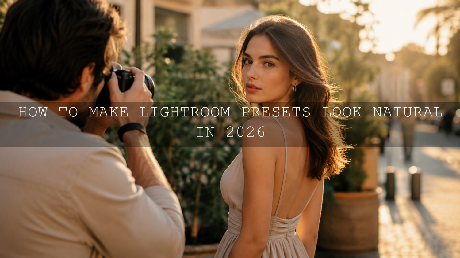
How to Make Lightroom Presets Look Natural in 2026
Learning how to make Lightroom presets look natural is one of the most important editing skills for photographers in 2026. Presets can save time, create a consistent style, and give your photos a polished look, but they should never make the image feel fake, heavy, or over-processed. A good Lightroom preset should support the photo’s original light, color, skin tone, and mood instead of forcing every image into the same dramatic look.
Here’s why this matters: the best preset workflow is not about one-click editing. It is about applying a strong creative starting point, then adjusting exposure, white balance, contrast, HSL, masking, sharpening, and preset intensity until the photo still feels real. Adobe’s official guide to editing photos with presets in Lightroom explains that presets can be adjusted with the Amount slider, which is one of the easiest ways to reduce an edit that feels too strong.
For a flexible natural editing workflow, start with the 1000+ Master Lightroom Presets Bundle and browse more styles in the Lightroom Presets for Lightroom Mobile & Desktop collection. Try these presets today — Buy 3, Get 9 FREE — then use the steps below to make every edit feel clean, realistic, and professional.
The Preset Paradox: Speed vs. Soul
Presets are popular because they solve a real problem: editing takes time. If you shoot weddings, portraits, travel, street photography, products, food, or social media content, presets help you create a consistent look faster. The problem begins when the preset becomes stronger than the photograph itself.
A natural photo edit should still feel connected to the original scene. Golden hour should feel warm but not orange. Skin should look healthy but not plastic. Greens should feel rich but not neon. Shadows should have mood but not lose all detail. When every photo looks like it has the exact same color cast, the edit starts to look artificial.
I have tested strong cinematic presets on portraits, wedding-style outdoor shots, and street images, and the same rule appears every time: the preset works best after the basic exposure and white balance are corrected. Even a beautiful preset can look wrong if the photo starts too dark, too warm, or too contrasty.
Signs Your Lightroom Preset Looks Over-Edited
Before you can create natural-looking Lightroom presets, you need to recognize what makes an image feel fake. Most over-edited photos have one or more of these problems:
- Unnatural skin tones: Skin becomes too orange, too yellow, too red, too gray, or too smooth. Real skin has small color variations, soft texture, and natural undertones.
- Too much saturation: Greens, blues, reds, and oranges become louder than the subject. This is especially common in travel, landscape, and street photos.
- Crushed shadows: Dark areas lose detail and become solid black. This can look dramatic, but it often removes depth.
- Blown highlights: Bright areas lose texture, especially skies, white clothing, skin highlights, and reflective surfaces.
- Harsh clarity or texture: Skin, skies, and smooth backgrounds start to look crunchy, noisy, or metallic.
- Heavy color grading: Strong orange highlights, teal shadows, or brown tones can look stylish, but too much can make every photo feel copied.
If this happens often, read the guide on why Lightroom presets look different on every photo. It explains how exposure, white balance, camera profile, and lighting conditions can change the result after a preset is applied.
Natural Editing Starts Before the Preset
The biggest mistake many beginners make is applying a preset before checking the base image. A preset cannot fully fix poor exposure, wrong white balance, or distracting color casts. It can improve the mood, but the foundation still matters.
Before applying a preset, check three things:
- Exposure: Is the photo too dark or too bright?
- White balance: Does the image feel too warm, too cool, too green, or too magenta?
- Subject priority: Is the subject clear, or is the background stealing attention?
For example, if you apply a warm film preset to a photo that is already very yellow, the final image may look orange. If you apply a moody preset to an underexposed photo, the shadows may become too deep. A natural preset workflow begins with small corrections first, then creative styling second.
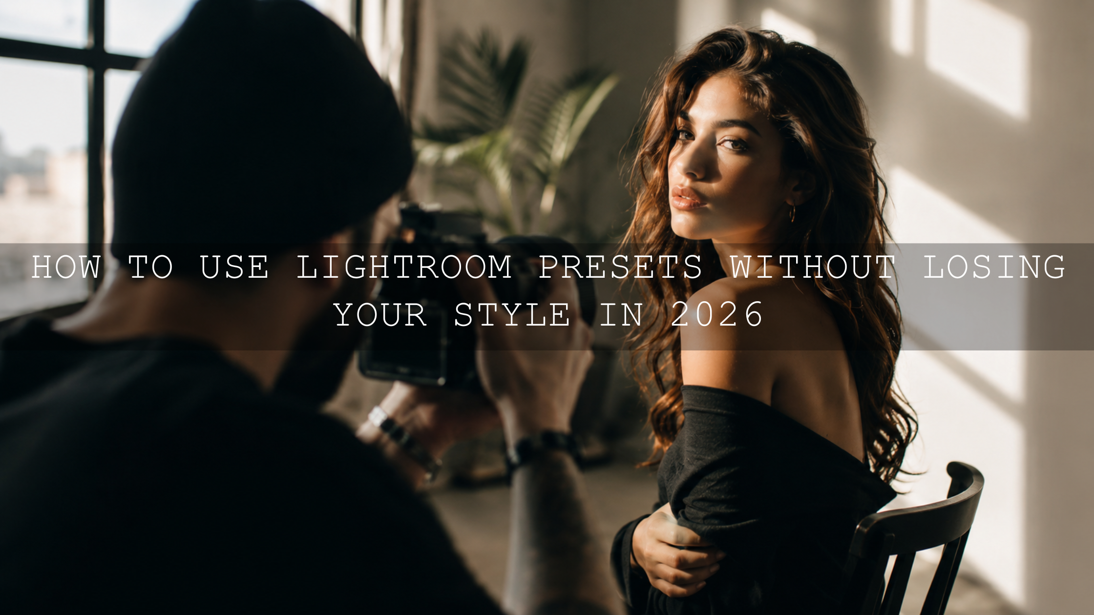
Presets vs Manual Editing: Which Looks More Natural?
Presets and manual editing are not enemies. They work best together.
Presets are best for speed, consistency, and creative direction. They help you create a recognizable look across a full gallery or social media feed. For example, a portrait photographer may use a warm preset to keep skin tones soft across multiple sessions, while a street photographer may use a cinematic preset to keep shadows and colors consistent.
Manual editing is best for final accuracy. It lets you adjust each image based on its real lighting, subject, background, and color balance. Manual refinements are what make a preset feel custom instead of automatic.
The best workflow is simple: use a preset for style, then use manual adjustments for truth. If you want a strong but flexible starting point for urban images, try AI-Optimized Street Cinematic Lightroom Presets, then reduce contrast, saturation, or clarity when the scene needs a softer finish.
The Apply, Assess, Adjust Workflow
The easiest way to make any Lightroom preset look natural is to follow this repeatable workflow:
- Apply the preset. Choose a preset that matches the photo’s mood, not just the trend. A bright lifestyle preset may not suit a rainy street photo, and a dark cinematic preset may not suit a soft newborn image.
- Assess the image. Look at skin, shadows, highlights, whites, greens, blues, and overall contrast. Ask yourself: does this still feel like the real scene?
- Adjust preset intensity. If the effect feels too strong, reduce the Amount slider. This keeps the style but softens the overall impact.
- Fix white balance. Adjust temperature and tint before changing too many color sliders. White balance affects every color in the image.
- Fine-tune exposure and contrast. Recover highlights, lift shadows if needed, and avoid crushing detail.
- Refine color selectively. Use HSL or Color Mixer adjustments instead of pushing global saturation too far.
This workflow is especially helpful when editing full galleries. For example, when editing warm family photos, one preset might work beautifully on golden hour portraits but feel too yellow indoors. The solution is not always a new preset. Often, you only need to reduce warmth, lower orange saturation slightly, or lift skin luminance. For more real-world examples, see this guide to editing warm family photos in Lightroom.
How to Keep Skin Tones Natural
Skin tones are the fastest way to tell whether a preset is working. If the skin looks unnatural, the whole photo feels wrong, even if the background is beautiful.
Use these skin-tone checks after applying a preset:
- Check orange saturation: If skin looks too strong, reduce orange saturation slightly instead of lowering all saturation.
- Adjust orange luminance: A small lift can make skin look cleaner and softer without making it look fake.
- Watch the tint: Too much magenta or green can make skin look unhealthy.
- Avoid heavy texture on faces: Texture can be useful for clothing, landscapes, and details, but too much on skin can look harsh.
Adobe explains that the Color Mixer in Lightroom can adjust Hue, Saturation, and Luminance for individual colors. This is important because natural editing usually needs selective color control, not one global saturation change.
For portraits where skin tone control matters most, explore the Portrait Photography Lightroom Presets collection or test AI-Optimized Dark Skin Cinematic Lightroom Presets when you want a cinematic look that still needs careful skin-tone balance.
Use HSL for Natural Color, Not Loud Color
Many over-edited photos happen because the editor increases global saturation too much. A better approach is to adjust individual colors using HSL or Color Mixer.
Here’s a simple natural color formula:
- Greens: Lower saturation slightly and adjust hue away from neon green if needed.
- Blues: Reduce saturation if skies look too electric, then adjust luminance for a cleaner sky.
- Oranges: Protect skin tones first. Avoid extreme hue shifts unless the lighting is unusual.
- Yellows: Reduce yellow saturation if indoor lights or dry grass look too strong.
- Reds: Watch lips, clothing, signs, and flowers because red can overpower the frame quickly.
When I test presets on street photos, I usually look at greens, oranges, and blues first. Green signs, orange skin, and blue shadows often reveal whether the preset is balanced. The goal is not to remove color. The goal is to make color feel believable.
Use Masking Instead of Global Heavy Edits
If one part of the image needs more drama, do not always push the whole photo harder. Use masks. A sky may need more dehaze, but the subject may not. A background may need darker shadows, but skin may need softness. A product photo may need more texture on the product, but not in the background.
Adobe’s guide to masking for local adjustments in Lightroom explains how masks help you edit specific parts of an image. This is one of the most important tools for natural preset refinement because it lets you improve the photo without damaging everything else.
For example:
- Use a subject mask to brighten a face without lifting the whole background.
- Use a sky mask to reduce highlights without making the person too dark.
- Use a brush mask to soften harsh clarity on skin.
- Use a linear gradient to darken a bright edge that pulls attention away from the subject.
This is also useful for landscape and travel photos. If you enjoy outdoor editing, compare your results with the ideas in the landscape Lightroom presets guide and then refine your own preset workflow with local adjustments.
Control Clarity, Texture, Dehaze, and Sharpening
Clarity, Texture, Dehaze, and Sharpening can make an image look professional, but they can also make it look rough. These tools are powerful because they change the perception of detail and contrast.
Use this simple rule: add detail only where detail should exist.
- For portraits: Use very light texture and avoid heavy clarity on faces.
- For street photos: Add clarity carefully to buildings, roads, and signs, but watch skin and skies.
- For landscapes: Use Dehaze gently because too much can create unnatural skies and harsh shadows.
- For product photos: Sharpen the product, but keep the background smooth and clean.
If a preset gives your image a crunchy look, reduce Clarity first, then Texture, then Dehaze. After that, check sharpening and noise reduction. Natural editing is often about removing the excess rather than adding more.
How to Build Your Own Natural Preset Style
If you want your edits to feel consistent without looking copied, build a preset style around principles instead of trends. A trend may say “make everything brown and moody.” A principle says “protect skin tones, keep highlights soft, and use warm shadows only when the scene supports it.”
Use this preset-building checklist:
- Start with a balanced raw photo. Do not build a preset from a badly exposed image.
- Keep white balance flexible. Avoid baking in extreme warmth or coolness unless the preset is made for one specific lighting style.
- Use moderate contrast. Let the user increase contrast if the photo needs more drama.
- Keep skin tones protected. Test on different skin tones and lighting conditions.
- Test across real scenarios. Try portraits, travel photos, street shots, indoor light, cloudy light, and golden hour.
- Save different versions. Create soft, medium, and strong versions so the edit can adapt.
For vintage-style editing, for example, a natural look usually means soft contrast, gentle warmth, controlled grain, and muted colors rather than extreme fading. A pack like Old Vintage Lightroom Presets can give you a classic starting point, but the final result should still match the subject and lighting.
Related Reading
- Best street photography Lightroom presets for cinematic urban edits
- How AI-optimized presets work in Lightroom Mobile
- Preset styles that help photos stand out on Pinterest
Final Natural Preset Checklist
Before you export or publish your photo, ask these questions:
- Does the skin tone look real?
- Are the highlights controlled but still bright?
- Do shadows have mood without losing all detail?
- Are greens and blues believable?
- Does the subject still feel more important than the preset?
- Would the photo still look good six months from now, after the trend fades?
If the answer is yes, your preset is doing its job. It is helping the image, not overpowering it.
Natural-looking presets are not weak presets. They are refined presets. They guide the image toward a mood while leaving room for real light, real color, real skin, and real emotion. For a complete editing toolkit, start with the 1000+ Master Lightroom Presets Bundle, explore the Lightroom Mobile and Desktop preset collection, and choose styles that match your photography instead of forcing every photo into one look. Buy 3, Get 9 FREE and build a preset workflow that saves time while keeping your images authentic.
FAQ
Why do my Lightroom presets look fake?
Lightroom presets usually look fake when saturation, contrast, clarity, color grading, or white balance is too strong for the original photo. Reduce the preset Amount slider, fix white balance, protect skin tones, and use HSL adjustments to make the edit feel more natural.
How do I make skin tones look natural after applying a preset?
Start with white balance, then adjust orange saturation and orange luminance carefully. Avoid heavy texture or clarity on faces, and use masking if only the background needs stronger contrast or color.
Should I apply a preset before or after basic edits?
For the cleanest result, correct major exposure and white balance problems first, then apply the preset, then make final refinements. This helps the preset work with the photo instead of fighting the original lighting.
Are natural-looking presets better than dramatic presets?
It depends on the photo and purpose. Natural-looking presets are better for portraits, weddings, lifestyle, products, and long-term brand consistency. Dramatic presets can work well for cinematic street, fashion, travel, or mood-driven images when they are adjusted carefully.
What is the best Lightroom preset setting to adjust first?
Adjust preset intensity first if the overall look feels too strong. After that, check white balance, exposure, highlights, shadows, skin tones, and HSL color settings.
Written by Asanka — creator of AAAPresets (10,000+ customers).

Leave a comment
This site is protected by hCaptcha and the hCaptcha Privacy Policy and Terms of Service apply.