Stylized Color Grading Looks: Teal & Orange, Bleach Bypass, and Cross-Processing
If you love cinematic color, these three stylized looks—Teal & Orange, Bleach Bypass, and Cross-Processing—belong in your toolkit. In the first minute, here’s the essence: each look shapes emotion by separating warm skin tones from cool backgrounds, dialing realism and grit, or embracing surreal, punchy color shifts. I use these on commercial spots and music videos, and the same principles work whether you’re grading in Premiere Pro, DaVinci Resolve, or building a photography workflow in Lightroom. Want a fast head start while you learn? Try a proven pack and then fine-tune your own grades—our Bestselling LUTs Collection pairs well with stylized looks, and you can browse more in the Cinematic LUTs for DaVinci Resolve collection. Try them today—Buy 3, Get 9 FREE.
Teal & Orange: Why It Works and When to Use It
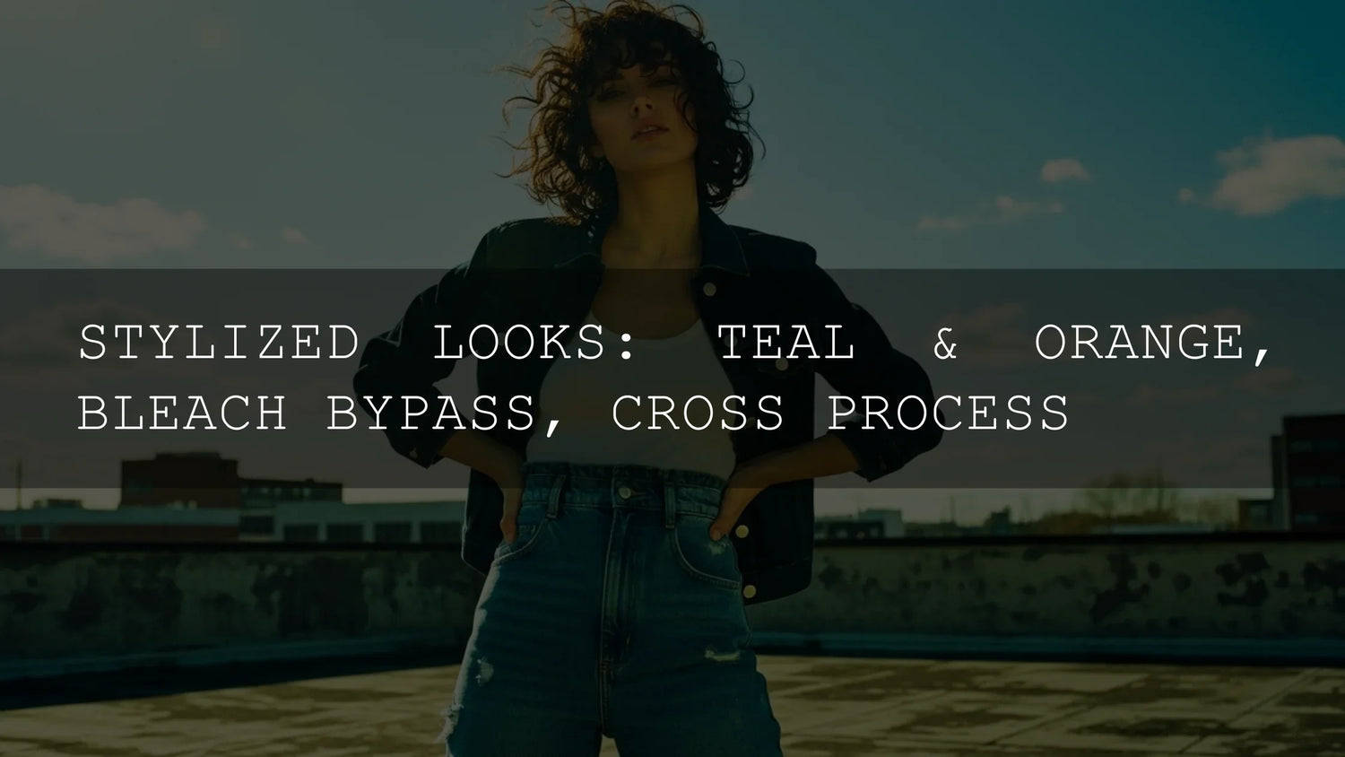
What it is: A complementary-contrast grade that pushes skin-tone highlights/midtones toward warm oranges while guiding shadows toward teal/blue. You’ll see it across action films, travel ads, and creator content because it instantly adds “cinema polish.”
- Color theory in action: Complementary hues maximize separation and perceived saturation. Use Adobe’s Color Wheel to explore harmonies and preview palettes before grading (Adobe Color Wheel).
- Subject isolation: Warm skin tones pop against cooler environments, improving readability on small screens.
- Versatility: Subtle for naturalism, or pushed for highly stylized music videos and trailers.
How to build it fast
- Balance first: Fix white balance/exposure, then add a gentle S-curve. Premiere users can start in Basic Correction and move to Creative/Curves—see Premiere Pro basic color correction.
- Push shadows cool: Use Lift/Offset (Resolve) or the Shadow color wheel (Premiere) to nudge toward teal. Keep saturation controlled.
- Warm midtones/highlights: Lean orange/amber in Gamma/Highlights; protect skin with a hue vs hue curve if it drifts too red.
- Target with masks: In Lightroom/Camera Raw, isolate subject/background with AI masks so backgrounds get the teal bias while skin stays natural. See Lightroom masking for local adjustments.
Real-world tip: I tested a subtle teal & orange on a sunset wedding clip—cooling shadows kept the suit and trees moody while a warm midtone lift preserved glowing skin and candles. On phones, faces read better without overcooking saturation.
Level up with resources from our site: shaping color in shorts and Reels with curves (see curves for stylized looks in Resolve) and brand-consistent LUT use (see matching LUTs to your brand).
Bleach Bypass: Grit, Weight, and Somber Realism
What it is: A desaturated, contrast-heavy look inspired by skipping the bleach step in photochemical processing—metallic highlights, restrained color, stronger grain/texture.
- Use cases: War films, thrillers, street/editorial pieces, and any story needing severity or toughness.
- Why it lands: Lower chroma focuses attention on luminance and texture—faces feel more “real,” stakes feel higher.
How to build it fast
- Start neutral: Correct exposure; don’t clip. Then reduce global saturation ~10–30%.
- Contrast with care: Add luma contrast but keep mids alive. In Premiere, combine Curves with Basic contrast; in Resolve, mix a midtone-detail boost with restrained S-curve.
- Selective color kills: Use hue vs sat to mute reds/yellows while preserving slight skin color to avoid “dead” faces.
- Local tools: Burn backgrounds lightly; dodge faces with AI masks in Lightroom/Camera Raw (Camera Raw masking).
Pro tip: Add subtle film grain after shaping contrast. Texture sells the look—especially on 8-bit mirrorless footage.
Cross-Processing: Bold, Unpredictable, and Expressive
What it is: Digital emulation of developing film in the “wrong” chemicals—high contrast, wild casts (greens/magentas/yellows), and crushed/raised extremes. In 2025, it’s a strong choice for music videos, fashion, and experimental shorts.
How to build it fast
- Start with a LUT: Use a cross-process or vintage LUT as a base, then refine with curves. See how to import/apply LUTs on your platform: Windows & Mac LUT import guide or LUTs in After Effects.
- Hue vs hue “weirdness”: Push blues → cyan/green; tweak yellows → gold/acidic. Keep skin on a separate mask.
- Protect detail: Strong looks eat dynamic range; compress highlights selectively and lift shadows only where needed.
- Palette planning: Choose a controlled color story first with Premiere Pro’s color workflow overview and audition palettes in Adobe Color harmony.
Pro tip: Build two intensities: a “hero” version for key shots and a “lite” version for coverage. Consistency matters—see our brand consistency guide.
Workflow: From Base Correction to Look, Step by Step
- Technical baseline: White balance, exposure, neutral contrast, accurate skin. (Premiere’s basic tools: Basic Color Correction)
- Look application: Apply a LUT or manual wheels/curves. Keep nodes/layers modular: Base → Look → Subject Isolations → FX/Grain.
- Masking & refinement: Target faces, skies, and background separately with AI masks (Lightroom masking).
- Delivery checks: Compare on mobile bright mode/dim rooms; ensure faces readable at a glance.
If you want great results fast, start with professional presets/LUTs and iterate. Explore our Bestselling LUTs or browse Retro & Vintage LUTs to jump into cross-processed vibes—Buy 3, Get 9 FREE.
Presets vs Manual Editing (Quick Comparison)
- Speed & consistency (Presets/LUTs): Instant baselines across cameras/scenes; best for deadlines and multi-editor teams.
- Precision (Manual): Maximum control for tricky skin, mixed light, or brand-specific palettes.
- Best of both: Apply a LUT/preset, then correct skin and background with masks; adjust curves for finesse.
Practical Recipes You Can Try Today
Soft Teal & Orange (Natural)
- Shadows: small push toward teal; saturation −5 to −10.
- Midtones/Highs: gentle orange/amber; protect skin with hue vs hue.
- Finish: tiny halation or glow; subtle grain for cohesion.
Bleach Bypass (Modern)
- Saturation −20 to −35, keep skin −10 to −15 only.
- Contrast via S-curve plus midtone detail; avoid crushed blacks.
- Optional warm highlights for cinematic steel-and-sun feel.
Cross-Process (Editorial)
- Apply a cross-process/vintage LUT, then adjust hue vs hue.
- Lift shadows slightly, compress highs; vignette subtly.
- Keep a neutral skin mask to anchor realism.
Recommended Tools & Learning
- 1000+ Master Lightroom Presets Bundle — massive range of cinematic palettes for photography workflows.
- Creamy Minimalist Cinematic LUTs Pack — a clean, modern base for teal/orange variations.
- Ultimate Concert Video LUTs — punchy, high-contrast looks that adapt well to cross-processed styles.
- Curves for stylized looks (Resolve how-to) — learn targeted curve moves for separation.
Related Reading
- The Ultimate Guide to Color Grading Reels/Shorts in Resolve
- How to Match LUTs for Brand Consistency
- How to Import and Apply LUTs (Windows & Mac)
- Importing XMP Presets on iPhone/Android
- Autumn Editing Trends to Watch
Need Help?
New to presets or LUTs? Our FAQ & Install Help covers Lightroom preset installation and LUT import steps, plus licensing and support.
Bring These Looks Into Your Workflow
Whether you’re chasing cinematic warmth, gritty realism, or bold surreal palettes, start with a reliable baseline and adapt it to the story. Explore our Bestselling LUTs and browse Cinematic LUTs for DaVinci Resolve to build scene-ready looks in minutes—Buy 3, Get 9 FREE.
FAQ
What’s the fastest way to try Teal & Orange without breaking skin tones?
Apply a gentle teal bias to shadows, warm the midtones/highlights, then mask skin and use hue vs hue to keep it natural. Finish with subtle contrast.
Can I do Bleach Bypass on photos in Lightroom?
Yes. Lower global saturation, increase luma contrast with a tone curve, and use AI masks to keep faces readable. Add grain for texture.
How do I keep cross-processing consistent across a whole edit?
Build two LUT intensities (hero/lite), lock a palette in Adobe Color, and maintain consistent midtone contrast and skin protection masks.
Should I start with a LUT or grade manually?
For speed and consistency, start with a LUT/preset, then refine manually. For tricky mixed light or brand-critical color, manual first can be better.
Where can I learn the fundamentals of masking and grading?
See Adobe’s guides to Lightroom masking and Premiere Pro color workflows.
Written by Asanka — creator of AAAPresets (10,000+ customers).


Leave a comment
This site is protected by hCaptcha and the hCaptcha Privacy Policy and Terms of Service apply.