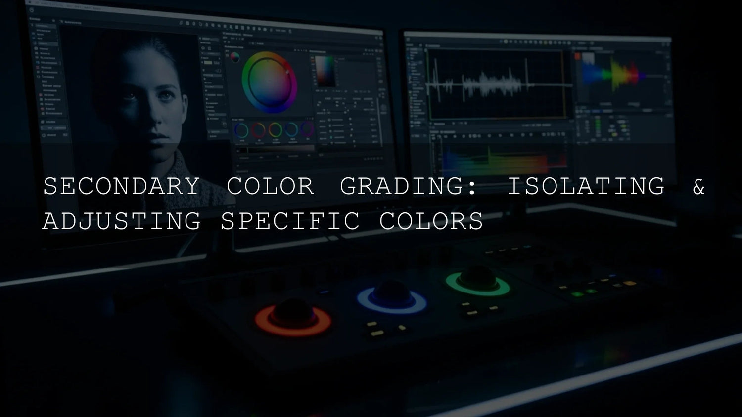
Secondary Color Grading: A Practical Guide to Precise, Story-Driven Color
If you’ve nailed your primary grade but the image still isn’t singing, it’s time to reach for secondary color grading. Instead of moving the whole frame together, you selectively target hues (skin, foliage, wardrobe, signage, skies) and adjust their hue, saturation, or luminance without disturbing everything else. The result: cleaner skin tones, stronger subject emphasis, and a look that supports your story—shot by shot and scene by scene.
Before we dive in, a quick way to accelerate your look development is to start from a curated creative base and refine with selective adjustments. Explore cinematic LUT starting points and browse the broader LUTs collection. Try what fits your footage, then use secondaries to perfect skin, tame problem colors, and stay on brand—Buy 3, Get 9 FREE.
Primary vs Secondary: Why Global Controls Aren’t Always Enough
Primary controls set exposure, contrast, white balance, and overall color for the entire image. They’re essential to establish a consistent baseline. But real scenes aren’t uniform. Mixed lighting can push skin slightly green, a brand shirt may desaturate under fluorescents, or a vibrant prop should pop more than the background. Secondary grading gives you the scalpel to fix those specifics without breaking the global look.
For a quick refresher on objective monitoring, see our scopes explainer: reading waveform, parade, and vectorscope. Pair that with fundamentals like white balance & exposure and tone shaping via Lift/Gamma/Gain for a strong base.
When to Use Secondary Color Grading
- Perfect skin tones: Neutralize a foliage or tungsten cast without flattening the whole frame.
- Direct attention: Nudge a hero prop’s saturation so the eye lands where you want.
- Creative styling: Push a single hue for mood (amber hour glow, steel-blue night) while preserving neutrals.
- Fix environmental casts: Tame green from old fluorescents or magenta spill from LEDs.
- Brand accuracy: Keep product or logo colors consistent across scenes and cameras.
Your Secondary Toolkit (Premiere Pro, Lightroom, Resolve)
Premiere Pro: HSL Secondary in Lumetri
Use the eyedropper to sample a hue, refine the selection via HSL range, then adjust Hue/Sat/Luma and add blur/denoise to the key for clean edges. Adobe’s walkthrough covers the full panel in detail—see HSL Secondary controls in Lumetri.
Lightroom (Classic / Desktop / Mobile): Masking with Color Range
Lightroom’s Masking lets you isolate subjects, backgrounds, skies, or a color range, then refine with sliders. Start here: Masking in Lightroom Classic and this focused guide to creating a Color Range mask. Adjust Temperature/Tint, Saturation, and Curve inside the mask for precise, natural results.
Photoshop: Color Range & Selective Color (when you need pixels)
For stills, Photoshop’s Color Range selection or Selective Color layers give exacting control with layer masks—great for product stills or composites before exporting to your video or print pipeline.
Hands-On: Three Mini Workflows
1) Natural Skin Tones in Mixed Light (Premiere Pro)
- Baseline: Complete your primary correction so exposure and balance are solid.
- Select skin: In Lumetri → HSL Secondary, sample cheek/midtones (not shiny highlights). Add/erase with the plus/minus droppers.
- Refine: Narrow the HSL ranges until your matte isolates skin. Add blur to the key to soften edges.
- Correct: Gently nudge Tint toward magenta if foliage made skin green, or pull magenta down if LEDs added pink. Subtle wins.
- Verify: Use vectorscope and aim near the skin-tone line. Toggle before/after and watch for edge artifacts.
Pro tip: If you plan a stylized overall grade, finalize skin secondaries first, then layer the creative look. For creative inspiration, start from a tasteful base like the Cinematic LUTs Pack and refine.
2) Rich, Real Greens in Landscapes (Lightroom)
- Primary first: Balance white point, lift shadows, set contrast.
- Mask → Color Range: Sample foliage; refine the range until earth and sky fall outside the selection.
- Feather: Increase feathering for gentle, invisible transitions.
- Saturation & Luminance: Add a little saturation; adjust luminance for depth (slightly darker greens often read more natural).
- Final check: Zoom 100% and look for halos along branches; reduce the selection’s edge contrast if needed.
3) On-Brand Product Color (Any App)
- Sample the exact brand hue (shirt, label, packaging).
- Limit the range so only the brand color is affected—protect neutrals and skin.
- Saturate modestly and adjust hue a few degrees until it matches your brand guide.
- Compare across shots using scopes and overlays for consistency.
For harmony ideas when building a palette around that hero hue, try Adobe Color’s palette generator or its Color Wheel harmony rules.
My Field Notes (First-Hand)
- On a wedding highlight reel shot under mixed tungsten and window light, I sample skin in the mids, then key-blur ~10–20 and reduce magenta saturation a touch. It keeps warmth while avoiding pink “plastic” skin.
- For product greens under fluorescents, I isolate the offender hue first (usually green/yellow), add key noise reduction, and correct the cast before re-adding creative warmth to highlights.
Presets vs Manual Editing (Use Both, in Order)
- Presets/LUTs: Fast, cohesive starting points for tone and palette—great for series or campaigns. Apply lightly; you’ll still refine.
- Manual secondaries: Clean up the shot-specific issues: skin neutrality, brand color accuracy, prop emphasis.
Want a head start? Explore the 1000+ Master Lightroom Presets and the Lightroom Presets collection, then finish with targeted secondaries for polish.
Quality Keys for Natural Results
- Feather everything: Hard edges give away the trick. Key blur/softness is your best friend.
- Watch the vectorscope: Keep skin near the skin-tone line; better slightly under-saturated than over-pushed.
- Mind luminance: Sometimes a small Luma tweak reads more natural than a big Saturation change.
- Keep keys clean: Use Denoise/Blur on the matte; avoid crunchy edges in hair and fine detail.
- Iterate in passes: One selective fix per node/layer keeps changes reversible and readable.
Related Reading
Common Pitfalls (And Quick Fixes)
- Over-saturation: If it looks “edited,” drop saturation 10–20% and re-balance luminance.
- Unnatural hue shifts: Keep changes within a few degrees unless it’s an intentional stylization.
- Key chatter/noise: Add key denoise or slightly widen saturation range, then re-feather.
- Ignoring the base grade: Bad primaries = bad secondaries. Fix exposure/WB first.
Try It on Your Next Edit
Build a clean base grade, then pick one selective fix that best serves the story (usually skin). When that’s right, add a creative push. To speed up experimentation, start from a tastefully graded base and iterate: pair the Cinematic LUTs Pack with focused secondaries, or explore the Lightroom Presets library and refine per scene. If you need install steps, see how to install presets.
FAQ
What’s the difference between primary and secondary color grading?
Primary grading adjusts the whole image (exposure, contrast, WB). Secondary grading isolates specific hues/areas (skin, foliage, wardrobe) to tweak hue/sat/luma without disturbing the global look.
How do I isolate skin tones cleanly?
Sample midtone skin, narrow the HSL ranges, add key blur/denoise, then nudge Tint or Saturation subtly. Verify near the skin-tone line on vectorscope and watch edges around hair.
Can I do secondary grading in Lightroom?
Yes—use Masking with Color Range or Subject/Background masks to target adjustments. It’s perfect for stills and batch consistency across a set.
Should I apply LUTs/presets before or after secondaries?
Usually after you establish primaries and skin neutrality, apply a gentle LUT/preset, then fine-tune with secondaries. That order preserves realism while achieving a cohesive style.
How do I keep brand colors consistent across clips?
Create a targeted key for the brand hue, adjust subtly, and use scopes for objective checks. Save grades/presets and reuse across the project for consistency.
Further learning from Adobe: HSL Secondary in Lumetri • Masking in Lightroom Classic • Adobe Color harmony tools
Written by Asanka — creator of AAAPresets (10,000+ customers).
Leave a comment
This site is protected by hCaptcha and the hCaptcha Privacy Policy and Terms of Service apply.