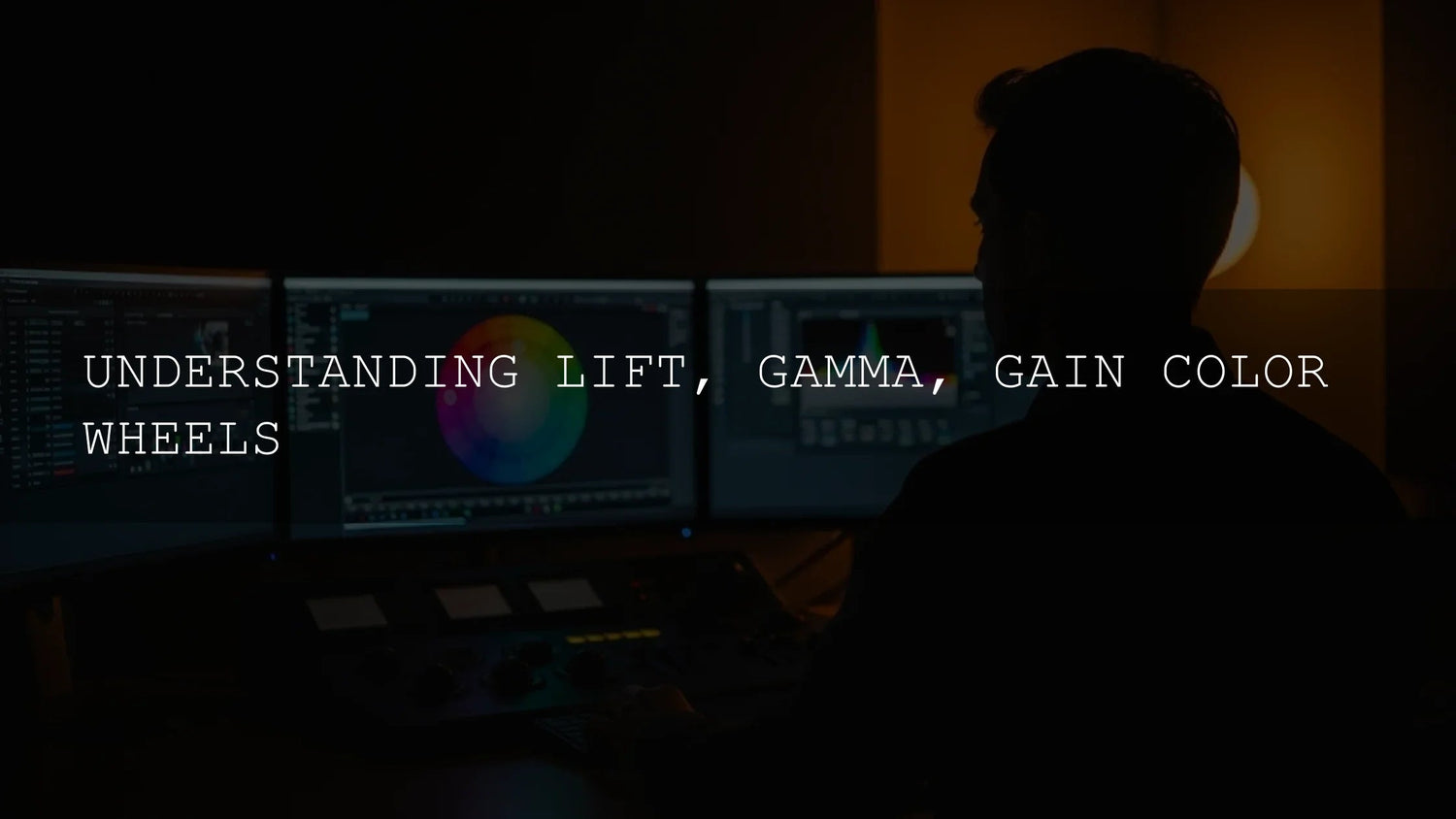
Lift, Gamma, Gain Explained: How to Grade Shadows, Mid-tones, and Highlights with Confidence
If you’ve ever stared at the three color wheels and wondered, “How do Lift, Gamma, and Gain actually shape my image?”—this guide is for you. We’ll demystify the Lift–Gamma–Gain (LGG) workflow, show you how each wheel influences luminance and color, and walk through a practical, step-by-step process you can apply today. Along the way, I’ll share field notes from real edits, a quick comparison of presets/LUTs vs manual grading, and links to authoritative Adobe resources such as monitoring with Lumetri Scopes, three-wheel color correction, and Adobe Color’s harmony rules. Try a curated LUT bundle to jump-start your looks and refine with wheels—Buy 3, Get 9 FREE: Cinematic LUTs Pack. Or browse the broader library here: LUTs for Premiere Pro Collection.
Deconstructing Tone: What Each Wheel Controls
Think of video brightness as a spectrum from deepest black to brightest white. LGG splits this spectrum into three zones so you can shape them independently.
- Lift manipulates shadows (near-black). It sets perceived black level and subtly affects low-end contrast and color cast.
- Gamma shapes the mid-tones (most of the image). This is where overall mood, contrast, and skin tones live.
- Gain guides the highlights (brightest areas), managing specular detail and preventing clipping.
As a best practice, keep Lumetri Scopes visible so you’re grading by eye and measurement. Scopes help you validate black point, mid-tone placement, and highlight headroom.
Lift: Sculpting Clean, Credible Shadows
What it does: Raises or lowers black level and adds a low-end color cast. Push Lift down for richer blacks; nudge it up to reveal detail in dim scenes.
- Mood tints: Cooler Lift (blue/cyan) suggests night, steel, or distance; warmer Lift (amber) can feel vintage or smoky—use sparingly to avoid muddying.
- Pro tip: Watch the waveform’s floor. Aim to touch zero IRE on the darkest pixels without flattening textured areas like hair and fabric.
Field note: On a city-at-dusk sequence, I lowered Lift until the waveform kissed zero, then added a faint blue bias for a clean twilight feel. It preserved alley-brick detail while selling “evening.”
Gamma: The Mid-tone Maestro
What it does: Sets overall image body and perceived brightness. Small moves here have big impact because mid-tones dominate the frame.
- Warm gamma (orange/yellow) reads inviting and nostalgic; think golden-hour travel pieces.
- Cool gamma (blue/cyan) reads calm, sleek, or somber—useful for tech, drama, or rainy vibes.
- Pro tip: Make mid-tone adjustments while checking skin on the vectorscope’s skin-tone line, then fine-tune with HSL if needed. See Adobe’s skin-tone correction walkthrough.
Field note: For a bridal prep scene, I brightened Gamma slightly and leaned warm. The groom’s navy suit stayed neutral while skin looked lively and true-to-life.
Gain: Protecting Highlights and Shaping Light Quality
What it does: Controls brightest regions and their hue. Raise for sparkle; lower to recover detail and prevent “paper white.”
- Warm Gain suggests late-day sun or candlelight; cool Gain can evoke moonlight or crisp studio light.
- Pro tip: Use Color Wheels & Match sliders to trim highlight luminance without tinting if you only need level control.
Putting It Together: A Reliable 6-Step LGG Workflow
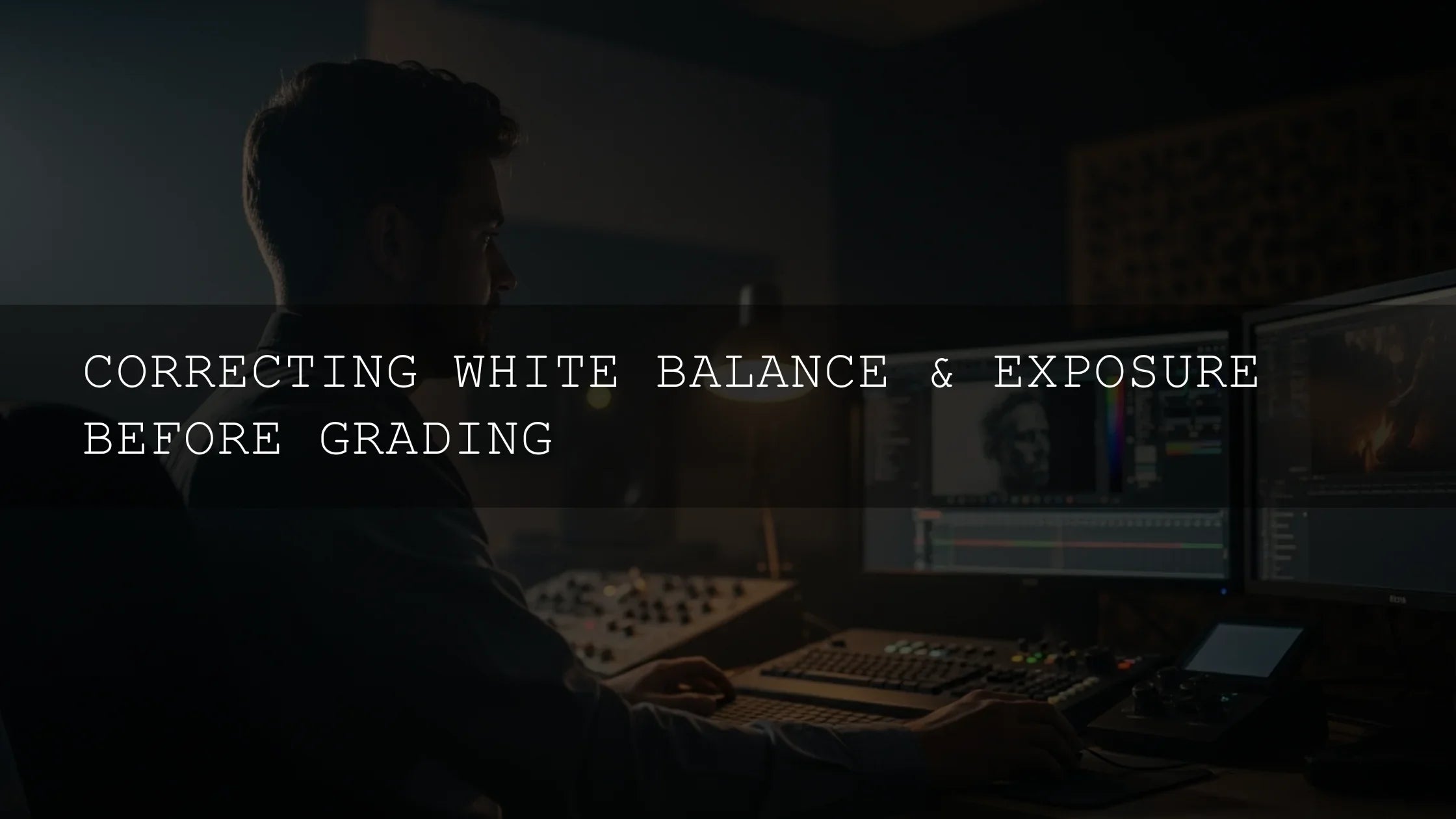
- Neutralize exposure & WB: Start with balanced exposure and white balance so creative choices aren’t fighting technical errors. (Scopes help—see Lumetri Scopes.)
- Set black point (Lift): Lower until shadows anchor the image; raise only if detail matters more than drama.
- Guard highlight detail (Gain): Bring down clipped regions until textures reappear.
- Shape the story (Gamma): Establish mood with mid-tone brightness and subtle chroma bias.
- Refine color harmony: Check palette balance with Adobe Color harmony rules (analogous for calm, complementary for pop).
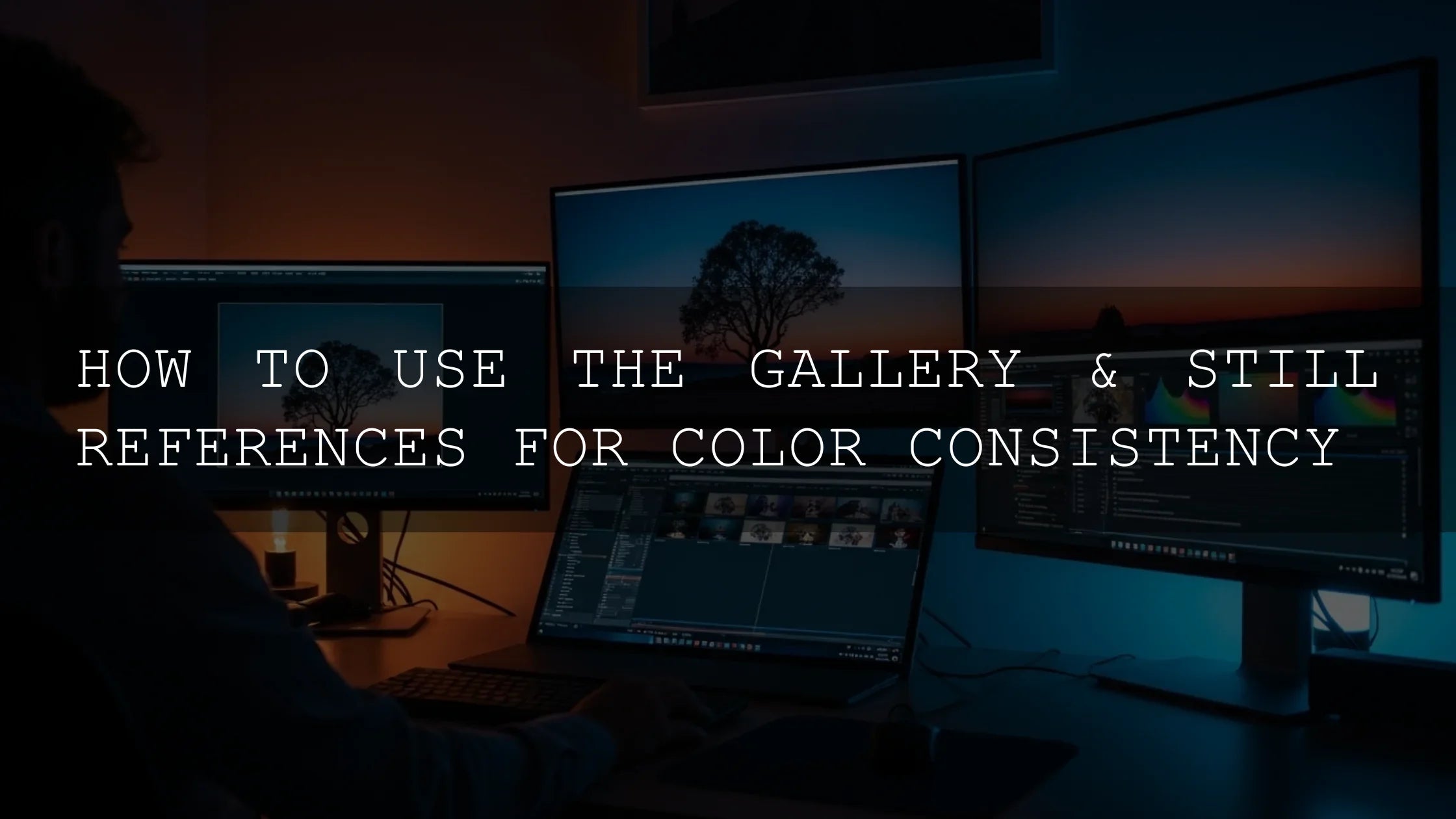
- Match shots: Pick a hero frame and align other clips’ LGG and saturation to it; use reference view or split-screen for tight matching.
Presets & LUTs vs Manual Grading (and Why the Best Workflows Use Both)
Presets/LUTs deliver speed and cohesion across a project. They’re great for establishing a base aesthetic, especially on log footage. Manual LGG excels at precision—dialing skin, fixing mixed light, and polishing highlights per shot.
- Start fast: Apply a look-defining LUT, then correct with LGG for exposure and hue accuracy.
- Finish precise: Validate with scopes and micro-adjust Gamma for skin and product colors.
Want a ready-to-use cinematic base? Try: Teal & Orange Cinematic LUTs and Drone & Landscape LUTs. Browse more: Cinematic LUTs Collection.
Advanced Tips for Clean, Consistent Grades
- Grade in the right space: Confirm your working color space and HDR/SDR setup; see Adobe’s note on color management & Lumetri.
- Protect skin first: Set Gamma and hue bias to keep skin near the vectorscope skin-line; correct casts with subtle LGG rather than heavy saturation.
- Beware crushed blacks: If the waveform flats at zero over large areas, you’re losing texture—raise Lift or reduce contrast.
- Use targeted masks: For tricky skies or backlit faces, add localized adjustments after LGG. (See Adobe’s masking overview for the concept—even if you grade video, the masking logic is the same.)
- Palette discipline: Validate your look’s color harmony with Adobe Color’s wheel and keep accent hues intentional.
Working with Log Footage & Conversion
Log profiles (S-Log, C-Log, V-Log) carry extra dynamic range but look flat until transformed. Apply a technical transform (camera-to-Rec.709 or HDR workflow) before creative LGG moves. Then use your favorite look LUT for vibe, followed by small LGG trims so skin, sky, and product colors remain natural. For color-management fundamentals, see this neutral primer from the ICC: digital photography color-management basics.
Shot-to-Shot Consistency (Fast)
- Choose a hero shot: Lock exposure and color on that clip first.
- Match with wheels: Use Color Wheels & Match for a one-click starting point, then refine LGG.
- Clipboard discipline: Paste attributes across similar shots; fine-tune Lift/Gamma in close-ups to preserve skin texture.
Real-World Mini Case Study
Scenario: Travel vlog with harsh noon sun and shaded alleys. I applied a soft filmic LUT for cohesion, then:
- Alleys: Raised Lift slightly to reveal brick/grout detail; cool Lift by ~5° toward blue for depth.
- Plaza: Lowered Gain to recover stone highlights; warmed Gain a touch for sun-kissed feel.
- Faces: Brought Gamma up +0.2 and eased toward magenta to neutralize green cast from foliage.
Result: Clean contrast, believable color, and consistent skin across mixed lighting—delivered in under 10 minutes per scene because the LUT set the vibe and LGG did the polish.
Try This Today
- Open scopes and set a neutral base exposure/WB.
- Dial Lift until blacks anchor but texture remains.
- Trim Gain to prevent clip; decide if highlights should feel warm or cool.
- Mold Gamma for mood; confirm skin on the vectorscope line.
- Optionally apply a creative LUT first (then re-balance LGG).
Ready to build a reusable look library? Explore: color grading basics, cinematic LUTs guide, teal & orange grade explained. For products, start with: 1000+ Master Lightroom Presets (great for photo-to-video branding continuity) and Premiere Pro LUT Bundle.
FAQ
What’s the difference between Lift/Gamma/Gain and Shadows/Midtones/Highlights?
They target similar tonal ranges, but implementations vary by app. In Lumetri, the three color wheels control brightness and chroma for shadows, mid-tones, and highlights. Start with wheels, then refine with curves and HSL. See Adobe’s overview of color wheels and curves.
Should I grade before or after applying a creative LUT?
For speed, apply the LUT after a technical transform (for log) and a rough exposure/WB pass, then finesse with LGG. If the LUT pushes too hard, reduce its intensity and re-balance Gamma.
How do I keep skin tones natural?
Use the vectorscope skin-tone line as your guardrail, then nudge Gamma or HSL to remove casts. Adobe’s skin-tone guide shows the process.
Why do my highlights look “paper white” after I raise Gain?
You’re likely clipping. Lower Gain, protect speculars, and consider rolling off with curves. Validate on Lumetri Scopes.
Do I need a calibrated monitor?
Yes—grading accuracy depends on display accuracy. Even basic calibration helps ensure your LGG decisions translate to phones and TVs consistently.
Related Reading
Gentle nudge to create your signature look
If you want polished, cinematic color faster, start with a look you love and refine with LGG. Explore curated options here: Lightroom Presets Collection and LUTs for Premiere Pro Collection. Try them on your next project—Buy 3, Get 9 FREE—and build a look library you can reuse across edits.
Written by Asanka — creator of AAAPresets (10,000+ customers)
Leave a comment
This site is protected by hCaptcha and the hCaptcha Privacy Policy and Terms of Service apply.