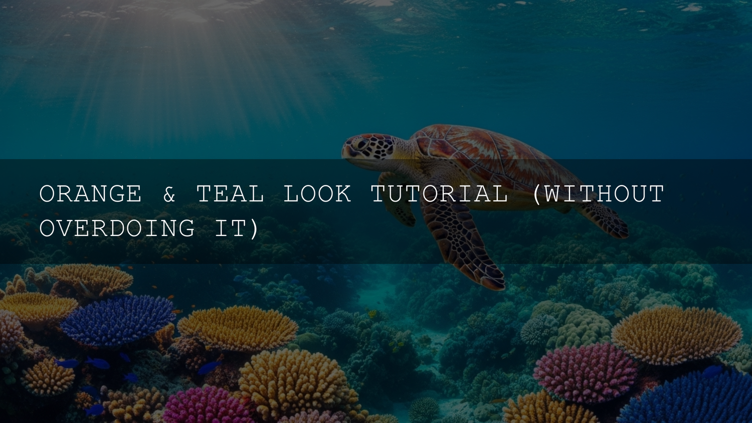
Orange and Teal Color Grading for Wildlife & Bird Footage
Orange and teal color grading has become a cinematic staple for a reason: it makes subjects pop, adds depth, and gives your footage an instantly polished, professional feel. When you combine this classic look with carefully tuned orange and teal color grading LUTs for wildlife, you get something even more powerful—bird and nature footage that feels both cinematic and true to the natural world. In this guide, we’ll break down why the orange and teal look works so well, how to avoid the usual mistakes, and how to build a smart workflow around specialized teal and orange LUTs for bird videography.
If you want to skip straight to a polished, cinematic base grade, you can start with the Cinematic Teal & Orange Bird LUTs Pack and keep exploring the wider Video LUTs. With the Buy 3, Get 9 FREE offer, it’s easy to test different cinematic looks without breaking your flow.
Why Orange and Teal Works So Well on Wildlife Footage
The orange and teal palette isn’t just a trend—it’s grounded in solid color theory. On the color wheel, orange and teal sit opposite each other as complementary hues, creating natural contrast that feels dynamic and pleasing to the eye. For wildlife creators, that contrast translates directly into stronger subject separation and a more immersive viewing experience.
- Natural skin and feather tones live in the “orange” range. Warm tones in feathers, beaks, eyes, and even subtle skin (if a human appears in frame) sit close to orange. Pushing these gently toward warm oranges or amber helps your subject feel alive and inviting.
- Backgrounds often live in the “teal” range. Skies, shadows in foliage, distant water, and cool-toned environments can be nudged toward teal. This gives you a calm, cinematic backdrop that lets birds and wildlife stand out clearly.
- Instant depth and visual hierarchy. With warm subjects against cooler backgrounds, the viewer’s eye knows exactly where to look. That’s crucial in busy natural environments with branches, grass, and cluttered backgrounds.
To experiment with complementary palettes beyond orange and teal, you can explore the Adobe Color wheel for complementary color palettes and see how different harmonies behave before you ever touch your footage.
Getting the Look in Your Editor Without Ruining Natural Color
The best orange and teal grades look like an enhanced version of reality, not a sci-fi filter. Whether you work in Adobe Premiere Pro, DaVinci Resolve, Final Cut Pro, or another editor, the workflow usually follows a similar structure: correct first, then stylize.
Step 1: Start With a Clean Base Grade
Before you touch teal and orange, fix the fundamentals:
- Balance exposure so your subject is visible and detail isn’t crushed or blown out.
- Set white balance so your footage isn’t unintentionally too warm or too cool.
- Adjust contrast gently so you have a solid, neutral starting point.
If you’re working in Lightroom or using stills as references, Adobe’s tutorial on adjusting color in Lightroom is a great refresher on temperature, tint, and color mixer basics.
Step 2: Apply a Cinematic LUT as Your “Look” Layer
Once the foundation is solid, you can apply a teal and orange LUT to introduce the overall cinematic mood. In Premiere Pro, for example, you can load a .cube file through Lumetri Color—Adobe walks through this in Adobe’s guide to applying LUTs in Premiere Pro.
- Apply your teal and orange LUT on an adjustment layer above your clips, or directly on the clips if you prefer.
- Dial back the LUT intensity if your software supports it (or by blending opacity) until the look feels natural.
- Use it as a starting point, not a final one—think “80% there” out of the box.
This is where a purpose-built wildlife LUT pack shines: you get a grade that’s already tuned for feathers, foliage, and outdoor light, rather than a generic teal and orange designed for cityscapes or portraits.
Step 3: Refine With Local Adjustments
After the LUT, refine specific areas:
- Brighten the bird’s eye and head slightly so they become the focal point.
- Use vignettes or gradients to gently darken distracting edges.
- Desaturate problem areas (like neon greens in foliage) so they don’t compete with your subject.
In photo workflows, tools like masks and color range selection—covered in depth in Adobe’s masking documentation—are incredibly useful for doing this precisely without affecting the whole frame.
Common Orange and Teal Mistakes (and How to Fix Them)
Because the orange and teal look is so popular, it’s also easy to overdo. Here are the classic mistakes that make a grade look cheap instead of cinematic, plus simple fixes.
-
Problem: Nuclear saturation. If blues are glowing and oranges are radioactive, your grade will scream “filter” instead of “film.”
Fix: Reduce saturation in the cool and warm channels separately. Aim for rich but believable color. Your reference should be high-end wildlife documentaries, not cartoon animation. - Problem: Crushed shadows and blown highlights. Overly aggressive contrast can hide feather detail in the shadows or wipe out the sky.
- Fix: Use curves or shadow/highlight sliders to keep detail visible. Zoom into feathers and eyes at 100% while adjusting; if detail disappears, dial it back.
- Problem: Weird foliage and skies. If trees look cyan and skies look electric teal, the look stops feeling natural.
- Fix: Use HSL/Color Mixer tools to bring greens closer to natural tones, and keep skies in a deeper, slightly desaturated cyan/blue rather than neon.
- Problem: Skin tones and incidental humans look wrong. If your bird hides near people, bad orange and teal can make human skin look jaundiced or bruised.
- Fix: Use selective color tools or masks to protect skin tones, pushing them toward a healthy, warm hue while keeping the rest of the scene stylized.
Over time, you’ll develop an instinct for when the teal and orange grade supports the story—and when you’ve pushed it a bit too far.
Meet the Cinematic Teal & Orange Bird LUTs Pack
The Cinematic Teal & Orange Bird LUTs Pack was created specifically for bird and wildlife creators who want that cinematic pop without losing natural detail. Instead of you spending hours building the same look from scratch, you get a tuned, production-ready base you can trust.
In my own wildlife projects, I like to treat these LUTs as a “cinematic starting line.” I’ll pick a LUT that matches the mood—soft golden-hour warmth, dramatic overcast teal, or deep forest contrast—then fine-tune exposure, saturation, and selective color until the bird looks exactly how I remember it in the field.
Key Benefits for Bird & Wildlife Creators
- Eight unique orange and teal interpretations. You get a set of 8 .cube LUTs, each with its own flavor of teal shadows and orange highlights. Some are more contrasty and punchy; others are softer and more subtle, so you can match different lighting and species.
- Feather-first color science. The LUTs are tuned to reveal feather structure and micro-contrast rather than flatten it. Details in wings, tails, and crests stay crisp instead of turning into muddy blocks of color.
- Optimized for natural environments. Greens, browns, blues, and neutral earth tones are handled gently, so forests, wetlands, and coastlines still feel like real places—just with a cinematic push.
- Compatible with major editors. You can load the LUTs into Adobe Premiere Pro, DaVinci Resolve, Final Cut Pro, After Effects, Sony Vegas, and any app that supports .cube files.
- Works with HD and 4K footage. Whether you shoot on a mirrorless camera, a hybrid stills/video body, or a dedicated cinema camera, the LUTs are resolution-agnostic and scale cleanly.
What You Get Inside
- 8 high-quality cinematic LUTs (.cube). Each is tested on a variety of cameras and light conditions, from overcast forest light to blazing golden hour at the lake.
- Easy installation instructions. A simple guide (paired nicely with the store’s How to install LUTs in Premiere Pro and DaVinci Resolve) helps you get up and running quickly.
Presets vs Manual Editing: A Smart Hybrid Workflow
A common worry is that LUTs or presets will make your work look “like everyone else’s.” That only happens if you stop at the one-click stage. The most professional-looking wildlife videos use a hybrid approach: LUTs for speed and consistency, manual adjustments for nuance.
- Where LUTs shine: Giving you a cinematic baseline in seconds, keeping a consistent look across different clips and shoots, and helping you work faster on large projects like bird documentaries or YouTube series.
- Where manual grading is essential: Fine-tuning exposure, protecting specific colors, matching shots from different days or cameras, and shaping the final mood of the sequence.
In practice, that workflow looks like this:
- Perform basic color correction (exposure, contrast, white balance).
- Apply a LUT from the Cinematic Teal & Orange Bird LUTs Pack as a “look” layer.
- Reduce LUT strength if needed so it feels subtle and filmic.
- Use curves, HSL, and masks to refine the bird, background, and sky separately.
This “LUT + manual refinement” combo is exactly how many professionals work, and it’s the fastest way to get reliable results while still putting your own signature on the grade.
Practical Shooting Tips for Better Orange and Teal Grades
Great color grading starts long before you open Premiere or Resolve. A few small choices in the field can make your teal and orange wildlife grades look dramatically better.
- Shoot in consistent light when possible. Early morning and late afternoon (golden hour) give you natural warm highlights that play beautifully with teal shadows.
- Watch your backgrounds. If you can, position yourself so that the bird is against sky, water, or clean foliage. That gives your teal tones a smooth canvas.
- Expose to protect detail. Slightly underexpose bright feathers and skies so you don’t clip highlights. You can lift shadows later; blown highlights are gone forever.
- Use log or flat profiles when available. Many cameras offer log or flat profiles that give you more dynamic range and grading flexibility. These pair especially well with teal and orange LUTs.
For a deeper dive into cinematic grading concepts, you might also enjoy How to achieve a film look in DaVinci Resolve using LUTs & grading tools and Best LUTs for cinematic color grading in DaVinci Resolve (2025 Deep Dive).
The Art of Subtlety: Letting the Wildlife Lead
The most compelling orange and teal wildlife grades are the ones you almost don’t notice. The viewer’s attention stays on the bird’s behavior, the environment, and the story—not on the color grade itself. Subtlety is your secret weapon:
- Use teal more in shadows and distant background, not on everything.
- Keep oranges mostly in sunlight, feathers, beaks, and subtle rim light.
- Check your grade against neutral reference stills to make sure it doesn’t drift too far from reality.
When I’m unsure, I’ll often toggle the grade off and on while watching the bird’s eyes and feathers. If they look more alive, three-dimensional, and emotionally engaging with the grade on, I keep it. If they look plastic or overcooked, I dial the look back.
To build a complete cinematic toolkit around this look, you can pair the Cinematic Teal & Orange Bird LUTs Pack with broader bundles like Video LUTs bundle for filmmakers and browse the Cinematic LUTs for Video for more stylized options.
Related Reading
- Best LUTs for cinematic color grading in DaVinci Resolve 2025 (A Deep Dive)
- How to achieve a film look in DaVinci Resolve using LUTs & grading tools
- Matching LUTs with lighting styles: daylight, indoor, and blue hour
- DaVinci color grading for music videos: step-by-step workflow
- How to get the Hollywood cinematic look in Premiere Pro (practical guide)
FAQs
What is the orange and teal color grade?
It’s a cinematic color scheme where shadows and backgrounds lean toward teal while highlights and warm subjects move toward orange. The contrast between these complementary hues creates depth, focus, and a polished filmic feel—especially effective for bird and wildlife footage where you want the subject to stand out from the environment.
Are teal and orange LUTs only for big-budget films?
No. Thanks to LUTs, the same color science used in high-end productions is now accessible to solo creators, YouTubers, and hobbyist wildlife shooters. A pack like the Cinematic Teal & Orange Bird LUTs Pack lets you apply a refined cinematic look in seconds, then shape it further with your own creative adjustments.
How do I avoid overdoing the orange and teal look?
Start with a LUT and immediately reduce its intensity until the look feels natural. Then, use HSL and masks to correct any colors that look off—especially foliage, skies, and any human skin. Regularly compare against neutral reference stills, and ask yourself whether the grade supports the story or distracts from it.
Which cameras do these LUTs work best with?
The LUTs are designed to be flexible, so they work well with footage from popular mirrorless cameras, hybrid stills/video bodies, and cinema cameras. As long as your editor can load .cube files, you can use them. For log footage, do basic normalization first, then apply the teal and orange LUT on top.
Can I combine these LUTs with other creative looks?
Yes, but stack them carefully. In most cases, you’ll get the best results by using one teal and orange LUT as your primary look, then layering subtle adjustments on top—grain, glow, or soft contrast curves—rather than piling multiple LUTs together. If you want more variety, explore the wider Video LUTs instead of stacking too many looks on the same clip.

Written by Asanka — creator of AAAPresets (10,000+ customers).
Leave a comment
This site is protected by hCaptcha and the hCaptcha Privacy Policy and Terms of Service apply.