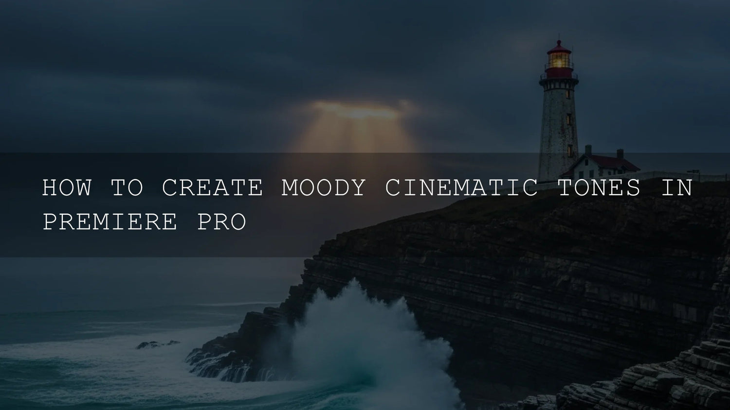
Moody Cinematic Color Grading in Premiere Pro: A Practical, Step-by-Step Workflow
If you want cinematic color grading in Premiere Pro that feels intentional—cooler shadows, warm highlights, tasteful contrast, and clean skin tones—this guide is for you. We’ll build moody tones using the Lumetri Color panel, scopes, and optional LUTs, and we’ll keep things practical with checklists, pro tips, and pitfalls to avoid. I’ll also share a few first-hand notes from grading wedding films and travel sequences so you can apply the same approach to your own footage. Try a curated LUT bundle or preset pack if you want a faster start—then refine by hand to match your story.
Why moody tones work
- Emotion on cue: Cooler shadows (teal/cyan) suggest introspection; warmer highlights (amber) signal nostalgia and connection.
- Clear subject focus: Controlled contrast and vignettes steer the eye to your subject—no heavy effects required.
- Brand consistency: A repeatable palette becomes your signature across client work, vlogs, and ads.
Want to audition looks quickly before fine-tuning? Explore a cinematic LUT bundle and a broad preset set—try them, then dial in with curves and wheels. You can browse here: 1000+ Master Lightroom Presets and 700+ Cinematic Video LUTs. For variety by theme, keep a collection handy, like Lightroom Presets collections. Try these today—Buy 3, Get 9 FREE.
Your core toolkit in Adobe Premiere Pro
Lumetri Color (your grading command center)
Open Window > Lumetri Color. Use it for exposure/white balance, creative looks, curves, color wheels, HSL Secondary, and vignettes. For a structured overview of the color workspace and settings, see Adobe’s guide to the Lumetri Color workspace.
Lumetri Scopes (objective feedback)
Open Window > Lumetri Scopes. Use:
- Waveform (Luma): Set black/white points and overall contrast.
- Vectorscope: Check hue/saturation balance (especially skin tones).
- RGB Parade: Spot and fix color casts per channel.
Learn the panel options and presets in Adobe’s Lumetri Scopes overview.
Optional LUTs (fast starting points)
Use a film-style conversion or creative look LUT to jump-start your grade, then refine. See Adobe’s Looks & LUTs reference and how to add LUTs in Premiere Pro.
A reliable, repeatable grading workflow
1) Normalize and balance (Basic Correction)
- Exposure: Adjust Exposure/Whites/Blacks while watching Waveform. Avoid clipping unless it’s a conscious choice.
- White balance: Eyedropper a gray/white reference; verify neutrality on RGB Parade. Fine-tune Temp/Tint.
- Tone shape: Add modest contrast and recover detail in Highlights/Shadows.
Field note: I tested this on a cloudy wedding prep scene—lifting shadows + slight warmth in Temp restored skin vibrancy without pushing saturation. On a city night sequence, pulling Blacks down a touch added depth without crushing details in dark suits.
2) Kickstart the look with a LUT (optional)
In Creative > Look, import a film-emulation or “teal–orange” LUT at 20–50% intensity. Think of LUTs as a sketch: establish the vibe, then sculpt with curves and wheels. If you’re working from varied cameras or log profiles, use the appropriate conversion first, then apply the creative LUT. For installation and usage specifics, refer to Adobe’s articles above.
3) Sculpt contrast with curves
- Classic S-Curve: In Curves, nudge the toe (darker) down and lift the shoulder (brighter) up. Keep an eye on Waveform to preserve detail.
- Channel curves (R, G, B): Cool shadows slightly (add blue), keep mids neutral, and warm highlights a touch (lift red). It’s a refined path to the moody, cinematic split.
4) Paint mood with Color Wheels & Tone
- Shadows: Lean into blue/cyan for depth and atmosphere.
- Midtones: Stay near neutral; add gentle complementary shifts for cohesion.
- Highlights: Warm with subtle orange—great for skin and practical lights.
Use Shadows/Midtones/Highlights sliders to keep exposure under control while coloring. For a clean primer on the broader color workflow, see Adobe’s color workflow overview.
5) Target specifics with HSL Secondary
Isolate a hue range (like skin) and refine hue/sat/luma without affecting the whole frame. Denoise and blur the key for clean edges. This is where you tame “video-ish” saturation or unify skin tones across mixed lighting. Learn the controls in Adobe’s HSL Secondary guide.
6) Guide the eye with a vignette (subtle!)
Use Vignette for a gentle, wide feather darkening of edges. Or create an Adjustment Layer with a masked curve for custom shapes. If you notice the vignette, it’s probably too strong.
7) Match and maintain consistency
- Compare View: Use split/side-by-side to check progress against the original.
- Shot-matching: Copy/paste Lumetri between similar shots; then tweak.
- Save looks: Save a custom look for quick reuse across a series.
Presets vs manual editing (and how to combine them)
Presets/LUTs save time and provide strong starting aesthetics, especially when deadlines are tight or projects span multiple deliverables. Manual adjustments deliver precision, scene-specific nuance, and clean shot-matching. In professional work you’ll often combine both: apply a look to explore direction, then refine with curves, wheels, HSL Secondary, and per-scene exposure.
To experiment quickly, keep a curated toolkit handy: cinematic LUTs for video and a broad photo preset set like 1000+ Master Lightroom Presets. For broader browsing, see LUTs collections.
Common pitfalls (and how to avoid them)
- Over-saturation: Moody ≠ neon. Underplay global saturation; add local color with HSL Secondary.
- Crushed blacks: Preserve a hint of shadow detail. Watch Waveform; don’t flatten texture in suits, hair, or backgrounds.
- Ignoring scopes: Calibrations vary; scopes don’t. Make them your default view.
- Inconsistent scenes: A great look applied inconsistently breaks immersion—match first, stylize second.
- Trying to fix bad capture: Grading won’t repair missed focus or severe noise. Nail exposure and WB on set.
Quick, real-world recipes
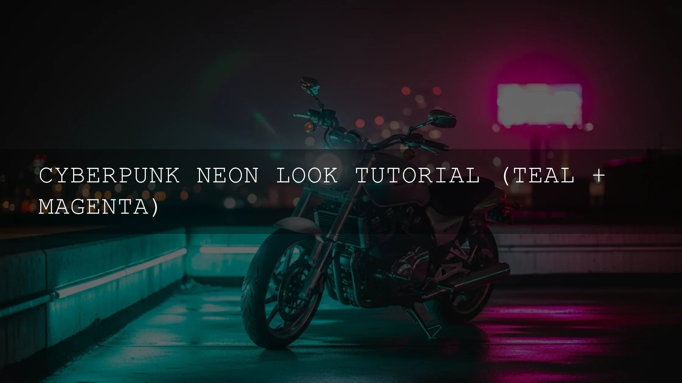
Cinematic teal-orange (subtle)
- Normalize exposure/WB.
- Light S-curve for contrast.
- Shadows: small push toward cyan/blue; Highlights: small push toward orange.
- HSL Secondary: unify skin—slightly warm and desaturate 5–10%.
- Very soft vignette.
Muted urban night
- Lift mids slightly, protect highlights to keep signage readable.
- Desaturate 10–20%; re-add color only to key neons with HSL Secondary.
- Cool shadows; keep skin neutral.
- Noise check at 100%—add light grain if banding appears.
Warm nostalgic interior
- WB slightly warm; add gentle highlight roll-off via curves.
- Desaturate globally a touch; add color back to wood/lamps with HSL Secondary.
- Micro-contrast in mids; soft vignette to center.
Color planning: pick harmonies first
Before grading, choose a palette so your choices feel cohesive. Adobe’s Color Wheel harmony tool helps you preview complementary, split-complementary, or triad schemes that translate well to moody grades.
Related reading
- premiere pro color grading basics
- teal and orange look tutorial
- using lumetri scopes effectively
- best cinematic luts for video
- skin tone correction in mixed lighting
Action plan you can follow today
- Create a Color workspace: Lumetri Color + Scopes visible (Adobe’s scopes guide).
- Normalize: exposure/white balance/contrast first.
- Apply a low-intensity LUT for direction (Adobe’s Looks & LUTs).
- Sculpt with S-curve; cool shadows, warm highlights.
- Target skin/neons/sky with HSL Secondary.
- Subtle vignette and final shot-matching.
If you want high-quality starting points, try 700+ Cinematic Video LUTs or explore the Lightroom Presets collection—Buy 3, Get 9 FREE.
FAQ
What’s the difference between color correction and color grading?
Correction normalizes exposure and white balance so footage looks natural and consistent. Grading adds style and mood to support the story—like cooler shadows and warm highlights for a cinematic feel.
Should I use a LUT or grade from scratch?
Both. Use a conversion LUT for log/flat sources when needed, and a creative LUT for direction. Then refine with curves, color wheels, and HSL Secondary to match the scene and skin tones.
How do I keep skin tones natural with a moody grade?
Keep mids near neutral, warm highlights slightly, and use HSL Secondary to unify skin hue/sat. Check the Vectorscope skin-tone line for balance.
How strong should my vignette be?
Subtle enough that it’s felt more than seen. If viewers notice the vignette, lower the amount and increase feather.
What scopes should be on by default?
Waveform (Luma) for exposure, Vectorscope for saturation/hue, and RGB Parade for channel balance. They’re your guardrails for accuracy.
Written by Asanka — creator of AAAPresets (10,000+ customers).

Leave a comment
This site is protected by hCaptcha and the hCaptcha Privacy Policy and Terms of Service apply.