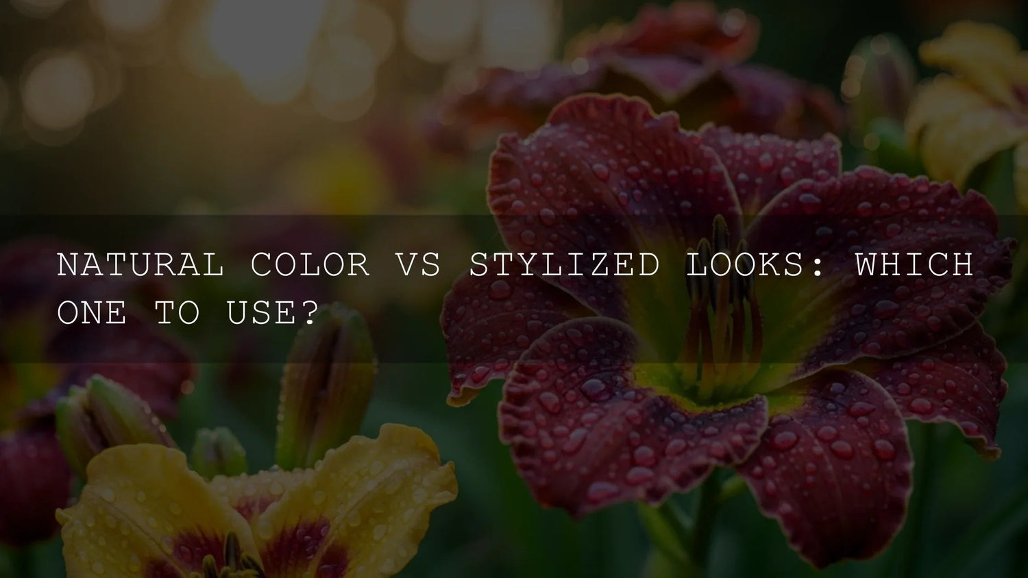
Natural vs Stylized Color Grading: How to Choose the Right Look
If you’ve ever finished an edit and wondered whether you should keep the image natural or push into a more stylized, cinematic color grading look, you’re not alone. Natural vs stylized color grading isn’t just an aesthetic choice—it’s a storytelling decision that affects how your audience feels, how professional your work looks, and how consistent your brand becomes over time.
In this guide, we’ll break down when to choose natural color, when to lean into stylized LUTs and grades, and how to build a workflow that gives you the best of both worlds. I’ll also share how I approach this in my own edits, from wedding shoots to moody travel films, and how you can speed things up using Lightroom presets and video LUTs without losing creative control.
If you want to explore both natural and stylized looks quickly, start from curated tools instead of a blank timeline. For photos, try a bundle like 1000+ Master Lightroom Presets, and for video, combine them with cinematic LUT bundles such as 700+ Cinematic Video LUTs from the Lightroom presets collection. You can test multiple directions in minutes—and still refine everything by hand—while taking advantage of the Buy 3, Get 9 FREE offer.
What “Natural Color” Really Means in Modern Editing
Natural color isn’t “uncorrected” or “boring.” It’s a technically clean, realistic representation of the scene—true-to-life skin tones, believable contrast, and accurate white balance. You’re still editing, but your goal is fidelity, not a heavy cinematic grade.
In Lightroom Classic, this usually starts in the Basic panel: exposure, contrast, white balance, and presence tools, supported by the histogram to keep highlights and shadows under control.Adobe’s guide to working with image tone and color in Lightroom Classic For video, the same “natural first” mindset lives in the Basic Correction section of the Lumetri Color panel in Premiere Pro.Adobe’s overview of the Lumetri Color panel for color and white balance.
When Natural Color Grading Is the Best Choice
Natural color grading shines when trust, clarity, and realism matter more than stylization. Some examples:
- Client work that must look true: Weddings, corporate events, real estate, food, and product photography often need colors to match real life. The couple’s skin tone or the brand’s packaging has to look right.
- Documentary or journalistic projects: Viewers need to feel that what they’re seeing is real and unmanipulated.
- Education and how-to content: Tutorials, behind-the-scenes, or product demos benefit from neutral, accurate color so details are easy to understand.
- Future-proof projects: Natural color ages better than trendy looks and keeps your work feeling timeless.
On one wedding shoot I edited, I tried a heavy stylized LUT at first. It looked cool, but the bride’s dress shifted from pure white to a strange warm tint, and the flowers didn’t match the actual decor. Dialing back to a clean, natural grade instantly felt more honest—and the couple loved it.
A Simple Step-by-Step for Natural Color Grading
Whether you’re in Lightroom, Camera Raw, or Premiere Pro, a natural grade usually follows a similar process:
- Fix exposure first: Adjust Exposure, Highlights, and Shadows until the subject is clearly visible and nothing important is clipped.
- Set white balance: Use the WB eyedropper on something neutral or manually adjust Temperature and Tint until skin tones look believable.
- Balance contrast: Use Contrast, Blacks, and Whites (or curves) to add depth without crushing details.
- Fine-tune color: Subtle tweaks in Vibrance and Saturation are usually enough for a natural look; avoid extreme saturation unless the scene truly demands it.
- Check consistency: Compare neighboring clips or images to make sure the look feels coherent across the whole project.
If you want a fast starting point for a clean base across many shoots, you can apply a neutral preset pack from the Lightroom presets collection and then refine manually.
Stylized Color Grading: Turning Color Into Story
Stylized color grading is where you bend reality on purpose. You lean into cinematic looks, LUTs, and strong color direction to push mood, genre, and emotion. This is where “natural vs stylized color” becomes a storytelling choice rather than a technical one.
What Stylized Looks Actually Do
A stylized look might include:
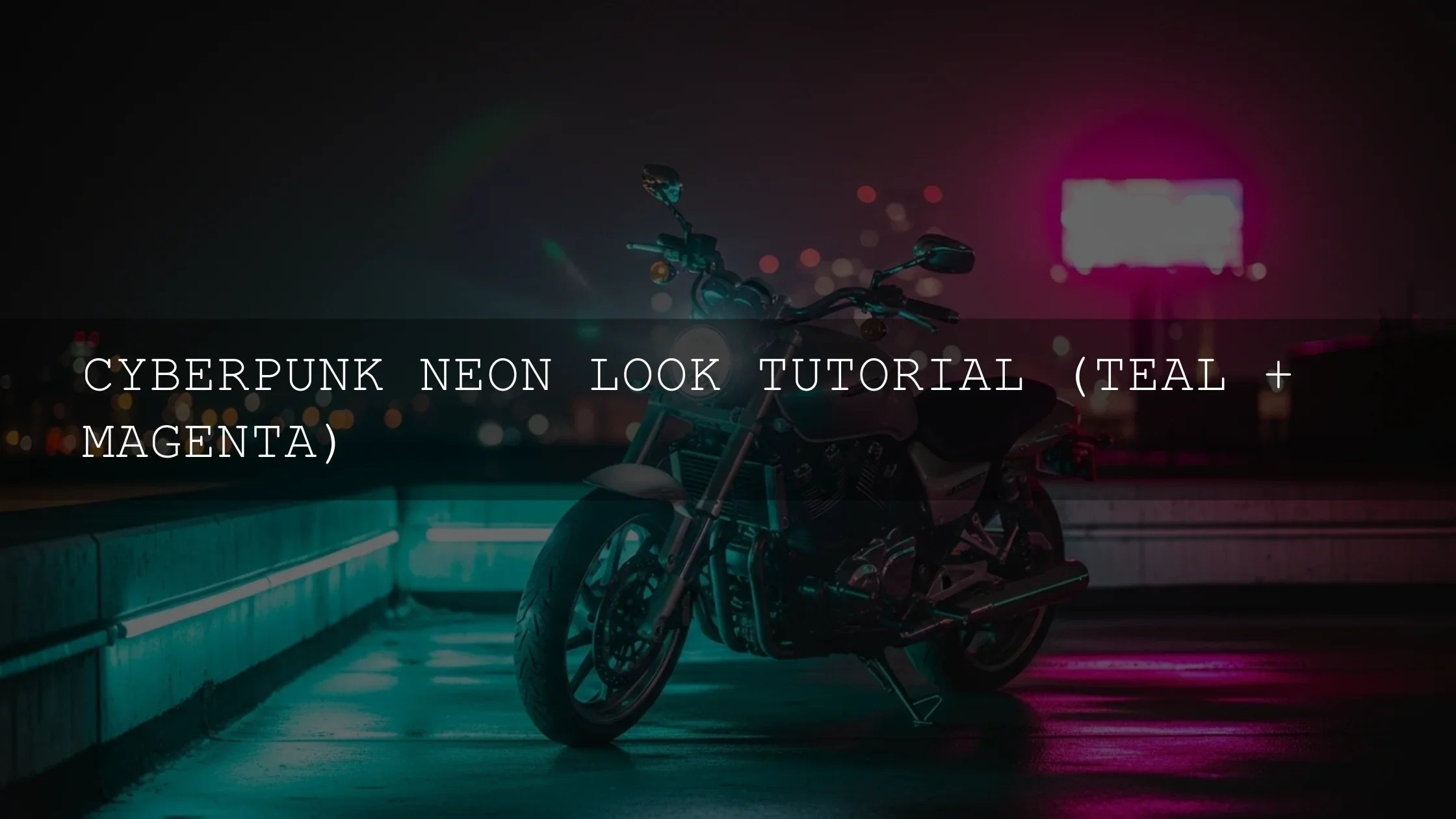
- Strong color palette: Teal-and-orange for blockbuster vibes, muted greens for gritty realism, pastel tones for dreamy romance.
- Altered contrast and dynamic range: Soft contrast for nostalgic, filmic softness; punchy contrast for energetic music videos.
- Shifted hues: Cooling down shadows, warming highlights, pushing greens toward teal, or adjusting skin tones toward peachy warmth.
- Texture and glow: Film grain, halation, bloom, and glow all add to the stylized feel.
Stylized looks are perfect for travel films, fashion editorials, music videos, cinematic vlogs, and personal passion projects where mood is more important than strict realism.
Using Color Psychology and Harmony
Different palettes trigger different emotions. Warm, golden tones feel inviting and nostalgic; cooler blues and cyans hint at mystery, distance, or melancholy. Tools like the Adobe Color harmony and palette generator help you design complementary, analogous, or triadic palettes before you even touch a slider, making your stylized grading more intentional and less random.
Step-by-Step: Building a Stylized Look on a Natural Base
The most reliable stylized grades start from a clean, natural base. Here’s a workflow you can reuse:
- Start with a neutral correction: Do everything from the “Natural” section first—exposure, contrast, white balance.
- Choose a direction: Decide on words like “warm romantic”, “cold sci-fi”, or “gritty street” and stick to that vision.
- Apply a LUT or preset as a starting point: Use a cinematic LUT from a pack like 700+ Cinematic Video LUTs or a stylized Lightroom preset from your favorite bundles, then adjust intensity so it enhances, not destroys, your base.
- Refine with HSL/Color Mixer: Tame oversaturated colors, keep skin tones natural, and push background tones toward your desired palette using targeted Hue, Saturation, and Luminance tools.
- Use color grading wheels: Add subtle tints to shadows, midtones, and highlights to reinforce the mood, not overpower it.
- Test on multiple clips/images: Make sure the look works in bright, dark, and mixed lighting situations.
I tested one teal-and-orange LUT from a music video pack on a rainy street shoot—at 100% it looked too aggressive, but at around 40–50% strength with extra attention to skin tones, it turned a flat, gray scene into a moody, cinematic sequence that still felt grounded.
Natural vs Stylized Color Grading: How to Decide for Each Project
Instead of asking “Which is better?”, ask “What serves this project best?” Here’s a practical way to choose between natural and stylized looks.
1. Clarify the Main Goal
- Accuracy and trust: Choose a natural grade if the viewer must trust what they see (products, tutorials, documentary, real estate).
- Emotion and atmosphere: Choose stylized looks when you want viewers to feel something specific: tension, nostalgia, excitement, or calm.
- Hybrid projects: Use a mostly natural grade with subtle stylization—slightly warmer highlights, gentle color shifts—to get the best of both.
2. Think About Your Audience and Platform
A TikTok or Instagram audience that loves cinematic travel and music videos expects stylized looks and bold color grading. A corporate client’s website or a training portal expects cleaner, more natural color. Matching expectations makes your work feel “right” for the platform.
3. Let the Subject Matter Decide
- People-first projects (weddings, portraits, lifestyle): Natural color with tasteful enhancement usually wins—skin tones must look flattering and believable.
- Conceptual or narrative pieces: Stylized grading helps separate different timelines, emotional beats, or character perspectives.
- Travel and landscape: Both can work. You might keep daytime vistas more natural but push sunsets and blue-hour scenes into stylized territory.
4. Blend Natural and Stylized for a Signature Look
Some of the strongest visual identities are hybrids. You start with natural color to keep things believable, then layer in subtle stylization: warmer highlights, cooler shadows, a consistent shift in greens, or a recurring filmic contrast curve. It’s still grounded, but unmistakably “you.”
One of my favorite approaches is to keep skin tones as close to natural as possible and push the environment (skies, foliage, shadows) more aggressively. That way viewers stay connected to the subject, but the world around them feels like a movie.
Presets vs Manual Editing: Which Should You Rely On?
There’s no real battle between presets and manual color grading—they’re tools that work best together.
How Presets and LUTs Help
- Speed: Presets and LUTs give you an instant starting point, especially when you need to test natural vs stylized color options quickly.
- Consistency: Using the same preset family or LUT pack across a project keeps your look coherent.
- Discovery: Sometimes a LUT will suggest a direction you wouldn’t have found manually.
What Manual Editing Gives You
- Fine control: You can fix tricky skin tones, rescue highlights, and match mixed lighting situations.
- Adaptability: No preset or LUT is perfect for every camera, lighting condition, or subject.
- Personal signature: Your own tweaks are what turn a popular LUT into your look.
Best Practice: Combine Both
A practical workflow is to apply a preset from something like 1000+ Master Lightroom Presets or a LUT from 700+ Cinematic Video LUTs, then refine color manually—especially skin tones and contrast. For bolder styles like music videos, you might also explore packs such as 300+ Music Video LUTs to quickly test more extreme looks.
This “preset + manual” combo lets you explore natural and stylized directions much faster than building everything from scratch, without feeling locked into someone else’s aesthetic.
A Practical Workflow: From Capture to Final Grade
Here’s a repeatable process that works for both natural and stylized color grading in Lightroom and Premiere Pro.
Step-by-Step for Photos (Lightroom / Camera Raw)
- Start with calibration: Make sure your monitor is reasonably calibrated so natural color actually looks natural.
- Do a clean base correction: Exposure, contrast, and white balance first; then refine shadows/highlights.
- Decide “natural vs stylized”: If you stay natural, focus on subtle tweaks in Color Mixer and local adjustments. If you go stylized, apply a preset and then sculpt colors with HSL and the Color Grading wheels.
- Refine local adjustments: Use masks (subject, sky, background) to keep detail where it matters most—faces, important objects, or the hero subject.
- Sync and fine-tune: Sync your base settings across similar images, then tweak individually so everything still feels consistent.
Step-by-Step for Video (Premiere Pro)
- Organize footage: Group clips by scene and lighting so you can apply unified corrections.
- Base correction with Lumetri: Use the Basic Correction section for exposure and white balance. Start from a neutral profile or log-to-Rec.709 technical LUT if needed.
- Decide on the look: For natural color, keep creative adjustments minimal and focus on clarity. For stylized looks, add a creative LUT or custom curves in separate Lumetri instances.
- Use scopes: Rely on Waveform, Parade, and Vectorscope to keep skin tones, contrast, and saturation under control while pushing style.
- Match shots: Use shot matching tools and manual tweaks so cuts feel seamless—even with a stylized grade.
Building a Cohesive Visual Identity
Whether you prefer natural, stylized, or a hybrid, what really stands out in 2025 is consistency. When your color grading is consistent across your Instagram feed, YouTube channel, client projects, and portfolio, people start to recognize your work instantly.
One approach is to choose a “home base” look—maybe a slightly warm, natural grade with clean skin tones—and then create 2–3 stylized variations (darker mood, brighter travel, punchy music video) using preset and LUT bundles. You can organize these into collections like cinematic LUTs collections and use them as your brand’s visual toolkit.
If you’re unsure where to start, you can explore educational articles like cinematic color grading for beginners and more focused guides such as color grading for social media videos or street photography editing for real-life raw moments to see how others approach natural vs stylized color in real-world scenarios.
And if you need technical support, a reference page like how to install presets and LUTs correctly ensures everything is set up cleanly so you can focus on the creative side.
Related Reading
- Cinematic color grading for beginners
- How to use LUTs in Premiere Pro
- Color grading for social media videos
- Natural light portrait editing tips
- Street photography editing for real-life raw moments
FAQs: Natural vs Stylized Color
Is it better to keep my footage natural or use a stylized LUT?
Neither is “better” overall—it depends on the project. Use natural color when accuracy, trust, and realism are the priority (weddings, corporate work, products). Use stylized LUTs when mood, emotion, and atmosphere matter most (music videos, cinematic travel, narrative films). Many creators start natural and then layer a subtle stylized grade for the best of both.
How do I get a good natural base before I stylize?
Always correct exposure and white balance first, then refine contrast. In Lightroom or Camera Raw, use the Basic panel and histogram; in Premiere Pro, start with the Basic Correction section in Lumetri. Once your image looks believable and balanced, you can safely apply presets or LUTs without fighting baked-in problems.
Can I mix natural and stylized looks in the same project?
Yes—but keep it intentional. You might keep interviews natural and grade B-roll more heavily, or use stylized color only for flashbacks or dream sequences. The key is to maintain internal logic so viewers understand why one part looks different from another.
Do presets and LUTs make my work look like everyone else’s?
They can, if you rely on them at 100% with no adjustments. The trick is to treat presets and LUTs as starting points. Apply them at a sensible intensity, then customize contrast, saturation, and HSL to match your footage and taste. That’s how you build a recognizable style instead of a generic one.
What’s the fastest way to test natural vs stylized looks on a large project?
Build one neutral “master” grade, save it as a preset (or Lumetri preset), and apply it across the whole project. Then duplicate that timeline or virtual copy and add stylized LUTs or presets on top. Compare the versions side by side and refine from there. Using large preset and LUT bundles makes it easy to audition many looks quickly without rebuilding everything by hand.
Whether you lean more toward faithful natural color or bold stylized grades, the real power comes from knowing why you’re choosing one over the other—and having a workflow that lets you move between them confidently.
When you’re ready to experiment, explore tools like 1000+ Master Lightroom Presets, 700+ Cinematic Video LUTs, and curated sets from the cinematic LUTs collection. You can build a natural base, test multiple stylized looks, and lock in a signature style—while taking advantage of the Buy 3, Get 9 FREE offer to grow your toolkit for future projects.
Written by Asanka — creator of AAAPresets (10,000+ customers).
Leave a comment
This site is protected by hCaptcha and the hCaptcha Privacy Policy and Terms of Service apply.