
Film Look Essentials: Grain, Bloom, Fade & Texture (A Practical Guide for Photographers and Filmmakers)
Ever looked at an image and thought, “That feels like film”? You’re noticing four pillars of the classic analog aesthetic: grain, bloom, fade, and texture. Used with intention, these tools add warmth, depth, and storytelling to otherwise clean digital files. Here’s a field-tested guide to build a cinematic film look in Lightroom, Photoshop, Premiere Pro, or DaVinci Resolve—without losing control.
If you want a fast starting point for exploration, try a curated pack first, then fine-tune by hand. Explore ready-made looks here: 1000+ Master Lightroom Presets and keep browsing with Lightroom Presets Collection. Try them on your next project—Buy 3, Get 9 FREE.
Why Aim for a Film Look in a Digital Workflow?
Digital files are ultra-clean. That’s powerful—but sometimes too clinical for mood-driven stories. Film aesthetics reintroduce organic imperfections our eyes associate with memory and cinema: soft highlight roll-off, tactile surfaces, and lived-in blacks. The result is work that feels intentional and emotive rather than merely sharp.
From experience: I tested a subtle grain + faded blacks combo on a wedding highlight reel and saw longer audience retention; the footage looked timeless without feeling “effect-heavy.”
Grain: Authentic Texture That Unifies the Frame
- Start subtle. Think of grain like seasoning. Increase gradually until it’s present but never distracting.
- Match the stock. Fine, tight grain evokes modern color negative stocks; chunkier grain leans vintage/hi-ISO. Keep size consistent with your output resolution.
- Where to add. Lightroom/Camera Raw provide Grain, Size, Roughness controls; Premiere/AE include grain and stylize options; overlays can work for video (composited with Overlay/Soft Light), but balance opacity so it sits “in” the image, not on top.
- Light-aware realism. Grain is more apparent in shadows, subtler in highlights—let that natural behavior guide intensity.
Helpful references: Lightroom’s grain, size, and roughness controls and Camera Raw’s film grain guidance.
Bloom: Gentle Glow for Dreamy Highlight Roll-Off
- Understand roll-off. Instead of hard clipping, aim for highlights that feather into white. Use Tone Curve/Highlights to compress gently before adding glow.
- Use glow sparingly. In NLEs, start with lower intensity and moderate radius/threshold so bloom hugs bright sources (lamps, sun rims, practicals) without washing the frame.
- Where it shines. Golden hour, city nightscapes, stage lights, or backlit portraits—any scene with distinct bright zones.
See Adobe’s coverage of stylize/glow tools in Premiere Pro: Stylize effects (Glow family).
Fade: Lifted Blacks for Mood and Era
- Lift, don’t crush. Raise the shadow floor with the Tone Curve so blacks sit at deep charcoal rather than pure zero. A tiny bottom-left curve bump goes a long way.
- Tint the shadows. Add a hair of cool blue, teal, or a gentle warm cast in the shadows for character—keep it barely perceptible.
- Balance contrast. Re-check midtones and whites after lifting blacks; too much fade can make images read “flat.”
Learn the curve behavior: Lightroom Classic: work with image tone & color.
Texture: Tactile Presence Without Harshness
- Texture vs Clarity. Texture enhances fine detail; Clarity pushes midtone contrast. Use texture for surfaces (fabric, bark, skin pores), clarity for “presence”—then back off until it feels natural.
- Local masks. Apply only where needed (fabric weave, hair, architectural edges). Protect faces from over-crisping.
- High-pass for photos. In Photoshop, use a high-pass layer on Overlay/Soft Light for precise, edge-respecting crispness.
Great primer: Lightroom’s Texture & Clarity guide.
Presets vs Manual Editing (and How to Combine Both)
- Presets = speed & consistency. Excellent for exploring directions fast and maintaining a signature look across projects.
- Manual = precision. Essential for targeted highlight control, nuanced shadow tints, and local texture work.
- Best practice. Start with a preset/LUT you like, then dial in grain size/roughness, curve-based fade, and local texture masks for the scene. This hybrid approach is both fast and bespoke.
Want a solid base to tweak? Test a cinematic set from 700+ Cinematic Video LUTs alongside 1000+ Master Lightroom Presets—then refine with your curve, glow, and mask passes.
Step-by-Step: Build a Cohesive Film Look
- Correct the basics. White balance, exposure, contrast, and color cast.
- Apply your base look. A film-leaning preset or LUT to set direction.
- Add grain early. Light to moderate intensity; set size relative to output resolution.
- Shape contrast & fade. Tone Curve for lifted blacks; micro-contrast with Clarity.
- Control highlights. Soften roll-off; if needed, add subtle bloom around sources.
- Local texture. Masks for fabric/architecture/hair; protect skin.
- Final color polish. Split-tone/shadow tint; ensure neutrals stay believable.
- Review at scale. Zoom out and watch in motion. If you feel the mood rather than noticing the effect, you’re done.
Real-World Use Cases & Quick Recipes
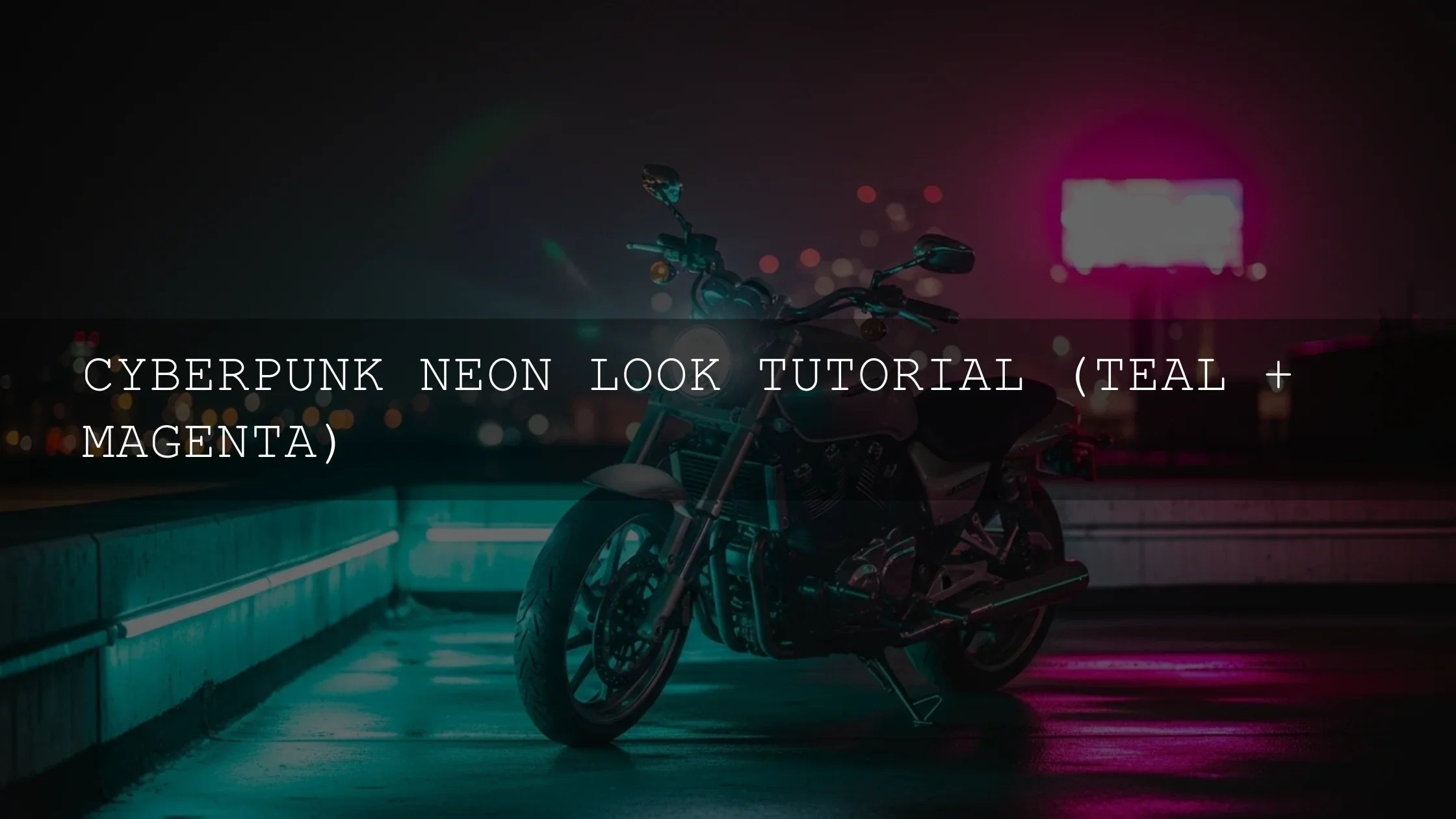
Street at Night
- Low–medium grain, strong bloom around neons, lifted blacks with cool shadow tint, restrained saturation.
- See also: Urban Street Photography Presets: A Guide to the Best Looks.
Golden-Hour Portraits
- Fine grain, gentle highlight compression, light glow, soft texture on skin with masked clarity on hair/fabric.
- Try: Portrait Presets: Editing Skin Tones for Natural, Glowing Results.
Travel Film
- Medium grain for cohesion, mild fade for nostalgia, selective glow on sun rims, consistent LUT across cuts.
- Explore: Unlocking Cinematic Travel: How LUTs Transform Your Journeys in 2025.
Pro Tips (Small Tweaks, Big Payoff)
- Output-aware grain. For 4K delivery, a slightly larger grain size reads more naturally; downsize for social.
- Expose for roll-off. Keep key highlights a fraction under clipping to preserve bloom-friendly detail.
- Neutral reference. Toggle to a neutral version to avoid “effect blindness.” If the effect disappears but the mood remains, it’s right.
- Skin protection. Use masks to reduce clarity/texture on faces while keeping garments crisp.
- Consistency pass. Before export, copy/paste essential settings across the sequence, then trim shot-by-shot.
Related Reading
- Unlock Cinematic Color: Your Ultimate Step-by-Step Guide to Using LUTs in Premiere Pro
- Unlocking Pro-Level Edits: Your Comprehensive 2025 Guide to Mastering Curves for Ultimate Color Control
- Cube LUTs vs. Power Grades in DaVinci Resolve: What’s the Difference?
Helpful Adobe References
- Enhance Texture & Clarity in Lightroom
- Work with image tone & color (Tone Curve)
- Stylize & Glow effects in Premiere Pro
Where to Go Next
Build your signature look faster with a strong base, then refine like an artist. Start with 1000+ Master Lightroom Presets for photos and pair with 700+ Cinematic Video LUTs for video. Browse more options in Lightroom Presets Collection and keep learning with How to Install Presets and LUTs.
How much grain is “too much” for a film look?
If grain becomes the first thing you notice, it’s too much. Aim for a level that binds the image together without overpowering fine detail; check at 100% zoom and full-screen playback.
Should I add bloom on every clip?
No. Reserve it for shots with strong light sources (neon, sun rims, practicals). Subtlety matters—bloom should support highlight roll-off, not haze the frame.
What’s the fastest way to get a cinematic look consistently?
Use a trusted preset/LUT for base tonality, then standardize grain size, a gentle curve-based fade, and quick masks for skin/texture. Save this as a template for future projects.
Is “fade” just lowering contrast?
Not exactly. Fade lifts the black point (via Tone Curve) to a soft charcoal while preserving midtone separation. Re-balance whites so the image doesn’t read flat.
Where should I apply texture and clarity?
Use texture on surfaces that benefit from tactile detail (fabric, architecture) and clarity for midtone presence. Reduce both on skin with masks for a polished, natural look.
Written by Asanka — creator of AAAPresets (10,000+ customers).

Leave a comment
This site is protected by hCaptcha and the hCaptcha Privacy Policy and Terms of Service apply.