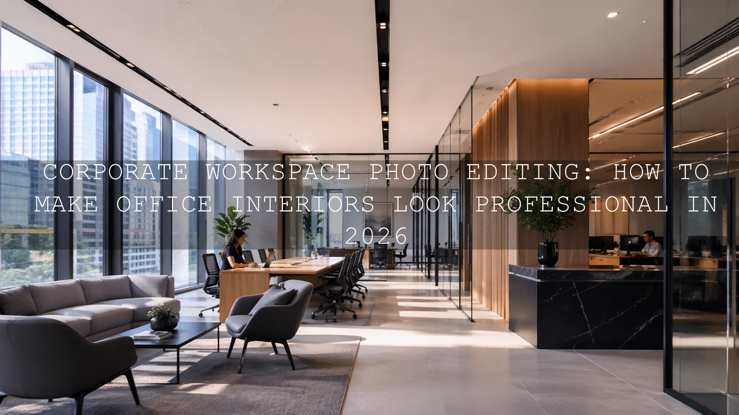
Corporate Workspace Photo Editing: How to Make Office Interiors Look Professional in 2026
Corporate workspace photo editing is no longer just a finishing step. In 2026, it is a core part of how companies present trust, culture, design quality, and attention to detail. Whether you are editing a law office, a startup hub, a boardroom, or a branded co-working space, the goal is the same: create images that feel bright, organized, credible, and true to the company behind them. Good editing does not make a workspace look fake. It makes the space look like its best real version.
That matters because office photography often carries more responsibility than people expect. These images appear on websites, LinkedIn pages, recruitment campaigns, brochures, investor decks, press releases, and video walkthroughs. One flat, yellow, cluttered-looking image can quietly damage perception. A clean, balanced, polished edit can make the same room feel premium and well run.
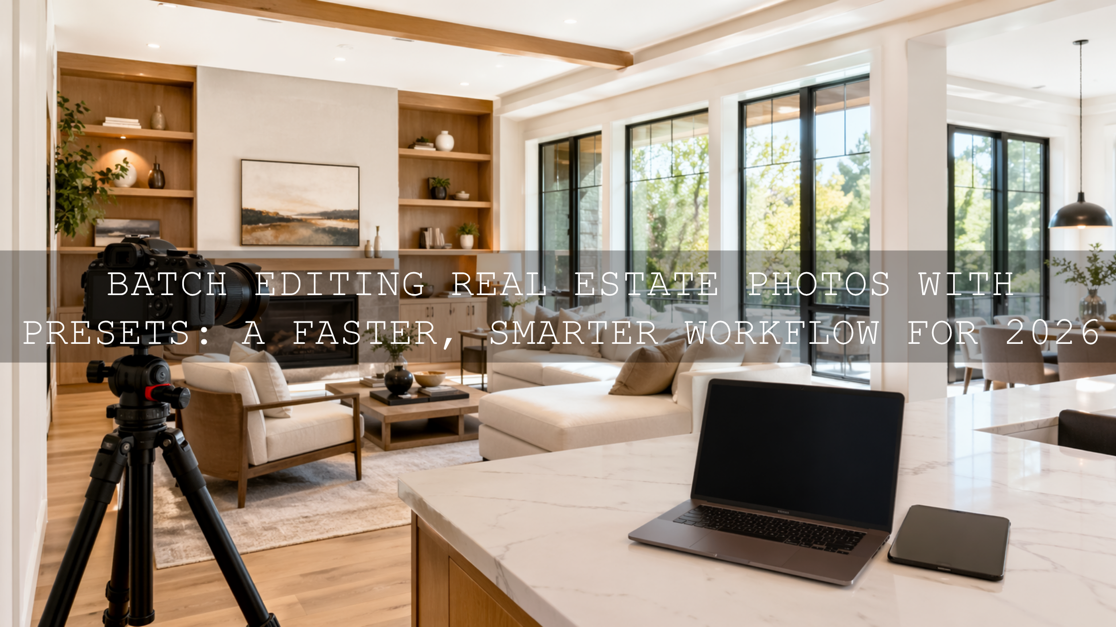
If you want a fast starting point for office interiors, architectural details, and polished commercial spaces, try the AI-Optimized Interior Design & Real Estate Lightroom Presets and browse the wider Lightroom Presets for Lightroom Mobile & Desktop collection. For teams handling both photo and video deliverables, the Real Estate LUTs Pack can help keep walkthroughs and promo clips visually consistent. And if you are building a bigger toolkit, you can naturally work the AAAPresets offer into your workflow: Buy 3, Get 9 FREE.
Why edited office photos shape brand perception so quickly
When someone lands on a company website, they start judging before they read a single paragraph. They notice whether the office feels bright or gloomy, whether lines look straight, whether colors feel modern or muddy, and whether the space looks cared for. That visual read happens fast.
- Professionalism: Balanced light, clean geometry, and natural color tell viewers the company pays attention to quality.
- Brand alignment: Warm luxury offices, minimal tech spaces, and heritage buildings all need different editing choices.
- Spatial appeal: Good edits make a room feel open, usable, and welcoming without making it look unreal.
- Trust: Accurate whites, controlled window light, and tidy details help viewers believe what they are seeing.
- Consistency: A full gallery should feel like one visual system, not a mix of random edits.
Here’s why this matters: corporate clients are rarely asking only for “nice photos.” They are asking for visuals that support sales, hiring, public image, and internal pride. That changes how you edit.
The most common problems in corporate office photography
Office interiors look simple until you start editing them. In reality, they are one of the trickiest categories because the light is mixed, the colors are easily contaminated, and straight lines expose every small mistake.
- Mixed lighting: daylight from windows, warm lamps, cool LEDs, and monitor glow can all exist in the same frame.
- Window highlights: offices often have bright exterior views that blow out faster than the interior.
- Deep shadows: conference tables, ceilings, corners, and under-desk areas can lose detail quickly.
- Perspective distortion: vertical lines lean when interiors are shot quickly or with wide lenses.
- Color casts: white walls turn green, blue, or orange depending on the room.
- Visual clutter: cables, reflections, fingerprints, screens, and uneven furniture spacing pull the eye away from the design.
If you often struggle with indoor color and mixed light before you even begin styling the final look, it helps to review guides like why presets can look bad indoors and how to handle tricky mixed indoor and window lighting. Those problems show up constantly in corporate interiors.
A step-by-step workflow for clean, believable workspace edits
Let’s break it down into a repeatable process you can use on single hero shots or full office galleries.
1. Start with a neutral base before adding style
Before you chase mood, contrast, or cinematic polish, get the file under control. Correct exposure enough to see detail, pull back harsh highlights, and open shadows carefully. For white balance, aim for believable neutrals, not perfection in every corner. Adobe’s guide to white balance and tonal adjustments in Camera Raw is useful here because it reinforces the same principle: find a neutral reference and build from there.
I have tested this approach on commercial interiors where a bright glass wall sat next to warm ceiling fixtures, and the biggest improvement came from resisting the urge to stylize too early. Once the base looked honest, every later adjustment became easier.
2. Correct perspective before the image feels “expensive”
Nothing makes office photography look rushed faster than leaning walls and warped architectural lines. Use Lightroom’s Transform tools early, especially on boardrooms, corridors, lobby entrances, and reception areas. Adobe’s guide to Guided Upright perspective correction is worth bookmarking because clean verticals are one of the fastest ways to make a corporate image feel premium.
This is also where a preset made for interiors helps. The AI-Optimized Interior Design & Real Estate Lightroom Presets are especially useful when you need a bright, polished base that still respects architectural detail.

3. Use masking to balance windows, corners, and work surfaces
Global adjustments rarely solve office images on their own. One side of the room may need highlight recovery while the opposite side needs shadow lift. Desk surfaces may need more texture, while screens and windows need restraint. This is where local masking becomes essential. Adobe’s Lightroom masking guide is especially helpful for creating targeted corrections without flattening the whole image.
- Use linear gradients to calm bright windows.
- Use brush or object masks to lift detail on furniture and branded signage.
- Use subtle texture and clarity on materials like wood, glass, and fabric.
- Use selective color cleanup if wall paint is drifting green or yellow.
On one workspace shoot with white desks, black chairs, and floor-to-ceiling windows, masking made the difference between “corrected” and “finished.” The room did not need dramatic editing. It needed each zone to feel controlled.
4. Keep the room bright, but do not erase depth
Corporate clients often ask for images that look bright and airy. That is a good direction, but many editors push too far and end up with rooms that feel flat, washed out, and unrealistic. A better target is controlled brightness with clear tonal separation.
That is one reason the workflow in this real estate preset guide for bright, clean interiors translates well to office spaces too. It focuses on making rooms feel fresh and professional while keeping depth in the shadows and detail in the highlights.
5. Finish with consistency across the whole gallery
Corporate clients rarely need one image. They need a set: lobby shots, desks, meeting rooms, detail close-ups, team areas, exteriors, and sometimes drone or video coverage. Your job is to make the set feel unified.
- Match white balance from room to room.
- Keep contrast levels consistent.
- Do not over-edit one hero image while leaving the rest plain.
- Use similar crop logic so the gallery feels intentional.
- Protect brand colors where signage, furniture, or decor matter.
Presets vs manual editing for corporate interiors
One of the most useful comparisons for corporate workspace photo editing is presets vs manual editing. The best answer is not either-or. It is a hybrid workflow.
- Presets win on speed and consistency: ideal for large office galleries, recurring client shoots, and fast turnaround.
- Manual editing wins on problem-solving: necessary when a room has difficult mixed light, severe perspective issues, or unusual brand color requirements.
- The best professional workflow: apply a well-matched preset first, then refine white balance, transform, masking, and color locally.
For photographers who shoot offices, interiors, and commercial spaces regularly, presets are best treated as a smart starting point rather than a shortcut that removes judgment. That hybrid approach is also reflected in guides like how color grading shapes perception in architecture, where the visual mood supports the message rather than distracting from it.
When to use Lightroom presets, LUTs, and drone tools together
Modern corporate jobs often include more than stills. A client may want office photography, a short brand reel, detail shots of materials, an exterior establishing video, and aerial footage of the building. The most efficient way to handle that is to think in systems.
For still images, the AI-Optimized Interior Design & Real Estate Lightroom Presets give you a strong base for interior clarity. For walkthroughs, interview b-roll, and architectural clips, the Real Estate LUTs Pack helps maintain a polished visual identity across video footage. If the project includes headquarters exteriors, campuses, or rooftop context, the Drone Aerial LUTs Pack can help aerial footage feel richer and more cinematic without becoming over-processed.
If you frequently shoot both ground and aerial coverage, it also makes sense to browse collections like AI-Optimized Lightroom Presets for Mobile and Desktop and Cinematic Drone Video LUTs for Video Editing so your tools stay aligned across formats.

Editing for different corporate brand personalities
Not every company should look the same. The best workspace edit is the one that matches the brand.
Bright and modern
Tech offices, co-working spaces, wellness brands, and creative studios usually benefit from clean whites, gentle contrast, controlled highlights, and soft but accurate color. These edits should feel calm, sharp, and contemporary.
Premium and executive
Law firms, finance brands, private consultancies, and luxury corporate spaces often need slightly deeper contrast, richer material texture, and more controlled highlights. Dark wood, stone, leather, and glass should feel refined, not crushed.
Heritage and timeless
Older buildings, libraries, historic boardrooms, and legacy brands often look better with subtle warmth and softer tonal roll-off. In these cases, a restrained heritage-inspired approach can work beautifully. And when a project needs a stronger monochrome editorial feel for executive portraits, architecture details, or brand films, the Luxury Black and White LUTs Pack can create a sophisticated finish that emphasizes form, materials, and atmosphere.
For adjacent commercial work, it can also help to study how clean presentation supports sales in related categories, such as e-commerce and product photography. The principle is similar: clarity builds confidence.
Practical pro tips that save time and protect quality
- Shoot for editing, not just capture. Slightly protect window highlights when possible. It is easier to lift shadows than rebuild blown-out glass.
- Declutter before you edit. Editing cannot fully fix a messy workspace with tangled cables and random objects in every corner.
- Watch whites carefully. “Bright” should not mean blue, green, or sterile. Neutral whites are part of a trustworthy corporate look.
- Do not oversaturate brand colors. Corporate interiors often include logos, accent walls, and product displays. Keep them believable.
- Use local masks instead of global overcorrection. Rooms almost always need zone-by-zone balancing.
- Export for the actual use case. Website hero banners, LinkedIn posts, print brochures, and presentation decks do not all need the same crop or tonal intensity.
How to build a repeatable corporate editing workflow that clients trust
The photographers and marketers who win repeat corporate work are usually not the ones making the most dramatic edits. They are the ones delivering dependable polish. Their images feel clean, intentional, and consistent every time.
That means having a workflow you can explain: neutral base, perspective correction, selective masking, controlled brightness, color cleanup, brand-aware finishing, and gallery-wide consistency. It also means using tools that reduce time without sacrificing judgment. If you need help choosing the right toolkit for your next office, interior, or branded workspace project, you can always visit the contact page and map the best fit for your workflow.
When you want office interiors to look polished in stills and equally strong in video, pairing the AI-Optimized Interior Design & Real Estate Lightroom Presets with the Real Estate LUTs Pack is a practical place to start. Add the Drone Aerial LUTs Pack when the story includes campus views or exterior establishing shots, and keep browsing through the Lightroom Presets for Lightroom Mobile & Desktop collection when you want more looks that still fit a professional, commercial standard. It is an easy way to move faster while keeping your brand presentation sharp, and you can build out your editing set with the Buy 3, Get 9 FREE offer.
Related Reading
- Presets for real estate photography: bright, clean, professional results
- How color grading shapes perception in real estate and architecture
- Why presets look bad indoors and how to fix them
- Master presets in tricky mixed indoor and window lighting
- The best Lightroom presets for clean commercial product presentation
What is the biggest editing mistake in corporate office photography?
The most common mistake is pushing brightness too far and flattening the room. Corporate interiors should feel bright and polished, but they still need depth, texture, and believable color.
Should I use presets for office interiors or edit everything manually?
A hybrid workflow is best. Use a strong preset as your starting point for speed and consistency, then refine white balance, perspective, masking, and local color by hand.
How do I keep window light from ruining my office photos?
Protect highlights during capture when possible, then use local masks or gradients to recover windows while lifting interior shadows carefully. The goal is balance, not forcing both zones to look identical.
Are LUTs useful for corporate video content?
Yes. LUTs are especially useful for office tours, executive interviews, architecture reels, and aerial brand videos because they help maintain a consistent look across clips and cameras.
What makes a corporate workspace edit feel premium?
Straight lines, accurate white balance, controlled highlights, natural material texture, and visual consistency across the full gallery are what usually make corporate images feel high-end.
Written by Asanka — creator of AAAPresets (10,000+ customers).

Leave a comment
This site is protected by hCaptcha and the hCaptcha Privacy Policy and Terms of Service apply.