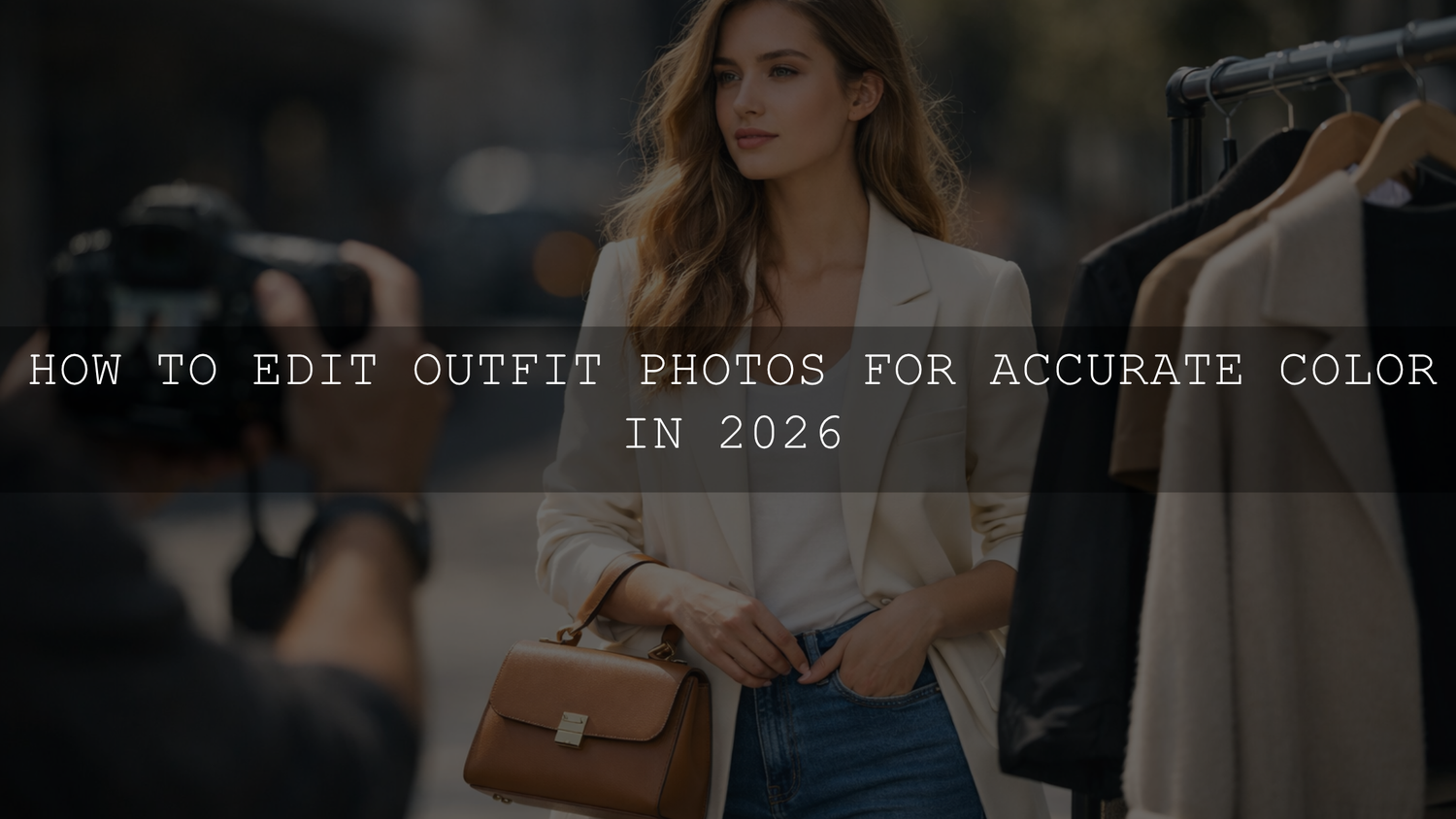
How to Edit Outfit Photos for Accurate Color in 2026
If you want to edit outfit photos for accurate color in 2026, the goal is not to make every image louder, warmer, or more dramatic. The goal is to make fabric, skin, and background tones feel believable together. Strong true-to-color outfit photo editing helps fashion creators, influencers, and online stores present clothing honestly while still keeping a polished look. When navy stays navy, cream stays cream, and black fabric keeps depth without turning gray, your content instantly feels more premium and trustworthy.
If you want a faster starting point, begin with Vibrant Blogger Presets For Instagram Influencers or browse the Stunning Instagram Presets For Content Creators collection. They give you a strong base for fashion and creator content, and you can build a larger editing workflow around them with Buy 3, Get 9 FREE.
Why Accurate Color Matters in Fashion Content
Here’s why this matters: outfit photography is not only about style. It is also about trust. When a blazer looks camel in your post but arrives looking mustard, or when a white shirt shifts yellow in your carousel, people notice. That gap affects purchase confidence, return rates, and how professional your content feels.
For influencers, accurate color helps followers feel like they are seeing the real outfit instead of a heavily filtered version. For brands, it supports better product expectations. For photographers, it shows that your workflow is controlled rather than random.
I have tested this kind of editing on fashion portraits, ecommerce outfit shots, and creator content where one small color shift made the garment look like a different product. In most cases, the fix was not a heavy retouch. It was a cleaner starting preset, better white balance, and a few focused Color Mixer adjustments.
If your work also overlaps with store visuals and catalog content, the guide on polishing lookbook images for online shops and catalogs is worth reading next.
What Usually Pushes Clothing Colors Off
Before you fix color, you need to know what caused the shift. Most outfit photos go wrong for one of these reasons:
- Mixed light sources: window light, room light, neon signs, and sunset can all push fabric in different directions.
- Incorrect white balance: auto white balance often makes whites too blue, too yellow, or too magenta.
- Overpowering presets: some presets look great on one image and completely distort another.
- JPEG limitations: compressed files give you less room to recover subtle clothing tones.
- Screen inconsistency: what looks fine on one display can look too warm or too flat on another.
Adobe’s own resources are useful here. If you want to understand the controls more deeply, Adobe’s guide to tone, white balance, and color tools in Lightroom Classic and Adobe’s Camera Raw workflow for tonal and color adjustments both explain the tools you will use most.
A Practical Workflow for True-to-Color Outfit Photo Editing
Let’s break it down into a repeatable process you can use for influencer photos, fashion editorials, and clothing product shots.
1. Start with the cleanest file possible
RAW is the better choice whenever you can use it. It gives you more room to recover highlights in white clothing, correct shadow color in black garments, and control subtle tones in beige, olive, denim, and pastels. JPEG can still work, but it usually gives you less room before colors start to break apart.
2. Fix exposure before chasing color
If the image is too bright, clothing can look washed out. If it is too dark, colors turn muddy. Set exposure first, then refine highlights, shadows, whites, and blacks. A white dress should keep detail. A black jacket should keep shape. A neutral sweater should not look flat and chalky.
3. Correct white balance before touching saturation
This is the step most people rush through. Use the white balance eyedropper on something neutral when possible, then fine-tune temperature and tint by eye. White, gray, and black clothing are especially helpful reference points. If your whites look clean and believable, the rest of the outfit usually gets closer too.
4. Use the Color Mixer for fabric-specific control
This is where fashion photo color correction becomes precise. Instead of pushing global saturation, adjust the exact channels that affect the garment. Yellow and orange often influence cream knits, beige coats, and warm skin. Blue and aqua control denim and cool neutrals. Red and magenta can shift burgundy, lipstick, and pink fabrics very quickly.
5. Protect skin while correcting the outfit
One common mistake is fixing the clothing and accidentally making skin too orange, gray, or pink. If your image includes a model, edit the base image first, then use masking when needed so the outfit and skin do not fight each other. This is especially important in influencer and portrait-led fashion content. For deeper guidance, read how to make Lightroom presets work across different skin tones.
6. Compare against reality, not just mood
Ask a simple question before you export: if someone saw this garment in person, would they say the color looks close? That check matters more than whether the edit feels trendy. A good fashion image can still be stylish, cinematic, and clean without lying about the color.
7. Export and test on more than one device
Desktop, mobile, and social apps can shift the feeling of contrast and color. Review at least once on a phone before posting. If your images start changing after a software update, this article on why Lightroom presets can act differently after updates can help you troubleshoot the change faster.
Presets vs Manual Editing for Accurate Clothing Color
Presets and manual editing are not enemies. The best workflow uses both.
- Presets are best for speed and consistency: they help you build a recognizable style across reels, posts, campaigns, and blog content.
- Manual adjustments are best for precision: they help you correct the exact fabric tone, lighting shift, or skin balance in a specific image.
In real work, I treat presets as the starting point, not the final answer. A good preset gets me 70 to 80 percent of the way there. Then I correct exposure, white balance, and a few key color channels so the outfit still looks real. That is usually faster and more reliable than building every image from zero.
A strong preset should save time without forcing every shirt, jacket, dress, and background into the same color recipe.
Preset Picks That Work Well for Fashion and Creator Content
If you want your workflow to stay fast but still accurate, these are strong options to keep in your fashion editing kit.
Vibrant Blogger Presets for clean, lively fashion content
Vibrant Blogger Presets For Instagram Influencers are a solid match when you want outfit photos to feel bright, energetic, and scroll-stopping without crushing skin tones or fabric detail. They work especially well for creator shoots, city fashion, travel outfits, café looks, and everyday content that still needs polished color.

What I like about this type of preset for fashion work is that it gives you a cleaner baseline before fine-tuning. If an image already feels close, you only need small corrections in white balance and the Color Mixer instead of rebuilding the entire look.
- Best for: influencer outfits, lifestyle fashion, travel clothing edits, creator feeds
- Strength: bright modern color with balanced contrast
- Tip: if the outfit starts looking too intense, reduce vibrance before lowering all saturation
AI-Optimized Golden Fashion Presets for warm editorial style
If your fashion content leans luxury, romantic, or editorial, AI-Optimized Golden Fashion Lightroom Presets are a strong fit. They push warmth and elegance in a more refined direction, which works beautifully for golden-hour portraits, weddings, premium fashion campaigns, and elevated social content.

These work best when the scene already has good light and you want a polished finish with soft highlights and a premium glow. On neutral clothing, keep an eye on yellow and orange channels so cream and beige stay believable rather than drifting too warm.
- Best for: editorials, wedding fashion, luxury outfits, warm lifestyle images
- Strength: cinematic warmth with a polished fashion feel
- Tip: use a lighter hand on temperature when the preset already adds warmth
Two more helpful fashion options
For creators who want more variety in the same workflow, Insta Fashion Blogger Lightroom Presets can help keep outfit content social-friendly and consistent, while FASHION Portrait Lightroom Presets are useful when your styling images need a slightly more editorial portrait finish.
Advanced Tips That Make a Big Difference
- Use vibrance more carefully than saturation: vibrance is often safer when you want stronger color without pushing skin too far.
- Watch neutrals first: white, gray, beige, denim, and black tell you quickly whether your color balance is believable.
- Mask before over-correcting: if only the jacket or dress needs help, isolate it instead of shifting the entire frame.
- Build around harmony, not random contrast: Adobe’s color harmony tools and color wheel are useful when you want fashion images to feel coordinated instead of chaotic.
- Save adjusted versions of your favorite presets: one for cloudy daylight, one for indoor warm light, and one for golden-hour fashion shoots can save a huge amount of time.
How to Keep a Consistent Feed Without Killing Accuracy
One reason creators struggle with accurate clothing color is that they chase consistency too hard. A harmonious Instagram feed does not mean every outfit needs the exact same warmth, contrast, or saturation. It means the images feel related.
A better approach is this:
- Choose one preset family for your main style.
- Correct exposure and white balance on each image individually.
- Use the Color Mixer for outfit-specific adjustments.
- Export a test image and compare it on mobile.
- Save your final tweaks as a variation if you keep seeing the same lighting conditions.
If you want a broader library for this kind of repeatable workflow, browse Lightroom Presets for Lightroom Mobile & Desktop or explore Portrait Photography Lightroom Presets for people-first fashion images.
Related Reading
- The best Lightroom presets for e-commerce and product photography
- The ultimate guide to polishing lookbook images for online shops and catalogs
- How to make one preset work across different skin tones
- Why your Lightroom presets can change after updates
- How to install Lightroom presets in a quick and easy way
Final Thoughts
Accurate color in outfit photography is not about making your work boring. It is about making your edits believable, usable, and consistent. Once your light, white balance, and garment tones are under control, you can still add mood, style, and a signature finish without losing the truth of the clothing itself.
If you want to speed that process up, start with Vibrant Blogger Presets For Instagram Influencers for brighter creator content or AI-Optimized Golden Fashion Lightroom Presets for a warmer editorial finish. You can also browse the Stunning Instagram Presets For Content Creators collection to build a more complete workflow around your style. Try these presets today and expand your edit library with Buy 3, Get 9 FREE. If you need help choosing the right pack for your workflow, visit the AAAPresets contact page.
FAQ
How do I stop white clothes from looking yellow in photos?
Start by correcting white balance before adjusting saturation. Lower the temperature slightly, check tint, and make sure highlights still keep detail. White clothing usually turns yellow when the light source is warm or the auto white balance is off.
Is vibrance or saturation better for outfit photos?
Vibrance is usually the safer choice because it lifts weaker colors more gently and is less likely to push skin too far. Saturation can help, but it becomes unnatural much faster on clothing and faces.
Are presets enough for accurate clothing color?
Presets are the best starting point for speed and consistency, but most outfit photos still need a few manual adjustments. White balance, exposure, and Color Mixer corrections are what make the final result feel accurate.
Why do my outfit photos look different on desktop and mobile?
Different screens display contrast, brightness, and color differently. Review your final export on a phone before posting, especially if you are working with neutrals like beige, cream, white, denim, or black.
What is the best file type for true-to-color outfit editing?
RAW is the best choice because it preserves more color and tonal information. That extra flexibility helps you recover detail and correct subtle clothing tones more cleanly than JPEG.
Written by Asanka — creator of AAAPresets (10,000+ customers).
Leave a comment
This site is protected by hCaptcha and the hCaptcha Privacy Policy and Terms of Service apply.