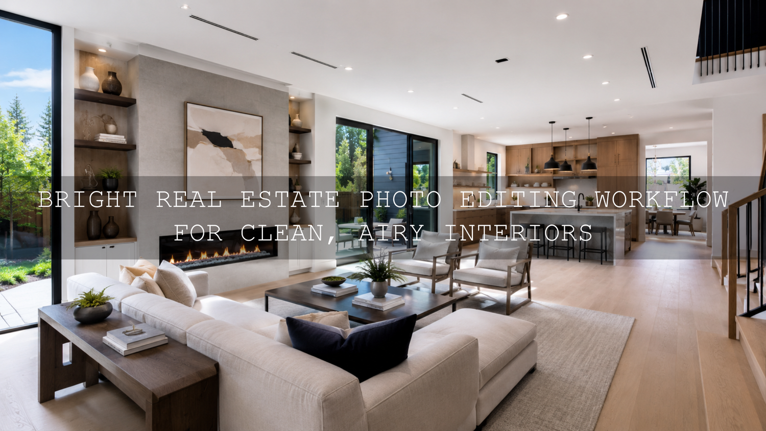
Bright Real Estate Photo Editing Workflow for Clean, Airy Interiors
A bright real estate photo editing workflow helps property images feel open, clean, welcoming, and ready to sell without making the rooms look fake. In real estate photography, brightness is not just about pushing the Exposure slider higher. The goal is to balance window detail, natural wall color, clean shadows, straight vertical lines, and a consistent look across the full listing gallery.
Here’s why this matters: buyers often make their first decision from the photos before they read the listing details. A dark living room can feel smaller than it really is, while a bright, balanced interior can make the same space feel modern, fresh, and easier to imagine living in.
For a faster starting point, try AI-Optimized Interior Design & Real Estate Lightroom Presets for clean architectural clarity, balanced indoor light, and natural room colors. You can also browse the full Lightroom Presets for Lightroom Mobile & Desktop collection. Try these presets today — Buy 3, Get 9 FREE when you add 12 presets to your cart and pay for only 3.
Why Bright Interior Photography Works So Well for Listings
Bright interior photography works because it helps viewers understand the space quickly. The room feels cleaner, the layout becomes easier to read, and important selling points like windows, flooring, countertops, furniture, and architectural details become more visible.
But bright does not mean overexposed. One of the biggest editing mistakes in real estate photography is making the walls too white, the windows completely blown out, or the colors too flat. A professional edit keeps the space luminous while still preserving shape, contrast, and depth.
I have tested real estate Lightroom presets on interior scenes with mixed window light, warm lamps, white walls, and darker furniture. The best results always come from a balanced workflow: start with a strong RAW file, correct the exposure carefully, then use local adjustments only where the room actually needs extra light.
Start With the Shoot Before You Edit
Your real estate photo editing workflow starts before Lightroom opens. Editing can improve light, color, and polish, but it cannot fully fix a badly exposed, blurry, or poorly composed photo. If you want bright interior photos that look natural, build the edit on a strong capture.
Use Natural Light at the Right Time
For most interiors, mid-morning to early afternoon works well because the light is usually cleaner and more even. Open curtains and blinds, turn on practical lights only when they help the mood, and avoid shooting when direct sunlight creates harsh floor patches or strong wall shadows.
Use a Tripod for Cleaner Results
A tripod is one of the simplest ways to improve real estate photography. It allows slower shutter speeds, cleaner ISO settings, sharper lines, and consistent framing. This matters because bright interiors often need more exposure time, especially in rooms with small windows or dark corners.
Keep Vertical Lines Straight
Walls, doors, cabinets, and window frames should look straight. Tilted verticals can make a room feel unstable or amateur. Keep the camera level when possible, and leave a little extra space around the frame so you can correct perspective later in Lightroom.
Watch Mixed Lighting
Mixed lighting is one of the most common problems in interior real estate photo editing. Window light may look cool, lamps may look yellow, and some LEDs may create a green cast. Before editing, decide which light source should feel dominant. In most listing photos, neutral daylight with a slightly warm, welcoming feel works best.
Step-by-Step Lightroom Workflow for Bright Real Estate Photos
This Lightroom workflow for property photos is designed to keep interiors bright, realistic, and professional. You can use it manually, or apply a preset first and fine-tune each step to match the room.
- Import and cull your RAW files. Keep only the sharpest, cleanest, best-composed images. Do not waste editing time on frames with bad focus, awkward angles, or distracting clutter.
- Apply lens corrections. Enable profile corrections and remove chromatic aberration to reduce wide-angle distortion, edge darkening, and color fringing.
- Correct perspective. Use transform tools to straighten vertical and horizontal lines. Real estate images should feel clean and architectural, not tilted or warped.
- Set white balance first. Use a neutral wall, white trim, or gray surface as a starting point. Then adjust Temperature and Tint until whites look clean but not cold.
- Lift exposure carefully. Increase Exposure until the room feels bright, but stop before walls and ceilings lose detail.
- Recover highlights. Pull Highlights down to protect windows, glossy countertops, white bedding, and reflective surfaces.
- Open the shadows. Raise Shadows to reveal furniture, corners, under-cabinet areas, and darker flooring without making the image look flat.
- Set Whites and Blacks. Add a little Whites for freshness and a little Blacks for depth. This keeps the room bright but not washed out.
- Refine color. Use Vibrance gently. Avoid heavy saturation because strong colors can make walls, wood, and décor look unrealistic.
- Sharpen with masking. Sharpen edges like furniture, windows, and cabinets, but avoid adding noise to plain walls and ceilings.
For detailed local editing, Adobe’s official Lightroom Classic Masking tool guide is helpful because masks allow you to brighten specific areas without changing the entire room.
Presets vs Manual Editing for Real Estate Photography
Presets and manual editing both have a place in a professional real estate photography workflow. The key is knowing when to use each one.
When Presets Help
Presets are best when you need speed, consistency, and a polished starting point. For example, if you are editing a full property gallery with 30 images, a preset can quickly create a clean base look across the living room, kitchen, bedrooms, bathrooms, and exterior lifestyle shots.
The AI-Optimized Interior Design & Real Estate Lightroom Presets are especially useful for bright interior photography because they are designed for property visuals, architectural lines, natural tones, and indoor lighting balance.
When Manual Editing Matters
Manual editing is important when each room has different lighting. A kitchen with bright windows may need highlight recovery, while a bedroom may need shadow lifting and warmer white balance. A bathroom may need extra correction for color casts from tiles, mirrors, or artificial light.
The best workflow is not presets or manual editing. It is presets plus manual refinement. Apply a strong base edit, then adjust exposure, white balance, masks, and perspective for each image.
How to Make Interiors Bright Without Looking Fake
The most natural bright real estate photos have three things in common: controlled highlights, open shadows, and believable color. If one of these is pushed too far, the image can quickly look artificial.
- Protect the window view. Do not let every window turn pure white. Lower Highlights, use masks, or blend exposures when needed.
- Keep walls neutral. White walls should look white, not blue, yellow, green, or gray.
- Avoid over-flattening shadows. Some shadow is necessary because it gives shape to furniture and architecture.
- Do not overuse clarity. Too much Clarity or Dehaze can make walls look dirty and edges look harsh.
- Match the whole listing gallery. A bright kitchen, dark bedroom, and orange living room can make the listing feel inconsistent.
For a deeper look at indoor color problems, read how to master presets in tricky mixed indoor and window lighting. It pairs well with this workflow because mixed lighting is one of the biggest reasons real estate edits start to look uneven.
Window Detail and Highlight Recovery
Windows are one of the hardest parts of real estate photo editing. The interior may need more brightness, but the window view may already be too bright. If you only raise Exposure, the room improves but the windows disappear. If you only lower Highlights, the room may stay too dark.
Use a balanced approach:
- Set the overall Exposure for the room, not the windows.
- Lower Highlights until window frames and bright surfaces regain detail.
- Use a Linear Gradient or Brush mask over the window area if it still looks too bright.
- Lift Shadows in the room separately if the corners feel heavy.
- Add a small amount of contrast back with Whites and Blacks.
This gives the image a natural dynamic range. The viewer can see the room clearly while still understanding there is light outside the window.
Color Correction for Clean Interior Real Estate Photos
Color correction can make or break a property photo. A bright image with bad color still feels unprofessional. Buyers expect the wall color, flooring, cabinets, and furniture to look believable.
Start with white balance. If the image feels too yellow, cool it down slightly. If it feels too blue, warm it up. If walls look green or magenta, adjust Tint carefully. Then move into HSL adjustments only if needed.
Here’s a practical example: if a white kitchen looks slightly yellow from warm bulbs, reduce the Temperature a little, then use a mask on the warm light area instead of cooling the entire room. This keeps the kitchen fresh without making daylight areas look too blue.
For color consistency across web exports, Adobe’s Lightroom Classic color FAQ explains how Lightroom handles color spaces for web and export workflows.
Advanced Editing Tips for Professional Property Photos
Once your basic edit is clean, small local adjustments can make the image feel more premium. These are the details that help a listing gallery stand out without looking overprocessed.
- Dodge the center of the room slightly. A small exposure lift in the main living area can guide the viewer’s eye.
- Darken distractions. If a corner, lamp, or reflection pulls attention away, reduce exposure or highlights locally.
- Warm the room carefully. A small warm shift can make interiors feel inviting, but keep whites and grays realistic.
- Use texture selectively. Add detail to wood, stone, fabric, and décor, not plain walls.
- Check every image as a set. Real estate galleries should feel consistent from the first photo to the last.
For more property-focused editing ideas, explore how to edit hotel and Airbnb photos for a luxury feel. Luxury rental edits use many of the same principles: clean highlights, natural color, controlled contrast, and consistent mood.
Export Settings for Real Estate Listing Photos
After editing, export settings matter. Your photos need to look sharp and clean online without loading too slowly. For most listing platforms, JPEG is the practical format, and sRGB is the safest color space for web use.
A strong export workflow looks like this:
- File type: JPEG
- Color space: sRGB
- Quality: high enough for clean detail, but not unnecessarily huge
- Sharpening: screen sharpening for web display
- File naming: use clean names that organize the room sequence
Adobe’s official Lightroom Classic export workflow is a useful reference if you want to double-check the export process before sending images to a client or uploading them to a listing platform.
Common Real Estate Photo Editing Mistakes to Avoid
Bright real estate editing should help the property look its best while staying honest and realistic. Avoid these common mistakes:
- Overexposed walls: If white walls lose texture, the edit has gone too far.
- Blown-out windows: Some brightness is normal, but pure white windows can feel unfinished.
- Heavy HDR look: Over-recovered highlights and shadows can make rooms look gray and unnatural.
- Too much saturation: Strong color can make flooring, cabinets, and décor look inaccurate.
- Crooked verticals: Uneven lines reduce trust and make the image feel less professional.
- Inconsistent gallery style: Every room should feel like it belongs to the same property.
For a broader view of how editing affects property perception, read how color grading shapes real estate and architecture visuals. It explains why tone, brightness, and color mood can influence how viewers feel about a space.
Simple Real Estate Editing Checklist
Use this checklist before delivering your final property gallery:
- Are all vertical lines straight?
- Do the walls look neutral and clean?
- Are windows controlled without looking fake?
- Do shadows show enough detail?
- Does each room match the rest of the gallery?
- Are colors accurate for flooring, cabinets, and furniture?
- Is the image sharp without looking crunchy?
- Are exports optimized for fast web viewing?
If you want a broader preset toolkit for multiple property styles, the 1000+ Master Lightroom Presets Bundle is useful for photographers who edit real estate, lifestyle, interiors, travel, and social media content. For brighter creative looks beyond property work, you can also try AI-Optimized Cinematic Bright Lightroom Presets.
Related Reading
- Presets for real estate photography with a bright, clean, professional look
- Mastering presets in tricky mixed indoor and window lighting
- How to edit hotel and Airbnb photos for a luxury feel
- How color grading shapes real estate and architecture perception
Final Thoughts on Bright Real Estate Photo Editing
A strong bright real estate photo editing workflow is about balance. You want rooms to feel open and inviting, but you also need realistic contrast, accurate color, clean lines, and preserved detail. When the edit is done well, buyers can understand the space quickly and feel more confident about the listing.
Start with a clean RAW photo, correct perspective, balance exposure, recover highlights, lift shadows naturally, and refine the final look with careful masks. If you want to speed up the process while keeping a professional base style, start with AI-Optimized Interior Design & Real Estate Lightroom Presets, then fine-tune each room for the most natural result. You can also browse Lightroom Presets for Lightroom Mobile & Desktop to build a complete editing toolkit for property, interior, lifestyle, and client work.
FAQ
How do I make real estate photos look bright in Lightroom?
Start by correcting white balance and perspective, then raise Exposure carefully, lower Highlights to protect windows, lift Shadows to reveal room detail, and use masks for local brightening. Avoid pushing the whole image too far because it can make walls look flat or overexposed.
Should real estate photos be edited with presets?
Yes, presets can be helpful for speed and consistency, especially when editing a full property gallery. The best approach is to apply a preset as a starting point, then manually adjust exposure, white balance, highlights, shadows, and masks for each room.
How do I keep windows from blowing out in interior photos?
Lower the Highlights slider, reduce Whites if needed, and use a local mask over the window area. For difficult scenes, shoot bracketed exposures so you have more detail available in both the interior and exterior view.
What color temperature is best for interior real estate photography?
A neutral white balance with a slightly warm feel usually works best. The room should feel inviting, but walls, ceilings, and white furniture should still look natural and clean.
What export settings should I use for real estate listing photos?
Export as JPEG in sRGB color space with high quality and screen sharpening. Keep the file size optimized for fast loading while preserving enough detail for property listing platforms and client delivery.
Written by Asanka — creator of AAAPresets (10,000+ customers).

Leave a comment
This site is protected by hCaptcha and the hCaptcha Privacy Policy and Terms of Service apply.