How to Build a Mobile and Desktop Editing Workflow That Stays Consistent in 2026
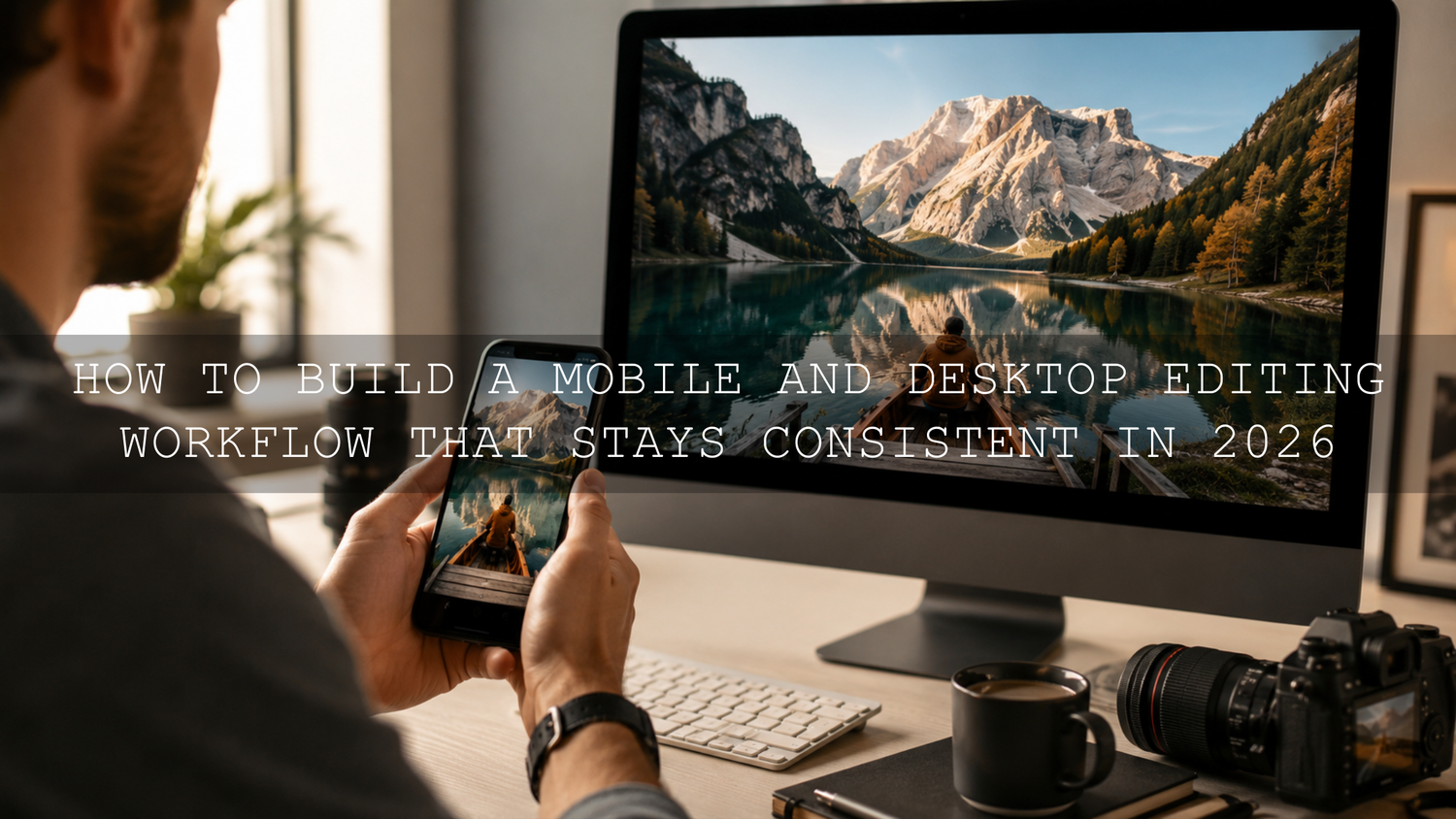
A reliable mobile and desktop editing workflow is one of the biggest time-savers for photographers, creators, bloggers, and small business owners in 2026. You might start an edit in Lightroom Mobile while traveling, finish the color work on desktop, then export the final photo for Instagram, Shopify, Pinterest, or a client gallery. The challenge is simple: your edits need to look consistent everywhere.
Here’s why this matters. A photo that looks warm, clean, and cinematic on your phone can look too dark, too green, or too contrast-heavy when you open it on a desktop monitor. That difference can slow you down, especially when you are editing batches of travel photos, portraits, product images, wedding galleries, or social media content.
For a faster starting point, try the 1000+ Master Lightroom Presets Bundle for a flexible library of mobile and desktop presets, or browse the Lightroom Presets for Lightroom Mobile & Desktop collection to build a consistent editing style across devices. Try these presets today — Buy 3, Get 9 FREE when you add 12 presets to your cart.
Why Mobile and Desktop Editing Consistency Matters
Creative work rarely happens in one place anymore. You may shoot a sunset on your phone, apply a preset in Lightroom Mobile, review the edit on your tablet, and make final adjustments on your desktop. That flexibility is powerful, but it also creates room for inconsistency.
When your mobile and desktop edits do not match, you can run into problems like:
- Wasted editing time: You end up correcting the same photo twice instead of moving forward.
- Uneven galleries: A wedding, travel album, or product set may look inconsistent from image to image.
- Color confusion: Skin tones, skies, greens, and shadows can shift between screens.
- Slower publishing: Every extra adjustment delays your blog post, reel cover, carousel, or client delivery.
I have tested mobile-to-desktop workflows on travel photos, portrait edits, and Lightroom preset packs, and the biggest difference usually comes from three things: screen brightness, white balance, and export settings. Once those are controlled, the edit becomes much easier to trust.
Start With One Editing Ecosystem
The easiest way to create a smooth Lightroom mobile desktop sync workflow is to avoid jumping between too many apps. When your photos, presets, albums, and edits live inside one connected system, it becomes easier to continue your work from any device.
Adobe Lightroom is one of the strongest options for this because it is built for cloud-based editing across mobile, desktop, and web. Adobe explains how photos and edits can sync through the cloud in its guide to syncing Lightroom edits across devices. For Lightroom Classic users, Adobe also explains how to sync Lightroom Classic with the Lightroom ecosystem.
Let’s break it down into a simple workflow:
- Import your photos into Lightroom: Start with one main library instead of scattering files across random folders.
- Create albums by project: Use names like “Sri Lanka Travel 2026,” “Wedding Preview,” or “Product Photos June.”
- Apply your base preset: Use the same preset family across mobile and desktop for a repeatable look.
- Fine-tune exposure and white balance: These two settings usually need the most image-by-image adjustment.
- Export with consistent settings: Use the same file type, color space, and size for each platform.
For more editing structure, read this guide on how to build a Lightroom editing workflow with presets.
Use Presets as Your Cross-Device Starting Point
Presets are not just shortcuts. In a mobile and desktop editing workflow, they act like a creative baseline. If you apply the same preset style on your phone and desktop, your contrast, tone curve, color mix, and overall mood start from the same place.
This is especially helpful when you edit in batches. For example, a street photographer might apply one preset to 20 city photos, then adjust exposure photo by photo. A wedding photographer might use one soft, clean preset family for the ceremony and a warmer preset for golden-hour portraits. A travel blogger might use a cinematic preset for landscapes and a brighter preset for food or hotel photos.
Adobe’s guide to adding and syncing Lightroom presets with mobile explains how presets imported into Lightroom Desktop can sync to mobile through the cloud. That is useful when you want the same look available whether you are editing from a phone, tablet, laptop, or desktop computer.
For an easy all-purpose toolkit, the Cinematics Look Lightroom Presets Pack is a strong option for creators who want polished, dramatic edits across mobile and desktop. For urban shoots, try the Street Photography Lightroom Presets to keep city tones, contrast, and shadows more consistent.
Presets vs Manual Editing: Which Is Better for Syncing?
Presets and manual editing are both useful, but they solve different problems.
- Presets are best for speed and consistency. They help you create a repeatable look across a large batch of photos.
- Manual editing is best for precision. It helps you correct exposure, skin tone, white balance, highlights, and local details.
- The best workflow uses both. Apply a preset first, then make small manual adjustments for each photo.
Here’s a real example. If a café photo looks flat on mobile, you might apply a warm cinematic preset to add contrast and color depth. On desktop, you can zoom in, lower harsh highlights on the cups, fix the white balance, and sharpen the details. The preset gives the photo style; the manual edit gives it accuracy.
The mistake is treating presets as a final edit every time. A good preset should get you 70–85% of the way there. The final 15–30% should come from your eye: exposure, crop, skin tone, noise reduction, and export settings.
Step-by-Step Mobile to Desktop Lightroom Workflow
Use this workflow when you want consistent photo edits from phone to desktop without starting over.
1. Import and Organize Before You Edit
Start by importing your photos into one Lightroom album. Avoid saving duplicate versions in multiple places unless you are creating a backup. A clean folder or album structure prevents confusion later.
Pro tip: name albums by project and date. For example, “Travel Photos — June 2026” is easier to find than “New Album 7.”
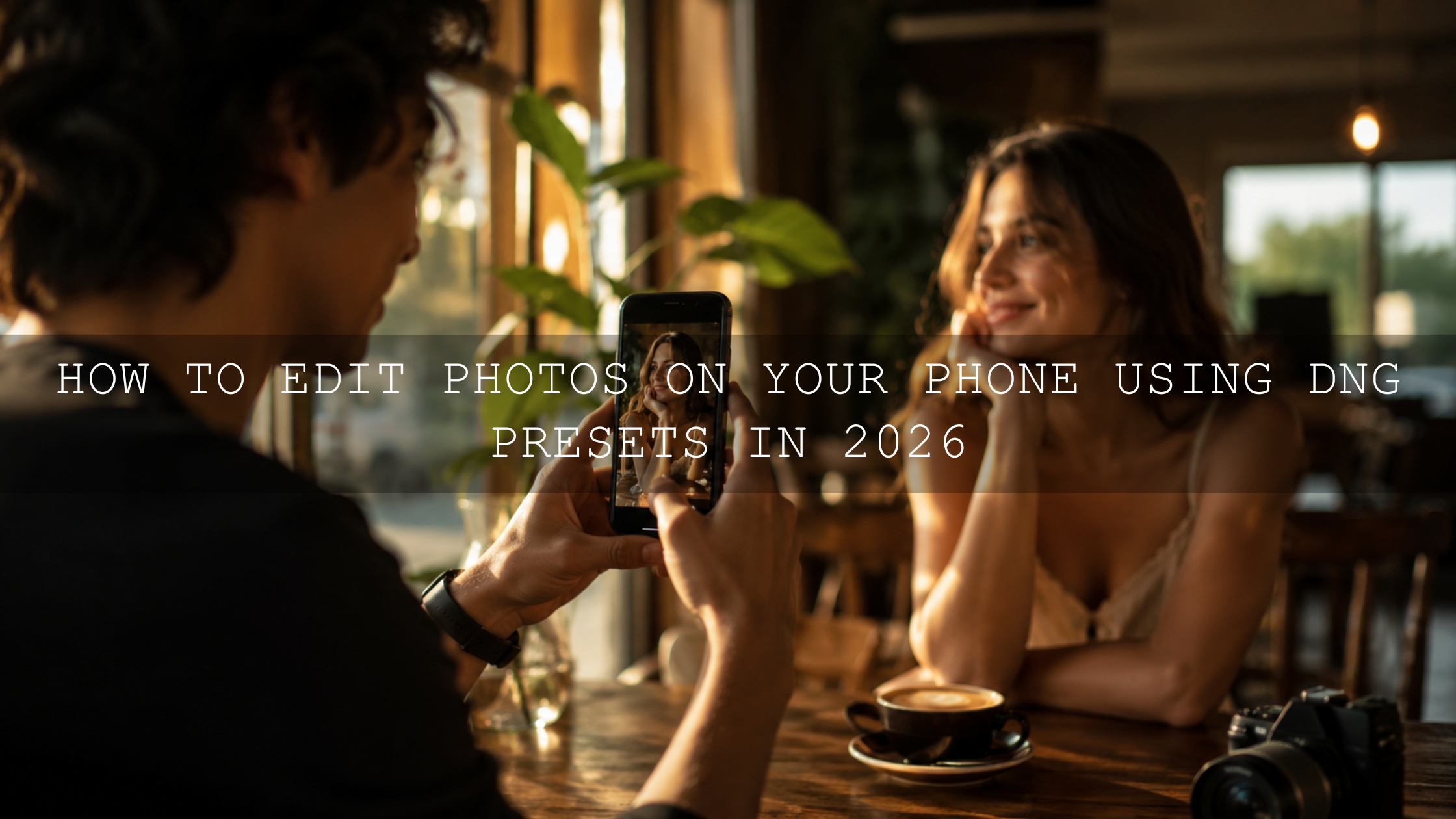
2. Apply a Preset on Mobile
Choose a preset that matches the mood of the shoot. For bright lifestyle content, use a clean preset. For city photos, use a street or cinematic preset. For evening shots, start with a preset designed for low light.
Do not judge the edit only at full brightness. Phone screens can make photos look more vibrant than they really are. Lower your brightness slightly and check whether the shadows still hold detail.
3. Adjust White Balance First
White balance is one of the main reasons mobile and desktop edits look different. If your phone edit looks warm but your desktop version looks yellow, adjust temperature and tint before touching color grading.
Expert tip: fix skin tones before fixing background colors. Viewers notice unnatural skin faster than they notice a slightly different wall, sky, or road tone.
4. Review the Edit on Desktop
Once the image syncs, open it on desktop and review it on a larger screen. Look closely at shadows, highlights, noise, and sharpness. Desktop editing is better for fine control because you can see small problems that are easy to miss on a phone.
This is also where you can compare multiple images side by side. If you are editing a full carousel or blog gallery, consistency matters more than making one photo look dramatic.
5. Export for the Final Platform
Export settings should match the destination. For web and social media, sRGB is usually the safest choice. Adobe’s Lightroom Classic color management guide explains how export color spaces affect how images appear on different devices in its article on Lightroom color management.
For Shopify blogs, product images, and website graphics, keep the edit clean and natural. Overly heavy contrast or saturation may look exciting on mobile but too intense on desktop.
Color Management Tips for Matching Mobile and Desktop Edits
Color is where most sync problems become visible. Even when Lightroom sync works perfectly, two screens can still display the same image differently.
- Keep brightness stable: Do not edit on a phone at maximum brightness and then judge the same image on a dim desktop screen.
- Use a consistent color space: For most online use, export in sRGB unless you have a specific reason to use another profile.
- Avoid extreme saturation: Strong reds, greens, and oranges can shift badly between screens.
- Check neutrals: White walls, gray roads, clouds, and black clothing reveal color casts quickly.
- Use one preset family: Mixing too many preset styles in one gallery can make your work look inconsistent.
If you create branded content, Adobe Color can also help you plan palettes. Use the Adobe Color wheel for color harmony when you want your photo edits to match a website, brand mood, or social feed aesthetic.
Common Mobile and Desktop Editing Mistakes
Even experienced creators run into small workflow problems. The good news is that most of them are easy to fix.
Editing Too Bright on Mobile
Phones are designed to make visuals look punchy. If you edit at full brightness, you may underexpose the photo without noticing. When you open it on desktop, it can look dark and heavy.
Applying Too Many Presets
Stacking presets can create strange colors, crushed shadows, and unnatural skin tones. Use one preset as your base, then adjust manually.
Ignoring Sync Status
Before switching devices, make sure your edits have finished syncing. If you move too quickly, you may open an older version of the image and think something went wrong.
Exporting Different Versions for Every Platform
It is fine to crop differently for Instagram, Pinterest, and Shopify, but your core color edit should remain consistent. Save platform-specific exports only after the master edit is finished.
For more practical fixes, read common Lightroom Mobile mistakes to avoid and this guide on adapting Lightroom Mobile presets to different lighting.
Build a Repeatable Editing Routine
A consistent workflow is not about making every photo identical. It is about making every image feel like it belongs to the same creative world.
Here is a simple repeatable routine:
- Import photos into one organized Lightroom album.
- Pick one preset style for the project.
- Correct exposure and white balance.
- Adjust highlights, shadows, and contrast.
- Fine-tune skin tones, greens, blues, and oranges.
- Check the image on mobile and desktop.
- Export in the correct size and color space.
I tested this approach on a mixed travel set with beach photos, street scenes, food shots, and sunset portraits. The best results came from using one preset family first, then making small corrections based on the lighting in each scene. The gallery looked more cohesive, but every photo still felt natural.
To go deeper, compare the strengths of each platform in Lightroom Mobile vs Desktop, then use the Lightroom Mobile workflow guide for daily content to speed up your process.
Best Presets for a Mobile and Desktop Editing Workflow
The best presets for syncing mobile and desktop edits are presets that include both DNG and XMP formats, work across different lighting conditions, and remain easy to adjust after one click.
- 1000+ Master Lightroom Presets Bundle — best for creators who want many styles for travel, portraits, lifestyle, landscapes, and social content.
- Cinematics Look Lightroom Presets Pack — best for dramatic, polished, cinematic edits.
- Bright and Airy Lightroom Presets — best for clean lifestyle, wedding, family, and bright brand photos.
- Lightroom Presets for Night Photos — best for low-light edits, city nights, events, and evening content.
You can also browse Lightroom Mobile Presets if you mainly edit from your phone, or explore the mobile and desktop Lightroom preset collection if you regularly switch between devices.
Related Reading
- Lightroom Mobile vs Desktop: choosing the right editing platform
- Build your first Lightroom editing routine with presets
- Master your mobile editing workflow for daily content
- Why every photographer needs a Lightroom presets bundle
Final Workflow Checklist
Before you finish an edit, run through this quick checklist:
- Did the photo fully sync before switching devices?
- Did you use the same preset style across the project?
- Did you correct white balance before color grading?
- Did you check the image on both mobile and desktop?
- Did you export in the right color space for web or social media?
A smooth mobile and desktop editing workflow gives you more freedom to create wherever you are. Start your edit on the go, refine it on a larger screen, and publish with confidence. For a complete editing toolkit, use the 1000+ Master Lightroom Presets Bundle, or browse Lightroom presets made for mobile and desktop to keep your photos consistent from first edit to final export.
FAQ
How do I keep Lightroom Mobile and desktop edits consistent?
Use one Lightroom account, keep sync enabled, apply the same preset style, correct white balance carefully, and export with consistent settings. Also check your edits on both screens before publishing.
Do Lightroom presets sync between mobile and desktop?
Yes, Lightroom presets can sync across devices when they are imported correctly and your Adobe account sync is active. This makes it easier to use the same editing style on phone, tablet, and desktop.
Why do my mobile edits look different on desktop?
The most common reasons are screen brightness, display color differences, white balance, and export settings. Phone screens often look more vibrant, so always review important edits on a larger calibrated or consistent display.
Should I edit on mobile or desktop first?
Start on mobile when you need speed and flexibility. Finish on desktop when you need detailed control over color, sharpness, noise, cropping, and batch consistency.
Are presets better than manual editing?
Presets are better for speed and consistency, while manual editing is better for precision. The best workflow is to apply a preset first, then fine-tune exposure, white balance, skin tones, and export settings manually.
Written by Asanka — creator of AAAPresets (10,000+ customers).

Leave a comment
This site is protected by hCaptcha and the hCaptcha Privacy Policy and Terms of Service apply.