
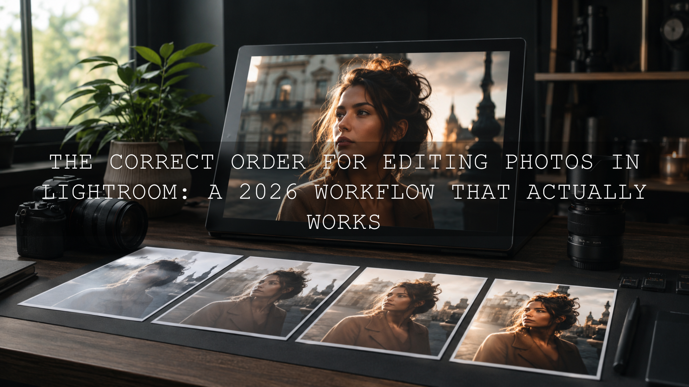
Pre-Editing Analysis: The 2026 Lightroom Workflow That Makes Every Edit Better
Pre-editing analysis is the simple habit of reading your photo before you start moving sliders, applying Lightroom presets, or building a full photo editing workflow. In 2026, editing tools are faster than ever, but the best results still begin with one question: what does this image actually need? When you understand the story, light, exposure, color, focus, and composition first, every edit becomes more intentional and much easier to control.
Here’s why this matters: a preset can create a beautiful style, but it cannot fully understand the emotional goal of your photo. A moody preset on a bright family portrait may feel too heavy. A warm vintage preset on a photo with already-orange skin tones may go too far. A cinematic preset on an underexposed image may crush the shadows. That is why reading the image before editing helps you get cleaner, more natural, and more professional-looking results.
For a faster creative starting point, explore the 1000+ Master Lightroom Presets Bundle and browse the Lightroom Presets for Mobile and Desktop collection. Try these presets today - Buy 3, Get 9 FREE, then use the workflow below to fine-tune every image with purpose.
Why Reading Your Photo Before Editing Is So Important
Many beginners open Lightroom and immediately apply a preset. That is not wrong, but it can lead to inconsistent results. One photo may look amazing, while the next feels too dark, too orange, too flat, or too sharp. Most of the time, the problem is not the preset. The problem is that the photo needed a small base correction first.
When I test presets for AAAPresets, I always check exposure, white balance, skin tone, highlight detail, and shadow detail before judging the final look. I have seen the same preset look cinematic on a balanced street photo and completely wrong on a poorly exposed portrait. The difference was not the preset. It was the starting point.
Adobe’s own Lightroom editing tools are built around this idea of controlled adjustment. Before going deep into style, you can use Lightroom’s histogram and clipping indicators to understand where highlights and shadows are losing detail. Adobe explains these controls in its Lightroom edit photos guide.
Step 1: Identify the Story Before You Touch the Sliders
Every strong photo has a reason to exist. Before editing, ask yourself what the viewer should feel first. Is the image soft and romantic? Dark and cinematic? Bright and clean? Warm and nostalgic? Dramatic and bold?
This step helps you avoid editing against the image. For example, a quiet wedding moment may need soft contrast, warm highlights, and gentle skin tones. A night street photo may need deeper blacks, richer color contrast, and stronger highlight control. A travel landscape may need balanced detail, natural color, and enough depth to guide the eye through the frame.
- Main subject: What should the viewer notice first?
- Emotion: Should the edit feel warm, calm, dramatic, nostalgic, clean, or bold?
- Environment: Does the background support the story or distract from it?
- Final use: Will this photo be used for Instagram, a portfolio, a client gallery, a blog, or a product page?
Pro tip: write your editing goal in one sentence before starting. For example, “I want this portrait to feel warm, natural, and premium” or “I want this street image to feel cinematic, contrasty, and moody.” That one sentence becomes your editing direction.
Step 2: Check Exposure and Histogram First
The histogram is one of the most useful tools in a Lightroom editing workflow because it shows the tonal information in your photo. The left side represents shadows and blacks. The middle represents midtones. The right side represents highlights and whites.
If the histogram is pushed heavily to the left, the image may be underexposed. If it is pushed heavily to the right, the image may be overexposed. If the graph is cut off at either edge, the photo may have clipped shadows or blown highlights.
- Underexposed photo: Lift exposure carefully, but watch for noise in dark areas.
- Overexposed photo: Reduce highlights and whites first, but know that fully blown highlights may not return.
- Flat photo: Add contrast carefully after the base exposure is balanced.
- High-contrast photo: Protect highlights first, then open shadows only where needed.
This is especially important before using Lightroom presets. If you apply a cinematic preset to a dark photo, it may make the shadows too heavy. If you apply a bright preset to an already overexposed image, skin and skies may lose detail. For more help, read this guide on why presets make photos too dark and how to recover detail.
Step 3: Check White Balance and Color Casts
White balance controls whether your photo feels warm, cool, green, or magenta. Before applying a strong look, check if the image already has a color cast. Indoor lighting may create yellow or green tones. Shade may make the photo too blue. Sunset light may already be very warm.
For portraits, white balance is even more important because skin tones can quickly look unnatural. A preset may add warmth, contrast, or color grading, but it works best when the base color is believable first.
- If skin looks too orange: reduce warmth or adjust orange saturation/luminance gently.
- If skin looks too green: move Tint slightly toward magenta.
- If the image feels too cold: add warmth carefully without making whites yellow.
- If the image feels too mixed: correct the subject first, then style the background with masking.
Adobe also explains color and tone editing inside Lightroom, including how tonal controls help shape the final image, in its official Lightroom photo editing guide.
Step 4: Review Focus, Sharpness, and Detail
Before you spend time color grading, zoom in and check the focus. Is the subject sharp? Are the eyes clear in a portrait? Is the product detail crisp? Is the motion blur intentional or accidental?
This matters because sharpening cannot truly fix a badly missed focus. It can improve edge detail, but too much sharpening creates halos, crunchy texture, and an unnatural digital look. If the image is slightly soft but emotionally strong, you may still edit it with a softer, film-style finish. If the focus is badly missed, it may be better to choose another photo.
Pro tip: sharpen based on the subject. Portraits usually need gentle sharpening and clean skin texture. Street photos can handle more grit. Landscapes often benefit from selective detail, but skies and smooth backgrounds should not be oversharpened.
Step 5: Study the Composition Before Cropping
Composition decides how the viewer moves through your image. Before cropping, look at the full frame carefully. Ask what supports the subject and what distracts from it.
- Horizon: Straighten it unless the tilt is clearly intentional.
- Edges: Remove distracting objects near the borders with a crop if possible.
- Subject placement: Try rule of thirds, center framing, or negative space depending on the story.
- Leading lines: Use roads, shadows, walls, rivers, or architecture to guide attention.
- Visual clutter: If the background is messy, crop tighter or darken distractions with local adjustments.
A good crop can make a weak photo feel stronger before any color work begins. It also helps presets perform better because the viewer’s attention is already moving toward the right place.
Step 6: Understand the Light Before You Grade the Color
Light creates the mood of the photo. Before editing, decide what kind of light you captured. Was it soft window light, harsh midday sunlight, golden hour glow, blue hour ambience, flash, neon, or cloudy daylight?
Each type of light needs a different editing approach. Soft light often works well with clean contrast and gentle color. Harsh light may need highlight recovery and careful shadow control. Golden hour light usually looks best when you protect warmth without oversaturating orange tones. Blue hour images often need controlled shadows and clean noise reduction.
- Front light: Add depth with contrast, tone curve, or subtle dodge and burn.
- Side light: Enhance texture and shape, but protect shadow detail.
- Backlight: Recover subject detail with masking while keeping the glow natural.
- Harsh light: Reduce highlights first, then add contrast only where needed.
- Soft light: Preserve smooth transitions and avoid over-editing.
If you want a ready-made starting point for everyday edits, the AI-Optimized Skin Tone Safe Pro Portrait Lightroom Presets are useful for portraits where believable skin color matters. For urban and street-style lighting, the Urban Cinematic Lightroom Presets Pack can help create deeper contrast and a stronger city mood.
Step 7: Use Masking for Local Fixes, Not Only Global Edits
One of the biggest editing mistakes is trying to fix the whole photo when only one area needs help. If the face is too dark, brighten the face. If the sky is too bright, adjust the sky. If the background is too distracting, reduce its exposure or saturation. This is where masking becomes powerful.
Adobe’s guide to masking in Lightroom explains tools like Select Subject, Select Sky, Select Background, and other local adjustment options. These tools help you make targeted edits without damaging the whole image.
For example, in a backlit portrait, I would not lift the entire exposure because the sky may become too bright. Instead, I would use a subject mask to raise exposure slightly on the person, reduce highlights in the sky, and keep the natural glow around the edges. That gives the photo a cleaner professional look.
Presets vs Manual Editing: Which Should Come First?
The best answer is usually a hybrid workflow. Manual editing gives you correction. Presets give you style.
- Manual editing: Best for exposure, white balance, cropping, horizon, noise, and skin tone corrections.
- Lightroom presets: Best for mood, color style, tone curve, contrast direction, and consistent branding.
- Hybrid workflow: Best for professional results because it combines accuracy with speed.
If your photo is already balanced, you can apply a preset first and fine-tune after. If your photo has exposure or white balance problems, fix the base first. This is why presets may look different on every image. For a deeper explanation, read why Lightroom presets look different and how to fix them.
A Simple 2026 Pre-Editing Checklist
Use this quick checklist before editing any photo in Lightroom Mobile, Lightroom Desktop, Photoshop, or Camera Raw:
- Story: What should the image communicate?
- Subject: What should the viewer notice first?
- Exposure: Are shadows or highlights clipped?
- White balance: Does the color feel natural before styling?
- Focus: Is the important part sharp enough?
- Composition: Does the crop improve the image?
- Light: Should the edit enhance softness, drama, warmth, or contrast?
- Color harmony: Are the main colors working together?
- Preset choice: Which preset matches the photo’s story?
- Final polish: Do you need masking, noise reduction, sharpening, or export adjustments?
For a broader editing structure, you can also follow this step-by-step Lightroom workflow for faster photo edits.
Color Harmony: Make the Edit Feel Intentional
Color is not just decoration. It controls emotion. Blue and orange can create cinematic contrast. Greens and browns can feel earthy and natural. Warm beige tones can feel nostalgic. Deep blacks and muted color can feel dramatic.
Before pushing saturation, look at the color relationships already inside the photo. Are the colors complementary, analogous, warm, cool, or mixed? Adobe’s Color Wheel tool for color harmony is helpful for understanding how color relationships work before you build a consistent editing style.
If you want a soft nostalgic finish, the AI-Optimized Warm Dust Vintage Lightroom Presets can help create a warm, memory-style tone. If you prefer browsing multiple looks, explore the Premium Lightroom Presets and LUTs Bundles for more editing styles across portraits, travel, street, landscape, wedding, and social content.
Common Pre-Editing Mistakes to Avoid
- Applying strong presets too early: Fix exposure and white balance first when the image has clear problems.
- Ignoring clipped highlights: If highlights are blown, no preset can fully restore missing detail.
- Over-saturating skin tones: Keep skin realistic, then style the background separately if needed.
- Sharpening everything: Use sharpening with control, especially on portraits and low-light photos.
- Editing without a goal: Decide the mood before changing sliders.
Many preset problems can be solved with small corrections. This 10-step preset troubleshooting checklist is useful when an edit looks too heavy, too flat, too dark, or too colorful.
Related Reading
- Step-by-Step Lightroom Workflow for Faster Photo Edits
- Why Lightroom Presets Look Different and How to Fix It
- Why Presets Make Photos Too Dark and How to Recover Detail
- Common Lightroom Mobile Mistakes to Avoid
Final Workflow: From Analysis to Finished Edit
The best Lightroom editing workflow is not about using every slider. It is about making the right adjustment at the right time. Start by reading the image. Understand the story. Check exposure. Fix white balance. Review focus. Improve composition. Study the light. Then choose a preset that supports the photo instead of fighting it.
This method turns editing from guessing into decision-making. It also helps you build consistency across your portfolio, Instagram feed, client galleries, and product visuals. Whether you are editing portraits, weddings, travel photos, street photography, landscapes, or social media content, pre-editing analysis gives every image a stronger foundation.
Ready to build a cleaner, faster workflow? Start with the 1000+ Master Lightroom Presets Bundle, explore more styles in the Lightroom Presets for Mobile and Desktop collection, and use the Buy 3, Get 9 FREE offer to test different looks across your own photos.
FAQs
What is pre-editing analysis in photography?
Pre-editing analysis means studying your photo before editing. You check the story, exposure, histogram, white balance, focus, composition, light, and color so your Lightroom edits or presets match what the image actually needs.
Should I fix exposure before applying Lightroom presets?
Yes, especially if the photo is too dark, too bright, or has clipped highlights. A balanced exposure helps presets look more consistent and prevents shadows, skin tones, and highlights from becoming too extreme.
Why do Lightroom presets look different on every photo?
Presets react to the original exposure, white balance, lighting, colors, and camera profile of each image. If two photos have different lighting conditions, the same preset can create different results. A clean base edit helps reduce that difference.
Is manual editing better than using presets?
Manual editing is better for correction, while presets are better for speed and style. The strongest workflow uses both: manual edits for exposure, white balance, and composition, then presets for mood, color grading, and consistency.
Can pre-editing analysis improve mobile Lightroom edits?
Yes. Even on Lightroom Mobile, checking exposure, white balance, crop, and subject focus before applying presets can make your edits look cleaner, more natural, and more professional.
Written by Asanka — creator of AAAPresets (10,000+ customers).

Leave a comment
This site is protected by hCaptcha and the hCaptcha Privacy Policy and Terms of Service apply.