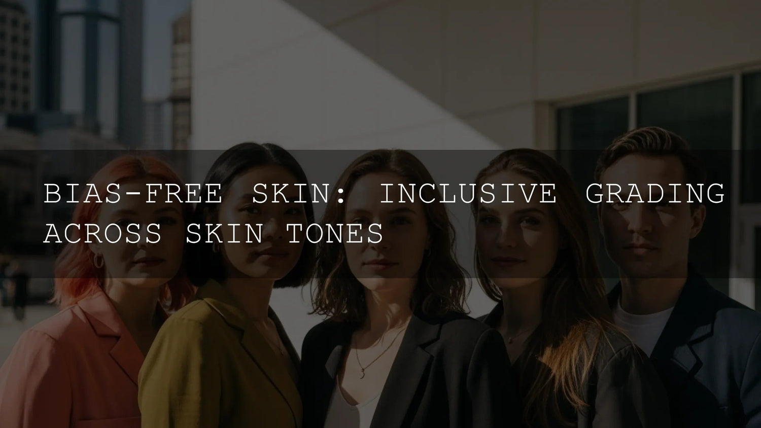
Bias-Free Skin: Inclusive Grading Across All Skin Tones
If you care about representation, inclusive skin tone grading is non-negotiable. Audiences expect portraits and videos that honor the full spectrum of human skin—without pushing everything toward a single “ideal.” This guide shows how to grade all complexions beautifully and consistently using practical color science, Lightroom/Premiere/DaVinci techniques, and a workflow you can repeat on real client work. Along the way, I’ll share field notes from sessions where I tested presets and LUTs on wedding, street, and studio shoots—plus quick checkpoints that keep unconscious bias out of the grade.
If you want a fast, reliable baseline before fine-tuning skin, try a versatile preset or LUT and then refine locally. For example, start with the 1000+ Master Lightroom Presets Bundle, then polish with masks; or build a video look around the 700+ Cinematic Video LUTs. You can mix and match—and with our current offer, you can try more looks without overpaying: Buy 3, Get 9 FREE. Browse the full Lightroom Presets collection for ideas you can adapt to your style.
Why bias creeps in (and how to catch it early)
Bias often enters through defaults—camera profiles that favor certain hues, LUTs designed for limited model sets, or lighting choices that work only for lighter complexions. The fix is awareness plus process. Before you touch a slider, decide what “healthy, natural skin” means for the person in front of you, not for a generic reference image. Then verify with scopes and targeted masks instead of global shifts that flatten undertones.
Understand the spectrum: undertones, not just “light vs dark”
- Deep skin tones: Protect red/blue/purple undertones. Avoid gray or muddy shifts from aggressive global contrast or cool white balance. Lift exposure thoughtfully to keep texture bright without milking shadows.
- Medium & olive: Watch green/yellow creep, especially under fluorescents or mixed lighting. Gentle magenta bias can neutralize green casts; targeted hue shifts are safer than global temperature moves.
- Fair: Keep micro-contrast and subtle warmth; avoid sallow yellow or blotchy reds from heavy clarity/texture. A touch of magenta plus restrained saturation keeps skin lively, not plastic.
Color-accurate foundations you can trust
- Calibrated display: Grade on a calibrated, profiled monitor so your skin judgments aren’t guesswork.
- Color spaces: Know your pipeline (Rec.709/Display P3/Rec.2020). Deliverables for social are typically Rec.709; don’t grade as if you’re in P3 and then squeeze to 709 at export.
- Profiles & color management: ICC profiles connect devices to a common reference so color decisions hold up across screens and prints. See the International Color Consortium overview for the big picture on profiles and workflow. ICC overview on color management
Tools that make inclusive grading easier
Lightroom: mask the person, then refine the skin
Create a People/Face Skin mask and handle exposure/white balance locally. It’s faster, safer, and kinder to undertones than global edits. Adobe’s docs are a great refresh: Apply masking for local adjustments in Lightroom.
- Color Mixer / Point Color: Make micro-adjustments to reds/oranges with restraint to preserve lifelike tones. See Color & tonal adjustments in Camera Raw for the underlying controls shared across Lightroom/ACR.
- Texture/Clarity: Use Texture modestly on skin; increase locally for hair, brows, and fabrics so faces stay dimensional without looking over-sharpened.
Premiere Pro / Lumetri: trust the scopes, not your memory
Use the Vectorscope and the skin-tone line as a reference—not a law. Many complexions sit naturally near the line but slightly warmer/cooler depending on the scene. Start with a neutral balance, then season creatively. Learn the process in Adobe’s guides: Correct skin tones with the Vectorscope and Lumetri scopes in Premiere Pro.
DaVinci / Advanced moves (applies conceptually in Lumetri too)
- Qualifier + Power Window: Isolate skin, soften the matte, then nudge hue/sat/luma in small steps. Keep a parallel node for complexion recovery if global looks push too far.
- Reference stills: Match across angles and days with shot stills so the same person reads consistently in all cuts.
A step-by-step workflow you can reuse
- Capture safe exposure: Avoid clipping and black crush. Slight underexposure on deep complexions can kill nuance; err toward rich midtones.
- Set neutral WB: Balance globally for the scene, then fine-tune skin with a People/Face Skin mask.
- Build a baseline look: Try a preset/LUT that fits the mood, then attenuate its effect on skin using masks. A great starting point is the 1000+ Master Lightroom Presets for photos or the 700+ Cinematic Video LUTs for video.
- Protect undertones: Use Hue vs Hue/Sat curves (or Lightroom Color Mixer) to keep oranges/reds clean. If olive casts appear, add a whisper of magenta in the skin mask.
- Micro-contrast: Add pop to eyes/hair/lips with separate masks. Keep skin texture realistic—reduce clarity slightly if needed; don’t blur.
- Scope check: Confirm saturation and hue sit where you intend across shots. The vectorscope keeps “memory” colors honest.
- Device check: Review on phone + laptop screens to ensure the look travels.
Presets vs manual editing (and why the best answer is “both”)
- Presets/LUTs = speed & consistency: They land you close to a creative direction across a set, saving hours.
- Manual edits = inclusivity & fidelity: Masks and per-tone adjustments honor unique undertones and lighting.
- Pro move: Start with a tasteful preset, then localize skin fixes. Explore Lightroom presets for Mobile & Desktop and round it out with a cinematic LUT option like 300+ Music Video LUTs when you need bolder palettes.
Field notes from real shoots
Wedding (golden hour): I tested three portrait presets on a bride with deeper skin. The warmest preset clipped highlights on cheeks; switching to a neutral portrait preset, then adding a gentle magenta bias in a Face Skin mask, preserved glow without flattening undertones.
Street (midday, olive tone): A teal-leaning look pushed skin green. I anchored WB to neutral, masked skin, and rotated Hue vs Hue slightly toward orange while easing saturation. The background kept its cool vibe; the subject looked healthy.
Studio (fair with redness): A crisp, high-contrast preset exaggerated blotchiness. Reducing local saturation in reds and lifting midtone exposure inside a skin mask restored balance while keeping punch elsewhere.
Quick wins & common pitfalls
- Do separate “creative” from “corrective” nodes/adjustments so you can dial either back independently.
- Don’t chase one global WB for mixed lighting—fix skin locally and embrace ambient color in the scene.
- Do keep saturation of oranges under control; most cameras over-amp it.
- Don’t over-smooth: real texture reads as confidence and authenticity.
Keep learning (hand-picked reads)
For deeper dives on techniques we touched on, explore:
- Portrait Presets: Editing Skin Tones the Right Way
- Mastering Lightroom Mobile: Avoiding Common Mistakes
- What Are LUTs and Why Every Videographer Should Use Them
- Color Grading Reels/Shorts/TikToks in DaVinci Resolve
- Trending Lightroom Presets for 2025
Try this on your next project
Build your own inclusive skin-first workflow with a repeatable recipe: choose a preset/LUT for mood, isolate skin with masks, secure undertones with micro-hue shifts, and verify on scopes plus a couple of common devices. When you’re ready to expand your toolkit, explore Lightroom Presets and Cinematic LUTs—and remember, Buy 3, Get 9 FREE lets you test widely until your signature look clicks.
How do I keep deep skin tones from looking gray?
Start with a neutral global balance, then mask the face/skin and slightly increase exposure and saturation in oranges/reds. If the look is cool overall, add a hint of magenta inside the skin mask. Verify on the vectorscope: saturation should hold while hue stays natural.
What’s the fastest way to fix green casts on olive complexions?
Create a People/Face Skin mask, nudge Tint toward magenta, and use Hue vs Hue to pull greens toward orange. Avoid heavy global WB changes that break background color harmony.
Are presets or LUTs “bad” for inclusive grading?
Not at all—presets/LUTs save time and unify sets. The key is to localize skin afterward. Apply the look globally, then refine skin with masks so undertones remain true.
Which color space should I deliver in for social?
Rec.709 is the safest default unless a platform or client specifies otherwise. Grade with that destination in mind to avoid surprises when exporting.
How do I learn the masking tools quickly?
Practice on a few portraits and follow Adobe’s concise tutorials: Lightroom masking and Premiere Pro skin-tone correction. You’ll build speed fast.
Need installation or download help? Check our FAQs or contact us.
Written by Asanka — creator of AAAPresets (10,000+ customers).


Leave a comment
This site is protected by hCaptcha and the hCaptcha Privacy Policy and Terms of Service apply.