
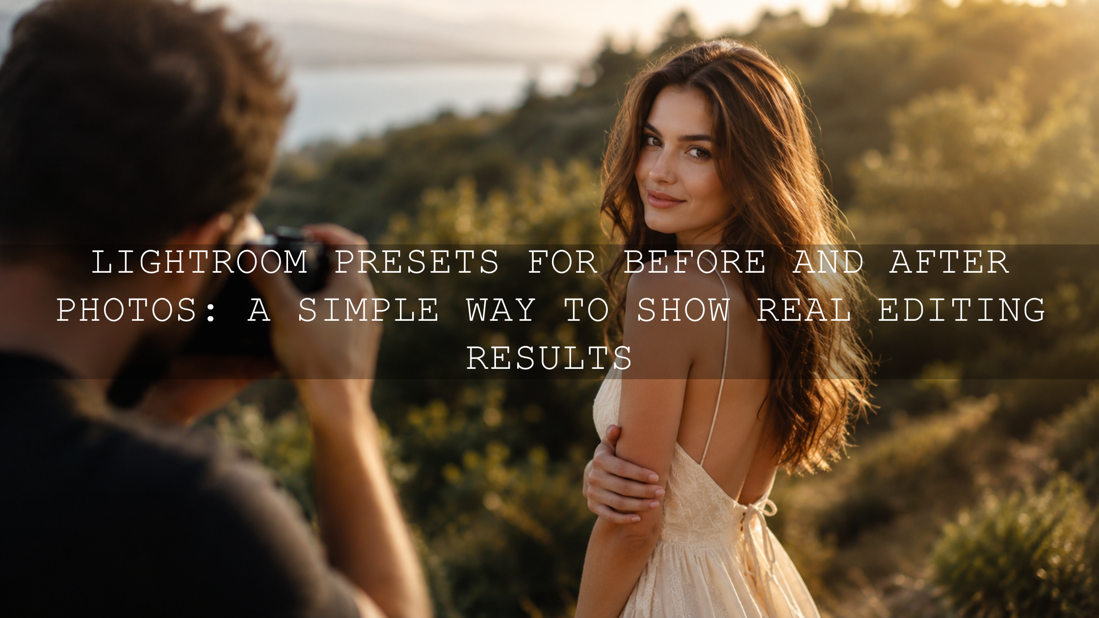
How to Create a Signature Look in Photography With Lightroom Presets
A signature look in photography is the visual style that makes your work feel instantly recognizable. It is not just one filter, one preset, or one trendy color grade. It is the consistent editing style behind your images: your color palette, contrast, skin tone handling, shadows, highlights, grain, mood, and overall storytelling. In 2026, photographers, creators, small brands, and personal brands need more than beautiful single images. They need a repeatable Lightroom workflow that helps every photo feel connected.
Here’s why this matters: people scroll fast. If your edits look random from post to post, your work can feel less memorable. But when your images share a clear mood, your audience begins to recognize your style before they even read your name.
For a flexible starting point, explore the 1000+ Master Lightroom Presets Bundle and browse the Lightroom Presets for Lightroom Mobile & Desktop collection. Try these presets today — Buy 3, Get 9 FREE — then use the workflow below to turn a preset into a personal editing style that feels truly yours.
What Is a Signature Editing Style?
A signature editing style is a repeatable visual system. It gives your portfolio, Instagram feed, website, client galleries, and creative projects a consistent emotional tone. The goal is not to make every image look identical. The goal is to make every image feel like it belongs to the same creative world.
Your signature look may include:
- A clear color palette: warm golds, muted greens, soft browns, cinematic blues, vintage tones, or clean neutral colors.
- A recognizable mood: bright and airy, moody and dramatic, nostalgic and film-like, bold and modern, or soft and romantic.
- Consistent contrast: deep blacks, lifted shadows, soft highlights, or crisp commercial-style clarity.
- Controlled skin tones: natural, flattering color that does not become too orange, red, gray, or flat.
- A finishing texture: subtle grain, polished sharpness, faded film softness, or clean digital detail.
Think of your signature look as your visual voice. Just like a writer has a tone, a photographer has an edit. Presets can help you find that voice faster, but the final style comes from how you choose, adjust, and repeat those edits.
Why Lightroom Presets Help Build a Signature Look
Lightroom presets are useful because they give you a professional starting point instead of forcing you to build every edit from zero. Adobe explains that presets can apply saved adjustments such as exposure, contrast, saturation, color grading, and more inside Lightroom, which makes them helpful for speeding up a repeatable workflow. You can learn more in Adobe’s official guide to editing photos with presets in Lightroom.
But the best photographers do not use presets blindly. They use presets as a foundation, then refine the photo based on the light, subject, camera file, and intended mood.
When I test a preset for AAAPresets, I do not judge it from one perfect sample image. I test it on different scenes: portraits, travel photos, outdoor light, indoor light, shadows, strong highlights, and mixed colors. A preset only becomes useful for a signature editing style when it can be adapted across real photos, not just one showcase example.
That is why a large, varied pack like the 1000+ Master Lightroom Presets Bundle can help. You can test cinematic, warm, moody, vintage, portrait, landscape, street, and lifestyle directions before deciding which look feels closest to your creative identity.
Start With a Clear Creative Direction
Before applying any preset, define the emotional direction of your photography. This step saves time because it stops you from chasing every popular look. You are not trying to find the “best” preset in general. You are trying to find the best preset for your style.
Ask yourself:
- Do I want my photos to feel warm, nostalgic, and emotional?
- Do I prefer dark shadows, cinematic contrast, and deep tones?
- Do I want bright lifestyle photos with clean whites and soft color?
- Should my edits feel premium and polished, or more raw and film-inspired?
- What subjects do I shoot most: weddings, street, portraits, travel, products, food, landscapes, or social media content?
Here’s a simple example. If you shoot café lifestyle content, a warm film look may support your story better than a high-contrast blue cinematic style. If you shoot urban street portraits, a moody color grade with controlled highlights may feel stronger than a bright airy preset. If you shoot weddings, natural skin tones and soft highlight recovery matter more than dramatic color shifts.
For more help building a repeatable editing routine, read how to build a Lightroom editing workflow with presets.
Build a Mood Board Before You Edit
A mood board helps you see patterns in the images you already love. Save 20 to 30 images that match the direction you want. These can be your own photos, film stills, brand visuals, color palettes, or photography references. Then study them carefully.
Look for repeated choices:
- Are the shadows cool, warm, crushed, or lifted?
- Are skin tones natural, golden, peachy, or slightly muted?
- Are greens vibrant, olive, faded, or desaturated?
- Are highlights soft and creamy, or bright and crisp?
- Is the overall feeling clean, vintage, cinematic, earthy, luxury, or documentary?
For color direction, the Adobe Color palette generator and color wheel is useful because it helps you create harmonious color schemes using relationships such as analogous, complementary, triadic, and monochromatic palettes. This is especially helpful if you want your signature look to support a personal brand, product brand, or social media identity.
Choose Presets That Match Your Real Photos
The biggest mistake is choosing presets only because the preview images look beautiful. A preset must work with your camera files, your lighting, your subjects, and your shooting style.
Test your shortlisted presets on a small sample gallery:
- One bright outdoor photo.
- One golden hour photo.
- One indoor or mixed-light photo.
- One portrait with visible skin tone.
- One darker image with shadows.
- One image with important greens, blues, or warm colors.
After applying each preset, ask one question: does this preset bring the photo closer to my style, or does it fight the image?
If a preset looks good only on one perfect lighting condition, it may still be useful, but it should not be your main signature preset. Your main look should be flexible enough to adapt across the work you actually create.
For cinematic edits, you can test a focused option like the Cinematics Look Lightroom Presets Pack. For nostalgic edits, the Old Vintage Lightroom Presets can help you explore faded tones, soft contrast, and film-inspired color.
Presets vs Manual Editing: Which Is Better for a Signature Look?
Presets and manual editing are not enemies. The strongest workflow usually combines both.
- Presets are better for speed and consistency: they help you apply a repeatable mood, color direction, and contrast foundation quickly.
- Manual editing is better for precision: it helps you correct exposure, white balance, skin tones, masking, highlights, shadows, and individual color issues.
- The best approach is hybrid: apply a preset first, then refine the photo manually until it feels natural and intentional.
Let’s break it down. A preset may give your image a warm cinematic tone, but one photo might still need less orange in the skin. Another might need darker highlights. Another might need green desaturation. The preset creates the style, but manual adjustments make the style fit the photo.
If your gallery looks inconsistent after applying presets, study why Lightroom presets look different on every photo and how to fix it.
Step-by-Step Workflow to Create Your Signature Look
Step 1: Normalize the Photo First
Before applying a creative preset, make basic corrections. Fix exposure, white balance, lens corrections, and major highlight or shadow problems. This gives the preset a cleaner base.
Pro tip: Do not over-edit before applying the preset. Just make the photo technically balanced. The creative mood should come from the preset and your final refinements.
Step 2: Apply a Preset That Matches Your Direction
Choose a preset that supports your mood board. If your direction is warm and nostalgic, avoid presets that push the image toward cold blues. If your direction is cinematic and bold, avoid overly bright presets that flatten shadows too much.
Adobe’s Lightroom preset tools are designed to apply saved edit settings quickly, but your job is to judge whether the result supports the photo. A preset should feel like a strong first draft, not a final answer.
Step 3: Adjust the Preset Strength
If the preset feels too strong, reduce the effect instead of rejecting it immediately. In many cases, the color direction is right, but the intensity is too heavy for that specific image.
This is especially useful for portraits, wedding galleries, and lifestyle photos where skin tone realism matters. If the edit is beautiful but slightly too dramatic, reducing intensity can make it look premium and natural.
For more subtle edits, read how to tame overly powerful Lightroom presets.
Step 4: Refine White Balance and Skin Tones
White balance can make or break your signature editing style. A warm preset on a photo that is already too yellow can create orange skin. A cool preset on a cloudy photo can make the image feel lifeless. Adjust temperature and tint after applying the preset until the subject looks natural.
Pro tip: Always check skin tones before saving your final look. A signature style can be warm, moody, or vintage, but skin should still feel believable unless you are creating a highly stylized artistic edit.
If you edit portraits often, explore how to make Lightroom presets work across different skin tones.
Step 5: Use HSL and Color Mixer for Your Palette
The Color Mixer or HSL panel is where your signature color palette becomes more intentional. You can adjust hue, saturation, and luminance for individual colors instead of changing the whole image.
For example:
- Shift greens slightly toward olive for an earthy outdoor style.
- Reduce orange saturation if skin feels too strong.
- Lower blue luminance for richer skies.
- Desaturate yellows for a cleaner editorial look.
- Lift orange luminance to make skin feel softer.
Adobe’s Lightroom editing tools include advanced color controls such as Color Mixer and Color Grading, which are useful for shaping a consistent mood. You can learn more from Adobe’s guide to editing photos in Lightroom desktop.
Step 6: Shape Contrast With Tone Curve
The tone curve controls how your shadows, midtones, and highlights feel. This is one of the most powerful tools for building a recognizable signature editing style.
A soft vintage style may use lifted blacks and gentle highlights. A cinematic style may use deeper shadows and stronger midtone contrast. A bright lifestyle style may keep shadows open and highlights clean.
Pro tip: Small curve adjustments often look more professional than heavy contrast slider changes because they give you more control over where the contrast appears.
Step 7: Add Color Grading With Intention
Color grading lets you add tint to shadows, midtones, and highlights. This is where many cinematic, film-inspired, and luxury-style edits get their emotional finish. For example, you might use warm highlights with slightly cool shadows, or soft golden midtones with muted green shadows.
Adobe explains that Lightroom’s Color Grading tool can add color tints to different tonal ranges, including shadows, midtones, and highlights, to help create mood and color harmony. You can review Adobe’s Lightroom Color Grading guidance for a closer look at how those controls work.
Step 8: Save Your Custom Version
Once you refine a preset into a look that feels personal, save it as your own custom preset. Use clear names so you can find it quickly later.
- Signature Warm Portrait V1
- Moody Street Evening V2
- Golden Travel Soft Contrast
- Vintage Lifestyle Natural Skin
- Clean Product Neutral Base
Do not save only one version. Create small variations for different lighting situations. For example, you might have a bright daytime version, an indoor version, a golden hour version, and a darker evening version. This keeps your portfolio consistent without forcing one preset onto every photo.
How to Keep Your Portfolio Consistent
Consistency does not mean copying and pasting the same edit forever. It means using the same creative rules across your work. Your exposure may change, your subject may change, and your location may change, but the emotional style should feel connected.
Use this quick consistency checklist before publishing:
- Do the colors feel like they belong to the same palette?
- Are skin tones believable across different images?
- Are the blacks and shadows handled consistently?
- Do highlights feel soft, bright, or dramatic in the same way?
- Does the overall mood match your brand or portfolio direction?
For photographers working across different camera bodies, consistency can be harder because Canon, Sony, Nikon, Fujifilm, and smartphone files may respond differently. In that case, read how to make Lightroom presets look consistent across different cameras.
Real Example: Turning a Preset Into a Personal Look
Imagine you apply a warm cinematic preset to a travel portrait shot during golden hour. The first result looks beautiful, but the skin is slightly orange, the greens are too yellow, and the shadows feel too heavy.
Instead of abandoning the preset, make small refinements:
- Reduce temperature slightly to control extra warmth.
- Lower orange saturation a little and raise orange luminance for softer skin.
- Shift green hue toward olive and reduce green saturation.
- Lift shadows slightly so the face keeps detail.
- Add a small amount of grain for a film-like finish.
- Save the result as a custom preset for golden hour portraits.
Now the preset is no longer generic. It has become part of your own editing system.
Common Mistakes to Avoid
- Using too many styles at once: if every photo has a different mood, your portfolio will feel scattered.
- Ignoring lighting: the same preset will not react the same way in midday sun, indoor tungsten light, and cloudy weather.
- Over-saturating skin tones: strong color can look exciting at first, but unnatural skin quickly makes an edit feel less professional.
- Forgetting to save custom versions: if you manually adjust every photo from memory, your style will be harder to repeat.
- Chasing trends too often: your signature look should evolve, but it should not change completely every week.
Related Reading
- How to create a signature editing style for personal brands
- How to stack Lightroom presets for unique results
- Why every photographer needs a Lightroom presets bundle
- How to match Lightroom presets with LUTs for a cross-platform aesthetic
Best AAAPresets Collections to Explore
If you are still discovering your visual direction, start broad and then narrow down. The Lightroom Presets for Lightroom Mobile & Desktop collection is the best place to explore versatile looks for portraits, travel, lifestyle, landscapes, and social media content. If your style leans darker and more emotional, browse the Moody Lightroom Presets collection for deeper tones and dramatic atmosphere.
When you are ready to build a complete editing toolkit, the 1000+ Master Lightroom Presets Bundle gives you a wide range of styles to test, customize, and save into your own signature workflow. You can also pair it with focused packs like Cinematics Look Lightroom Presets or Old Vintage Lightroom Presets depending on the mood you want to build.
FAQ
What is a signature look in photography?
A signature look in photography is a consistent visual style that makes your images recognizable. It usually includes a repeated color palette, contrast style, mood, skin tone treatment, and overall editing approach.
Can Lightroom presets help me create a signature editing style?
Yes. Lightroom presets can help you create a signature editing style faster by giving you a repeatable starting point. The best result comes from applying a preset, refining it manually, and saving your own custom version.
Should every photo use the exact same preset?
No. Your photos should follow the same visual direction, but they do not need the exact same settings. Create preset variations for different lighting conditions so your style stays consistent and natural.
How do I stop presets from looking too strong?
Start by reducing preset intensity, then adjust exposure, white balance, HSL, highlights, shadows, and contrast. Small changes usually make presets look more professional and less over-processed.
What is the best AAAPresets pack for building a signature look?
The 1000+ Master Lightroom Presets Bundle is a strong starting point because it gives you many styles to test, compare, customize, and save as your own signature presets.
Written by Asanka — creator of AAAPresets (10,000+ customers).

Leave a comment
This site is protected by hCaptcha and the hCaptcha Privacy Policy and Terms of Service apply.