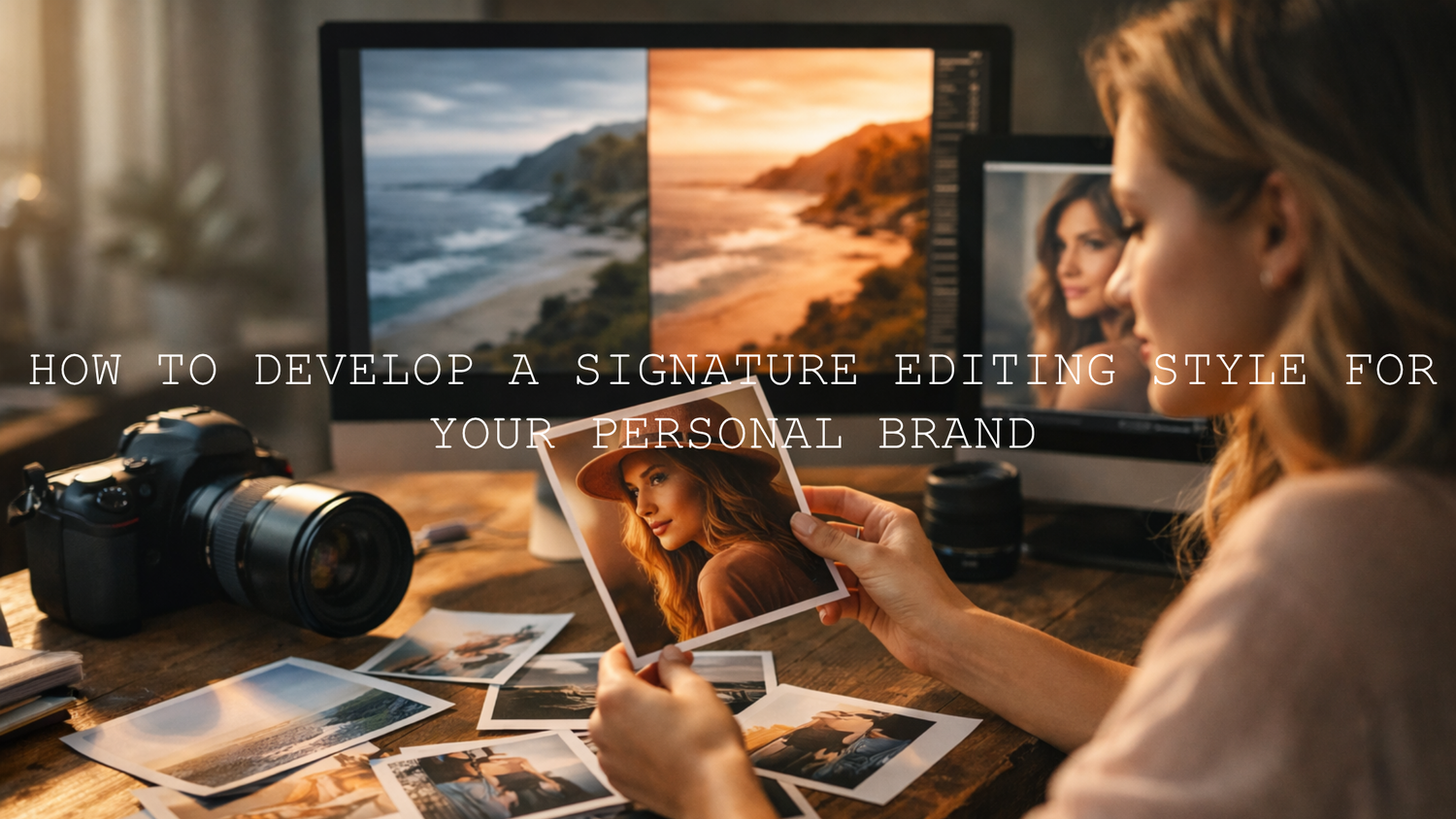
How to Develop a Signature Editing Style for Your Personal Brand
A signature editing style for personal brands is more than a trendy filter. It is the repeatable visual system behind your content: your color temperature, contrast, skin tone handling, blacks, highlights, saturation, and overall mood. Strong personal brand photo editing makes your posts, reels, thumbnails, and website visuals feel connected. When people can recognize your content before they read your name, your editing is already doing brand-building work.
That is why this matters so much in a crowded creator economy. A clean, consistent visual identity helps you look more professional, more intentional, and easier to remember. It also saves time. Instead of guessing your look every time, you edit from a clear visual direction. If you want a faster starting point, try the 1000+ Master Lightroom Presets Bundle, explore Stunning Instagram Presets for Content Creators, and pair your still-image workflow with a video base like Clean Minimal LUTs for Video Editing. It is a practical way to build consistency faster, and you can still shape the final look around your own personality with Buy 3, Get 9 FREE.
Why a Signature Editing Style Matters for Personal Brands
Think about the creators you remember most. Their visuals usually feel familiar even when the subject changes. One day they post a mirror selfie, the next day a desk setup, then a talking-head reel, then a travel moment, but it still looks like it belongs to the same brand. That is not an accident. It is consistency built on purpose.
- It improves brand recognition: your audience starts to recognize your work instantly.
- It builds trust: consistency makes your brand feel polished and dependable.
- It attracts the right audience: your style communicates mood before your caption does.
- It speeds up editing: once your look is defined, editing becomes more efficient.
- It strengthens storytelling: color and tone can communicate emotion before a single word is read.
I have found that most personal brands do not need heavier editing. They need more disciplined editing. When I test different looks across a week of creator content, the strongest results usually come from protecting skin tone, controlling whites, and keeping contrast consistent rather than making every frame darker or more dramatic.
Start With Brand Identity Before You Touch the Sliders
Before choosing a preset or LUT, define the feeling you want your brand to create. Your editing style should support your message, not fight it.
- Luxury and authority: deeper blacks, cleaner highlights, controlled saturation.
- Warm and personal: soft contrast, warm whites, friendly skin tones.
- Modern and minimal: neutral balance, uncluttered color, crisp whites.
- Creative and cinematic: stronger mood, richer shadows, more stylized color separation.
- Outdoor and adventurous: natural greens, clean blues, balanced warmth.
Here is a simple way to decide your direction: describe your brand in three visual words. For example, “clean, premium, calm” or “warm, bold, energetic.” Those three words should guide your editing decisions more than social media trends.
For color planning, Adobe’s color wheel and harmony tool is useful for understanding whether your brand palette leans complementary, analogous, muted, or high-contrast. That matters because your color grading should support your brand palette, not randomly compete with it.
The Five Elements That Usually Define a Signature Look
Most recognizable editing styles are built on the same core decisions. The creator may use different cameras, different locations, or different outfits, but these five elements stay surprisingly consistent.
- White balance: Are your images warmer, cooler, or neutral?
- Contrast: Do you prefer soft depth or punchy separation?
- Black point: Are your shadows faded, rich, lifted, or clean?
- Color intensity: Are your tones muted, vibrant, pastel, or cinematic?
- Skin tone priority: Do you always protect natural skin, or do you stylize more aggressively?
If you lock these five decisions first, your content will start to look consistent even before you fine-tune advanced details.
Presets vs Manual Editing vs LUTs
One of the biggest mistakes creators make is treating presets, manual editing, and LUTs like competing methods. In reality, the best workflow usually combines them.
Presets
Presets are ideal for speeding up photo editing. They help you create repeatable results and reduce decision fatigue. They are especially useful when you need a consistent look across portraits, lifestyle shots, product photos, and content batches.
Manual Editing
Manual editing gives you precision. It is where you refine exposure, clean up skin tone, control highlights, and make each image feel finished rather than automated. Adobe’s guide to white balance and tonal adjustments in Camera Raw is a strong reference if you want to improve this part of your workflow.
LUTs
LUTs are especially powerful for video. They create a fast color base across reels, talking-head content, behind-the-scenes clips, and brand films. But like presets, they work best when you adjust after applying them instead of assuming one click should solve everything.
Presets and LUTs create consistency fast. Manual editing is what makes that consistency look intentional.
A Simple Step-by-Step Workflow to Build Your Signature Editing Style
- Create a mood board: save 20 to 30 images or videos that match your ideal brand feeling.
- Look for patterns: identify repeated color temperature, contrast level, and mood.
- Choose one starting family of looks: warm cinematic, bright soft, minimal clean, nature-rich, or creamy editorial.
- Edit 10 to 15 pieces of your own content in that direction: do not judge from one image alone.
- Refine your repeatable settings: note your preferred exposure range, temperature, tint, blacks, and vibrance.
- Test on different devices: check phone, desktop, and social preview before locking your final style.
- Save your workflow: turn your final adjustments into a preset stack, written checklist, or LUT-based template.
I also recommend testing your edit on both bright and low-light content before calling it your signature style. A look that feels premium on one studio clip can fall apart on a casual phone video if the blacks get muddy or skin tones shift too yellow.
Five Aesthetic Directions You Can Test for a Personal Brand
1. Warm, immersive, and cinematic
If your personal brand needs depth, nostalgia, or storytelling weight, the Brown Warm Cinematic LUTs Pack Video Editing is a strong fit. This direction works well for creators who want their content to feel grounded, emotional, and premium rather than bright and casual. It is especially useful for talking-head videos, moody lifestyle reels, café content, fashion, and storytelling-based personal brands.

Use this style when you want rich midtones, earthy warmth, and stronger emotional presence. Keep an eye on skin tones so they stay believable rather than overly orange.
2. Bright, soft, and polished
If your content lives in beauty, lifestyle, creator tutorials, indoor portraits, or travel, the Cinematic Bright Soft Film LUTS Pack for Video Editing can help create an airy, polished, audience-friendly feel. This type of signature style usually performs well for personal brands that want to feel open, approachable, and modern.

It is a good choice when your audience expects softness, clarity, and flattering highlights. Pair it with careful white balance correction so whites stay fresh rather than washed out.
3. Natural and outdoor-focused
For creators building a personal brand around travel, adventure, fitness, nature, or outdoor storytelling, the Cinematic Nature LUTs Pack for Video Editing is a logical direction. It helps preserve the beauty of greens, blues, and earth tones while still adding polish.

This style works best when your brand identity needs to feel alive, grounded, and real. Avoid over-saturating nature content, because too much intensity makes outdoor visuals feel less premium.
4. Clean, modern, and minimal
Some personal brands do not need mood-heavy color. They need clarity. The Clean Minimal LUTs for Video Editing are ideal for creators, consultants, educators, founders, and professionals who want their visuals to feel refined without looking over-edited.

This is one of the safest and smartest directions for long-term brand building because it ages well. Clean edits usually survive trend changes better than highly stylized looks.
5. Creamy, soft, and elegant
If your brand leans into understated luxury, fashion, beauty, or premium lifestyle visuals, the Creamy Minimalist Cinematic LUTs Pack For Video Editing can help you create softness without losing structure. It brings a smooth, elevated feel that works well for polished personal branding.

This direction is useful when you want a premium result that still feels approachable. It works especially well for portrait-driven brands, subtle luxury aesthetics, and soft editorial content.
How to Make One Look Work Across Photos and Video
A common personal brand problem is this: your photos look one way, but your reels look like a different person made them. The fix is not to force identical settings. The fix is to match your visual principles across formats.
- Match white balance philosophy: warm photos should not be paired with cold video unless that contrast is intentional.
- Keep contrast behavior similar: if your photos have soft shadows, your videos should not have crushed blacks.
- Protect skin tones in both formats: this is what usually makes the brand feel coherent.
- Use the same color mood family: clean, warm, moody, airy, or cinematic.
- Check social output: export settings can shift how saturation and contrast appear on mobile apps.
For photo-specific refinement, Adobe’s Lightroom masking guide is worth using when you need to brighten a face, soften a background, or recover detail without affecting the whole image. That is often the difference between a generic preset result and a polished personal-brand finish.
Common Mistakes That Break Brand Consistency
- Changing your look every week: experimentation is useful, but constant switching weakens recognition.
- Applying one click and stopping: presets and LUTs need adjustment based on lighting and camera differences.
- Ignoring skin tones: viewers forgive many things, but unnatural skin is distracting.
- Over-editing blacks: muddy shadows make content feel cheaper, not more cinematic.
- Letting trends control your style: your brand should feel distinctive, not copied from the current trend cycle.
If you want a useful companion read, check common mistakes creators make when using LUTs. It is especially relevant if your content looks inconsistent from clip to clip even when you are using the same pack.
Pro Tips for Locking In a Style That Actually Lasts
- Build a small editing rulebook: write down your preferred temperature range, contrast level, shadow depth, and saturation style.
- Use one base look per content category: one for outdoor, one for indoor, one for reels is often enough.
- Keep a reference gallery: compare every new edit against 6 to 12 of your best-performing visuals.
- Edit for your audience, not just your taste: a signature style should still be readable and attractive on mobile.
- Revisit quarterly, not daily: small refinements are smart; full visual reinventions are usually not.
If you are still shaping your direction, this guide on matching LUTs for brand identity and this article on AI-optimized presets in Lightroom Mobile are both useful next reads. For a wider view of evolving styles, you can also browse trending Lightroom preset directions.
Related Reading
- How to match LUTs for stronger brand consistency
- Common LUT mistakes and how to fix them
- AI-optimized presets for faster consistent edits
- Popular editing directions creators are using
If you want your brand visuals to feel more memorable without spending hours rebuilding every image from scratch, start with a repeatable system. Use the Clean Minimal LUTs for Video Editing for a modern base, add mood with the Brown Warm Cinematic LUTs Pack Video Editing, and browse Lightroom Presets for Lightroom Mobile & Desktop to keep your photo edits aligned with your video style. If you prefer a more creator-focused library, Stunning Instagram Presets for Content Creators is also a strong place to explore your next look. If you need help choosing a workflow or understanding support options, visit the FAQ or learn more on the About Us page.
FAQ
How long does it take to develop a signature editing style?
Usually longer than one editing session. Most creators find clarity after testing the same visual direction across multiple shoots, lighting conditions, and platforms.
Should I use the exact same preset or LUT on every piece of content?
No. Use the same visual direction, but adjust exposure, white balance, contrast, and skin tones for each file so the result stays consistent and believable.
Can personal brands use both presets and LUTs together?
Yes. Many of the best personal brands use presets for photos and LUTs for video while keeping the same overall color mood, contrast style, and skin tone approach.
What is the fastest way to make my content look more consistent?
Choose one base look, write down your key editing rules, and compare every new edit against your strongest existing visuals before posting.
What matters more: trendy colors or recognizable consistency?
Recognizable consistency. Trends can bring short-term attention, but a repeatable visual identity is what makes a personal brand memorable over time.
Written by Asanka — creator of AAAPresets (10,000+ customers).
Leave a comment
This site is protected by hCaptcha and the hCaptcha Privacy Policy and Terms of Service apply.