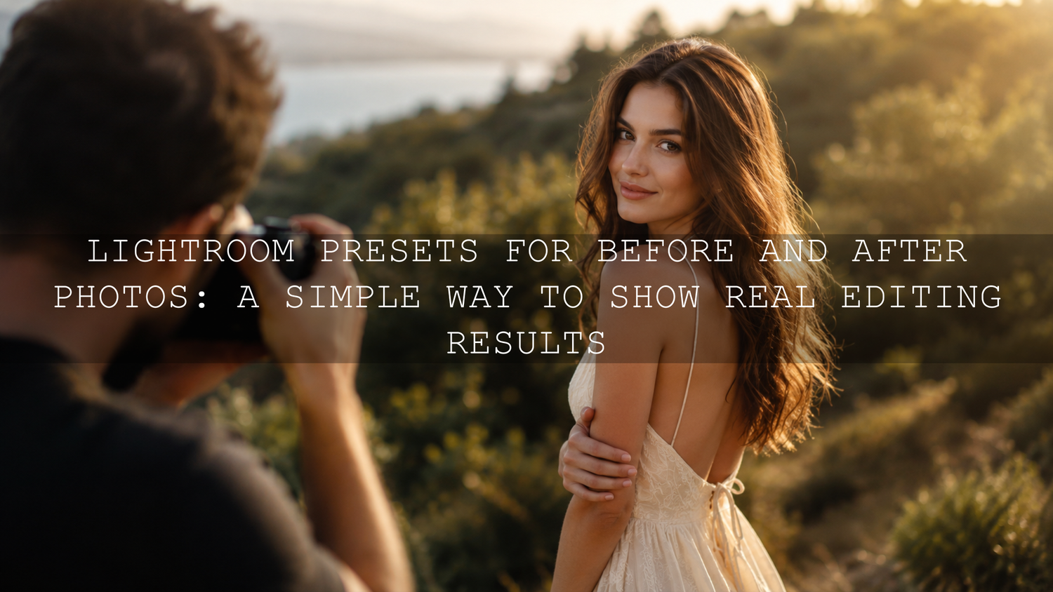
Lightroom Presets for Before and After Photos: A Simple Way to Show Real Editing Results
Lightroom presets for before and after photos are one of the easiest ways to show how much a good edit can transform an image. In 2026, creators, photographers, small business owners, and social media editors need visuals that explain value quickly. A strong before-and-after comparison does exactly that: it shows the original photo, the improved edit, and the creative style behind the result.
Here’s why this matters. People do not always understand editing settings, tone curves, color grading, masking, or white balance. But they understand visual change. When you place a soft, flat original photo next to a clean cinematic edit, the difference feels instant. That is why before-and-after photo editing is powerful for Instagram carousels, product pages, portfolios, blogs, Pinterest pins, and client previews.
If you want a faster starting point, explore the 1000+ Master Lightroom Presets Bundle and browse more styles from the Lightroom Presets for Mobile & Desktop collection. Try these presets today — Buy 3, Get 9 FREE — and build cleaner before-and-after edits without starting from zero every time.
What Are Photo Editing Presets?
A preset is a saved set of photo editing adjustments. Think of it like a repeatable recipe for a specific look. Instead of changing exposure, contrast, highlights, shadows, color temperature, saturation, HSL, tone curve, sharpening, grain, and effects manually every time, you can apply a saved preset and then fine-tune the image.
Adobe explains presets as a way to save adjustments and apply them across photos, while still allowing you to customize the final result. You can learn more from Adobe’s guide to Lightroom presets and Adobe’s tutorial on creating custom Lightroom presets.
For before-and-after edits, presets are useful because they make the transformation easier to understand. Your “before” image shows the original camera result. Your “after” image shows your editing direction: warmer skin, brighter exposure, deeper shadows, cleaner greens, softer highlights, stronger contrast, or a more cinematic color grade.
Why Presets Work So Well for Before-and-After Photo Editing
Before-and-after content works because it is visual proof. It shows the viewer what changed, how strong the edit is, and what kind of style they can expect. Presets make this process faster, cleaner, and more consistent.
- Consistency: Applying the same preset across a shoot helps your edits feel connected instead of random.
- Speed: A preset gives you a polished starting point in seconds, especially when editing large batches.
- Professional style: A well-built preset can improve tone, color, contrast, and mood without overcomplicating the workflow.
- Better storytelling: Before-and-after comparisons help clients, followers, and customers see the value of your editing choices.
- Learning value: When you inspect preset settings, you can understand how exposure, curves, HSL, and color grading work together.
I have tested presets on wedding, travel, portrait, and product-style images, and the best results usually happen when the preset does 70% of the work and the final 30% is manual refinement. That small final adjustment is what makes the edit feel natural instead of forced.
Presets vs Manual Editing: Which Is Better?
Let’s break it down. Presets and manual editing are not enemies. They work best together.
Presets are best for speed and consistency
Presets are ideal when you want a repeatable look. For example, if you are editing 40 wedding photos from the same outdoor ceremony, a preset helps keep the highlights, skin tones, greens, and shadows consistent across the full gallery. This is also helpful for Instagram carousel posts because each image feels like part of the same visual story.
Manual editing is best for precision
Manual editing gives you full control over each photo. This matters when one image is too dark, another has a strong yellow cast, and another has bright highlights in the sky. Even after applying a preset, you should still check exposure, white balance, crop, masking, and skin tone.
The best workflow uses both
Apply the preset first, then fine-tune. A preset gives you the style. Manual adjustments make it fit the actual photo. This approach is especially useful for before-and-after photo editing because the transformation stays clear, but the final image still feels realistic.
For a deeper workflow foundation, read how to build a Lightroom editing workflow with presets and how to organize RAW photos before applying presets.
How to Create Strong Before-and-After Edits With Presets
The goal is not just to make the “after” photo look dramatic. The goal is to make the edit look better, believable, and visually connected to the original image. Here is a simple step-by-step workflow.
Step 1: Choose the right original photo
Start with a photo that has enough detail to improve. A slightly flat photo is perfect because the before-and-after result will clearly show the value of the edit. Avoid using images that are too blurry, extremely underexposed, or badly cropped because even the best preset cannot fully fix a weak starting point.
Step 2: Apply a preset that matches the scene
Use a preset style that fits the subject. For portraits, choose a preset that protects skin tones. For travel photos, choose a preset that improves atmosphere and color depth. For flowers, gardens, and outdoor images, a softer green or warm cinematic style can work beautifully.
For bright, clean edits, try AI-Optimized Cinematic Bright Lightroom Presets. For warm vintage looks, explore AI-Optimized Warm Dust Vintage Lightroom Presets. For darker edits with stronger contrast, check AI-Optimized Moody Black Lightroom Presets.
Step 3: Adjust exposure first
Exposure is the first setting I check after applying any preset. If the image is too bright, the edit can look washed out. If it is too dark, the details can disappear. A small exposure correction often makes the preset look more professional immediately.
Step 4: Fix white balance
White balance controls the warmth or coolness of the image. If a preset looks too orange, reduce the temperature slightly. If it looks too blue or cold, warm it up carefully. This matters a lot for portraits, weddings, product images, and indoor lifestyle photos.
Step 5: Protect skin tones
Skin tone is one of the easiest ways to judge whether an edit feels professional. If the orange or red tones become too strong, reduce saturation slightly in the color mixer. If the skin looks too dull, gently adjust luminance instead of pushing saturation too hard.
Step 6: Use masking for local improvements
Global edits affect the full photo, but masking lets you adjust specific areas like the subject, background, sky, or face. Adobe’s editing tools make selective adjustments easier, and you can explore Adobe Lightroom’s photo editing features to understand how local adjustments support a cleaner final image.
Step 7: Compare before and after before exporting
Before exporting, compare the original and edited version. Ask yourself: Does the edit improve the photo? Does the color feel natural? Is the subject clearer? Are the highlights controlled? Is the style strong but not overdone?
In Lightroom Mobile, Adobe notes that you can press and hold on the image to view the original before releasing to return to the edited version. This is a quick way to check whether your preset actually improved the image. You can learn more from Adobe’s Lightroom Mobile presets workflow.
How to Present Before-and-After Photos for Social Media
A strong edit can lose impact if the presentation is messy. Your before-and-after layout should be simple, clear, and easy to understand at a glance.
Use a clean side-by-side layout
Place the original photo on the left and the edited version on the right. Keep both images the same size. This makes the transformation easy to compare.
Use carousel posts for stronger engagement
For Instagram, TikTok photo mode, Pinterest, and Facebook, carousel posts work well because you can show the final result first, then reveal the before-and-after comparison in later slides. This gives the viewer a reason to keep swiping.
Avoid too much text on the image
Simple labels like “Before” and “After” are enough. Too much text can distract from the edit. Let the photo transformation speak first.
Keep the crop consistent
If the before image is cropped differently from the after image, the comparison feels unfair. Use the same crop, same angle, and same export size whenever possible.
Real Example: Turning a Flat Outdoor Portrait Into a Cinematic Edit
Imagine a soft outdoor portrait taken during late afternoon. The original photo has good light, but the colors feel flat. The greens look slightly dull, the subject needs more separation from the background, and the overall image does not yet feel polished.
Here is a simple preset-based workflow:
- Apply a warm cinematic Lightroom preset to create the main color direction.
- Reduce highlights slightly to protect bright areas on the face and background.
- Lift shadows just enough to keep detail in the hair and clothing.
- Adjust orange luminance to keep skin natural and clean.
- Lower green saturation slightly if the background feels distracting.
- Add a soft mask on the subject to improve brightness and focus.
- Compare the before and after to make sure the edit feels improved, not artificial.
This is where presets shine. The preset gives the image a strong creative base, while the final manual touches make it feel custom. For more lighting-specific guidance, read how to adapt Lightroom Mobile presets to different lighting.
Pro Tips for Better Before-and-After Preset Results
- Do not judge the preset too early: Apply the preset, then adjust exposure and white balance before deciding whether it works.
- Use RAW files when possible: RAW photos usually give more flexibility for recovering highlights, shadows, and color detail.
- Keep skin tones realistic: A beautiful color grade should not make faces look too orange, red, grey, or green.
- Control greens carefully: Outdoor edits often fail because the greens become too neon or too dark.
- Export both images equally: Your before and after should use the same crop, size, and quality settings for a fair comparison.
One customer-style result we often see is simple but powerful: a normal travel photo becomes more cinematic after the preset adds warmer highlights, deeper contrast, and richer blues. The edit does not need to look extreme. It just needs to make the viewer feel the scene more clearly.
Common Mistakes to Avoid When Using Presets
Presets can save time, but they still need good judgment. Here are the most common mistakes that make before-and-after edits look less professional.
Using one preset for every photo
One preset will not work perfectly on every image. A sunset preset may look beautiful on golden hour photos but too warm on indoor portraits. Choose the preset based on the lighting, subject, and mood.
Ignoring exposure differences
If your original photo is much darker or brighter than the image used to create the preset, the result may look off. Exposure correction should always come early in the workflow.
Over-saturating colors
Strong color can be attractive, but oversaturation can make a photo look cheap. Use vibrance and HSL adjustments carefully, especially with skin, grass, skies, and product colors.
Forgetting the purpose of the edit
A wedding edit should feel emotional and timeless. A street edit can feel moody and bold. A product edit should keep colors accurate. Always match the preset style to the purpose of the image.
If you often struggle with presets in harsh light, this guide on building stable Lightroom base presets for difficult lighting will help you understand why some edits break and how to fix them.
Best Types of Photos for Before-and-After Preset Content
Before-and-after content works across many niches, but some subjects show the transformation more clearly than others.
- Portraits: Great for showing skin tone, light correction, and mood.
- Weddings: Perfect for soft highlights, emotional tones, and consistent galleries.
- Travel: Useful for showing color depth, atmosphere, and cinematic style.
- Street photography: Strong for contrast, shadows, film tones, and urban mood.
- Drone and landscape photos: Ideal for skies, greens, water, and depth.
- Product photos: Helpful for showing clean color, clarity, and brand polish.
If you edit mostly on your phone, browse the Lightroom Mobile Presets collection. If you want to compare app-based editing with desktop editing, read Lightroom Mobile vs Desktop for photo editing workflows.
Related Reading
- Build a Lightroom editing workflow with presets in 2026
- Organize RAW photos before applying presets
- Master Lightroom Mobile presets in different lighting
- Create stable Lightroom base presets for difficult light
- AI-optimized presets in Lightroom Mobile
Final Thoughts on Lightroom Presets for Before-and-After Photos
Lightroom presets for before-and-after photos are not just a shortcut. They are a practical way to build a repeatable editing style, save time, and show your audience the real value of photo editing. The strongest results come from using presets as a creative base, then refining exposure, white balance, color, and masking for each image.
To create better before-and-after edits, start with a strong original photo, apply a preset that matches the scene, adjust the key settings, and present the result in a clean comparison layout. Over time, this helps you build a recognizable style and a stronger visual brand.
Explore the 1000+ Master Lightroom Presets Bundle, try style-focused packs like AI-Optimized Cinematic Bright Lightroom Presets, and browse the full Lightroom Presets for Mobile & Desktop collection to find looks that match your photography. Buy 3, Get 9 FREE and start creating cleaner, faster, more polished before-and-after edits today.
FAQ
Are Lightroom presets good for before-and-after photos?
Yes. Lightroom presets are great for before-and-after photos because they create a clear visual transformation while keeping your editing style consistent across multiple images.
Do I still need manual editing after applying a preset?
Yes. A preset gives you the main look, but small manual adjustments to exposure, white balance, skin tones, and masking usually make the final edit look more natural and professional.
What is the best way to show a before-and-after edit?
The best method is a clean side-by-side layout using the same crop, size, and export settings. This makes the editing difference easy to understand and fair to compare.
Can I use Lightroom presets on mobile and desktop?
Yes. Many Lightroom preset packs include formats for both Lightroom Mobile and Lightroom Desktop, such as DNG for mobile and XMP for desktop workflows.
Why does a preset look different on each photo?
Presets react to the original photo’s lighting, exposure, color temperature, camera profile, and subject. That is why small adjustments are important after applying the preset.
Written by Asanka — creator of AAAPresets (10,000+ customers).


Leave a comment
This site is protected by hCaptcha and the hCaptcha Privacy Policy and Terms of Service apply.