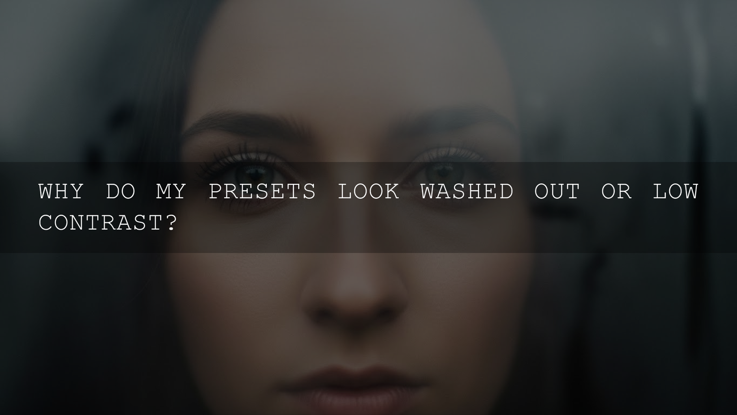
Why Your Lightroom Presets Look Washed Out in 2026 (and How to Fix It Fast)
If your Lightroom presets look washed out the second you click them, you’re not alone. A preset is supposed to make your photo feel crisp, clean, and finished — but instead you get faded contrast, gray-ish blacks, and colors that look sun-bleached.
The good news: most of the time, it’s not a “bad preset.” It’s a mismatch between your starting photo (exposure/white balance/profile) and what the preset expects. Once you fix that mismatch, your presets start working reliably in minutes on both Lightroom Desktop and Mobile.
If you want a consistent starting point built for lots of lighting situations, check the 1000+ Master Lightroom Presets Bundle and browse the Lightroom Presets for Lightroom Mobile & Desktop collection — especially if you’re building a go-to toolkit. And yes, you can Buy 3, Get 9 FREE when you add 12 items to your cart.
The Real Reasons Presets Turn Photos Flat and Faded
When a preset looks “milky,” it’s usually one (or more) of these:
- White balance is off (your “neutral” isn’t neutral, so everything drifts dull or muddy).
- Exposure isn’t in the preset’s sweet spot (too bright, too dark, or missing midtone detail).
- Low-contrast lighting (fog, overcast, haze, open shade, mixed indoor lighting).
- JPEG limitations + in-camera processing (less highlight/shadow headroom; easier to break colors).
- Preset mismatch (golden-hour preset on tungsten indoor shots = instant weirdness).
- Color management / HDR viewing differences (screen brightness, profiles, and HDR/SDR viewing can make exports look different than Lightroom).
Once you identify which bucket you’re in, the fix becomes simple — and repeatable.
The 5-Minute Fix Checklist (Do This Before You Blame the Preset)
This is the fastest way to rescue a faded look without turning your photo into a crunchy, overcooked mess.
Step 1: Correct white balance first (always)
Washed-out results often start with slightly wrong color — then the preset amplifies it. In Lightroom, use the White Balance Selector (eyedropper) on a neutral area (white shirt, gray wall, paper). If you want Adobe’s official walkthrough, see Adobe’s guide to adjusting photo lighting and color in Lightroom.
Quick cue: If skin looks gray/green or orange/muddy, fix WB before you touch contrast.
Step 2: Set your “true” black and white points
Most “washed out preset” problems are really two issues: blacks lifted too high (gray shadows) and highlights pushed too far (flat whites with lost detail). Use Blacks/Whites (or Curves) to anchor the image:
- Lower Blacks slightly until shadows feel grounded (don’t crush texture).
- Lower Highlights if bright areas look foggy or blown.
- Raise Whites only if the photo still lacks sparkle after highlights are controlled.
If you want a clean order of operations, reference Adobe’s tone control adjustment guide for Lightroom Classic.
Step 3: Add contrast the “clean” way (Curves > Contrast slider)
The Contrast slider can help, but Curves usually look more natural. Add a gentle S-curve:
- Pull down shadows slightly (left side)
- Lift highlights slightly (right side)
- Keep the midtones smooth — avoid a jagged curve
Pro tip: Matte presets (lifted blacks) are the #1 reason people feel an edit is washed out. If the preset is intentionally matte, reduce that lifted-black effect first.
Step 4: Use Vibrance before Saturation
If colors feel dull, Vibrance is safer than Saturation — especially for skin tones. Add a little Vibrance, then fine-tune a couple of colors in HSL/Color Mix (don’t “nuke” everything globally).
Step 5: Control preset strength (the cheat code)
Most people apply presets at 100% and then fight the result. Don’t. Reduce the preset intensity and the “washed-out” feeling often disappears instantly. In Lightroom, use the preset Amount slider (when available) — see Adobe’s guide to presets (including the Amount slider).
Real-World Examples: How Washed-Out Presets Happen (and the Exact Fix)
Example 1: Outdoor portrait in open shade
What happens: Open shade is soft and low-contrast. A preset designed for golden hour adds lifted blacks + warm highlights, and suddenly the whole frame looks hazy.
Fix: Lower Blacks, add a subtle S-curve, reduce preset Amount to ~60–80%, then add a touch of Dehaze (+2 to +8) if the air looks milky.
Example 2: Bright midday street photo
What happens: Midday sun clips highlights and flattens color. Presets that brighten shadows can make everything look gray.
Fix: Pull Highlights down first, then reduce Shadows slightly (yes, reduce), and re-add contrast with Curves. If the preset lifts blacks a lot, bring Blacks down until your subject separates from the background.
If you shoot street and want styles that hold up across different lighting, start with a broad toolkit like the 1000+ Master Lightroom Presets Bundle, then save your favorite “go-to” look as a custom preset.
Example 3: Indoor mixed lighting (window + warm bulbs)
What happens: Auto WB can swing wildly. A preset that assumes “clean daylight” makes warm areas muddy and cool areas gray.
Fix: Correct WB (Temp/Tint) first, then use Color Mix/HSL to tame orange/yellow. Keep Saturation low and use Vibrance instead.
Presets vs Manual Editing: When One-Click Wins (and When It Fails)
Presets are best when:
- You have consistent lighting across a shoot (weddings, sessions, travel series).
- You want a repeatable base look and you’re happy to fine-tune.
- You shoot RAW and have room to recover tones cleanly.
Manual editing wins when:
- The photo has extreme dynamic range (harsh sun, backlight, stage lighting).
- Mixed lighting creates different color casts in different areas.
- You need accurate product color (e-commerce, real estate, brand consistency).
The sweet spot is simple: use presets for direction and speed, then manually correct WB/exposure/black point for the specific image. When you do those basics first, presets stop looking “random” and start looking intentional.
RAW vs JPEG: Why Your File Type Changes Everything
If you want presets to behave predictably, RAW is your best friend. RAW files hold more highlight/shadow data and let you correct white balance without destroying color. JPEGs can still work, but they’re easier to push into banding, muddy shadows, or blown highlights — especially when a preset stacks multiple strong adjustments.
If you must use JPEG: expose carefully (avoid clipped highlights), set WB intentionally, and reduce preset intensity more often.
Camera Settings That Quietly Cause Washed-Out Edits
Auto white balance (AWB)
AWB is convenient, but inconsistent. If you apply the same preset across a set of photos and half look faded, AWB is often the reason.
Underexposure “to save highlights” (without a plan)
Underexposed files turn gray when shadows get lifted too far. You’ll also pull in noise. Expose well, then recover highlights in editing.
Picture profiles (for JPEG shooters)
Neutral/flat in-camera styles reduce contrast before editing begins. Then a “soft” preset stacks on top and everything goes milky.
Color Profiles and Monitor Brightness: The Invisible Trap
If your edit looks great on your laptop but washed out on your phone, your display brightness (and sometimes color profile) is usually the culprit. Many screens ship overly bright, and HDR/SDR viewing can also shift perceived contrast.
A simple habit that helps: edit at a moderate brightness (not max), then check one export on another device before you export a whole batch.
A Simple Workflow That Makes Presets Look Good on Almost Anything
Use this order every time:
- White balance (eyedropper + Temp/Tint)
- Exposure (overall brightness)
- Highlights/Shadows (recover detail)
- Whites/Blacks (set clean endpoints)
- Apply preset (then reduce Amount if needed)
- Curves (gentle S-curve for punch)
- Color (Vibrance first, then HSL if necessary)
- Detail (Texture/Clarity lightly; don’t overdo)
If you’re building a fast system for both mobile and desktop edits, start with the AI-Optimized Lightroom Presets collection — pick 3–5 favorites and learn exactly how they behave in different lighting.
Related Reading
- How to install Lightroom presets in a quick and easy way
- How to import XMP files into Lightroom on iPhone and Android
- 10 common photo editing mistakes (and how to fix them using presets)
- Top fall Lightroom presets (and how to avoid washed-out autumn colors)
- Why underwater photos look dull (and how presets can fix them)
Common “Washed-Out Preset” Fixes (Quick Troubleshooting)
- If blacks look gray: lower Blacks, reduce matte/raised black point, add a gentle S-curve.
- If everything looks hazy: reduce preset Amount, lower Highlights, add a touch of Dehaze.
- If skin looks lifeless: fix white balance first, then use Vibrance (not heavy Saturation).
- If colors feel wrong in different areas: mixed lighting — correct WB, then HSL/Color Mix.
- If it only looks washed out after export: check display brightness and color-managed viewing differences across devices.
If you want presets that are easy to dial in for portraits and social content, try the AI-Optimized Film Portrait Cinematic Lightroom Presets Pack or a clean social look like Dark Moody Aesthetic Instagram Feed Lightroom Presets. And if you’re building your library, you can Buy 3, Get 9 FREE when you add 12 items to your cart.
Why do my Lightroom presets look washed out?
It’s usually a mismatch between your photo’s exposure/white balance and what the preset was designed for. Fix white balance first, set clean Blacks/Whites, then reduce preset intensity and add a gentle S-curve for contrast.
Should I edit exposure before or after applying a preset?
For consistent results, set a basic exposure and white balance first, then apply the preset and fine-tune. If the preset is strong, reduce the Amount/Intensity so your adjustments stay natural.
How do I add contrast without making the photo look harsh?
Use Curves for a subtle S-curve instead of cranking the Contrast slider. Then adjust Blacks slightly and use Texture/Clarity lightly to avoid a crunchy look.
Do presets work better on RAW files?
Yes — RAW gives you more room to recover highlights, lift shadows, and correct white balance without artifacts. JPEG can still work, but you’ll often need lower preset intensity and gentler adjustments.
Why does my edit look fine in Lightroom but washed out after export?
This often comes from display brightness/calibration differences or viewing the export in a different color-managed environment (sometimes HDR/SDR differences too). Check your exported file on another device before finalizing a whole batch.
Written by Asanka — creator of AAAPresets (10,000+ customers).
Leave a comment
This site is protected by hCaptcha and the hCaptcha Privacy Policy and Terms of Service apply.