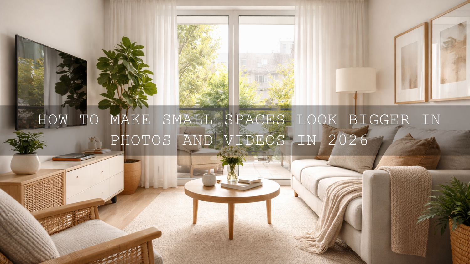
How to Make Small Spaces Look Bigger in Photos and Videos in 2026
Learning how to make small spaces look bigger in photos is one of the most valuable skills in real estate photo editing, interior design photo editing, and Airbnb content creation. A compact room can feel bright, calm, and premium in a finished image, or it can feel tight, dark, and slightly uncomfortable. The difference usually comes down to perspective, light, color, and restraint in the edit. In 2026, the goal is not to fake size. It is to present the room in a way that feels open, clean, believable, and inviting.
If you want a faster starting point, try the AI-Optimized Interior Design & Real Estate Lightroom Presets and browse Lightroom Presets for Lightroom Mobile & Desktop. That combination gives you a clean base for brighter interiors, controlled highlights, and consistent color across a full property set, and it fits naturally with our Buy 3, Get 9 FREE offer.
Here’s why this matters. When people look at a room photo, they judge the space in seconds. They notice whether the walls feel straight, whether the windows look blown out, whether the room feels yellow or muddy, and whether the corners disappear into shadow. Even a beautiful home can feel smaller than it really is if the edit is too dark, too warm, too flat, or too aggressive. A good edit helps the eye move through the room naturally.
I have tested this kind of workflow on compact bedrooms, narrow hallways, and small living rooms where the original frame looked tighter than the space felt in person. The biggest improvements almost always came from simple decisions: correct the geometry first, neutralize color casts, open shadows carefully, and avoid pushing contrast too hard. That is usually what makes a room feel larger without making it look fake.

Start with straight lines and believable proportions
Before you touch the creative look, fix the structure of the frame. Small-space photography falls apart fast when vertical lines lean backward or when the room feels stretched. In Lightroom, the Geometry tools are often the quickest way to correct that. Adobe’s official guide to using the Geometry tool in Lightroom is worth bookmarking because straight walls and balanced perspective instantly make interiors feel calmer and more professional.
This is especially important for bathrooms, kitchens, apartments, condos, offices, and staged real estate listings. A slightly crooked frame makes the room feel unstable. A corrected frame makes it feel intentional. That one change alone can make a small room read as more spacious.
If you want to go deeper into this type of workflow, read Presets for Real Estate Photography: Bright, Clean & Professional. It pairs nicely with this topic because the same principles apply: straight lines, cleaner light, and controlled color are what sell the space.
Brightness creates space, but only when it feels natural
The most common mistake in small room photography editing is assuming that “bigger” always means “brighter.” Brightness helps, but only when the photo still has shape. If you raise exposure too much, the room loses depth. White walls go flat, window light becomes harsh, and textures in wood, fabric, tile, and stone start to disappear.
A better approach is to open the room in layers. First, set a balanced overall exposure. Next, protect your highlights so windows, lamps, and glossy surfaces do not clip. Then lift shadows gently in the darker corners. In many rooms, this gives you the airy feeling people want without erasing contrast completely.
When I edit interior images, I usually think in terms of “visual breathing room.” The room does not need to be bright everywhere. It just needs enough clean light in the right places that the viewer can read the layout comfortably. Corners should not feel blocked. Floors should separate from walls. Furniture should not melt into the shadows.
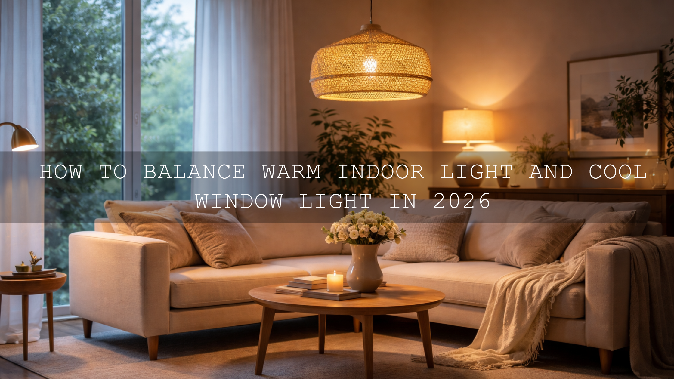
If mixed lighting is making the room look patchy, this mixed indoor and window light guide is especially helpful. Small spaces often have daylight from one side and warm bulbs from the other, and that is exactly where many edits start to fall apart.
Color temperature can make a room feel larger or smaller
Color is not just style. It changes how spacious a room feels. Heavy yellow or orange casts can make a room feel closed-in, especially on white walls and ceilings. On the other hand, edits that are too cool can feel lifeless and sterile. The sweet spot is usually neutral-to-gently-warm, with enough clarity that whites look clean and materials look honest.
Adobe’s Color Wheel and harmony tools are useful here because they remind you that a room feels best when the palette is controlled. You do not need every color in the frame to be loud. Often, a cleaner edit with restrained saturation makes the room feel more premium and more open.
A good rule is this: correct color first, stylize second. If the base white balance is wrong, every preset or LUT will exaggerate the problem. That is why indoor photos often look “off” even when the preset itself is not bad. If you have struggled with muddy or strange-looking indoor edits, read Why Do My Presets Look So Bad Indoors? It explains the issue clearly and helps you fix it faster.
Use masking to guide the eye through the room
Masking is one of the best tools for making a compact space feel open without overediting the whole frame. Instead of lifting the entire image, brighten only the areas that help the layout read more clearly. That might mean opening the back corner of a bedroom, softening a shadow near a sofa, or lowering the brightness of a distracting window pull so the viewer stays inside the room.
Adobe’s official guide to masking in Lightroom Classic is excellent if you want more control. Small edits with masks often do more for room perception than big global slider moves. This is where your edit starts feeling professional instead of preset-only.
One example: on a compact Airbnb kitchen, I once had a file where the overhead bulbs made the cabinets go yellow and the far counter disappeared into shadow. A quick geometry correction helped, but the real difference came from two masks: one to cool and brighten the back counter, and one to pull down a hot reflection on the fridge. The room immediately felt cleaner, more balanced, and wider.
Presets vs manual editing for small spaces
Let’s break it down honestly. This is not really an either-or choice.
- Presets are best for speed and consistency. They give you a repeatable starting point across a full property shoot, listing gallery, or design portfolio.
- Manual editing is best for correction. It helps you solve room-specific issues like mixed lighting, tilted walls, hot windows, and dark corners.
- The strongest workflow uses both. Apply a clean preset first, then fine-tune exposure, white balance, geometry, and masking.
That is why a real estate workflow usually feels faster and better when you begin with a purpose-built preset rather than a random creative look. For a moody, modern finish with strong structure and depth, the Black Tone Lightroom Presets can work beautifully on selected architectural images, especially when you want richer contrast and more graphic lines. Just use them carefully on small spaces so you do not let shadows close the room down too much.
If you are curious about how mood changes perception in architecture and property images, this article on how color grading shapes perception in real estate and architecture is a smart follow-up read.

A step-by-step workflow for making a small room look bigger
- Correct perspective first. Straighten verticals and remove any obvious distortion.
- Set clean white balance. Neutralize heavy yellow, green, or magenta casts before styling.
- Balance exposure. Keep windows controlled, open shadows gently, and preserve texture.
- Apply a room-appropriate preset. Use a bright, clean interior look as your base.
- Refine with masks. Lift dark corners, recover detail near windows, and even out distracting light patches.
- Adjust clarity and texture carefully. Enough to define surfaces, not so much that the room feels harsh.
- Keep saturation tasteful. Over-coloring décor, wood, plants, or textiles can make the space feel busy.
- Match the full set. Consistent edits across all room photos help the whole property feel more premium.
This workflow works well for agents, hosts, designers, builders, renovators, and photographers who need polished results without spending forever on each frame.
What about a cinematic look?
Not every small-space image needs to be bright and airy. Sometimes a subtle cinematic finish can make the room feel more intentional and high-end, especially for hospitality, boutique rentals, luxury apartments, or design portfolios. The key is subtlety. You want mood, not murkiness.
The Cinematic Film Look Lightroom Presets are a strong option when you want more atmosphere while still keeping highlights controlled and materials readable. They work best when the room already has good shape and the purpose of the image is story, style, or emotion rather than pure listing accuracy.
For video walkthroughs, the same principle applies. A good grade should make the space feel polished, not artificially dramatic. The Real Estate LUTs Pack is especially useful for property tours, Airbnb promos, and architecture reels because it helps unify brightness, color balance, and contrast quickly. If you want more video grading options, you can also browse Cinematic LUTs for Premiere Pro, DaVinci Resolve, and Final Cut Pro.
For editors working in Premiere Pro, Adobe’s documentation on Color Management and Lumetri Color is a useful official reference when you want cleaner LUT handling and more predictable color results.

Common mistakes that make small spaces look even smaller
- Over-darkening the frame. Moody does not have to mean closed-in.
- Leaving walls crooked. Bad geometry makes the room feel unstable and cramped.
- Pushing clarity too hard. Too much micro-contrast can make interiors feel rough and cluttered.
- Ignoring mixed lighting. Blue window light and orange lamp light can shrink a room visually when left unchecked.
- Over-saturating décor colors. Strong colors compete for attention and reduce the feeling of openness.
- Using the same preset on every lighting situation. A preset should help, not replace judgment.
Related reading
- Presets for Real Estate Photography: Bright, Clean & Professional
- Real Estate & Architecture: How Color Grading Shapes Perception
- Master Presets for Mixed Indoor & Window Lighting
- Why Indoor Presets Go Wrong and How to Fix Them
- How to Install Lightroom Presets in a Quick and Easy Way
If your goal is to make compact rooms feel brighter, cleaner, and more premium without spending too long on every file, start with the AI-Optimized Interior Design & Real Estate Lightroom Presets, then build out your workflow with Lightroom Presets for Lightroom Mobile & Desktop. If you also create walkthroughs or short-form property videos, pair your photo workflow with the Real Estate LUTs Pack. And if you need help with setup, the FAQ page is a useful place to start.
What is the best edit to make a small room look bigger?
The best edit usually combines straight vertical lines, balanced exposure, controlled highlights, cleaner white balance, and subtle shadow lifting. A room feels bigger when viewers can read the layout clearly without blown windows or muddy corners.
Are presets enough for small-space photography?
Presets are a strong starting point, but the best results usually come from combining a preset with manual adjustments. Geometry correction, masking, and white balance refinement are often what make the final image feel natural and professional.
Should real estate photos always be bright and airy?
Not always. Bright and airy works well for many listings, but some spaces benefit from a slightly richer or more cinematic finish. The important thing is that the room still feels believable, open, and true to the property.
Can the same workflow work for Airbnb and interior design photos?
Yes, with small adjustments. Airbnb photos usually need to feel welcoming and practical, while interior design images may allow more mood and styling. The base workflow of geometry, exposure, color correction, and local masking still applies to both.
Do LUTs help make small spaces look better in video?
Yes. A good LUT can unify brightness, contrast, and color in walkthrough footage, making the space feel cleaner and more polished. Just like presets, LUTs work best when the clip is already exposure-balanced and white balance is close.
Written by Asanka — creator of AAAPresets (10,000+ customers).
Leave a comment
This site is protected by hCaptcha and the hCaptcha Privacy Policy and Terms of Service apply.