
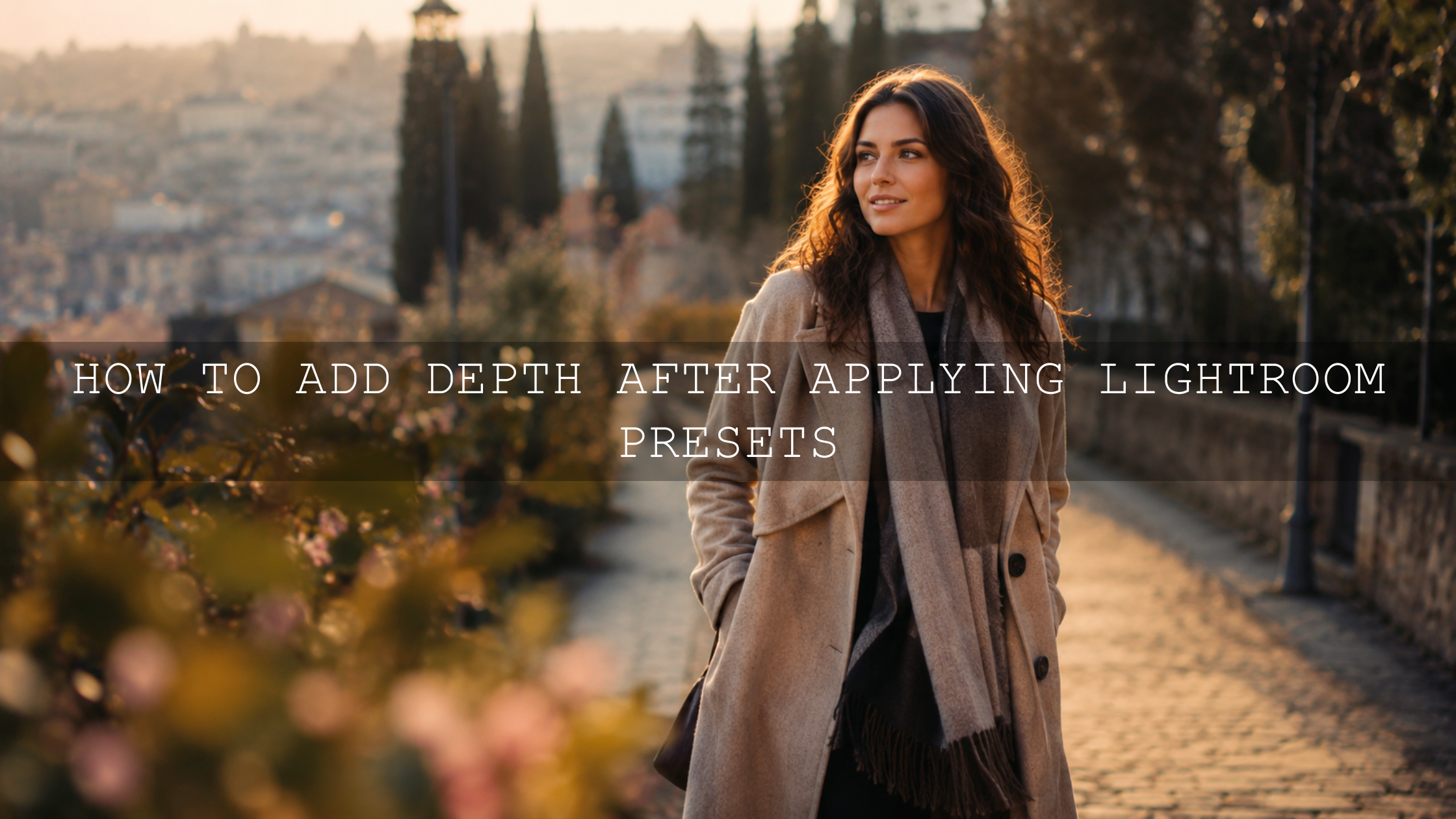
Fix Flat Photos With Contrast and Clarity in Lightroom
Learning how to fix flat photos with contrast and clarity is one of the fastest ways to make your Lightroom edits look sharper, deeper, and more professional. A flat photo is not always a bad photo. Often, the composition is strong, the subject is interesting, and the moment is real, but the image needs better light separation, midtone detail, and controlled texture.
Here’s why this matters. Contrast shapes the relationship between bright and dark areas, while clarity adds local depth around edges and midtones. When you use both carefully, dull images can start to feel more cinematic, dimensional, and alive without looking over-edited.
For a faster starting point, try the 1000+ Master Lightroom Presets Bundle and browse more flexible looks in the Lightroom Presets for Mobile and Desktop collection. Try these presets today — Buy 3, Get 9 FREE — then use the workflow below to refine contrast, clarity, tone, and texture for a cleaner final edit.
What Contrast and Clarity Actually Do
Contrast and clarity are often used together, but they are not the same thing. Understanding the difference helps you avoid one of the biggest editing mistakes: pushing every slider harder because the photo feels weak.
Contrast controls light and shadow separation
Contrast changes the difference between the lighter and darker areas of a photo. When contrast is low, the image can feel soft, gray, and flat. When contrast is too high, highlights can look harsh and shadows can lose detail. Adobe explains contrast as the difference in brightness between light and dark areas, which is why it has such a strong effect on dimension and image punch. You can learn more from Adobe’s Lightroom contrast explanation.
In simple terms, contrast gives your photo structure. It helps the viewer understand where the light is coming from, where the subject begins, and where the background falls away.
Clarity controls midtone detail and edge definition
Clarity is more local. It affects edge contrast and midtone detail instead of simply making the whole image brighter or darker. Adobe describes clarity as a way to change contrast around the edges of objects, and in Lightroom masking tools, clarity can add depth by increasing local contrast. For deeper technical guidance, see Adobe’s guide to Lightroom effects adjustments and Adobe’s guide to masking and local adjustments in Lightroom.
Think of clarity as the detail sculptor. It can make rocks, clothing, buildings, clouds, hair, and landscape textures feel more defined. But on skin, too much clarity can exaggerate pores, lines, and small imperfections, so it needs a lighter touch.
Why Photos Look Flat After Shooting or Applying Presets
A photo can look flat for many reasons. Sometimes the lighting was soft and even. Sometimes the camera protected the highlights and made the whole image look slightly underpowered. Sometimes a preset creates a beautiful color style but still needs small adjustments to fit the exact photo.
Common reasons include:
- Overcast or low-contrast light: Cloudy light is soft and flattering, but it can reduce natural separation between subject and background.
- Underexposure: A slightly dark photo may protect highlight detail, but it can make shadows muddy.
- Weak black and white points: If there is no true dark or bright area, the image may feel gray.
- Too much shadow recovery: Lifting shadows too far can remove depth and create a washed-out look.
- Preset mismatch: A preset made for golden-hour portraits may not instantly fit a cloudy street photo or indoor image.
This is why presets should be used as a strong creative starting point, not the final step. If you want a deeper workflow, read why presets look flat and how to add depth and pop.
Presets vs Manual Editing: Which Is Better for Flat Photos?
Presets and manual editing are not enemies. The best results usually come from using both together.
Presets are excellent for speed, consistency, color direction, and creative mood. They help you start with a finished-looking style instead of building every edit from zero. This is useful when editing wedding galleries, travel photos, product shots, portraits, drone photos, and social media content.
Manual editing is where you make the preset fit the photo. This is where you adjust exposure, contrast, highlights, shadows, whites, blacks, clarity, texture, masks, and sharpening based on the image in front of you.
I tested this approach on a soft outdoor portrait where the preset gave the image a nice warm tone, but the subject still blended into the background. A small contrast boost, a slight reduction in highlights, a subject mask with gentle exposure, and very low clarity on the clothing made the portrait look much more polished while keeping the skin natural.
That is the real workflow: preset first, correction second, final polish last. For a repeatable editing system, read how to build a Lightroom editing workflow with presets.
Step-by-Step Workflow to Fix Flat Photos With Contrast and Clarity
Step 1: Correct exposure before adding contrast
Before touching contrast, check the overall exposure. If the image is too dark, adding contrast can crush the shadows. If it is too bright, adding contrast can make highlights look harsh. Start by making the photo feel balanced.
- Increase exposure slightly if the whole image feels dull.
- Lower highlights if the sky, face, or white clothing is too bright.
- Lift shadows only enough to reveal useful detail.
- Do not make every shadow bright; some darkness is needed for depth.
Pro tip: If a photo feels flat after you lift shadows, lower the Blacks slider slightly or add a subtle tone curve. This brings back depth without making the full image too dark.
Step 2: Add contrast slowly
Now increase contrast carefully. You are not trying to make the photo dramatic immediately. You are trying to create better separation between the subject, background, highlights, and shadows.
For most flat photos, a small contrast increase is enough. If the image still feels weak, use the Tone Curve instead of pushing the Contrast slider too far. A gentle S-curve can lift upper midtones and deepen lower midtones, which creates a more natural 3D feeling.
Before: A cloudy travel image may look gray, with soft skies, weak buildings, and no clear subject separation.
After: A moderate contrast boost, controlled highlights, and deeper blacks can make the same image feel cleaner, stronger, and more intentional.
For more help with this part of the workflow, read how to use exposure, contrast, and whites to make presets work better.
Step 3: Use clarity for texture, not for everything
Clarity is powerful, but it should be applied with purpose. A landscape can often handle more clarity than a close-up portrait. A street scene may benefit from clarity on buildings and pavement, while a wedding portrait may need clarity mostly on hair, clothing, flowers, or background details.
Use clarity to enhance:
- Mountain edges and landscape texture
- Cloud shape and sky drama
- Clothing, fabric, jewelry, and accessories
- Architecture, streets, walls, and wooden details
- Food texture, product details, and lifestyle scenes
Be careful with clarity on:
- Skin
- Noisy low-light photos
- Smooth skies
- Soft newborn, beauty, or wedding portraits
- Images that already have heavy sharpening
If you want a preset style that keeps contrast softer and more flattering, explore AI-Optimized Soft Cinematic Contrast Beauty Lightroom Presets. This type of look is useful when you want polished contrast without making skin or highlights feel too harsh.
Step 4: Use masking instead of global over-editing
One of the easiest ways to make a flat photo look professional is to stop editing the whole image the same way. Flat photos often need targeted separation. That means the subject may need brightness, the background may need darker tones, and texture may need to appear only in selected areas.
Try this simple masking workflow:
- Create a subject mask and lift exposure slightly.
- Add a small amount of contrast to the subject if needed.
- Add clarity only to clothing, hair, or details, not the full face.
- Create a background mask and reduce exposure slightly for separation.
- Use a linear gradient to darken the top or bottom edge if the frame needs focus.
This keeps the image natural while guiding the viewer’s eye. For portraits, this is especially important because global clarity can make skin look rough. For more portrait-specific guidance, read realistic Lightroom portrait retouching tips.
How Much Contrast and Clarity Should You Use?
There is no perfect number because every photo starts differently. A RAW file from a soft cloudy day may need more contrast. A JPEG from a phone may already have contrast and sharpening baked in. A low-light image may fall apart quickly if you push clarity too much.
Use this simple guide:
- Portraits: Low to moderate contrast, very low global clarity, selective clarity on eyes, hair, and clothing.
- Landscapes: Moderate contrast, moderate clarity, careful highlight control in skies.
- Street photos: Moderate to strong contrast, selective clarity on buildings, roads, and clothing.
- Food photos: Controlled contrast, selective clarity on texture, avoid making shadows too heavy.
- Wedding photos: Soft contrast, protected highlights, gentle clarity away from skin.
I often test a preset by pushing contrast and clarity slightly too far, then pulling them back until the photo looks believable again. That helps reveal the limit of the image. The goal is not maximum punch. The goal is clean depth.
Common Mistakes That Make Flat Photos Worse
Using saturation instead of contrast
If your photo looks flat, do not immediately push Saturation. Saturation makes colors stronger, but it does not always create depth. In fact, a flat image with high saturation can look fake quickly. Fix exposure, contrast, whites, blacks, and clarity first. Then adjust color.
Adding too much clarity to skin
This is one of the most common beginner mistakes. Clarity can make portraits look gritty and unflattering when applied globally. Use masks and keep skin smooth but realistic.
Crushing shadows too much
Deep shadows can make a photo cinematic, but fully black areas with no detail can look heavy. Watch the darkest parts of the frame and keep important details visible.
Ignoring the histogram
The histogram helps you see whether highlights or shadows are being clipped. You do not need to edit only by numbers, but the histogram is useful when your eyes get used to the image after staring at it too long.
Applying a preset and stopping there
A preset gives direction, but your final edit needs adjustment. The same preset reacts differently on bright sunlight, cloudy portraits, indoor scenes, drone photos, and night images. Read why Lightroom presets look different on every photo to understand this better.
Best AAAPresets Options for Stronger Contrast and Depth
If your goal is to build more depth without starting every edit from zero, choose presets that match your subject and lighting. A portrait preset should protect skin. A landscape preset should enhance texture and atmosphere. A cinematic preset should shape tone without destroying detail.
Start with the 1000+ Master Lightroom Presets Bundle if you want a wide range of looks for portraits, travel, lifestyle, landscape, weddings, and everyday edits. For more modern preset styles, browse the AI-Optimized Lightroom Presets collection.
For warm outdoor edits where contrast and natural color matter, you can also try AI-Optimized Cinematic Golden Garden Lightroom Presets. For beauty, portraits, and soft contrast edits, the Soft Cinematic Contrast Beauty presets are a better match.
Related Reading
- Why presets look flat and how to add depth and pop
- How to use exposure, contrast, and whites with presets
- How to edit flat photos into professional images
- How to edit water scenes with motion, clarity, and texture
Final Editing Checklist for Flat Photos
Before exporting, use this quick checklist:
- Is the exposure balanced before adding contrast?
- Do the highlights still have detail?
- Are the shadows deep but not blocked?
- Did clarity improve useful texture without damaging skin?
- Does the subject stand out from the background?
- Does the image still look natural at 100% zoom?
- Does the preset style match the lighting and subject?
When you are ready to speed up your workflow, start with the 1000+ Master Lightroom Presets Bundle and continue exploring professional looks in the Lightroom Presets for Mobile and Desktop collection. Try these presets today — Buy 3, Get 9 FREE — and use contrast, clarity, masking, and tone control to shape every image into a stronger final edit.
FAQs
What is the best way to fix flat photos in Lightroom?
Start with exposure, then adjust contrast, highlights, shadows, whites, and blacks. After the tonal base feels balanced, add clarity carefully to improve midtone detail and texture.
Should I use contrast or clarity first?
Use contrast first for overall light and shadow separation. Then use clarity to enhance selected texture and edge detail. This order usually creates a cleaner, more natural edit.
Can too much clarity ruin a photo?
Yes. Too much clarity can create halos, exaggerate noise, and make skin look rough. Use it gently, especially on portraits, and apply it selectively with masks when possible.
Do Lightroom presets fix flat photos automatically?
Presets can give your image a strong creative starting point, but flat photos usually still need small adjustments to exposure, contrast, clarity, tone curve, and masking.
Why does my photo still look flat after increasing contrast?
The image may need better black and white points, a subtle tone curve, local subject masking, or controlled clarity. Sometimes lifting shadows too much can also make the photo look flat again.
Written by Asanka — creator of AAAPresets (10,000+ customers).

Leave a comment
This site is protected by hCaptcha and the hCaptcha Privacy Policy and Terms of Service apply.