How to Edit Flat Photos Into Clean Professional Images in 2026
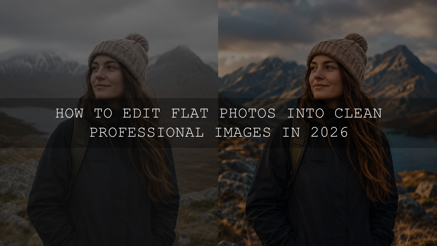
Learning how to edit flat photos is one of the fastest ways to make your images look cleaner, sharper, and more professional in 2026. A flat photo is not always a bad photo. Often, it has good composition, a strong subject, or a real moment, but the light, contrast, color, and depth have not been shaped yet. With the right Lightroom editing workflow, you can turn dull photos into polished edits that feel cinematic, natural, and ready to share.
Here’s why this matters: cameras and smartphones capture the scene, but they do not always capture the feeling. A cloudy travel photo may look gray instead of atmospheric. A portrait may look soft and lifeless instead of warm and professional. A street photo may have a great subject but still feel unfinished because the blacks, highlights, and color balance are not controlled.
For a faster starting point, begin with the 1000+ Master Lightroom Presets Bundle and explore more flexible editing styles in the Lightroom Presets for Mobile and Desktop collection. Try these presets today - Buy 3, Get 9 FREE.
What Makes a Photo Look Flat?
A flat photo usually lacks separation between shadows, midtones, and highlights. Everything feels close together tonally, so the subject does not stand out. The image may be technically clear, but it does not have enough contrast, color direction, or visual energy.
Common signs of a flat photo include weak blacks, washed-out highlights, gray-looking midtones, dull colors, low subject separation, and lighting that feels too even. This often happens on cloudy days, indoor scenes, midday photos, phone photos, and RAW files that are designed to look neutral before editing.
Flatness can also come from incorrect white balance. A photo may look too yellow, too blue, too green, or too magenta. Even a small color cast can make skin tones, skies, food, streets, and interiors feel less professional.
Start With a Simple Lightroom Editing Workflow
The best way to fix flat photos is to work in a clean order. Do not jump straight to saturation, sharpening, or heavy filters. Build the image from the foundation first: crop, exposure, contrast, color, local adjustments, and final polish.
Adobe’s own Lightroom editing controls include key tools like Exposure, Contrast, Highlights, Shadows, Whites, Blacks, Saturation, and Vibrance, which are the foundation of most clean photo edits. You can review these controls in Adobe’s guide to editing photos in Lightroom.
When I test presets on flat outdoor portraits, I usually fix exposure and white balance before judging the final style. The same preset can look beautiful on a balanced image and too heavy on a dark or color-shifted image. That is why the workflow matters as much as the preset.
Step 1: Improve the Composition Before Editing Color
Before touching color or contrast, check the crop. A flat photo often feels weaker because the subject is not clearly framed. Remove distracting edges, straighten tilted lines, and make sure the viewer knows where to look first.
- Crop for purpose: Use a tighter crop for portraits, a wider crop for landscapes, and a vertical crop for Reels, Shorts, or Pinterest-style images.
- Straighten horizons: A slightly tilted photo can look less polished even after strong editing.
- Use negative space: Clean empty areas can make the subject feel more premium and intentional.
Pro tip: crop before heavy editing because composition affects how you judge brightness, contrast, and subject focus.
Step 2: Fix Exposure, Highlights, and Shadows
Exposure is the first major correction when you edit flat photos. Start with the overall brightness, then recover highlights and shadows. If the image is too dark, raise Exposure slightly. If the sky or bright clothing is too strong, lower Highlights. If dark areas hide too much detail, raise Shadows carefully.
Do not push Shadows too far. It can make the image look noisy, gray, and even flatter. A better approach is to balance Exposure first, then use Shadows only for detail recovery. If your presets often make images too dark, this guide on recovering detail when presets make photos too dark is a helpful next read.
After exposure feels balanced, adjust Whites and Blacks. Whites add clean brightness to the strongest light areas. Blacks add depth to the darkest tones. This is where many flat photos finally begin to pop.
Step 3: Use Contrast Without Destroying Detail
Contrast gives a photo shape. It separates bright areas from dark areas and helps the subject feel more three-dimensional. But too much contrast can crush shadows, damage skin tones, and make the edit look harsh.
A clean professional edit usually uses moderate contrast with careful black and white point control. For example, on a cloudy street photo, you may increase Contrast slightly, lower Blacks a little, and lift Shadows just enough to keep detail. This gives the image depth without making it look over-processed.
For a stronger cinematic look, try the Cinematic Film Look Lightroom Presets or the Urban Cinematic Lightroom Presets Pack, then fine-tune exposure and blacks for your exact photo.
Step 4: Correct White Balance for Natural Color
White balance controls the emotional temperature of your image. Warm photos feel golden, cozy, and nostalgic. Cool photos feel clean, modern, or dramatic. But when white balance is wrong, the whole edit feels off.
For portraits, protect skin tones first. If the face looks too orange, reduce warmth or adjust orange tones in HSL. If the photo looks too blue, gently warm it up. If whites look green or magenta, adjust Tint until they feel neutral.
Here’s a simple test: look at something in the photo that should be neutral, such as a white shirt, gray wall, silver object, or cloudy sky. If that neutral area has a strong color cast, fix it before adding creative color grading.
Step 5: Add Vibrance Before Saturation
Flat photos often need richer color, but saturation is easy to overuse. Saturation boosts all colors equally, including colors that are already strong. Vibrance is usually safer because it gives muted colors more life while keeping already intense areas more controlled.
For clean photo editing, start with a small Vibrance increase. Then adjust individual colors using HSL if needed. For example, you can make skies deeper by adjusting blue luminance, improve grass by reducing yellow-green intensity, or make skin tones cleaner by controlling orange saturation.
For more help with preset behavior across different lighting and colors, read why Lightroom presets look different on every photo and how to fix it.
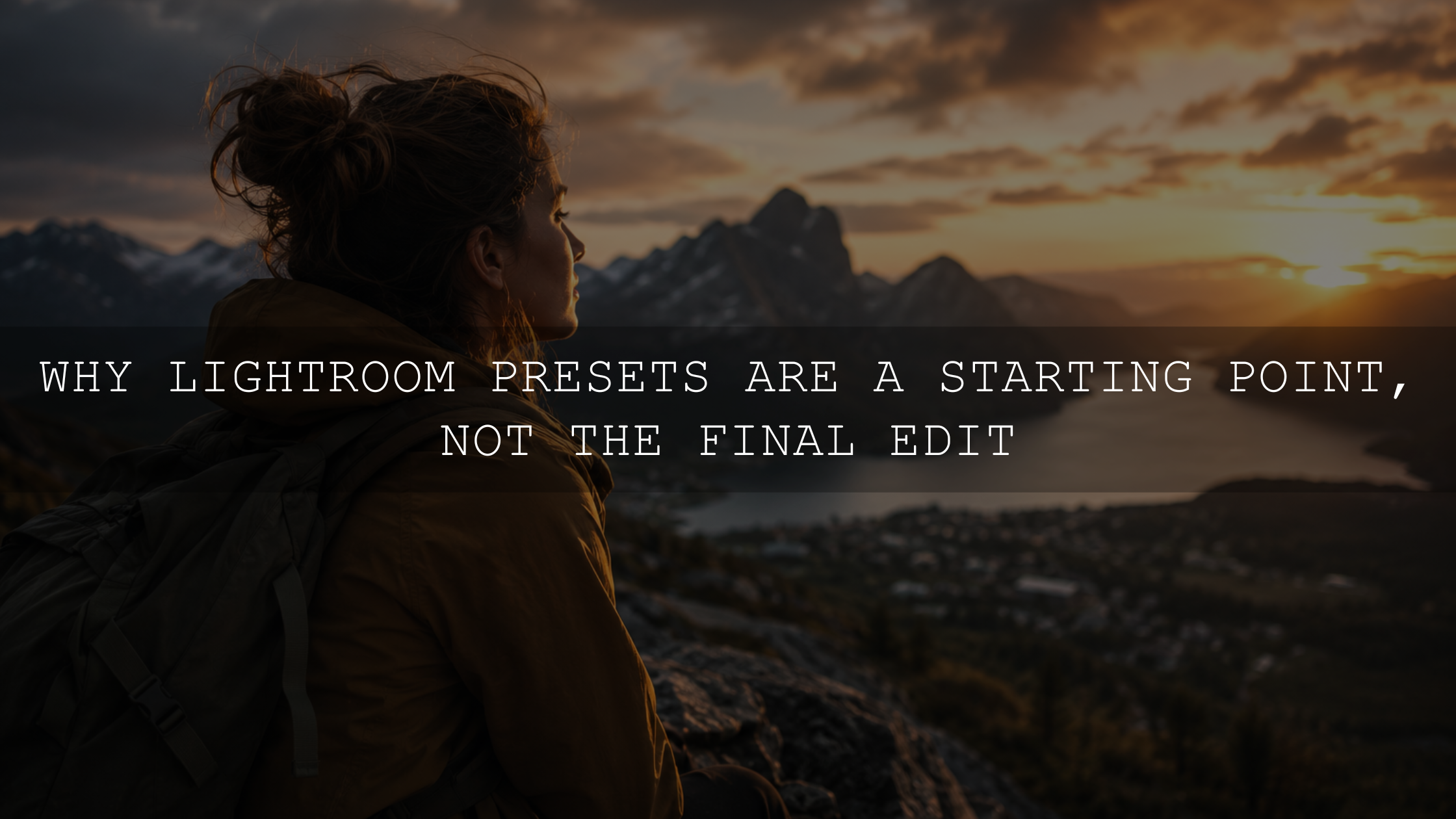
Presets vs Manual Editing: Which Is Better?
Presets and manual editing are not enemies. The best workflow uses both. A Lightroom preset gives you a creative direction quickly. Manual editing helps you refine that direction so the final photo fits the actual light, subject, and mood.
- Use presets for speed: They help you apply a consistent look across portraits, travel photos, weddings, products, and social media content.
- Use manual edits for accuracy: Exposure, white balance, skin tones, and local adjustments should be customized for each image.
- Use both for consistency: Apply a preset, then make small corrections so every photo feels polished but not copied.
Adobe explains that Lightroom presets are predefined settings that can apply adjustments such as exposure, contrast, saturation, and color grading. You can learn more from Adobe’s official guide to Lightroom presets.
If you want a broad creative base for many photo types, the 1000+ Master Lightroom Presets Bundle is a strong choice because you can test different looks quickly, then refine the final edit manually.
Step 6: Use Local Adjustments to Guide the Eye
Global edits affect the whole image, but professional edits often need local control. This is where masking becomes powerful. You can brighten a subject, darken a distracting background, recover a sky, soften harsh highlights, or add subtle depth to specific areas.
For example, if a portrait looks flat, add a soft mask over the face and lift Exposure slightly. Then darken the background a little so the subject stands out. If a landscape looks dull, use a sky mask to recover highlights and deepen the blue tone without affecting the ground.
Lightroom includes masking tools for selective edits, and Adobe explains options such as Select Subject, Select Sky, Select Background, and local adjustment sliders in Adobe’s guide to masking in Lightroom.
I tested this approach on a dull wedding guest photo where the background was brighter than the subject. A soft subject mask, small exposure lift, and controlled background darkening made the image feel cleaner without changing the natural moment.
Step 7: Sharpen Carefully and Reduce Noise Gently
Sharpening should make details clearer, not rough. Flat photos from phones or high ISO cameras may need a little sharpening, but too much creates crunchy edges and skin texture problems.
Use sharpening mainly for important detail areas like eyes, hair, clothing texture, buildings, leaves, or product edges. Avoid heavy sharpening on skies, skin, and smooth backgrounds. Noise reduction is also useful, but too much can make the image look plastic.
Pro tip: zoom in to check detail, then zoom out to judge the full image. A photo that looks sharp at 200% may look unnatural at normal viewing size.
Step 8: Create a Clean Final Polish
Once the main edit is complete, add subtle final polish. This can include a soft vignette, small color grading changes, or a final contrast check. The goal is not to make the edit louder. The goal is to make the image feel finished.
A slight vignette can help pull attention toward the subject. A small warmth adjustment can make lifestyle photos feel more inviting. A cooler shadow tone can add cinematic depth. But every final touch should support the story of the image.
If you prefer deeper edits, browse the Lightroom Presets for Moody Photography collection. For portraits, the AI Optimized Portrait Lightroom Presets can help create a polished starting point while keeping skin-focused edits easier to refine.
Common Over-Editing Mistakes to Avoid
The fastest way to ruin a good photo is to push every slider too far. A professional edit should feel intentional, not forced. When a photo looks fake, the viewer notices the edit before they notice the subject.
- Too much saturation: Colors become unrealistic and distracting.
- Too much clarity: Skin, skies, and smooth areas can look rough.
- Too much noise reduction: Details can become soft and plastic-looking.
- Too much contrast: Shadows lose detail and highlights become harsh.
- Wrong white balance: Skin tones and neutral colors feel unnatural.
A useful habit is to compare before and after. If the edited version has more mood, better color, cleaner light, and stronger focus while still feeling believable, you are on the right track.
A Practical Flat Photo Editing Recipe
- Crop and straighten the image first.
- Set Exposure for the subject, not just the background.
- Recover Highlights and lift Shadows only as needed.
- Set Whites and Blacks for clean contrast.
- Correct white balance before creative color grading.
- Add Vibrance before Saturation.
- Apply a preset for style, then reduce or refine if needed.
- Use masks to brighten the subject or control the background.
- Sharpen important details and reduce noise gently.
- Step away, return with fresh eyes, and make final corrections.
For a real before-and-after example, see how a dull phone photo can be transformed in this flat iPhone photo preset editing breakdown. You can also learn how stable base presets help protect highlights and skin tones in this guide to building safer Lightroom base presets.
Related Reading
- Why Lightroom presets look different on every photo
- How to recover detail when presets make photos too dark
- How a preset transformed a flat iPhone photo
- How to use safe base presets for cleaner edits
- How to edit night sky photos with clean contrast and color
Final Thoughts
Flat photos are not failed photos. They are unfinished photos. With a clean Lightroom editing workflow, you can improve exposure, recover detail, balance color, add contrast, guide the viewer’s eye, and create a professional result without over-editing.
If you want to edit faster while keeping your photos clean and consistent, start with the 1000+ Master Lightroom Presets Bundle, refine each image manually, and browse the Lightroom Presets for Mobile and Desktop collection for more styles. Try these presets today - Buy 3, Get 9 FREE.
If you need help installing or using presets, visit the AAAPresets FAQ and Lightroom preset help page.
FAQs
Why do my photos look flat before editing?
Photos often look flat because they lack contrast, strong black and white points, clean color balance, and subject separation. RAW files can also look naturally neutral before editing because they are designed to give you more flexibility in Lightroom.
What is the fastest way to edit flat photos?
The fastest method is to crop first, fix exposure and white balance, apply a Lightroom preset, then refine contrast, highlights, shadows, and color. A preset gives direction, but manual adjustments make the final image fit the real lighting.
Should I use presets or edit manually?
Use both. Presets are great for speed, consistency, and creative direction. Manual editing is important for exposure, white balance, skin tones, and local corrections. The cleanest results usually come from applying a preset and then fine-tuning it.
How do I avoid over-editing my photos?
Use small adjustments, compare before and after, and protect natural skin tones, highlights, and shadows. Avoid heavy saturation, excessive clarity, too much sharpening, and strong noise reduction unless the image truly needs it.
Can Lightroom presets fix every flat photo?
Presets can improve many flat photos, but they are not magic. A preset works best when the original image has decent focus, usable exposure, and a clear subject. For the best result, combine presets with basic exposure, color, and masking adjustments.
Written by Asanka — creator of AAAPresets (10,000+ customers).

Leave a comment
This site is protected by hCaptcha and the hCaptcha Privacy Policy and Terms of Service apply.