
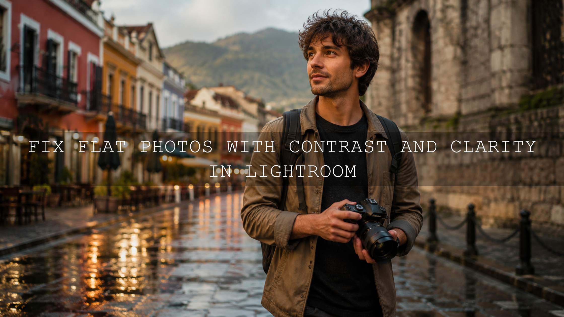
How to Make Colors Pop Without Oversaturation in Lightroom
Learning how to make colors pop without oversaturation is one of the most important skills in modern Lightroom color editing. A vibrant photo should feel alive, polished, and emotional, but it should not look neon, heavy, or fake. The goal is not to push every color harder. The goal is to build contrast, protect skin tones, control individual colors, and guide the viewer’s eye with intention.
Here’s why this matters: two photos can use the same preset, but one may look rich and natural while the other looks too orange, too green, or too intense. When I test presets for AAAPresets, I always check them on portraits, landscapes, food photos, wedding scenes, street images, golden-hour shots, and low-light edits because color reacts differently in every lighting situation.
For a faster starting point, explore the 1000+ Master Lightroom Presets Bundle and browse the Lightroom Presets for Mobile and Desktop collection. Try these presets today — Buy 3, Get 9 FREE — then use the workflow below to refine vibrance, saturation, HSL, tone, and contrast for a natural, high-end finish.
Why Oversaturation Makes Photos Look Unnatural
Oversaturation happens when color intensity is pushed harder than the photo can support. At first, it may look exciting. The sky becomes brighter, greens feel stronger, and warm tones jump forward. But after a few seconds, the problems appear: skin looks orange, grass turns neon, shadows become muddy, and the image loses its premium feel.
The biggest mistake is treating saturation as the main tool for colorful editing. Saturation increases color intensity across the image. That means it can boost the beautiful colors and the problem colors at the same time. If your image already has strong reds, yellows, greens, or blues, a global saturation boost can quickly make everything compete for attention.
A better approach is natural color enhancement in Lightroom. Start with exposure, contrast, white balance, and tone. Then use targeted HSL color adjustments, vibrance, masks, and selective luminance to improve only the areas that need help.
Start With Contrast Before Touching Saturation
Color often looks flat because the photo lacks contrast, not because the color itself is weak. If shadows are too lifted, highlights are dull, and midtones feel muddy, the colors will not stand out even when saturation is increased.
Before adjusting color, check the tonal foundation:
- Exposure: Make sure the image is not too dark or too bright before judging color.
- Contrast: Add enough separation between light and dark areas so colors have space to breathe.
- Highlights: Recover detail in bright skies, dresses, skin, or reflective objects.
- Shadows: Lift shadows only enough to reveal detail, not so much that the image becomes flat.
- Whites and blacks: Use these carefully to create a clean tonal range without clipping.
For example, if you are editing a travel photo with a blue ocean and golden sunlight, try adjusting contrast and whites before adding saturation. The ocean may look richer simply because the highlights are cleaner and the shadows have more depth.
Pro tip: Toggle your edit on and off after every major change. If the photo looks more colorful but less believable, the adjustment is probably too strong.
Vibrance vs Saturation: Which One Should You Use?
The difference between vibrance and saturation is important if you want colors to pop naturally. Saturation pushes all colors more evenly. Vibrance is more controlled because it tends to lift weaker colors while being gentler with colors that are already strong.
That is why vibrance is usually safer for portraits, weddings, lifestyle photos, and travel images with people. Skin tones often sit in red, orange, and yellow ranges. A heavy saturation increase can make faces look too orange or red. Vibrance can improve overall color energy while keeping skin more natural.
Simple Rule for Vibrance and Saturation
- Use Vibrance first when the image looks dull but already has some strong colors.
- Use Saturation in small amounts when the whole image genuinely needs more intensity.
- Use HSL when only one color family needs correction.
- Use Masking when only one area of the photo needs a color boost.
Adobe’s Lightroom editing tools include Color Mixer controls for adjusting Hue, Saturation, and Luminance by color range, which is much more precise than pushing one global saturation slider. You can learn more from Adobe’s Color Mixer controls in Lightroom.
Use HSL Color Adjustments for Natural Color Control
HSL stands for Hue, Saturation, and Luminance. This is where Lightroom color editing becomes more professional. Instead of making every color stronger, you can adjust individual colors based on what the image actually needs.
Hue: Change the Color Direction
Hue controls the tone of a color. For example, greens can move toward yellow or teal. Blues can move toward aqua or deeper navy. Reds can become warmer or more magenta.
Use hue when the color is not wrong in strength, but wrong in feeling. A landscape photo may have grass that looks too artificial. Instead of reducing all saturation, shift the green hue slightly toward yellow for a warmer, more natural outdoor look.
Saturation: Control Color Strength
Saturation controls how intense each color family appears. This is useful when one color is overpowering the entire photo.
For example:
- If skin looks too orange, reduce orange saturation slightly.
- If grass looks neon, reduce green and yellow saturation.
- If the sky looks too electric, reduce blue saturation instead of lowering global saturation.
- If food looks dull, gently increase orange, red, or yellow saturation depending on the dish.
Luminance: Make Colors Pop Without More Saturation
Luminance is one of the best tools for making colors pop without oversaturation. It changes how bright or dark a color appears. Sometimes a color does not need more saturation. It needs better brightness separation.
If a blue sky looks flat, lower blue luminance slightly to make the sky feel deeper. If orange sunlight feels heavy, raise orange luminance slightly to make it glow. If skin looks too dense after a preset, lifting orange luminance can make the face look cleaner without making it less warm.
I tested this approach on a warm portrait preset where the overall style looked beautiful, but the skin became slightly too orange. Instead of removing the preset, I reduced orange saturation a little, lifted orange luminance, and cooled the white balance slightly. The final image kept the warm cinematic mood but looked much more natural.
Presets vs Manual Editing: What Gives Better Color?
Presets and manual editing are not enemies. They serve different purposes. Presets give you speed, consistency, and a creative starting point. Manual editing gives you control, correction, and the final polish.
Presets Are Best For
- Creating a consistent mood across a gallery
- Speeding up editing for weddings, travel, portraits, and social content
- Testing different styles quickly
- Building a professional look without starting from zero
Manual Editing Is Best For
- Fixing exposure differences between photos
- Correcting skin tones after warm or cinematic presets
- Balancing greens, skies, and background colors
- Fine-tuning HSL, masks, and tone curve adjustments
The best workflow is simple: apply a strong preset, then personalize it. If a preset feels too intense, read this guide on how to tame overly powerful Lightroom presets. If your edit changes too much from photo to photo, this guide on why Lightroom presets look different on every photo will help you understand the cause.
Use Color Theory to Make Colors Feel Stronger
Colors pop more when they have contrast against surrounding colors. This is where color theory becomes useful. You do not need to memorize every rule, but a few ideas can improve your editing decisions immediately.
Complementary Colors
Complementary colors sit opposite each other on the color wheel. Blue and orange are the classic example. This is why warm skin tones often look strong against cool blue shadows, skies, or backgrounds.
If you want a cinematic color grading look, try cooling the shadows slightly and keeping the highlights warm. This can create a subtle teal-and-orange feeling without making the photo look fake.
Analogous Colors
Analogous colors sit close together on the color wheel, like yellow, orange, and red. These create harmony. They are great for fall photos, golden-hour portraits, cozy lifestyle images, and warm wedding edits.
For a soft autumn edit, use warm analogous tones but avoid making every yellow and orange too strong. A small amount of contrast and luminance control will make the warm palette feel richer.
Split-Complementary Colors
Split-complementary color schemes give contrast without looking too aggressive. For example, instead of using pure orange against pure blue, you may use warm yellow-orange highlights with blue-green shadows. The result feels modern, polished, and less harsh.
You can explore color relationships using Adobe Color harmony rules and color wheel tools, especially when planning brand visuals, social media palettes, or consistent photography styles.
Step-by-Step Lightroom Workflow for Vibrant Natural Colors
Use this workflow when a photo feels dull and you want stronger color without the oversaturated look.
- Correct exposure first. Adjust exposure until the subject feels clear and balanced.
- Set white balance. Fix any heavy blue, yellow, green, or magenta cast before judging color.
- Add contrast carefully. Use contrast, tone curve, whites, and blacks to create depth.
- Increase vibrance gently. Start small. Often +5 to +15 is enough, depending on the image.
- Use saturation only if needed. Keep global saturation subtle.
- Open HSL or Color Mixer. Adjust individual colors instead of pushing the whole image.
- Use luminance for polish. Brighten or deepen specific colors to create separation.
- Mask the subject or background. Enhance the subject without affecting everything else.
- Check skin tones. Make sure portraits still look natural after color changes.
- Take a break and review. Fresh eyes help you catch overediting quickly.
For targeted edits, Lightroom masking can help you adjust the subject, sky, background, or selected areas separately. Adobe explains these options in Adobe’s guide to masking in Lightroom.
Real Editing Examples: Before and After Color Decisions
Example 1: Landscape Photo With Flat Greens
Before editing, the landscape looks dull. The grass feels gray-green, the sky lacks depth, and the foreground does not separate from the background. A beginner might increase saturation heavily, but that often creates neon greens.
A better fix is to add contrast, lower blue luminance slightly for a deeper sky, reduce green saturation if it becomes too strong, and shift green hue slightly warmer. For landscape starting points, browse professional Lightroom presets for landscape photography.
Example 2: Portrait With Orange Skin
A warm preset gives the image a beautiful golden mood, but the face looks too orange. Instead of removing the preset, reduce orange saturation slightly, lift orange luminance, and adjust white balance. If needed, use a people mask to protect skin while keeping the background warm.
This is especially important when using cinematic presets. A good edit should make the whole scene feel stylish without making the person look unnatural.
Example 3: Food Photo That Needs More Energy
Food photography often needs color that feels fresh and appetizing. But too much saturation can make food look artificial. Start with clean exposure, add a little contrast, then use HSL to strengthen only the important colors. Reds, oranges, and yellows may need a small lift, while greens may need careful control so herbs or vegetables do not look fluorescent.
For creative food and lifestyle edits, the Vibrant Lightroom Presets for Food Photography can give you a strong base before final manual adjustments.
When to Use Masking Instead of Global Color Edits
Global edits affect the entire image. That is useful for broad style, but it can create problems when only one area needs attention. Masking gives you control over specific subjects, skies, backgrounds, clothing, faces, or objects.
Use masking when:
- The subject needs more brightness but the background is already perfect.
- The sky needs deeper blues but skin should stay warm and natural.
- The background is too colorful and competes with the subject.
- A product needs richer color without changing the entire scene.
- A wedding photo needs soft skin tones but vibrant flowers or decor.
For example, if a model is wearing a red dress in a busy street scene, you can slightly darken and desaturate the background while keeping the dress rich. This makes the subject pop without pushing every color in the frame.
Use Clarity, Texture, and Dehaze Carefully
Clarity, texture, and dehaze do not directly work like saturation, but they can make colors feel stronger because they increase local contrast and detail. This can be helpful for landscapes, architecture, food, fabric, and outdoor scenes.
However, these tools can also damage a photo if they are overused. Too much clarity can make skin look rough. Too much dehaze can make shadows heavy and colors harsh. Too much texture can make a soft lifestyle image feel gritty.
Use these tools with intention:
- Texture: Best for fine detail such as fabric, food, leaves, and product surfaces.
- Clarity: Best for midtone punch, but use less on faces.
- Dehaze: Best for skies, mountains, haze, and atmospheric depth.
Pro tip: If your image already has strong color, use contrast and luminance before clarity. This keeps the edit cleaner and more premium.
Color Pop Checklist for Lightroom Edits
Before you export your image, use this quick checklist to avoid oversaturation:
- Does the photo look good at both full size and small thumbnail size?
- Do skin tones still look believable?
- Are greens natural, or do they look neon?
- Is the sky rich without becoming electric blue?
- Does one color dominate the image too much?
- Did you use HSL before pushing global saturation?
- Did you compare before and after?
- Would the edit still look professional tomorrow after your eyes rest?
If you want a colorful but polished style, try the AI-Optimized Vibrant Cinematic Lightroom Presets or the Bright Cinematic Lightroom Presets. For warm seasonal color, the Autumn Fall Vibrant Lightroom Presets are a helpful starting point. Use them as creative bases, then fine-tune HSL, luminance, and masks so every photo feels custom.
Related Reading
- How to make one Lightroom preset work across different camera brands
- How to adapt Lightroom Mobile presets to different lighting
- Selective color adjustment guide for cinematic edits
- Adobe Color vs camera matching profiles for better preset results
Final Thoughts on Making Colors Pop Naturally
Making colors pop without oversaturation is not about one magic slider. It is a complete workflow: correct exposure, build contrast, use vibrance carefully, control colors with HSL, adjust luminance, protect skin tones, and use masks when only one area needs attention.
The strongest edits usually feel simple, not forced. A viewer should notice the emotion of the image before they notice the editing. That is the difference between a colorful photo and a professional photo.
To speed up your workflow, start with the 1000+ Master Lightroom Presets Bundle, then explore more looks in the Lightroom Presets for Mobile and Desktop collection. Try these presets today — Buy 3, Get 9 FREE — and use the color control steps in this guide to create vibrant, clean, natural edits that still feel like your own style.
If you need help with usage, compatibility, or common questions, visit the AAAPresets FAQ and help page.
FAQ
How do I make colors pop without oversaturation in Lightroom?
Start with exposure and contrast, then use vibrance, HSL, luminance, and masking instead of pushing global saturation too far. This gives you stronger color while keeping the image natural.
Is vibrance better than saturation?
Vibrance is usually safer for natural edits because it lifts weaker colors more gently. Saturation affects all colors more broadly, so it can make skin, skies, and greens look unnatural if used too heavily.
Why do my Lightroom presets make colors too strong?
Presets apply saved settings to photos with different lighting, exposure, camera profiles, and color palettes. If the starting photo is already warm, dark, or colorful, the preset can push those colors too far. Adjust white balance, HSL, and intensity after applying the preset.
How can I fix neon greens in Lightroom?
Use the HSL or Color Mixer panel. Reduce green and yellow saturation slightly, adjust green hue toward a more natural tone, and use luminance to control brightness. Avoid reducing global saturation unless the whole image is too intense.
Should I edit color before or after applying presets?
Apply the preset first if you want a fast creative direction, then adjust exposure, white balance, HSL, tone curve, and masks. This keeps the preset style while making the final result fit your specific photo.
Written by Asanka — creator of AAAPresets (10,000+ customers).

Leave a comment
This site is protected by hCaptcha and the hCaptcha Privacy Policy and Terms of Service apply.