How to Compare Lightroom Presets Before Choosing Your Final Look
Learning how to compare Lightroom presets before choosing your final look can save hours of editing time and help you build a cleaner, more consistent photography style in 2026. A preset can create a beautiful starting point, but the best final image usually comes from testing a few looks, checking the before and after, and making small manual adjustments until the edit fits the photo naturally.
Here’s why this matters: preset browsing can quickly turn into “preset purgatory.” You click one look, then another, then another, and suddenly you are no closer to a finished photo. A better workflow is simple: compare your strongest preset options side by side, judge them using clear editing criteria, and then refine the winner with exposure, white balance, HSL, masking, tone curve, and preset strength.
For a flexible starting point, try the 1000+ Master Lightroom Presets Bundle and browse more creative styles in the Lightroom Presets for Lightroom Mobile & Desktop collection. Try these presets today — Buy 3, Get 9 FREE — then use the comparison workflow below to choose the best look with more confidence.
Why One-Click Editing Is Only the Starting Point
The idea of a one-click preset is attractive because it feels fast and easy. You apply a preset, the photo changes instantly, and you hope the image is finished. Sometimes that works. But most of the time, a preset should be treated as a creative foundation, not the final decision.
Every photo begins with different light, camera settings, white balance, subject color, skin tone, shadows, highlights, and mood. A preset that looks perfect on a golden hour portrait may look too orange indoors. A dark cinematic preset may look beautiful on street photography but too heavy on a wedding portrait. A bright airy preset may look clean on lifestyle photos but too washed out on a dramatic landscape.
That is why comparing Lightroom presets matters. Instead of asking, “Which preset looks good in general?” ask, “Which preset gives this specific photo the strongest starting point?” This small mindset shift helps you edit faster and protect your personal style.
I tested this workflow on a mixed wedding gallery where one preset looked perfect on outdoor couple portraits but too warm on indoor reception photos. By comparing three preset options first, then adjusting white balance and highlights, the final gallery looked more consistent without forcing every image into the same look.
Presets vs Manual Editing: Which Is Better?
Presets and manual editing are not enemies. The best editing workflow often uses both. Presets help you move faster, explore different moods, and keep a consistent style across many images. Manual editing helps you correct the details that no preset can perfectly understand.
- Presets are best for: creating a quick style direction, building consistency, speeding up batch editing, and testing different creative looks.
- Manual editing is best for: correcting exposure, fixing white balance, protecting skin tones, recovering highlights, balancing shadows, and making the photo feel natural.
- The best workflow is: choose a strong preset, compare it against other options, then manually refine the final version.
Think of a preset like a professional recipe. It gives you the base flavor, but you still adjust the seasoning based on the ingredients in front of you. In photography, those “ingredients” are light, color, subject, contrast, and mood.
Before You Compare Lightroom Presets, Prepare the Photo First
A common mistake is testing presets on a photo that has not been prepared. If the original image is underexposed, too warm, too cool, or heavily shadowed, every preset may look wrong. Before comparing presets, do a quick base correction.
- Fix exposure first: Bring the image close to a balanced brightness before applying strong creative styles.
- Set a natural white balance: Make sure the photo is not too blue, yellow, green, or magenta before judging color presets.
- Protect highlights: If the sky, dress, product, or skin highlights are already too bright, reduce them before choosing a preset.
- Check shadows: If the photo is too dark, lift shadows slightly so you can judge the preset properly.
- Remove obvious distractions later: Do not spend too much time polishing before choosing the style. Compare first, then refine.
This base step is especially important if your presets often look different from photo to photo. For a deeper fix, read why Lightroom presets look different on every photo and how to make them more predictable.
The Best Ways to Compare Lightroom Presets
1. Use Before and After View for a Quick Reality Check
The fastest way to compare a preset is to toggle between the original and edited version. This helps you see whether the preset actually improves the photo or only makes it look more dramatic. A preset may feel exciting at first because it adds contrast, color, or mood, but the before and after view reveals whether important detail has been lost.
Use before and after view to check these questions:
- Did the preset improve the subject, or did it distract from the subject?
- Are the highlights still clean?
- Are the shadows rich but not crushed?
- Do skin tones still look natural?
- Does the image feel more professional or simply more intense?
Adobe’s Lightroom Classic shortcut reference includes before and after viewing options, which are useful when you want to compare edits quickly while working through a gallery. Learn more from Adobe’s Lightroom Classic keyboard shortcuts for before and after views.
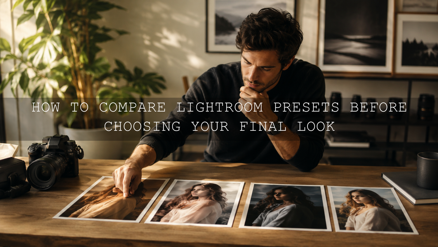
2. Create Virtual Copies for a Fair Preset Test
If you want a cleaner comparison, create multiple versions of the same photo and apply a different preset to each version. This is one of the best ways to compare Lightroom presets because every version starts from the same image. You are not guessing from memory. You are looking at the options side by side.
For example, you might create five versions of a portrait:
- Version 1: warm cinematic preset
- Version 2: bright minimal preset
- Version 3: moody green preset
- Version 4: luxury golden tone preset
- Version 5: clean wedding preset
Then compare them using the same criteria: skin tone, exposure, background color, contrast, detail, and emotional mood. If you are editing portraits or weddings, the 50 Wedding Lightroom Presets for Photography can be a helpful test pack because wedding images often include changing light, white clothing, skin tones, indoor scenes, and outdoor portraits.
3. Use Grid View to Remove Weak Options Fast
Grid view is useful when you want a quick overview of several preset versions. You do not need to study every tiny detail at this stage. The goal is to remove the presets that clearly do not fit.
Look for obvious problems:
- Too orange or too blue color cast
- Skin tones that look unnatural
- Highlights that look too harsh
- Shadows that lose too much detail
- Greens that look muddy or neon
- Overall mood that does not match the photo
After this first pass, choose your top two or three options and compare them more carefully. This keeps your workflow fast and avoids endless preset clicking.
4. Shortlist the Best Preset, Then Reduce the Strength
Sometimes the best preset is almost right but slightly too strong. Do not reject it too quickly. If the mood, color palette, and contrast direction are good, reduce the preset intensity and make small manual adjustments.
Adobe notes that preset intensity can be adjusted with the Preset Amount slider in Camera Raw, which is useful when a look is good but too heavy. You can learn more from Adobe’s guide to Camera Raw preset amount and before-after previews.
When a preset feels too strong, try this order:
- Reduce the preset amount or intensity.
- Correct exposure and highlights.
- Adjust white balance and tint.
- Use HSL to fix individual colors.
- Use masking only where needed.
For more help with heavy edits, read how to tame overly powerful Lightroom presets without losing the original mood.
What to Look for When Comparing Presets
Color Accuracy
Color is usually the first thing people notice. When comparing presets, check whether the preset improves the colors or pushes them too far. A cinematic preset may add beautiful warmth, but if white clothing turns yellow or skies turn cyan, the edit may need correction.
Pay special attention to blues, greens, reds, oranges, and neutrals. If one color looks wrong but the overall preset is strong, the HSL panel can fix it. For a practical color workflow, read HSL color correction after using presets.
Skin Tone Quality
If your photo includes people, skin tone should be one of your biggest deciding factors. A preset can make the background look amazing but still fail if the face looks too orange, gray, red, or lifeless.
When comparing presets on portraits, zoom in and check:
- Does the skin still look healthy?
- Are shadows on the face too dark?
- Is the orange channel too saturated?
- Does the preset create green or magenta tint on skin?
- Can the skin be fixed easily without ruining the background?
If you photograph different skin tones, use flexible preset packs and test each look carefully. The AI-Optimized Dark Skin Cinematic Lightroom Presets are a useful option when you want a cinematic look while paying close attention to deeper skin tone richness and shadow detail. You can also read how to make Lightroom presets work on every skin tone.
Light and Shadow Balance
A good preset should work with the light in the photo. It should not destroy the natural direction of the scene. When comparing presets, look at the brightest and darkest areas first. If the highlights are blown out or the blacks are crushed, the preset may create problems in a full gallery.
For moody edits, shadows can be deep, but they should still contain detail. For bright edits, highlights can glow, but they should not look harsh or flat. The best preset gives you mood without making the image feel damaged.
Subject Focus
The final edit should help the viewer notice the subject faster. If the preset makes the background too loud, the greens too saturated, or the shadows too heavy around the face, it may pull attention away from the main subject.
Use masking when the preset works globally but needs local correction. For example, you can darken the background slightly, brighten the face, soften a harsh sky, or reduce saturation in distracting areas. Adobe’s official guide explains how masks can apply local color and tonal adjustments, which is helpful when the whole image does not need the same correction. See Adobe’s guide to masking in Lightroom Classic.
Style Consistency
A single image can look beautiful on its own, but professional editing also needs consistency. If you are editing for Instagram, a wedding gallery, a brand campaign, a blog, or a client portfolio, the preset should fit the larger visual identity.
Ask yourself:
- Does this preset match my usual editing style?
- Will it work across similar photos from the same shoot?
- Does it support my brand mood?
- Can I adjust it easily for different lighting?
If your goal is a clean, simple, modern style, the Bright and Minimal Lightroom Presets may suit lifestyle, product, wedding, and social media photos. If your goal is stronger cinematic mood, the Cinematics Look Lightroom Presets Pack may give you a more dramatic starting point.
A Simple Step-by-Step Preset Comparison Workflow
Let’s break it down into a workflow you can use today.
- Choose one strong test image. Pick a photo with clear subject detail, visible highlights, shadows, and important colors.
- Make a quick base correction. Balance exposure, white balance, highlights, and shadows before testing creative looks.
- Create several versions. Use virtual copies or duplicate edits so each preset has its own version.
- Apply one preset per version. Keep the test fair by using the same starting image.
- Use grid view for first elimination. Remove presets that are clearly too harsh, too flat, too warm, too cool, or off-brand.
- Compare the top two or three. Check skin tones, color, contrast, mood, subject focus, and detail.
- Pick the best starting point. Choose the preset that needs the least correction while still giving the right creative direction.
- Refine the final edit. Adjust exposure, white balance, HSL, tone curve, masking, sharpening, and noise reduction.
- Check before and after again. Make sure the final image feels better, not just stronger.
- Save your repeatable workflow. If the result works well, use it as a reference for similar photos in the same shoot.
For a broader editing system, follow this step-by-step Lightroom workflow for faster photo edits. It pairs well with preset comparison because it helps you edit in a clean order instead of jumping randomly between sliders.
Real Editing Examples: Choosing the Best Preset for the Photo
Wedding Portrait Example
For a wedding portrait in soft window light, you may test a bright preset, a warm preset, and a cinematic preset. The bright preset may keep the dress clean but make skin too pale. The cinematic preset may add mood but make the shadows too heavy. The warm preset may be the best starting point if it keeps the skin natural and the background soft.
The final adjustment might be simple: reduce warmth slightly, lower highlights on the dress, lift shadows on the face, and add a subtle mask to brighten the subject.
Street Photography Example
For a street photo with harsh afternoon light, a strong film preset may look cool but crush the shadows. A cleaner cinematic preset may preserve more detail while still adding mood. In this case, the better preset is not always the most dramatic one. It is the one that gives you style without making the image harder to finish.
Landscape Example
For a landscape photo, compare how each preset handles the sky, greens, water, and shadow detail. If the sky turns too cyan or the grass becomes neon, the preset may need too much color correction. Adobe Color can also help you understand color relationships when building a consistent visual mood. Explore Adobe Color’s color wheel and harmony rules when you want stronger control over palette choices.
Common Mistakes When Comparing Lightroom Presets
- Testing too many presets at once: Choose 5–7 strong options first, not your entire library.
- Ignoring the original photo: Always compare against the before image so you can see what changed.
- Choosing drama over quality: A strong edit is not always a better edit.
- Forgetting skin tones: Portrait presets must protect natural skin first.
- Skipping white balance: Many preset problems are really white balance problems.
- Not checking at 100% zoom: Sharpening, noise, and texture issues often appear only when zoomed in.
- Using one preset for every lighting condition: A good preset pack should give you options for different scenes.
Pro Tips for Better Preset Decisions
- Pick the preset that needs fewer corrections: The best option is usually the one that gets you close quickly.
- Use preset strength before changing every slider: Reducing intensity often fixes an edit faster than manual fighting.
- Correct white balance before HSL: If the whole image has a color cast, HSL will feel messy.
- Use masks for local problems: Fix the face, sky, background, or subject separately instead of changing the entire photo.
- Compare across several photos before using a preset for a full gallery: A preset may look great on one image and fail on another.
When you want more options for testing different looks, browse the Lightroom Mobile Presets collection and compare styles across portraits, travel photos, weddings, landscapes, and social media content. A larger preset library helps you find a closer starting point, but the comparison process is what helps you choose the right one.
Related Reading
- Why Lightroom presets look different on every photo
- How to tame overly powerful Lightroom presets
- HSL color correction after using presets
- How to make Lightroom presets work on every skin tone
- Step-by-step Lightroom workflow for faster photo edits
Final Thoughts: Choose the Preset That Supports Your Style
The best Lightroom preset is not always the boldest, darkest, brightest, or most popular option. The best preset is the one that supports your photo, protects the subject, improves the mood, and gives you a strong starting point for your personal editing style.
When you compare Lightroom presets properly, you stop guessing. You can see what each preset does to color, light, contrast, skin tone, and detail. That makes your editing faster, cleaner, and more consistent, especially when working across full galleries or brand content.
Start with the 1000+ Master Lightroom Presets Bundle if you want a wide range of looks to test, then explore the Lightroom Presets for Lightroom Mobile & Desktop collection for more styles. Try these presets today — Buy 3, Get 9 FREE — and use this comparison workflow to find the look that feels polished, natural, and truly yours.
FAQ
What is the best way to compare Lightroom presets?
The best way to compare Lightroom presets is to create multiple versions of the same photo, apply one preset to each version, then judge them side by side for skin tone, color, contrast, highlights, shadows, and overall mood.
Should I edit before or after applying a preset?
Do a quick base correction before applying presets. Fix exposure, white balance, highlights, and shadows first. After choosing the best preset, make final refinements with HSL, tone curve, masking, sharpening, and preset strength.
Why do Lightroom presets look different on every photo?
Lightroom presets look different because every photo starts with different lighting, camera settings, white balance, dynamic range, and subject colors. A preset applies the same saved adjustments, but the starting image changes the result.
How many presets should I compare at once?
Compare 5–7 strong options first, then narrow them down to 2–3 final choices. Testing too many presets at once can slow your workflow and make the decision harder.
How do I know which preset is the right one?
The right preset is the one that gives you the best starting point with the least correction. It should improve the mood, protect important details, keep skin tones natural, and fit your editing style.
Written by Asanka — creator of AAAPresets (10,000+ customers).

Leave a comment
This site is protected by hCaptcha and the hCaptcha Privacy Policy and Terms of Service apply.