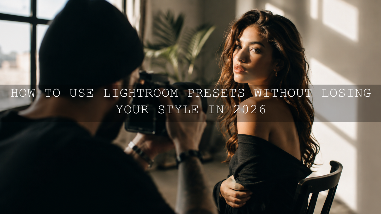
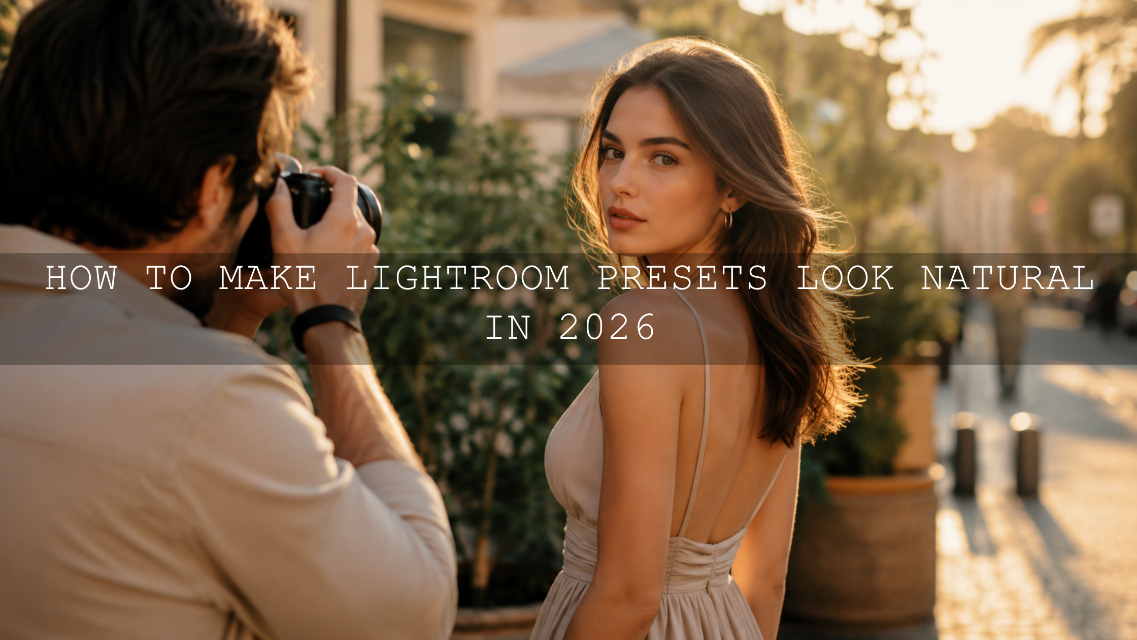
How to Use Lightroom Presets Without Losing Your Style in 2026
Learning how to use Lightroom presets without losing your style is one of the most important editing skills for photographers in 2026. Presets can save hours, create a consistent look, and help you build a polished portfolio, but they should never make every photo feel copied, flat, or over-processed. The real goal is simple: use Lightroom presets as a creative starting point, then adjust white balance, exposure, HSL, tone curve, masking, and preset strength until the final image still feels like your own work.
Here’s why this matters. A preset can give you 70% of the look quickly, but the final 30% is where your personal editing style comes alive. That last step is where you protect natural skin tones, match the mood of the original scene, and make sure your work does not look like everyone else using the same editing pack.
For a flexible preset workflow, start with the 1000+ Master Lightroom Presets Bundle and browse more creative styles in the Lightroom Presets for Lightroom Mobile & Desktop collection. Try these presets today — Buy 3, Get 9 FREE — then use the practical steps below to make each edit feel natural, personal, and professional.
The Real Problem With One-Click Preset Editing
Presets are powerful because they give you speed and consistency. If you are editing a wedding gallery, travel series, portrait session, or social media content batch, applying a preset can instantly bring your photos into the same visual direction. That is useful for branding, storytelling, and faster delivery.
But the danger starts when every photo receives the same preset with no adjustment. A sunset portrait, indoor lifestyle photo, cloudy street shot, and bright beach image all have different light, color temperature, contrast, and dynamic range. The same preset cannot treat all of them perfectly without some human control.
I have tested the same preset on golden hour portraits, indoor tungsten light, cloudy outdoor scenes, and high-contrast street photos. The preset gave a strong base every time, but the best results always came after small corrections to exposure, white balance, skin tones, and local masks.
Adobe also explains that Lightroom presets can be adjusted with the Amount slider, which means the effect does not have to stay at full strength. You can use Adobe’s guide to editing photos with presets in Lightroom to understand how preset intensity works inside Lightroom.
Presets Are Springboards, Not Final Edits
The best way to think about presets is this: a preset is a direction, not a destination. It can create a cinematic mood, soft film look, bright clean tone, moody contrast, or warm vintage color. But the photo still needs your decision-making.
A strong preset might include changes to:
- White balance: Makes the image warmer, cooler, greener, or more magenta.
- Exposure and contrast: Controls brightness, shadow depth, highlight recovery, and overall punch.
- HSL and color mixer: Changes individual colors such as greens, oranges, blues, and reds.
- Tone curve: Creates faded blacks, deep shadows, bright highlights, or a film-style contrast curve.
- Color grading: Adds mood through highlight, midtone, and shadow color shifts.
- Texture, clarity, and grain: Adds detail, softness, or analog character.
The problem is not the preset. The problem is applying it without checking whether those settings fit the actual photo. For deeper troubleshooting, read why Lightroom presets look different on every photo and how to fix it.
Presets vs Manual Editing: Which Is Better?
Presets and manual editing are not enemies. They work best together.
- Presets are best for speed: They help you create a consistent base style quickly across multiple photos.
- Manual editing is best for control: It helps you correct each image based on its light, color, subject, and mood.
- The best workflow combines both: Apply a preset first, then manually fine-tune the important details.
For example, if you apply a warm cinematic preset to a wedding photo, the first result may look beautiful but slightly too orange on skin. Manual editing lets you reduce orange saturation, adjust tint, and use a mask to brighten the couple’s faces. The preset creates the mood; your manual adjustment protects the realism.
This is why presets should never replace your eye. They should support your editing decisions. A beginner can use presets to learn faster, while an advanced photographer can use them to speed up repetitive work without sacrificing creative control.
Step-by-Step Preset Workflow for a Personal Editing Style
Let’s break it down into a simple workflow you can repeat on almost any photo.
1. Choose a Preset That Matches the Photo’s Mood
Do not choose a preset only because it looks trendy. Choose it because it supports the story of the image. A soft family photo may need warm, clean tones. A street portrait may need deeper contrast. A fashion image may need polished color and controlled highlights.
If you want a broad starting point with many styles, the 1000+ Master Lightroom Presets Bundle gives you room to test cinematic, bright, moody, portrait, landscape, and vintage looks. If your goal is a stronger film-inspired style, you can also test the Cinematics Look Lightroom Presets Pack.
Pro tip: Before applying a preset, look at the original photo and describe it in one sentence. For example, “soft golden hour portrait,” “cool rainy street scene,” or “bright lifestyle product photo.” This helps you choose a preset that fits the image instead of forcing a random trend onto it.
2. Reduce Preset Strength Before You Touch Sliders
If the preset looks too strong, do not remove it immediately. First, reduce the preset intensity. In Lightroom, the Amount slider can help you control how much of the preset effect is applied. This is especially useful when the colors, contrast, clarity, or shadows feel too heavy.
For many photos, reducing the preset strength to around 60–85% can make the edit feel more natural while keeping the overall style. If the preset still feels too strong after that, then move into exposure, white balance, HSL, and tone curve adjustments.
For a detailed fix, read how to tame overly powerful Lightroom presets for subtle edits.
3. Fix White Balance First
White balance is one of the biggest reasons presets look wrong. A preset designed for daylight can look too yellow indoors. A cool street preset can make skin look lifeless. A warm film preset can make white clothes, walls, or skies look unnatural.
Start with Temperature and Tint before making heavy color changes. Adobe explains white balance controls in Lightroom’s edit panel, including Temperature and Tint adjustments for correcting color casts. You can learn more from Adobe’s Lightroom edit panel guide for white balance controls.
- If skin looks too orange, cool the Temperature slightly or reduce orange saturation later.
- If the image looks too green, move Tint slightly toward magenta.
- If shadows look too blue, warm the image carefully without destroying highlights.
- If whites do not look clean, use them as a guide for neutral correction.
Pro tip: Always check skin, whites, and grays before judging the preset. If those neutral areas look wrong, the whole image will feel unnatural.
4. Correct Exposure, Highlights, and Shadows
After white balance, adjust the light. Presets often change exposure, contrast, highlights, shadows, whites, and blacks. But your photo may already be bright, dark, soft, or contrasty before the preset is applied.
A clean workflow is:
- Adjust Exposure until the subject feels properly bright.
- Lower Highlights if skies, faces, or white clothing are too bright.
- Lift Shadows if dark areas lose too much detail.
- Adjust Whites for clean brightness.
- Adjust Blacks for depth without crushing detail.
For example, a moody preset may look perfect on a bright outdoor portrait but too heavy on an underexposed indoor photo. In that case, lifting Exposure and Shadows can keep the mood while saving the details.
5. Use HSL to Protect Skin Tones and Signature Colors
HSL is where your personal style becomes more visible. Presets often shift greens, oranges, blues, and yellows to create a specific look. That can be beautiful, but it can also damage skin tones, clothing colors, landscapes, or brand colors if you do not adjust them.
Focus on these color areas first:
- Orange and red: Usually affect skin, lips, and warm highlights.
- Yellow and green: Usually affect grass, trees, indoor warmth, and nature scenes.
- Blue and aqua: Usually affect skies, water, shadows, and denim.
If a portrait looks too fake, reduce orange saturation slightly and adjust orange luminance until the skin feels alive. If a landscape looks too neon, reduce green saturation and shift green hue toward a more natural tone. If the sky becomes too deep or electric, reduce blue saturation or increase blue luminance.
For more skin tone guidance, read how to make Lightroom presets work across every skin tone.
6. Adjust the Tone Curve Without Destroying the Mood
The tone curve is often the secret behind a cinematic preset. It can create faded blacks, soft highlights, strong contrast, or a matte film look. But it can also make shadows too crushed or highlights too flat if the photo does not match the preset’s original lighting.
- If blacks are too deep, lift the lower-left curve point slightly.
- If highlights are too harsh, lower the top-right curve point a little.
- If the image feels flat, add a gentle S-curve in the midtones.
- If the edit feels too digital, soften the contrast curve instead of adding more clarity.
This is especially important when using the same preset across different cameras. Different camera profiles and sensors can react differently to the same curve. You can learn more in how to make one preset work across different camera brands.
7. Use Masking for the Final Professional Touch
Global edits affect the whole photo, but real professional editing often needs local control. Masking helps you adjust only the subject, face, sky, background, clothing, or landscape elements without changing the entire image.
Adobe’s Lightroom masking tools can help you select subjects, skies, backgrounds, people, objects, and landscape elements for local adjustments. Learn more from Adobe’s guide to masking for local adjustments in Lightroom.
Use masks to:
- Brighten a face without lifting the whole image.
- Darken a distracting background.
- Recover detail in a bright sky.
- Add subtle clarity to the subject, not the skin.
- Warm the subject while keeping the background cooler.
Pro tip: If the preset looks good overall but the subject does not stand out, do not change the whole edit. Add a subject mask and make a small exposure or contrast adjustment locally.
How to Build a Signature Look With Presets
Your signature editing style does not come from using only one preset forever. It comes from repeating your own visual decisions. Maybe you like soft highlights, warm skin, muted greens, deep shadows, clean whites, or subtle film grain. Once you notice those repeated choices, you can build a recognizable style.
Here is a simple way to develop your own look:
- Edit 10–20 photos from different lighting situations.
- Apply your favorite preset as a starting point.
- Adjust each photo until it feels natural and consistent.
- Write down the changes you repeat often.
- Create your own saved preset based on those repeated adjustments.
For example, if you always reduce green saturation, lift black points slightly, warm highlights, and soften clarity, those choices are part of your editing voice. You can save them as your own custom preset and use it as a personal base.
Adobe Color can also help you think more intentionally about color relationships, harmony, and mood. Explore Adobe Color palettes and harmony tools when planning a consistent visual identity for your photography brand, Instagram feed, or client portfolio.
Real Editing Examples: Before and After Thinking
Example 1: Golden Hour Portrait
A warm cinematic preset may look beautiful on a golden hour portrait, but it can easily push skin too orange. In this case, keep the warmth, reduce orange saturation slightly, lift orange luminance, and use a face mask to keep the subject bright. The final result still feels golden, but the skin looks more natural.
Example 2: Cloudy Street Photo
A moody preset may add strong contrast and deep shadows. On a cloudy street photo, that can create atmosphere, but it may also make the image too dark. Lift shadows, reduce black crushing, and use HSL to control any heavy blue or green tones. For street work, the Vintage Lightroom Presets collection can be a strong creative base when you want classic tones with adjustable character.
Example 3: Bright Lifestyle Photo
A clean bright preset may make lifestyle photos feel fresh and modern, but too much brightness can remove depth. Use the Bright and Minimal Lightroom Presets as a soft base, then lower highlights, add a little contrast, and use masks to keep the main subject clear.
Example 4: Luxury Wedding or Fashion Image
For a premium look, warm highlights and polished contrast can work beautifully. The AI-Optimized Luxury Golden Tones Lightroom Presets can help create a rich, high-end base, but you should still check skin, whites, and background saturation. A luxury edit should feel controlled, not overly yellow.
Common Preset Mistakes to Avoid
- Using the same preset at full strength on every photo: Reduce Amount when the look feels too heavy.
- Ignoring white balance: Fix Temperature and Tint before judging the color style.
- Overusing clarity and texture: Too much detail can make skin and soft scenes look harsh.
- Forgetting skin tones: Always check orange and red channels in portraits.
- Skipping local adjustments: Use masks when only one part of the photo needs correction.
- Copying trends without purpose: Choose edits that support the image, not just what is popular.
Related Reading
- Adobe Color vs Camera Matching profiles for better Lightroom preset results
- Warm lifestyle and family photo editing workflow
- Autumn Lightroom editing trends and color workflow
Final Thoughts: Be an Editor, Not Just a Preset User
Presets are not shortcuts for skipping creativity. They are tools for moving faster while still making thoughtful decisions. When you learn how to use Lightroom presets without losing your style, you can create consistent edits without making your work feel generic.
The best workflow is simple: apply a preset, reduce intensity if needed, fix white balance, balance exposure, refine HSL, soften or shape the tone curve, and finish with masking. That is how you turn a one-click edit into a personal, professional image.
To build your own consistent editing system, explore the 1000+ Master Lightroom Presets Bundle, try more creative looks in the Lightroom Presets for Lightroom Mobile & Desktop collection, and use the Buy 3, Get 9 FREE offer to test different styles across portraits, travel, weddings, landscapes, and social content.
FAQs
How do I use Lightroom presets without making every photo look the same?
Apply the preset as a starting point, then adjust white balance, exposure, HSL, tone curve, and masking for each photo. This keeps the overall style consistent while allowing each image to feel natural and unique.
Should I reduce the preset Amount slider?
Yes. If the edit looks too strong, reduce the preset Amount before changing many sliders. This is often the fastest way to make a preset look more natural while keeping the original style.
Why do Lightroom presets look different on every photo?
Presets look different because every photo has different lighting, exposure, white balance, camera profile, colors, and subject matter. A preset reacts to the original file, so small adjustments are usually needed.
Can I create my own preset from an edited photo?
Yes. Once you repeatedly make the same adjustments across multiple photos, save those settings as your own custom preset. This helps you build a more personal and consistent editing style.
Are presets better than manual editing?
Presets are better for speed and consistency, while manual editing is better for precision. The strongest workflow combines both: use a preset for the base look, then manually refine the details.
Written by Asanka — creator of AAAPresets (10,000+ customers).

Leave a comment
This site is protected by hCaptcha and the hCaptcha Privacy Policy and Terms of Service apply.