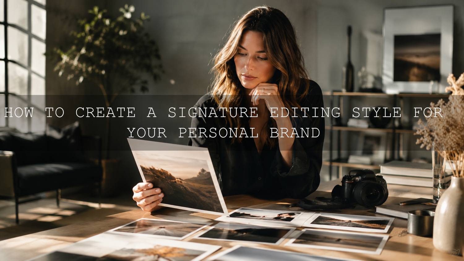
How to Create a Signature Editing Style for Your Personal Brand
A signature editing style is one of the fastest ways to make your personal brand feel recognizable, polished, and trustworthy. Whether you post portraits, product photos, lifestyle images, or short-form video, the right mix of color grading, contrast, and Lightroom presets can turn random content into a clear visual identity. In practical terms, this means your audience starts recognizing your work before they even read your name.
If you want a strong starting point instead of building everything from zero, try the 1000+ Master Lightroom Presets Bundle and browse the Lightroom Presets for Lightroom Mobile & Desktop collection. It is a simple way to test multiple looks, compare what fits your brand, and speed up the process. And yes, you can still keep it personal while taking advantage of the Buy 3, Get 9 FREE offer when you add 12 items to your cart.
Why your editing style matters more than most creators think
Most people assume branding starts with a logo, a font, or a catchy bio. Those things matter, but your editing style does a quieter and often more powerful job. It shapes how your audience feels when they land on your feed, open your portfolio, or watch your reels.
When your images share the same tone, contrast, and color behavior, you create visual trust. Your page feels intentional. Your work feels more professional. Your audience does not need to guess whether they are looking at your content because the mood is already familiar.
That is especially important for photographers, influencers, educators, small brands, and freelancers. A bright, airy edit one day and a harsh moody edit the next can make your brand feel scattered. A consistent style, on the other hand, makes even simple content look premium.
- Recognition: people begin to spot your work instantly.
- Trust: a consistent feed feels more serious and more reliable.
- Speed: editing gets easier when you stop reinventing the look every time.
- Storytelling: your color choices help support the message, not compete with it.
- Sales: a clear visual identity helps products, services, and portfolios feel more valuable.
Start with your brand words, not your sliders
Before you open Lightroom or DaVinci Resolve, define what your brand should feel like. This is the part many people skip, and it is why they end up copying someone else’s look instead of building their own.
Write down 4 to 6 words that describe your brand. For example:
- clean
- warm
- confident
- cinematic
- minimal
- soft luxury
Now ask yourself one important question: What should someone feel after seeing my content for three seconds? If the answer is “calm and elevated,” you probably do not want neon saturation and aggressive contrast. If the answer is “bold and energetic,” a washed-out pastel look may fight your message.
I usually tell creators to think of editing as translation. Your brand already has a personality. Editing is how that personality gets translated into skin tones, shadows, highlights, and color temperature.
Build a mood board that reveals patterns
Once your brand words are clear, gather inspiration. Pinterest boards, saved Instagram posts, magazine scans, film stills, and your favorite brand campaigns all work well. The goal is not to copy anyone. The goal is to notice patterns.
Look for answers to these questions:
- Do you prefer warm whites or cool whites?
- Are the blacks deep and contrasty, or softer and lifted?
- Do skin tones lean golden, neutral, or rosy?
- Are greens natural, muted, or pushed toward teal?
- Does the image feel crisp, dreamy, glossy, or textured?
If you want help shaping a more cohesive social look, this guide on editing influencer content for a consistent Instagram feed is a strong companion read. It pairs well with this article on building an Instagram aesthetic with Lightroom presets if your brand lives heavily on social platforms.
Create a “brand edit recipe” you can repeat
Here is where things become practical. Instead of saying, “I like this vibe,” turn that feeling into a small set of editing rules. This becomes your brand edit recipe.
A simple recipe might look like this:
- Keep white balance slightly warm.
- Protect skin tones first.
- Use moderate contrast, not harsh contrast.
- Reduce green saturation a little for a cleaner background.
- Add subtle grain for texture.
- Use the same tone curve on every image.
That is already a style. It is specific enough to repeat and flexible enough to survive different shoots.
When I test presets for creators, I usually lock skin tone direction before I touch dramatic effects. If skin looks wrong, the whole image feels wrong, even if the rest of the color grade looks stylish. On the other hand, if skin feels believable, you have much more freedom to push mood in the background and shadows.
Presets vs manual editing for brand consistency
One of the biggest questions is whether you should use presets or edit every image manually. The real answer is that the strongest workflows usually combine both.
Presets are better when:
- you want speed and repeatability
- you post often and need consistency
- you want a reliable base across different shoots
- you are building a brand library instead of editing one image at a time
Manual editing is better when:
- the lighting changes dramatically from shot to shot
- you need detailed corrections for one hero image
- the subject has tricky color casts, mixed lighting, or unusual tones
- you are fine-tuning the preset instead of starting from nothing
The best approach is to apply a strong base preset, then make small manual adjustments for exposure, white balance, and masking. If you want a deeper comparison, this breakdown of Lightroom presets vs Photoshop actions helps clarify where each workflow fits.
A practical Lightroom workflow for building your signature look
If you are using Lightroom, keep your process simple and repeatable. A signature editing style usually comes from a few disciplined decisions done the same way over time, not from using every slider available.
1. Set white balance first
White balance is mood. Warm edits feel inviting, nostalgic, and human. Cooler edits feel cleaner, sharper, and more modern. Pick a direction and stick close to it.
If you need a refresher on how presets and edit tools behave inside Lightroom, Adobe’s official guide to presets in Lightroom and Adobe’s official masking guide for Lightroom Classic are both worth bookmarking.
2. Adjust exposure before contrast
Many creators add contrast too early. First, get the image bright enough. Then decide how punchy or soft it should feel. If exposure is wrong, contrast decisions become misleading.
A quick rule:
- bright personal brands often need cleaner whites and softer blacks
- moody brands often need controlled highlights and deeper midtones
3. Use HSL for brand colors
This is where your style becomes unmistakably yours. HSL lets you control the hue, saturation, and luminance of specific colors. That means you can make greens less distracting, blues more cinematic, or oranges more flattering for skin.
For example, if your brand uses earthy tones, you might lower green saturation, warm up orange, and soften blue luminance. If your brand is fashion-forward, you might keep whites clean and let wardrobe colors stay rich without oversaturating skin.
For product-led creators, this matters even more. Consistent color makes products look more premium, which is one reason this guide on Lightroom presets for e-commerce and product photography is worth reading.
4. Use masking to protect the subject
A great signature style should not crush faces, destroy detail, or make skin look muddy. Local adjustments solve that. Lift the face a touch, control bright skies, or soften distractions in the background. These small moves keep the image professional while preserving your overall look.
I tested this kind of workflow on portrait and lifestyle edits where the goal was to keep skin soft but still maintain a cinematic atmosphere. The images that worked best were the ones where the subject stayed clean and readable, while the background carried most of the stylistic drama.
5. Finish with texture, grain, and restraint
Texture, clarity, and grain can help define your visual fingerprint, but they should feel intentional. A little grain can add character. A little clarity can add polish. Too much of either can make the work feel cheap or dated.
If your inspiration comes from film, editorial photography, or cinematic travel content, subtle grain and softened highlights often work better than heavy sharpening.
How to turn your edit into a reusable preset
Once you have a look that feels right, save it. This is where your editing style stops being an idea and becomes part of your workflow.
- Edit 8 to 12 images from different shoots until they feel visually related.
- Notice which adjustments repeat every time.
- Save those repeated adjustments as your base preset.
- Create 2 or 3 variations if needed, such as “indoor,” “golden hour,” or “clean product.”
- Apply the preset first, then fine-tune exposure and white balance per image.
If you want a faster way to experiment with different directions, the Vibrant Blogger Presets for Instagram Influencers, Insta Fashion Blogger Lightroom Presets, and AI-Optimized Aesthetic Moody Lightroom Presets are useful examples of how one brand can explore multiple moods without losing consistency.
Lightroom vs DaVinci Resolve for a multi-format brand
If your personal brand includes both photos and video, do not build two unrelated styles. Build one visual language and translate it across tools.
Use Lightroom when: your main output is photos, carousels, product images, portraits, or mobile content.
Use DaVinci Resolve when: you are shaping reels, YouTube videos, short films, talking-head content, or cinematic brand pieces.
The smartest workflow is to define your color identity in still images first. Once you know your preferred white balance, contrast behavior, skin tone direction, and color palette, it becomes much easier to recreate the same feeling in video. Blackmagic’s DaVinci Resolve overview and official Resolve training resources are useful if you want to carry your brand look into motion work.
For creators who work mostly on mobile and desktop photo workflows, the AI-Optimized Lightroom Presets collection gives you more flexibility for testing repeatable edits across different content types.
Common mistakes that weaken a personal brand
- Copying a creator too closely: inspiration is useful, imitation is forgettable.
- Over-editing: if the grade is louder than the story, people notice the edit before the message.
- Ignoring skin tones: this is one of the fastest ways to lose trust visually.
- No repeatable process: without a system, consistency becomes luck.
- Changing style every week: evolution is healthy, chaos is not.
What a strong signature style looks like in real life
Imagine a creator who posts fashion portraits, behind-the-scenes studio shots, and product flat lays. Before they define a style, the feed feels mixed: one image is cool and gray, the next is orange and contrast-heavy, and the next looks flat and green. Nothing is technically terrible, but nothing feels connected either.
After building a signature style, a few things change. Whites become cleaner. Skin tones stay warm but not orange. Shadows are richer. Background greens are less distracting. Grain is subtle. Suddenly the feed feels curated, even though the content itself is still varied.
That is the real goal. Not perfection. Not sameness. Just a recognizable editing language that makes your brand feel cohesive wherever people find you.
Related reading
- Which presets are best for Instagram photography
- How to install Lightroom presets quickly and easily
- Contact AAAPresets for support
If you are ready to stop guessing and start building a look that actually feels like your brand, begin with the 1000+ Master Lightroom Presets Bundle, then compare it against the Insta Fashion Blogger Presets or Vibrant Blogger Presets depending on whether your style is cleaner, brighter, or more social-first. You can also browse the Lightroom Mobile & Desktop presets collection to find a look that matches your brand direction while taking advantage of the Buy 3, Get 9 FREE offer.
What is a signature editing style?
A signature editing style is the repeatable visual look you apply across your photos or videos so your content feels recognizable and consistent. It usually comes from a combination of white balance, contrast, color grading, skin tone handling, and finishing details like grain or texture.
Should I create one preset for everything?
Usually no. A better approach is to build one main brand preset and then create a few close variations for different lighting conditions, such as indoor, outdoor, or golden hour. That keeps your work consistent without forcing every image into the exact same treatment.
How do I know if my editing style fits my brand?
Look at your feed or portfolio as a whole. If the images feel connected, the mood matches your message, and your audience could recognize your work quickly, you are moving in the right direction. If every post feels like a different photographer or brand, the style still needs refining.
Are presets enough, or do I still need manual edits?
Presets are the best starting point for speed and consistency, but manual adjustments still matter. Small fixes to exposure, white balance, cropping, and masking help each image look polished while keeping the overall brand look intact.
Can I use the same editing style for photos and video?
Yes, but it should be adapted, not copied blindly. Keep the same overall visual language such as warmth, contrast level, and color direction, then translate it through the tools that make sense for each format, like Lightroom for photos and DaVinci Resolve for video.
Written by Asanka — creator of AAAPresets (10,000+ customers).
Leave a comment
This site is protected by hCaptcha and the hCaptcha Privacy Policy and Terms of Service apply.