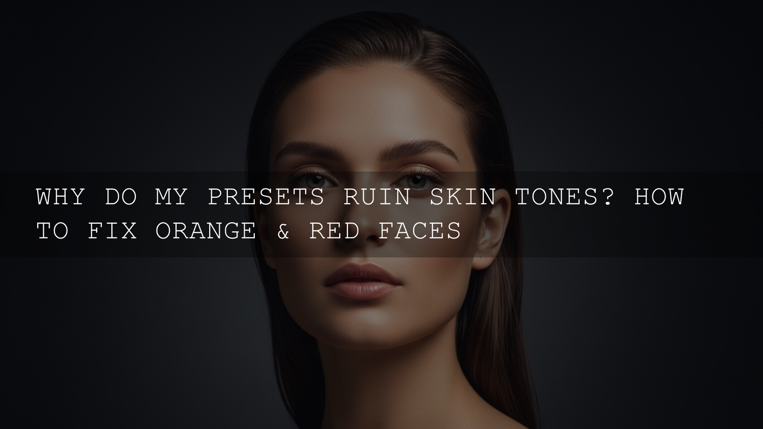
Ever Stare at a Photo and Think, “Why Does Everyone Look Like an Oompa Loompa?”
You know the moment. You took a genuinely great photo, you apply a preset, and instead of “clean, cinematic, natural,” you get skin tones that look like a radioactive sunset. If you’re trying to fix orange skin tones in Lightroom, you’re not alone—and you’re not “bad at editing.” This happens because presets are saved slider moves, and when they collide with your photo’s lighting, white balance, and camera color, they can shove reds/oranges way too far.
Here’s the good news: once you understand why it happens, the fix becomes repeatable. You’ll keep your preset’s vibe, but bring skin back to a healthy, believable tone.
If you want a reliable starting point that’s easier to adapt across different lighting (without destroying skin tones), start with the 1000+ Master Lightroom Presets Bundle and browse the Portrait Photography Lightroom Presets collection. And if you’re building your toolkit, you can Buy 3, Get 9 FREE when you add 12 items to your cart.
The 60-Second “Save the Skin” Workflow
If you only have a minute, do this in order. It fixes most “too orange / too red” preset disasters fast:
- White Balance first: cool Temperature slightly, then adjust Tint only if needed.
- Color Mixer (HSL): reduce Orange saturation a little; lift Orange luminance a touch; adjust Yellow if the scene feels muddy.
- Mask the face/skin: small local corrections beat global changes.
- Re-check Vibrance/Saturation: prefer Vibrance; keep global Saturation gentle.
Rule of thumb: If the whole photo is orange, fix White Balance first. If only skin is orange, fix HSL + Masking.
Why Presets Mess Up Skin Tones
Presets are awesome—until they’re not. They’re built on a specific photo (or set of photos), under specific lighting, with a specific camera profile. When your image is different, the preset can “stack” its warmth on top of warmth that’s already there.
- Skin lives in the Orange channel: Most natural skin tones sit heavily in Reds/Oranges. If a preset boosts Orange saturation or shifts Orange hue, faces take the hit first.
- Lighting changes everything: Golden hour, tungsten bulbs, LEDs, neon signs, shaded forests—each one pushes color differently. Presets don’t “see” the light. They just apply instructions.
- White balance drift (especially indoors): Auto White Balance can guess wrong. Then the preset warms it again and suddenly you’re in traffic-cone territory.
- Camera profiles & calibration differences: Even two cameras shooting the same scene can render oranges differently. A preset made on one camera might push another too far.
If you want the deeper “why presets behave differently on every photo” explanation, this is worth reading: Why Lightroom presets look different on every photo (and how to fix it).
Step-by-Step: Fix Orange or Red Skin Tones Without Killing the Preset Look
Step 1: Neutralize White Balance (Temperature + Tint)
Start global. If the whole image is warm, don’t fight it with HSL first—fix the base color cast.
- Temperature: move slightly cooler until whites look believable and skin stops “glowing.”
- Tint: touch this only if your image looks greenish or overly magenta after cooling.
- Use the WB eyedropper when you can: click something neutral (white shirt, gray wall, paper).
Official reference if you want to see the exact controls and what they do: Adobe’s guide to adjusting photo lighting and color in Lightroom (including White Balance).
Step 2: Use HSL / Color Mixer for Precision (Orange + Yellow)
White balance gets you back to “real.” The Color Mixer gets you back to “stylish.”
In the Orange channel, start with small moves:
- Orange Saturation: reduce slightly (think small steps, not huge drops).
- Orange Luminance: lift a touch if skin looks muddy/dirty (this often brings life back).
- Orange Hue: only tweak if the skin looks too red or too yellow—tiny shifts go a long way.
Then check Yellow (especially indoors):
- If the whole scene feels “mustard” or muddy, reduce Yellow saturation a little.
- If highlights (walls, warm lights) feel too yellow, a small Yellow luminance adjustment can help.
Official reference for where this panel lives and how it works: Adobe’s Color Mixer (HSL) guide for Lightroom Classic.
Step 3: Protect Skin With Masking (People / Face / Brush)
This is the move that separates “pretty good” from “that looks professional.” Fixing skin globally can ruin everything else—so isolate it.
- People mask (or Select Subject): target face/skin areas.
- Inside the mask: reduce saturation slightly, cool Temperature just a bit, and lift exposure a touch if the face looks heavy.
- Keep Texture/Clarity gentle on faces: too much micro-contrast makes skin look harsh, which can exaggerate redness.
Official reference: Adobe’s Lightroom Classic Masking tool guide.
Step 4: Check Calibration (When Oranges Keep Fighting You)
If you’ve cooled WB and tamed Orange/Yellow but skin still looks “weird,” calibration can be the hidden culprit. This is common with certain cameras, mixed lighting, or warm presets that push overall color separation.
- Try a small adjustment to Blue Primary Hue (tiny moves can shift how oranges feel).
- If the preset is aggressively warm, a slight reduction in Blue Primary Saturation can calm the overall warmth.
Think of this as your “last 10%” tool—don’t start here, but don’t ignore it when nothing else finishes the job.
Step 5: Rebuild the Look (Vibrance, Tone Curve, and Contrast)
Once skin is under control, bring the style back carefully.
- Prefer Vibrance over Saturation: Vibrance boosts color more safely (especially for skin).
- Tone Curve: use a gentle curve for depth; avoid crushing shadows (it makes faces look dirty).
- Highlights: protect them—over-warm highlights can turn foreheads and cheeks orange fast.
If your preset also makes images look flat or washed out, this companion guide helps: How to fix washed-out presets and boost contrast.
Real-World Examples (What to Do in Common Situations)
Example 1: Indoor Tungsten + Window Light (Mixed Lighting)
This is the #1 “orange skin” trap. I tested this workflow on an indoor family shoot under warm bulbs, and the preset made faces look neon. The fix was simple: I neutralized white balance first, then used a People mask to cool skin slightly without cooling the entire room.
- Fix WB first: cool Temperature until whites stop looking yellow.
- Yellow saturation: reduce slightly to remove that indoor “mud.”
- People mask: tiny cooling + slight saturation reduction on skin only.
If this happens to you a lot, read: Indoor preset fixes for artificial light.
Example 2: Golden Hour Portraits (Warm Light + Warm Preset)
Golden hour already gives warm highlights and warm skin. If your preset adds warmth on top, it can look fake fast. When I pushed a warm preset on a sunset portrait, cooling WB slightly and lifting Orange luminance gave me natural skin while keeping the glow.
- Cool Temperature just a little (don’t erase the sunset—control it).
- Reduce Orange saturation slightly; lift Orange luminance a touch.
- If highlights go too yellow, adjust Yellow saturation gently.
If you love warm looks but want a more controlled starting point, try AI-Optimized Cinematic Golden Hour Lightroom Presets and fine-tune with the steps above.
Example 3: Portrait Presets That Over-Retouch or Over-Warm Skin
Sometimes the preset isn’t “wrong”—it’s just too strong for your photo. In that case, the fastest fix is to start with a portrait-friendly base, then keep adjustments subtle.
- Start with a skin-aware preset like AI-Optimized Skin Retouch Portrait Lightroom Presets.
- Use HSL to tame Orange saturation (small moves).
- Mask the face and reduce Texture/Clarity slightly if skin looks harsh.
Presets vs Manual Editing: When One-Click Wins (and When It Fails)
Presets are best when:
- You shot a set in similar lighting (same location, same time of day).
- You want a consistent base look across a shoot.
- You’re happy to fine-tune after applying the preset.
Manual editing is better when:
- You have mixed lighting (window + tungsten + LED).
- Skin tone accuracy is critical (weddings, portraits, client work).
- The preset was built for a different camera profile or color science.
The sweet spot is a hybrid: preset for style + manual correction for realism. If you want to build more unique looks without breaking skin tones, this guide is helpful: How to stack presets for unique results.
Pro Tips That Make Skin Tones Look “Expensive” (Not Overcooked)
- Stop judging the preset before WB is fixed: a small WB correction can make a “bad preset” suddenly look perfect.
- Lift Orange luminance before you destroy saturation: muddy skin often needs luminance, not heavy desaturation.
- Keep global Saturation low: use Vibrance, then refine specific colors in Color Mixer.
- Mask beats global edits: if only the face is orange, don’t cool the whole image.
- Mobile workflow still works: the same order applies in Lightroom Mobile—WB → Color Mixer → Masking.
For mobile creators who want consistent results in any lighting, this is a strong read: Mastering Lightroom Mobile presets for any lighting.
Related Reading (If You Want to Go Deeper)
- Why Lightroom presets look different on every photo (and how to fix it)
- Indoor preset fixes: simple corrections for artificial light
- Fix washed-out presets and boost contrast
If you want presets that are easier to adapt (especially for portraits), try AI-Optimized Film Portrait Cinematic Lightroom Presets Pack or Professional Portrait Lightroom Presets for Stunning Portraits Editing, then browse more styles in AI-Optimized Lightroom Presets for Mobile and Desktop. If you want a huge variety of starting points (so you’re not forcing one preset onto every photo), the 1000+ Master Lightroom Presets Bundle is the fastest way to cover different lighting and moods. Need help choosing the right pack for your style? Reach out anytime via our contact page—and remember, you can Buy 3, Get 9 FREE when you add 12 items to your cart.
FAQ
Why do my Lightroom presets make skin look orange?
Skin tones sit heavily in the orange channel, so presets that boost warmth, vibrance, or orange/yellow HSL can push faces too far—especially under warm indoor light or golden hour. Fix White Balance first, then tame Orange/Yellow in the Color Mixer, and finish with a People/face mask for targeted correction.
Should I fix White Balance before adjusting HSL?
Yes, if the entire photo is too warm. White Balance sets the foundation. If only the skin is orange while the rest looks fine, use HSL and masking first so you don’t ruin the background.
What’s the safest Color Mixer move for natural skin tones?
Start by reducing Orange saturation slightly and lifting Orange luminance a touch. It often removes the “burnt” look while keeping skin alive and dimensional.
Why does skin look muddy after I reduce orange saturation?
Because saturation isn’t the only problem—luminance and contrast matter. Try lifting Orange luminance, easing off heavy contrast/clarity on faces, and using a mask to brighten the face slightly instead of desaturating globally.
Can I do this workflow in Lightroom Mobile?
Yes. The order stays the same: White Balance (Temp/Tint) → Color Mixer (HSL) → Masking (subject/face) → finish with small vibrance/contrast tweaks.
Written by Asanka — creator of AAAPresets (10,000+ customers).

Leave a comment
This site is protected by hCaptcha and the hCaptcha Privacy Policy and Terms of Service apply.