
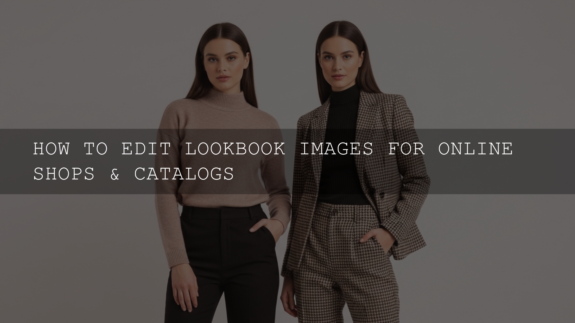
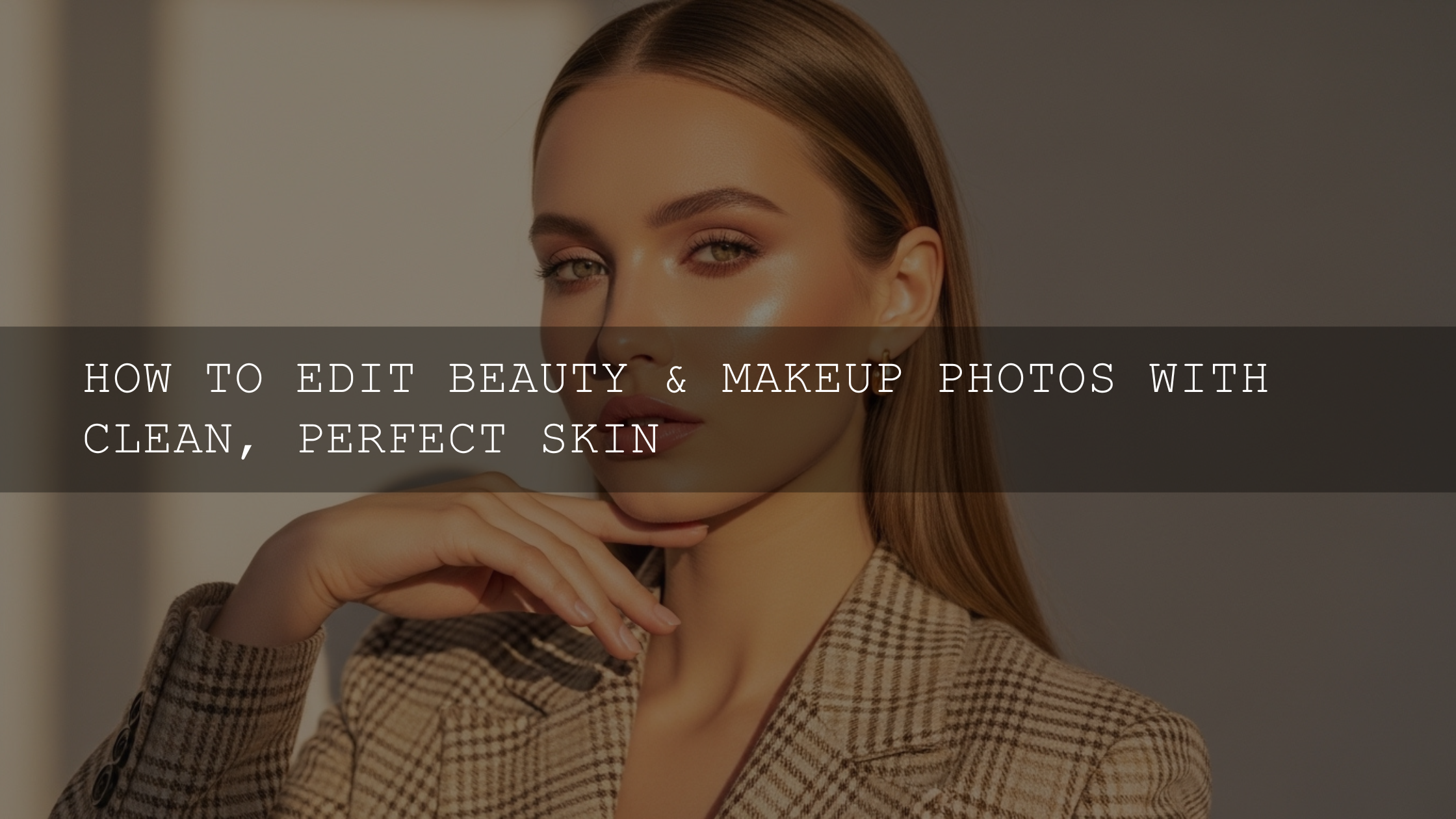
Fashion Photo Editing for Bold Colors That Still Looks Premium
Great fashion photo editing is not about making every slider louder. It is about using bold colors with intention so the wardrobe, mood, and brand identity all feel stronger in the final frame. In fashion photography, color can sell energy, luxury, confidence, edge, or softness in a split second. That is why bold colors still matter so much in 2026: they stop the scroll, shape emotion, and make a look feel editorial instead of ordinary.
If you want a faster starting point, you can try the FASHION Portrait Lightroom Presets or browse the wider Lightroom Presets for Lightroom Mobile & Desktop collection. For creators building a larger toolkit, the 1000+ Master Lightroom Presets Bundle gives you more room to test different color directions, and you can Buy 3, Get 9 FREE when you add 12 to your cart.
Why bold colors work so well in fashion photography
Fashion imagery is supposed to communicate quickly. Before a viewer studies the pose, styling, or fabric, they usually react to color first. A smart color edit can make a satin dress feel richer, a streetwear look feel more aggressive, or a beauty portrait feel cleaner and more expensive.
- Bold color creates instant attention. In social feeds, campaign banners, and lookbooks, vivid contrast helps your image stand out fast.
- Color reinforces the styling. A sharp jacket, metallic accessory, or strong makeup look feels more intentional when the palette is edited with control.
- It supports brand identity. Many fashion brands repeat recognizable tones across campaigns. Your edit helps lock that visual language in place.
- It increases perceived polish. Controlled blues, clean reds, and refined skin tones make the work feel more premium than random saturation boosts.
Here’s why this matters: viewers usually forgive a simple location, but they rarely forgive muddy color. If the outfit is meant to be the hero, your edit needs to separate it from the background without making the whole frame look fake.
Shoot for color before you open Lightroom
Editing can only enhance what the file already gives you. If the light is ugly, the white balance is drifting, or the background fights the wardrobe, you will spend more time fixing than creating.
- Shoot RAW whenever possible. RAW files preserve more highlight, shadow, and color information, which makes strong edits much safer.
- Get white balance close in-camera. You can refine it later, but a cleaner starting point makes skin and fabric much easier to control.
- Choose backgrounds with purpose. A red outfit against a dirty red wall usually feels flat. A red outfit against charcoal, cream, teal, or muted concrete often has far more pop.
- Watch fabric texture. Sequins, satin, leather, and denim react differently to light. Expose so you keep the detail, especially in highlights.
- Use fill when needed. A reflector or soft fill light can save color depth in shadows and prevent black clothing from turning into one dead shape.
I tested this approach on a low-light fashion shoot with a red satin dress and black blazer. The files that held highlight detail in the fabric gave me far better color separation later; the slightly underexposed frames looked moodier, but they lost the luxury feel once I tried to push the reds.
A practical fashion photo editing workflow for maximum color impact
Let’s break it down. The cleanest bold-color edits usually come from a repeatable workflow: tone first, then white balance, then global color, then local adjustments.
1. Build the tonal foundation first
Before touching HSL or color grading, fix the structure of the image. Adjust exposure, contrast, highlights, shadows, whites, and blacks until the frame already feels balanced. Then use the Tone Curve in Lightroom to add shape to the midtones and deepen the image without crushing detail.
A small S-curve is often enough for fashion work. Deepening blacks slightly can make colors feel richer, while lifting midtones keeps skin from looking heavy. This is one of the easiest ways to get “editorial punch” without making the image look overly processed.
2. Refine white balance before you push color
Strong color edits fall apart when the white balance is off. If the frame is too warm, reds and oranges can become muddy. If it is too cool, skin may look lifeless and blue fabrics may turn harsh. Set a believable base first, then decide whether the image wants a warmer luxury feel or a cooler modern feel.
For fashion portraits, I usually correct white balance first and then add mood later. On one rooftop editorial at sunset, I pushed the file warmer at the start and the gold tones looked beautiful, but the model’s skin became too orange. Pulling the warmth back, then warming only the highlights later, gave a much cleaner result.
3. Use vibrance more carefully than saturation
This is where many edits go wrong. Saturation raises the intensity of all colors more aggressively, while vibrance tends to protect already strong colors and skin a bit better. For most fashion photo editing, vibrance is the safer first move.
- Use vibrance when the image feels flat overall.
- Use saturation sparingly when the full image truly needs a little more intensity.
- Back off immediately if lips, skin, neon signs, or red garments start to look radioactive.
A useful pro tip: try raising vibrance first, then lowering saturation a touch. That combination often gives you punchier color with a more premium finish.
4. Use the HSL panel for the real magic
The HSL panel is where bold color becomes controlled color. Instead of pushing the entire image, you can target the exact channels that matter most.
- Hue: Shift a color slightly if the fabric looks off. A red dress may look better nudged a little toward orange or magenta depending on the mood.
- Saturation: Increase the key wardrobe colors, but reduce distracting background tones.
- Luminance: Darkening a blue or green channel can make it feel deeper and more luxurious. Brightening orange slightly can keep skin healthy.
This is also where you protect skin. If your fashion set includes a bright colored wall, sign, or LED light, those tones often bounce into the face. Small adjustments to orange and red luminance can restore natural skin without flattening the rest of the image.
If portrait work is a big part of your workflow, the guide Elevate Your Portraits in 2026: Workflow Tips with Presets & Local Adjustments is a useful companion read.
5. Use masking to separate subject from background
Once the global color looks good, start isolating the parts that matter most. Lightroom masking is one of the fastest ways to make a fashion image feel more expensive. Adobe’s official guide to Lightroom masking tools is worth reviewing if you want a cleaner local-adjustment workflow.
- Select Subject: Add a little exposure, texture, or saturation where the outfit needs more presence.
- Background Mask: Slightly reduce saturation or clarity behind the model so the clothing pops more.
- Brush or Object Mask: Target handbags, shoes, jewelry, or one section of the garment without affecting skin.
This is especially powerful for e-commerce fashion images. A client might need 40 product shots to feel consistent, but each fabric color still needs individual tuning. For that kind of work, you may also like The Best Lightroom Presets for E-commerce & Product Photography.
6. Add mood with color grading, not chaos
After tone, white balance, HSL, and masks are working, you can add a final grade. This should unify the frame, not fight it. A cool shadow and warm highlight combination is still one of the most reliable editorial looks because it adds contrast between light and color temperature.
You can also use Adobe Color’s color wheel tool to test complementary or analogous palettes before committing to a creative grade. That is useful when you want the background, wardrobe, and makeup to all feel part of one deliberate visual story.
If your look leans more retro, cinematic, or film-inspired, see this guide to grading retro and film revival looks for a deeper color-styling workflow across photo and video.
Presets vs manual editing in fashion photography
Both matter. The best results usually come from combining them instead of treating them like opposites.
- Presets are best for speed and consistency. They help you establish a repeatable baseline for campaign sets, model tests, social content, and lookbooks.
- Manual editing is best for refinement. You still need to adjust white balance, HSL, masks, and skin depending on the scene, fabric, and lighting.
- The smart workflow is hybrid. Apply a strong base preset, then customize the image so the final result feels tailored instead of generic.
For example, I often start with a preset to lock in contrast and overall palette, then I manually tweak the HSL panel for the garment and use masks to protect skin. That gets me speed without giving up control.
If you want a broad toolkit for testing different directions, start with the 1000+ Master Lightroom Presets Bundle. If your style leans more glossy and editorial, the FASHION Portrait Lightroom Presets are a stronger match. For a more stylized cinematic finish, the Cinematic Film Look Lightroom Presets are worth testing.
A repeatable editing recipe you can use today
- Import and correct exposure. Get the file balanced before styling it.
- Fix white balance. Make skin and neutrals believable.
- Apply your base preset. Choose one that matches the wardrobe and brand mood.
- Refine contrast with the Tone Curve. Add depth without killing detail.
- Adjust HSL by priority. Start with the main wardrobe colors, then the background, then skin support channels.
- Mask the subject and background. Separate the model from the scene.
- Finish with subtle color grading. Add mood, then stop before the image feels forced.
- Sync carefully across the set. Copy the look, but review every frame for skin, fabric, and exposure differences.
If you are still building your workflow, the article How to Install Lightroom Presets in a Quick and Easy Way can help you get your preset library organized faster.
Common mistakes that kill bold color
- Over-saturating everything. Strong color should feel intentional, not cartoonish.
- Ignoring skin tones. Fashion can be stylized, but skin still needs life and balance.
- Editing without a hero color. Decide what the viewer should notice first.
- Using one preset with no refinement. Great presets save time, but they are starting points, not final answers.
- Forgetting series consistency. A campaign falls apart when every frame has a different red, blue, or skin tone.
Related reading
- Fall fashion photography editing for bold colors and contrast
- Best Lightroom presets for e-commerce and product photography
- Portrait workflow tips with presets and local adjustments
- Retro and film revival color grading guide
If you want to build a fashion editing workflow that is both fast and flexible, start with the Portrait Photography Lightroom Presets or browse all-purpose tools in the Lightroom Presets for Lightroom Mobile & Desktop collection. And if you want to know more about the brand behind these tools, visit About AAAPresets.
Do presets ruin originality in fashion photo editing?
No. Presets save time by creating a strong starting point, but originality still comes from your lighting, styling, framing, HSL refinements, masking, and final color decisions.
What is better for bold fashion colors: vibrance or saturation?
Usually vibrance. It tends to boost weaker colors more gently and is less likely to destroy skin tones, while saturation can push the entire image too far very quickly.
How do I make clothing colors pop without making skin look fake?
Use the HSL panel and masks instead of global saturation. Target the garment color directly, then fine-tune orange and red luminance so skin stays balanced.
Are Lightroom presets enough for fashion campaigns?
They are enough for the baseline, but not always for the final polish. Most campaign work still benefits from manual tweaks to white balance, local masks, fabric detail, and consistency across the full gallery.
What is the fastest workflow for editing a full fashion set?
Correct one hero image first, save that look as a preset or synced edit, then apply it across the set and adjust frame by frame. This keeps the visual identity consistent while still protecting skin and fabric detail.
Written by Asanka — creator of AAAPresets (10,000+ customers).
Leave a comment
This site is protected by hCaptcha and the hCaptcha Privacy Policy and Terms of Service apply.