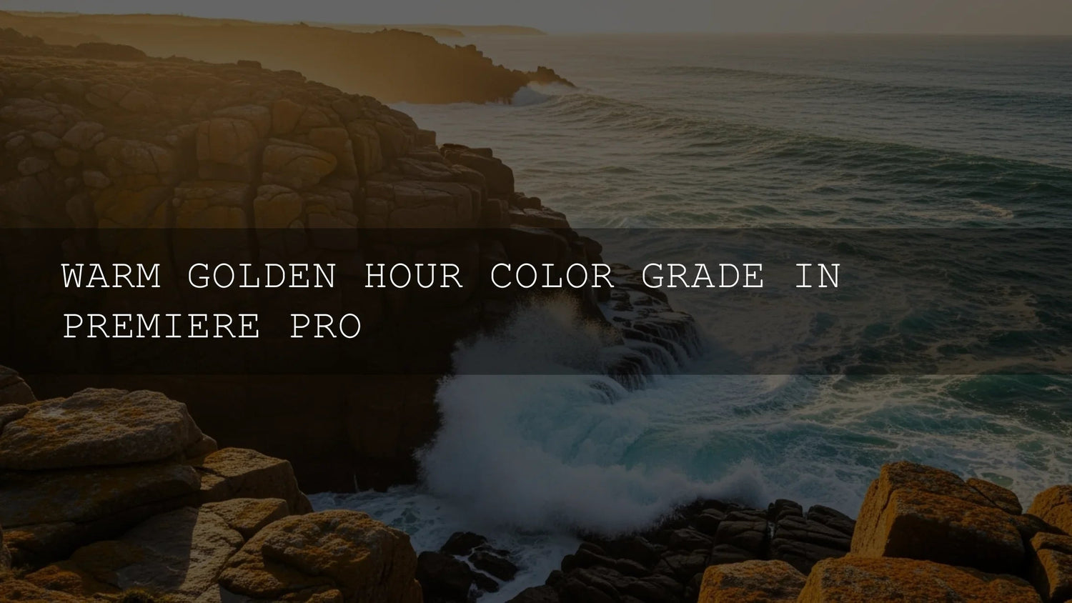
Golden Hour Color Grading in Premiere Pro: A Practical, Cinematic Workflow
That warm, sun-kissed glow you love isn’t just a “look”—it’s an emotional language. In this guide, you’ll turn any time of day into a believable golden hour using Lumetri Color in Adobe Premiere Pro. We’ll cover a clean step-by-step workflow, pro checks with scopes, and a few tasteful finishing moves so your grade feels cinematic—not orange or overcooked. For deeper feature references, see Adobe’s Lumetri Color panel overview, Lumetri Scopes guide, and Looks & LUTs in Premiere Pro.
Want a head start with cohesive warmth across a full project? Try a curated LUT bundle and a browsable collection so you can audition directions quickly and still refine by hand—Buy 3, Get 9 FREE: 700+ Cinematic Video LUTs and Lightroom Presets collection.
Why the Golden Hour Look Works
- Emotional resonance: Warm midtones and highlights subtly signal comfort, romance, nostalgia, and optimism.
- Flattering skin: Soft warmth + gentle contrast smooths imperfections and keeps complexions lively.
- Instant polish: The mellow roll-off and subtle diffusion read as “cinema” even on fast-turnaround edits.
- Project cohesion: A shared tonal bias helps unify clips shot at different times/places.
- Depth cues: Slightly cooler, clean shadows against warm mids/highs create dimensionality.
Premiere Pro Setup for Color Success
Open Window > Lumetri Color and Window > Lumetri Scopes. Work in the Color workspace so Basic Correction, Creative, Curves, Color Wheels/HSL, and Scopes are always visible. Adobe’s pages on the Lumetri Color interface and Scopes are great refreshers.
Step-by-Step Workflow: From Neutral to Golden
Phase 1 — Build a Neutral Foundation (Basic Correction)
- White balance first: Use Temperature to neutralize obvious blue/orange bias. Don’t force warmth here—save it for later so skin tones stay honest.
- Exposure without clipping: Nudge Exposure until the waveform shows solid mids and highlight detail intact. Avoid crushed blacks or blown whites.
- Gentle contrast: For a soft, cinematic roll-off, use modest Contrast. You can build perceived contrast later with curves and glow. For fundamentals, see Adobe’s Basic color correction options.
Phase 2 — Infuse Warmth & Character (Creative + Curves)
- Looks/LUTs for direction: In Creative > Look, test a warm or filmic LUT to set the tonal bias, then blend with Intensity (often 30–60%). Reference: Adobe: Looks & LUTs. You can install your own .cube files if needed: Install custom LUT files.
- RGB Curves for warm mids/highs: Nudge the Red curve up in mids/highlights; raise Green slightly in highlights for a yellow-leaning warmth. Keep the Blue curve steady (or a hair down in the top end) to avoid fighting the warmth.
- Hue vs Sat curves: Gently increase saturation around Reds/Oranges/Yellows for sun-kissed tones. If skies feel loud, slightly lower Blues/Cyans saturation for balance.
Phase 3 — Bloom, Vibrance & Vignette (Tasteful Finishing)
- Faded Film (Creative): A small bump softens digital hardness and pairs beautifully with warmth.
- Vibrance over Saturation: Add life to muted colors without nuking skin tones. Keep global Saturation conservative—natural beats neon.
- Subtle vignette: A soft, barely noticeable vignette centers attention and enhances intimacy.
- Optional dreamy diffusion: Duplicate the clip above, apply Gaussian Blur, set blend mode to Screen or Soft Light, then drop opacity to ~5–15%. Adjust blur radius until highlights glow, not smear.
Phase 4 — Verify with Scopes & Match Across the Timeline
- Waveform: Highlights lifted but not clipped; mids readable; blacks not crushed.
- Vectorscope: Skin tones clustering toward warm oranges but staying on/near the skin-tone line. See Adobe’s Lumetri Scopes overview.
- Histogram: Slight right-lean from warm brightness, still balanced.
- Paste Attributes: After you nail one shot, Copy > Paste Attributes (Lumetri Color) onto similar clips, then trim per-shot.
Real-World Notes from the Edit Bay
I tested this on a bridal prep scene shot at noon under harsh light: neutralize first, then warm mids/highs with curves, keep shadows clean, and add a faint glow layer. The skin stayed natural, the dress held highlight texture, and the bouquet popped without cartoon reds.
Presets vs Manual Editing (When to Use Which)
- Presets/LUTs: Great for speed, consistency, and establishing direction. Perfect when you need cohesive warmth across many clips fast (doc, travel series, vlogs).
- Manual grading: Essential for hero shots, tricky mixed lighting, or precise brand looks. You’ll still refine any LUT with curves and selective adjustments.
- Best of both: Use a warm LUT at low intensity for bias, then shape with curves/HSVs. It’s fast and precise.
To explore creative directions quickly and keep a cohesive tone, try: cinematic LUT bundle and 1000+ Master Lightroom Presets—audition, then fine-tune with Lumetri. Browse the full range here: Lightroom Presets.
Common Pitfalls (and Easy Fixes)
- Over-saturation: If skin turns pumpkin, reduce Look Intensity, pull down orange saturation, and re-balance the red curve.
- Orange shadows: Keep shadows slightly cooler/neutral for depth; avoid pushing warmth into the toe.
- Clipped highlights: Roll back Whites or curves; re-check waveform for detail in veils, clouds, metallics.
- No reference: Keep a still from your favorite warm sequence on a second monitor; A/B during grading.
Shot-to-Shot Matching Checklist
- Normalize exposure and white balance first.
- Apply your warm bias (LUT or curves).
- Dial skin tones with hue vs hue and hue vs sat.
- Check scopes (vectorscope for skin, waveform for exposure).
- Finish with vignette and optional diffusion.
Related Reading
- Warm color grading tutorial for Premiere Pro
- How to use scopes for accurate skin tones
- Cinematic look with curves and vignettes
- Efficient workflow for LUTs and presets
Quick Tools & Resources
- Learn the Lumetri Color panel from Adobe.
- Understand Lumetri Scopes for objective checks.
- Apply/organize Looks & LUTs the right way.
FAQ
How warm should I push the image?
Use curves and hue vs sat to bias mids/highs warm while keeping shadows closer to neutral. If skin or whites look tinted, back off until it feels natural on the vectorscope skin line.
Can I do this without LUTs?
Absolutely. Start neutral, warm mids/highs with RGB curves, boost vibrance slightly, add a soft vignette, and verify with scopes. LUTs simply make the first 80% faster.
What order should I apply effects?
Normalize (WB/exposure), then stylize (LUT/curves/HSV), then finish (vibrance, vignette, optional diffusion). Re-check scopes after each stage.
How do I keep skin tones from going orange?
Reduce Look Intensity, pull back orange saturation with hue vs sat, and nudge hue vs hue toward the skin-tone line. Keep shadows cleaner/cooler for depth.
What if my highlights are too harsh?
Lower Whites/Highlights, soften with a touch of Faded Film, or add a light diffusion layer (blur + Screen/Soft Light at low opacity) to bloom only the brights.
If you want a fast, cohesive warm look you can still customize, explore 700+ Cinematic Video LUTs, pair with 1000+ Master Lightroom Presets, and keep browsing in the Lightroom Presets collection. Need install help? See installation & getting started. Try these tools today—Buy 3, Get 9 FREE.
Written by Asanka — creator of AAAPresets (10,000+ customers).

Leave a comment
This site is protected by hCaptcha and the hCaptcha Privacy Policy and Terms of Service apply.