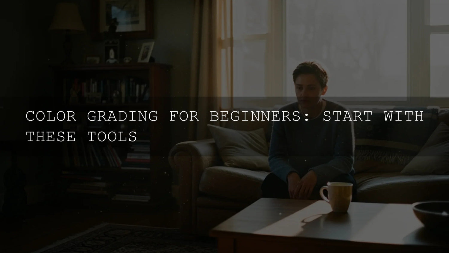
Make your footage look cinematic in Premiere Pro: a clear, creator-friendly workflow
Want a cinematic look in Premiere Pro without guesswork? This step-by-step guide shows how to grade with Lumetri Color, use LOG footage and LUTs, set a theatrical aspect ratio, simulate depth of field, add tasteful grain/flares, and finish with sound that feels like film. I road-tested this workflow on a beach wedding doc and a moody studio interview—both leveled up fast once the foundation was right.
If you’d like a jumpstart for looks while you learn, try a focused LUT pack and keep a browsable library handy. Explore the Cinematic LUTs for Premiere Pro collection and a versatile bundle like High-Demand Cinematic LUTs Set—and remember our offer: Buy 3, Get 9 FREE.
What actually makes footage feel “cinematic”
Films combine several ingredients. When you’re editing, target these first:
- Color & palette: a cohesive grade that sets mood and story (warm nostalgia, cool tension, gritty desaturation).
- Depth of field: subject separation that guides attention (optical or simulated).
- Aspect ratio: 2.35:1–2.39:1 framing signals “theatrical” and focuses composition.
- Lighting & contrast: motivated light and controlled shadows.
- Composition & movement: deliberate frames, stable motion, and restrained transitions.
For a deeper look at warmth as a storytelling tool, see how golden tones create intimacy. For transitions that feel like cinema rather than “YouTube-y,” skim the best transitions for Premiere Pro.
Phase 1 — Shoot for the grade (the unseen foundation)
Shoot LOG or flat when possible
LOG/flat profiles preserve highlight/shadow detail so you can push a richer grade later. Yes, LOG looks washed out—by design. You’ll convert and shape it in Lumetri.
Technical guardrails that pay off in the edit
- Resolution & frame rate: capture the highest practical resolution for reframing and clean slow-mo.
- Stability: prioritize tripod/gimbal; use Warp Stabilizer only when needed (Adobe’s Warp Stabilizer guide).
- Intentional light: soft sources, negative fill, and motivated key/backlight give you contrast to shape in the grade.
Phase 2 — Grade like a colorist with Lumetri Color
Open Window > Lumetri Color. Adobe’s overview is a great quick refresher: Adjust color with the Lumetri Color panel.
Step-by-step Lumetri workflow
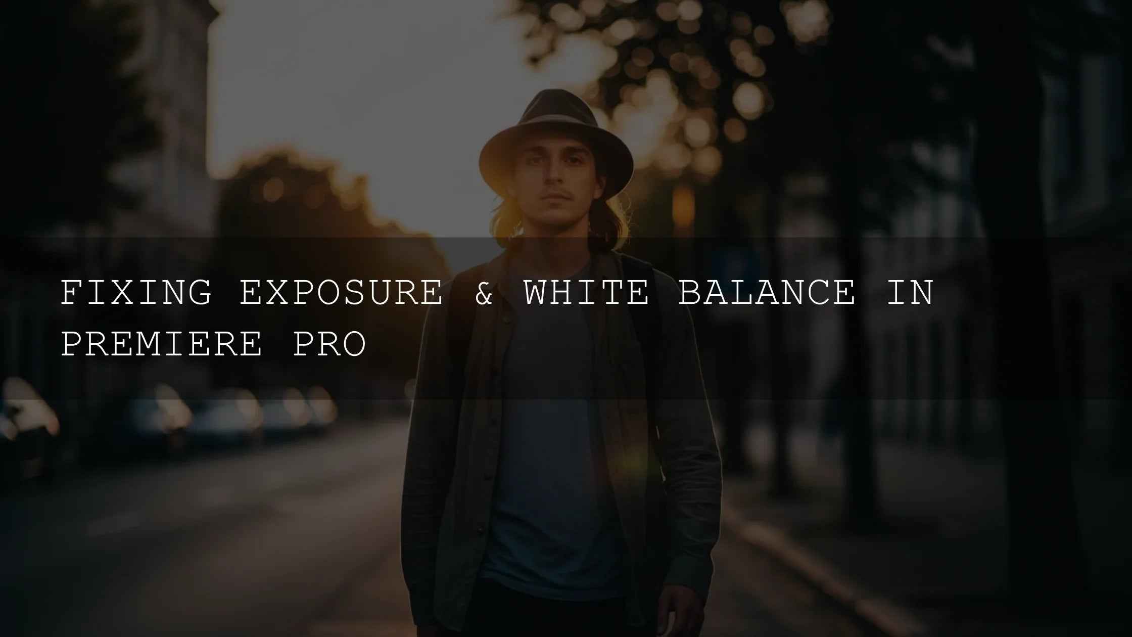
- Basic Correction (technical balance): set white balance and exposure; normalize LOG with an Input LUT if needed (Adobe: add Look-Up Tables).
- Creative (personality): refine contrast/softness (e.g., Faded Film), keep sharpening subtle, and avoid over-saturation.
- Curves (precision): add an S-curve for depth; nudge individual RGB curves to tint shadows/mids/highlights.
- Color Wheels & Match (polish & consistency): bias shadows cool for mood or highlights warm for daylight continuity; use shot-to-shot matching to maintain a unified look.
- Check with scopes: verify exposure and hue objectively with Waveform, Vectorscope, and Parade (Lumetri Scopes reference).
Want a practical, creator-first walkthrough? Try our Premiere Pro color grading guide next.
Presets & LUTs vs. manual grading (quick comparison)
- LUTs/presets — speed & cohesion: instant, repeatable baselines; great for social series, client packages, and cross-camera matching. See why top filmmakers still rely on LUTs.
- Manual grading — ultimate control: exact mood/skin tones; more time-intensive but uniquely yours.
- Best of both: start with a LUT for speed, then tailor with curves, wheels, and HSL.
If you want polished looks ready in seconds, browse Cinematic LUTs Packs or pick a style-forward set like Cinematic Moody Look Film LUTs. Buy 3, Get 9 FREE applies site-wide.
Phase 3 — Get theatrical framing: 2.35:1–2.39:1 aspect ratio
Those “black bars” aren’t just vibes—they guide composition and change how the eye reads a frame. Two easy approaches:
- True sequence sizing: create a sequence with 3840×1612 (≈2.39:1) or 3840×1634 (≈2.35:1). Scale your footage to fit horizontally.
- Letterbox overlays: use a widescreen matte on top video track so you can keep delivery at 16:9 but compose within the bars.
Whichever you choose, re-check headroom and lines of interest. The ratio change often invites lower horizons and more negative space—lean into it.
Phase 4 — Simulate shallow depth (when you couldn’t shoot it)
When bokeh wasn’t possible in-camera, simulate separation carefully:
- Duplicate the clip; blur the bottom layer (Gaussian Blur).
- Mask the subject on the top layer; feather generously (40–120+) for natural roll-off.
- Keyframe the mask if the subject moves; avoid “halo” edges.
Tip: a little background blur plus a touch of Faded Film and noise often reads more photographic than heavy blur alone.
Phase 5 — Tasteful polish: grain, flares, and transitions
Grain that adds life (not noise)
Add a subtle grain overlay or native effect to restore texture and fight digital plasticity. Keep it gentle—enough to kiss the mids/highs without muddying shadows.
Lens flares & light leaks (sparingly)
Blend on Screen/Add and position as if a practical source caused it. Understate it; you want character, not distraction. For hands-on transition styling, see our guide to film burns & light leaks in Premiere Pro.
Transitions that feel like film
- Hard cuts most of the time.
- J-/L-cuts for story flow (let audio lead or trail picture).
- Whip pans/match cuts for energy when justified by action or shape.
Need ready-to-use options? Explore Premiere Pro transition effects or review top transition ideas.
Phase 6 — Sound: the secret half of “cinematic”
- Music: score for pacing and emotion. Build dynamics—quiet breath before big moments.
- SFX/ambience: layer room tone, foley, and scene-specific beds for presence.
- Dialogue clarity: gentle noise reduction, subtractive EQ around mud (150–300 Hz), and consistent loudness.
- Mix balance: music supports dialogue; SFX punctuate picture edits.
Fast baseline while you learn
For consistent color and faster delivery, pair a dependable LUT set with a photo preset library so your thumbnails and stills match your video. Try Music Video Color Grading LUTs (Part 12) for bold stylization, Creamy Minimalist Cinematic LUTs for subtle polish, and the cross-platform 1000+ Master Lightroom Presets Bundle for cohesive stills—Buy 3, Get 9 FREE.
Related reading
- Premiere Pro Color Grading: Pro Workflow (Scopes, Curves, Wheels)
- Mastering one-click edits with presets, LUTs & transitions
- Why top filmmakers still rely on LUTs in an AI world
- The best transitions for Premiere Pro
- Cinematic warmth: using golden tones with intention
Reference links (Adobe)
- Adobe: Adjust color with the Lumetri Color panel
- Adobe: Lumetri Scopes (Waveform, Vectorscope, Parade)
- Adobe: Add Look-Up Tables (LUTs) in Premiere Pro
- Adobe: Stabilize footage with Warp Stabilizer
FAQ
What’s the fastest way to get a cinematic look in Premiere Pro?
Normalize LOG with an Input LUT in Basic Correction, add a subtle creative LUT for style, shape contrast with curves, bias shadows/highlights with Color Wheels, and compose inside a 2.39:1 matte. Check scopes at each step.
Do I need LUTs if I know manual grading?
No—but LUTs save time and keep looks consistent across shots/cameras. Many pros start with a LUT, then fine-tune manually for skin tones and scene intent.
2.35:1 or 2.39:1—does it matter?
Both read “cinema.” Pick one and stay consistent. If delivering 16:9, use a letterbox matte so your file stays platform-friendly.
How much grain should I add?
Enough to add texture without muddying shadows—often a light layer that’s more visible in mids/highs. Grain should be felt, not noticed.
My footage is shaky—should I just use Warp Stabilizer?
Use it sparingly. Prioritize solid capture. If you must stabilize, start with modest Smoothness and watch for warping; cut around problem areas or add slight crops to hide edges.
Written by Asanka — creator of AAAPresets (10,000+ customers).

Leave a comment
This site is protected by hCaptcha and the hCaptcha Privacy Policy and Terms of Service apply.