How to Balance Warm Indoor Light and Cool Window Light in 2026
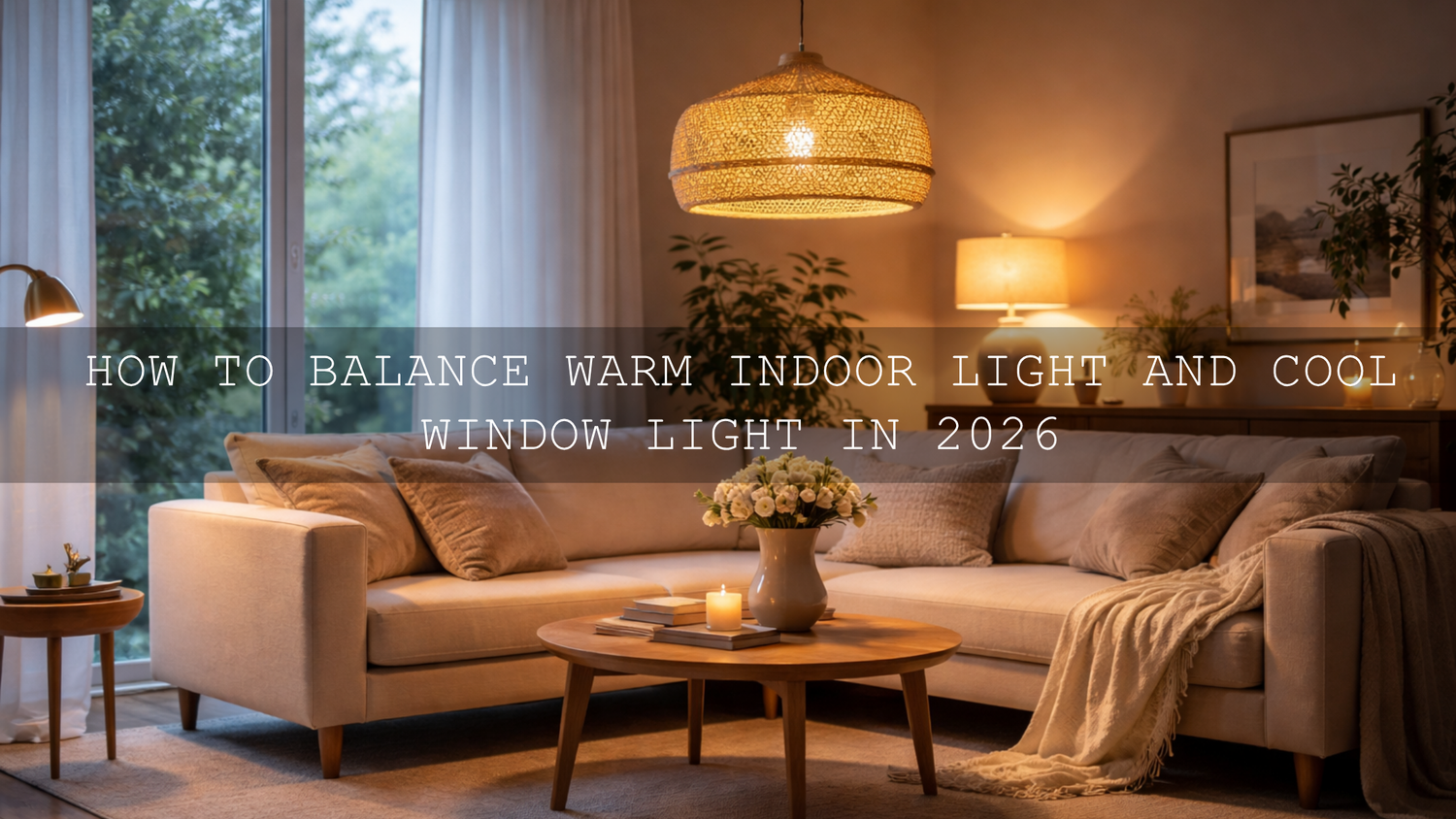
Mixed lighting interior photography is one of the biggest reasons a room looks amazing in real life but slightly off in the final photo. When warm indoor light from lamps meets cool window light from daylight, white walls can turn yellow in one corner and blue in another. In interior design photography, real estate edits, and cozy lifestyle shoots, the fix is not to remove all character. The goal is to control white balance, shape contrast, and use Lightroom presets or LUTs in a way that keeps the space believable, polished, and inviting.
If you want a faster starting point for indoor scenes, try AI-Optimized Interior Design & Real Estate Lightroom Presets and browse the AI-Optimized Lightroom Presets for Mobile and Desktop collection. That combination gives you a cleaner base for windows, lamps, wall color, and furniture tones, and it fits naturally with the brand offer: Buy 3, Get 9 FREE.
Here’s why this matters. A room can feel open, calm, and premium when the light feels intentional. The same room can feel muddy, uneven, or strangely tinted when the edit ignores the difference between daylight and artificial light. I have tested indoor edits on café corners, rental interiors, and living-room setups where a cool window, a warm pendant light, and a neutral wall all lived in the same frame. The best results almost always came from balancing the room first and styling it second.
Why mixed lighting causes so many indoor editing problems
Window light and indoor bulbs do different jobs. Daylight usually feels cleaner and cooler, especially when it is coming from open shade or a bright overcast window. Household bulbs, table lamps, sconces, and pendants usually feel warmer and more golden. Both can look beautiful on their own. The problem starts when they overlap in one frame and your camera has to guess which part of the scene should look neutral.
That is why you often see these issues:
- White walls shift color from one side of the room to the other.
- Wood tones go too orange when the edit tries to warm the whole image.
- Window areas turn blue when you correct for the lamps.
- Skin tones become inconsistent in lifestyle or portrait shots taken indoors.
- Contrast feels harsh because bright windows and warm shadow zones are fighting each other.
If you have been seeing those problems, you are not imagining it. This is one of the most common indoor workflow issues, and it is exactly why articles like mastering presets in tricky mixed lighting with indoor window light and simple fixes for indoor lighting problems matter so much for creators.
What good balance actually looks like
Balanced mixed light does not mean every part of the room becomes the exact same color. That usually looks flat and unnatural. A better target is this:
- The room still feels warm where warm light should feel warm.
- The window side still feels fresh and breathable instead of yellow.
- Neutral objects stay believable.
- The viewer notices the room, mood, and design first, not the color problem.
In other words, the edit should feel cohesive, not clinically corrected.
Start with the room, not the preset
One of the biggest mistakes in mixed lighting interior photography is applying a strong style preset before the foundation is stable. Presets are fast, but they are not mind readers. If the room already has blue daylight on one side and orange lamp glow on the other, a warm preset can push the whole frame further into orange, while a cool preset can make the windows feel even colder.
Before you style anything, do three simple things:
- Choose the main light story of the image. Is the room supposed to feel airy and bright, or warm and intimate?
- Set a believable global white balance.
- Use local adjustments to calm the worst problem areas before adding a creative look.
Adobe’s own resources are still the best place to review the fundamentals, especially Adobe’s Lightroom Classic guide to white balance and tone and Adobe’s masking tutorial for local adjustments. For color relationships and warm-versus-cool harmony, Adobe Color harmony guidance is also useful when you want a room to feel coordinated instead of random.
A practical step-by-step workflow for balancing mixed lighting
Let’s break it down into a workflow you can actually repeat.
1) Decide which light source leads the image
Not every frame should be corrected the same way. In a real estate photo, the window side often leads because buyers want the room to feel bright and spacious. In a café, bedroom, or restaurant scene, the warm lamps may be the emotional center. Pick the main mood first. Once you do that, every edit becomes easier.
2) Neutralize the worst color cast first
Look for something that should be close to neutral: white bedding, a gray countertop, a white wall, a paper menu, or a ceiling. Use that as your reference. If the room is extremely split between cool and warm zones, do not chase perfect neutrality everywhere. Just remove the strongest cast so the room stops feeling broken.
3) Fix exposure before fine color work
Many indoor edits fail because the window is too bright and the lamp side is too dark. Lower highlights, raise shadows carefully, and keep your whites from clipping too hard. Once exposure is more even, color becomes easier to judge.
4) Use masks instead of forcing one global correction
This is the part most people skip. If the left side of the room is blue from the window and the right side is orange from the lamp, one global slider move will rarely solve both. Use masks or gradients to cool only the too-warm side or warm only the too-cold side. That single habit can completely change your indoor workflow.
I tested this on a living-room edit recently: one broad global white balance correction made the sofa look fine but turned the window trim too blue. A soft local mask on the window side fixed it in seconds without damaging the rest of the room.
5) Apply style after correction
Once the room feels controlled, then you can add character. This is where presets become powerful instead of risky. For stills, AI-Optimized Aesthetic Coffee Shop Warm Film Lightroom Presets work especially well when you want warm wood, soft highlights, and inviting indoor tones without crushing the clean daylight side. If you want a richer, more editorial finish, AI-Optimized Warm Velvet Lightroom Presets can add premium warmth and smoother tonal depth.
6) Protect whites, skin, and wood tones
Three things reveal a bad indoor edit immediately: fake white walls, strange skin, and oversaturated wood. Keep an eye on all three. If your walls are yellow, pull back. If faces go orange, pull back. If the floorboards start glowing unnaturally, pull back.
7) Finish with subtle consistency
The final step is not adding more drama. It is making the whole frame feel unified. Tiny HSL refinements, slight contrast control, and a mild tone-curve adjustment often do more than another heavy preset layer.
If you want a deeper walkthrough on the temperature side of the process, read how to balance temperature and tint after applying a preset.
Presets vs manual editing for mixed lighting
This is where a lot of creators get stuck, so it helps to be clear.
Manual editing wins when:
- The room has extreme blue and orange separation.
- You have multiple bulb types in one scene.
- The image includes people and interiors together.
- You need precision for client work, property listings, or editorial delivery.
Presets win when:
- You already corrected the base white balance.
- You need consistency across a large set of interior images.
- You are building a specific mood across a brand, listing set, or content series.
- You want speed without starting from zero every time.
The best workflow is usually not preset or manual editing. It is manual correction plus a preset finish. That gives you both control and speed. For interior and property work, that balance is especially useful, which is why AI-Optimized Interior Design & Real Estate Lightroom Presets are such a practical fit for rooms with windows, practical lamps, reflective surfaces, and mixed wall tones.
Physical changes that make editing easier before you even open Lightroom
Good editing starts at capture. If the light is chaotic in camera, your post-production time grows fast.
- Turn off mismatched bulbs: If one lamp is much warmer or greener than the rest, it can contaminate the whole room.
- Use matching bulbs where possible: Consistency in practical lights makes color correction easier later.
- Diffuse harsh window light: Sheer curtains can soften the cool side of the frame and make transitions smoother.
- Bounce light gently: A white wall, reflector, or pale curtain can fill dark warm corners without adding another color cast.
- Watch reflective surfaces: Mirrors, glossy cabinets, polished tables, and stainless appliances can pick up different color temperatures fast.
These small capture decisions save a surprising amount of time. In interior design photography, they also help materials look more premium because texture reads better when the lighting transition is softer.
How to choose the right look for different indoor spaces
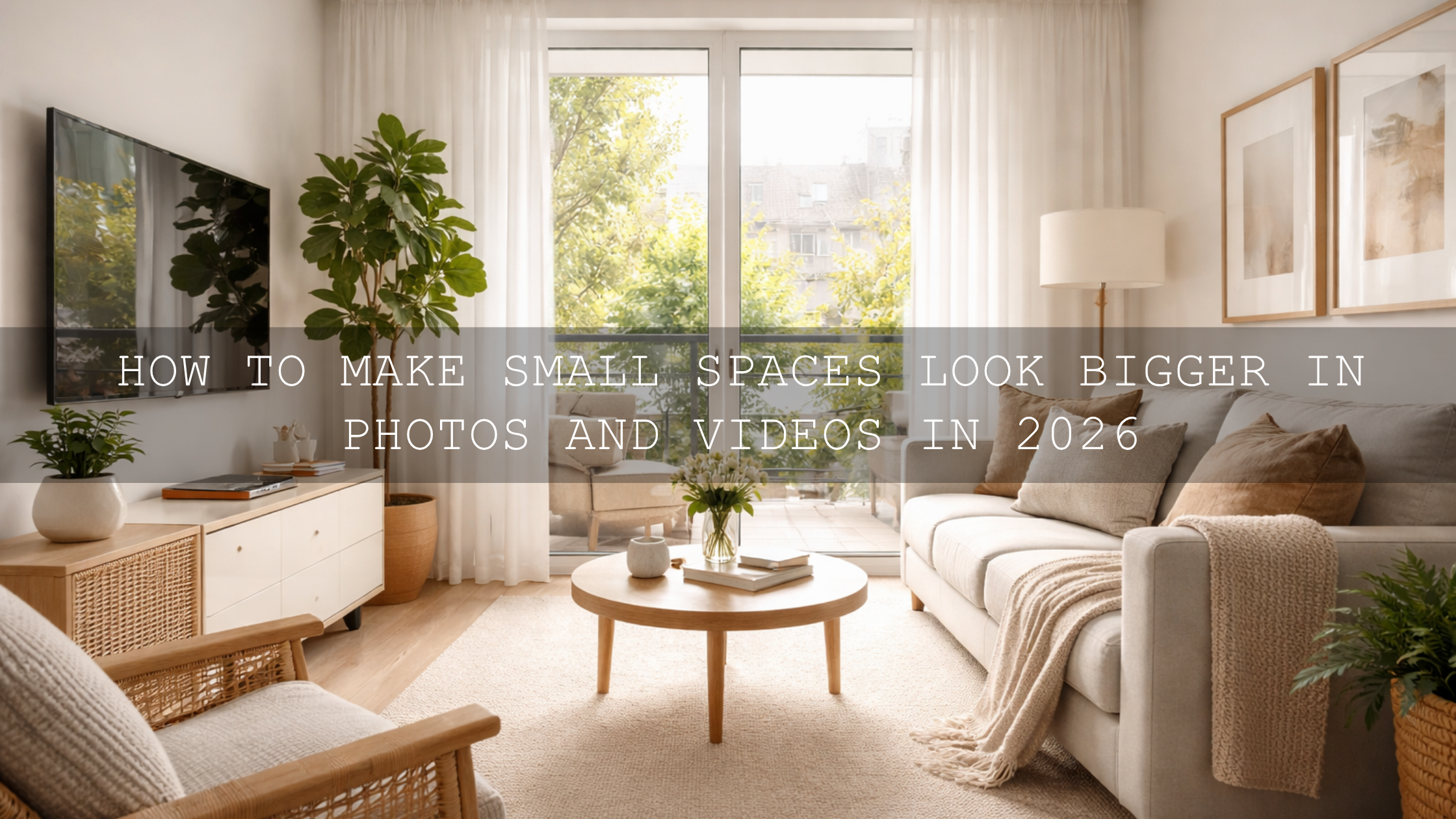
Clean, bright real estate interiors
For listings, rentals, and architecture, the priority is clarity. Keep the window side believable, open the shadows carefully, and avoid over-warming the walls. This is also where browsing the full AI-Optimized Lightroom Presets collection can help you build a repeatable interior workflow across multiple rooms and properties.
Cozy cafés, restaurants, and lifestyle corners
These scenes benefit from warmth, but it needs control. Rich browns, creams, wood, pastries, and lamp glow should feel inviting, not orange-heavy. If you also shoot video in these spaces, Aesthetic Coffee Shop Cinematic Warm Film LUTs Pack gives you a matching warm film direction for footage, and the Cinematic LUTs collection helps you keep continuity across editing apps.
Editorial or luxury interiors
Luxury spaces usually need smoother contrast, cleaner whites, and controlled gold tones. The warmth should feel expensive, not heavy. That is where velvet-style grading, careful highlight roll-off, and restrained saturation make the room feel elevated.
Common mistakes that make mixed light look worse
- Over-correcting all warmth: A room with lamps should still feel warm somewhere.
- Ignoring local fixes: One global adjustment rarely solves a split-light scene.
- Trusting auto settings too much: Auto white balance can drift badly indoors.
- Pushing orange and yellow too far: This is especially common after applying warm presets.
- Forgetting consistency across a gallery: One room may look fine alone but wrong next to the others.
If you have ever dealt with overly warm files after using a preset, this related guide on how color grading shapes perception in real estate and architecture pairs well with a more technical indoor-fix workflow.
Related reading
- Mastering presets in tricky mixed lighting with indoor window light
- Why presets look bad indoors and how to fix them
- How to balance temperature and tint after applying a preset
- Presets for real estate photography: bright, clean, professional results
- How color grading shapes perception in architecture and real estate


Final editing checklist for warm indoor light and cool window light
- Choose the room’s main mood before you touch color.
- Set a believable white balance first.
- Even out exposure before applying style.
- Use masks to fix color temperature region by region.
- Apply presets only after the room feels stable.
- Protect whites, skin, and wood tones.
- Keep the final image cohesive, not overly corrected.
Once you understand that mixed lighting is a control problem more than a preset problem, the whole process gets easier. You do not need to fear blue windows or warm lamps. You just need a repeatable workflow and the right tools. Start with AI-Optimized Interior Design & Real Estate Lightroom Presets, explore the Lightroom Presets collection for more indoor looks, and if you need matching video color, add the Aesthetic Coffee Shop Cinematic Warm Film LUTs Pack. And if you want help choosing the right set for your workflow, you can always contact us.
How do I fix a room that looks blue near the window and orange near the lamp?
Start with a global white balance that feels believable overall, then use masks or gradients to correct each zone separately. A single global adjustment usually cannot fix both sides well.
Should interior photos always be perfectly neutral?
No. A good interior edit should feel cohesive, not sterile. Keep some warmth where the practical lights belong and some freshness near daylight, but remove the distracting color clash.
Are presets enough for mixed lighting interior photography?
Presets are best after you correct the base file. For mixed lighting, manual white balance and local masking first usually lead to better, more consistent results.
What is the best workflow for real estate interiors?
Correct exposure, recover windows carefully, balance white walls, use local masks for problem zones, then apply a clean preset style that keeps the room bright and believable.
Can I match photo and video color in the same indoor space?
Yes. Correct the room first, then use a consistent preset or LUT family so stills and video share the same warmth, contrast, and overall mood.
Written by Asanka — creator of AAAPresets (10,000+ customers).
Leave a comment
This site is protected by hCaptcha and the hCaptcha Privacy Policy and Terms of Service apply.