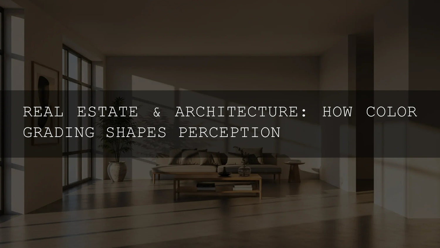
Real Estate Color Grading: How Color Shapes Emotion, Perception, and Sales
Ever walked into a home and felt an instant vibe? That’s real estate color grading at work. In 2025, smart color choices in photos and video don’t just make listings “prettier”—they guide emotion, spotlight architecture, and nudge buyers toward action. In this guide, we’ll break down how color psychology influences property decisions, how to enhance lines, textures, and light, and how to build an efficient workflow for both photography and video with Lightroom presets and LUTs. I’ll also share quick pro tips from real shoots so you can apply this today.
Try AI-Optimized Interior & Real Estate Lightroom Presets — Buy 3, Get 9 FREE. Or browse the full Lightroom Presets collection for interiors, architecture, and more.
The Psychology of Color: Why Buyers “Feel” a Listing Before They Read It
Warm palettes (subtle golds, soft ambers) convey comfort and hospitality—great for family living rooms. Cool palettes (muted blues, balanced greens) suggest hygiene and efficiency—ideal for kitchens and baths. Neutrals steady the frame: beige, gray, and taupe create a calm foundation that lets materials and lines speak. The key is intentionality—select a palette that fits the property’s architecture and the lifestyle you’re selling.
- Beach/Coastal: Lean into cool aquas and sea greens for calm and connection to nature.
- Urban/Modern: Cooler grays and precise whites underscore clean geometry and tech-forward finishes.
- Luxury/Executive: Deeper contrast and richer midtones signal sophistication without crushing detail.
On a recent condo shoot, I pushed the white balance slightly warm (+200 K) and lifted shadows +15 to make a compact living area read as cozy and inviting without faking the light.
For deeper fundamentals on color and tone tools, see Adobe’s guides to Lightroom Classic’s Develop tools and color workflows in Premiere Pro (Lightroom Classic – Develop module tools and Premiere Pro – Color correction basics).
Enhancing Architecture With Light & Color
Architecture is a dance of lines, forms, textures, and light. Effective color grading clarifies that dance:
- Lines: Use subtle clarity/structure to keep edges crisp—especially around cabinetry, tile, and window frames.
- Textures: Gentle contrast + selective color keeps wood grains, stone, and fabric honest.
- Light: Balance window highlights and interior shadows so the eye travels naturally through the frame.
For photography, AI-Optimized Interior Design & Real Estate Lightroom Presets are engineered for indoor lighting and architectural clarity—brightening spaces while holding window detail and keeping colors believable.

- Real estate agents: Make listings feel bright, clean, and move-in ready.
- Interior designers: Present materials and palettes accurately (and beautifully).
- Airbnb hosts: Lift booking appeal with consistent, inviting visuals.
- Content creators: Build a recognizable “clean architecture” look across posts.
Available in XMP & DNG, these presets keep your workflow fast across Lightroom Mobile, Desktop, and Adobe Camera Raw.
From Photos to Video: The Cinematic Edge of LUTs
Video tours are where buyers “live” a space. Consistent color across rooms is the difference between amateur and premium. A LUT-based workflow (Premiere Pro, DaVinci Resolve, Final Cut Pro) speeds this up and keeps looks consistent.
Real Estate LUTs Pack is tuned for interiors and exteriors, balancing brightness and color temperature so daylight shots, tungsten rooms, and twilight exteriors feel coherent.

- One-click base grade: Establish a neutral, professional baseline fast.
- Cross-software compatibility: .cube LUTs work in Premiere Pro, DaVinci Resolve, Final Cut Pro, After Effects, and more.
- 4K-ready: Clean color math that holds up in high-resolution tours.
Tip from set: I apply a neutral Real Estate LUT to all clips first, then fine-tune exposure, white balance, and saturation room-by-room in Lumetri to keep window highlights and wall paint true.
Presets vs Manual Editing (and When to Blend Both)
- Presets/LUTs: Speed, consistency, and a defined aesthetic. Best for tight turnarounds and brand cohesion across multiple listings.
- Manual editing: Precision for tricky interiors (mixed light, glossy surfaces, tinted glass) or hero images where every nuance matters.
- Best of both: Start with a preset/LUT for direction, then refine exposure, WB/tint, HSL, and local masks to match the space.
A Fast, Repeatable Workflow for Interiors
- Capture for dynamic range: Use a tripod, keep ISO low, bracket if needed to protect windows.
- Baseline color: In Lightroom, correct white balance before creative moves; in video, set a neutral WB/exposure in Lumetri.
- Apply look: Use AI-Optimized Interior & Real Estate Presets (photo) or Real Estate LUTs (video) to unify tone.
- Refine locally: Mask windows, lift corners, reduce color casts from mixed lighting.
- Consistency pass: Align color across rooms and sequences so the tour feels seamless.
Common Problems (and Quick Fixes)
- Orange/green casts from mixed lights: Balance WB, then reduce orange/green in HSL; for video, use Temperature/Tint and a targeted Hue vs Hue curve.
- Blown windows: Pull highlights; use a linear gradient to recover detail, then add a soft S-curve to maintain contrast.
- Gray, flat rooms: Add midtone contrast and gentle saturation; protect whites so walls don’t yellow.
- Glossy surfaces with color bounce: Lower saturation selectively (HSL/Curves) and use local desaturation on reflections.
Deeper Learning & Related Reads
Sharpen your technique and expand your toolkit with these internal guides and case studies:
- Presets for Real Estate Photography: Bright, Clean & Professional
- Case Study: How LUTs Transformed Real Estate Videos
- Warm vs Cool Tones: Picking the Right Look
- Stacking Lightroom Presets for Unique Results
Practical how-to pages for your workflow:
Quick Pro Tips from Real Shoots
- Meter for windows, lift shadows later: Protects highlight detail while keeping interiors natural.
- Neutral paint ≠ boring images: Use subtle color contrast in décor to create depth without misrepresenting the space.
- Consistency sells: Keep one calibrated look per listing; buyers subconsciously equate consistency with quality.
Recommended Products & Collections
- AI-Optimized Interior Design & Real Estate Lightroom Presets
- Real Estate LUTs Pack
- 1000+ Master Lightroom Presets Bundle
- Cinematic LUTs for Premiere Pro (Collection)
- Lightroom Presets – Mobile & Desktop (Collection)
Your Next Step
Color is the fastest path to emotion. When your photos and tours carry a cohesive, believable grade, buyers feel the story you’re selling—spaciousness, calm, luxury, or energy. Build a simple workflow, choose a consistent palette, and let your visuals do the heavy lifting.
Get the Interior & Real Estate Lightroom Presets or start grading video tours with the Real Estate LUTs Pack. If you want to explore more looks, browse all Lightroom Presets and Premiere Pro LUTs.
FAQ
What’s the quickest way to make interiors look bright but natural?
Fix white balance first, protect window highlights, then apply an interior-tuned preset. Finish with local masks to lift dark corners so walls stay clean and colors stay true.
Should I grade every room the same?
Keep a consistent baseline for cohesion, but tweak room-by-room for mixed lighting and materials. Consistency builds trust; small refinements keep it real.
Do I need LUTs if I already color grade manually?
LUTs establish a reliable starting point across many clips. You’ll still fine-tune exposure, WB, and saturation, but your look will stay consistent and faster to achieve.
Which software works with your LUTs?
Any editor that supports .cube LUTs, including Adobe Premiere Pro, DaVinci Resolve, Final Cut Pro, After Effects, and more.
Where can I learn the tools?
For photo, see Adobe’s Lightroom Classic Develop guide. For video, start with Premiere Pro color correction basics.
Written by Asanka — creator of AAAPresets (10,000+ customers).
Leave a comment
This site is protected by hCaptcha and the hCaptcha Privacy Policy and Terms of Service apply.