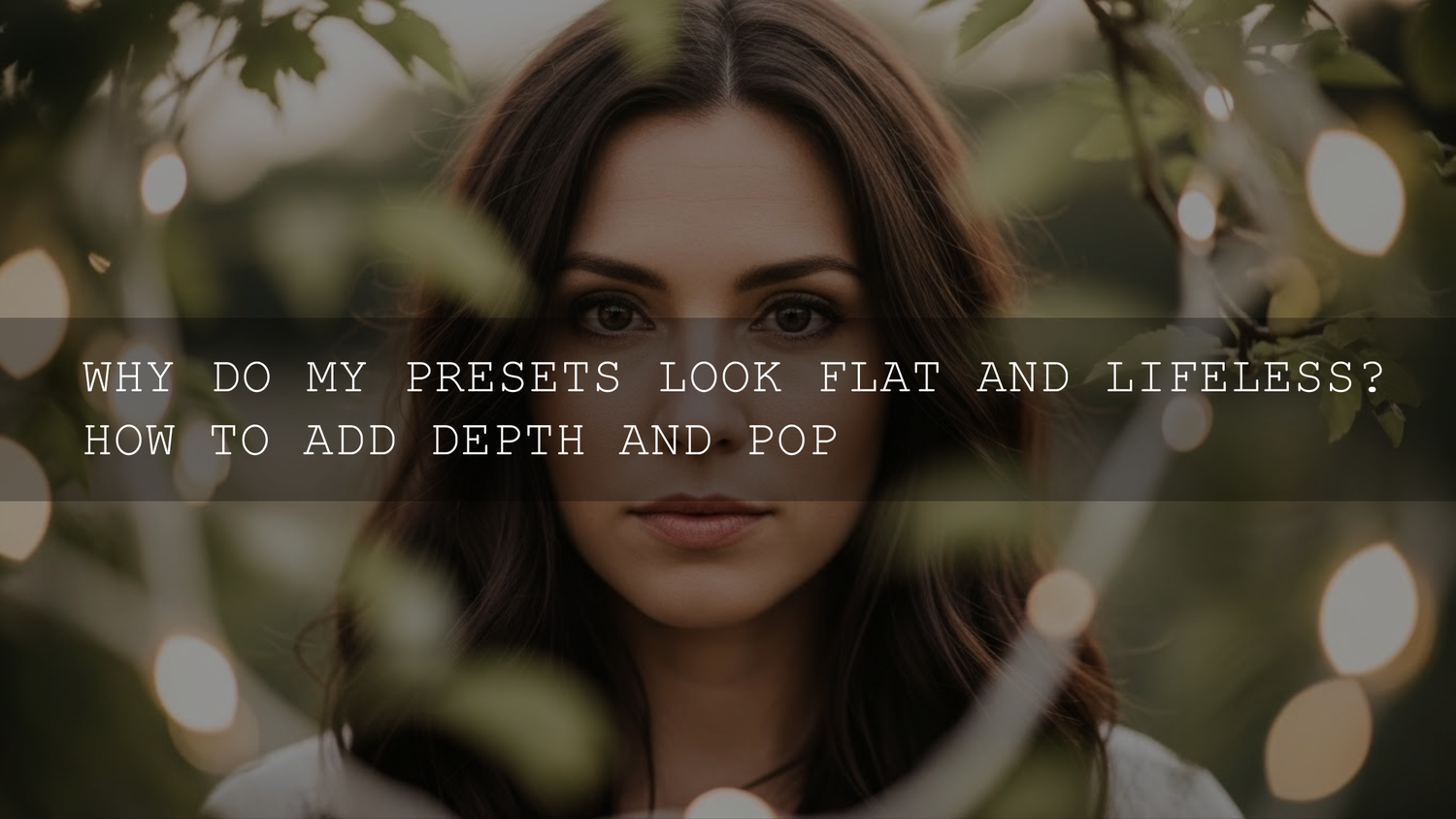
Why Your Lightroom Presets Look Flat (And How to Fix Low Contrast Fast)
If you’ve ever thought, “why do my Lightroom presets look flat?”—you’re not imagining it. A preset can turn a photo washed out, low contrast, and lifeless when your original exposure, white balance, or camera color profile doesn’t match what the preset was designed for. The good news: you don’t need to ditch presets. You just need a quick, repeatable workflow that adds depth, restores clean contrast, and makes your subject pop (without ruining skin tones).
I see this all the time: someone applies a “cinematic” look and the image suddenly feels gray, muddy, or “lying down” instead of jumping off the screen. Let’s fix that—step by step.
If you want a dependable starting point that covers basically every situation (portraits, travel, street, product shots), start with the 1000+ Master Lightroom Presets Bundle and browse the full Lightroom Presets for Mobile & Desktop collection—and remember: you can Buy 3, Get 9 FREE when you add 12 items to your cart.
What “Flat” Actually Means (So You Can Diagnose It in 10 Seconds)
A “flat” photo usually isn’t one problem—it’s a combo of these:
- No true black/white points: blacks are lifted (gray shadows) and whites are capped (dull highlights).
- Weak midtone separation: the subject blends into the background because tones are too similar.
- Muted color energy: saturation is low or colors are oversaturated but still look “dead” because luminance is wrong.
- Too much global correction: one preset pushes everything equally instead of shaping the subject vs background.
Presets are built on assumptions: “this image is exposed like this, shot in this kind of light, with these colors.” When your photo breaks those assumptions, the preset can’t “think”—it just applies math.
Why Presets Make Photos Look Flat (The Most Common Causes)
- Exposure mismatch: If your image is underexposed, a preset may lift shadows too hard and everything turns gray. If it’s overexposed, highlights clip and the image loses punch.
- Wrong white balance: A preset tuned for warm golden hour can make indoor shots look muddy; a cool preset can make skin look dull.
- Camera profile confusion: Different cameras (and even different profiles in Lightroom) can shift contrast and color response, making the same preset behave differently.
- Aggressive highlight/shadow settings: Many presets pull highlights down and lift shadows up—great on high-contrast scenes, but it can flatten already-soft lighting.
- “One-click final edit” expectation: A preset is a starting look, not a finished grade. The magic is in the small fixes after.
The Fix: A Repeatable “Depth & Pop” Workflow (Use This Every Time)
This is the workflow I use when a preset looks good stylistically but the photo still feels flat. I tested this approach on a quick street shoot at dusk (mixed neon + shadowy storefronts), and it instantly brought back separation without making the image crunchy or over-processed.
Step 1: Normalize the photo before you judge the preset
- Check Exposure first: get the overall brightness in the right neighborhood.
- Fix White Balance: aim for natural skin/neutral whites. If you’re unsure, start slightly warmer than you think for portraits.
- Watch the histogram: if it’s bunched in the middle, you’ll usually feel “flatness.”
Then apply your preset (or re-apply it). If the preset pushes exposure too far, pull it back—don’t fight an extreme baseline.
Step 2: Set real black and white points (instant contrast without ugliness)
Flat edits often happen because shadows never reach “real black,” and highlights never reach “clean white.” Here’s the fast fix:
- Adjust Whites: raise until highlights look alive, then back off if you lose detail.
- Adjust Blacks: lower until shadows feel grounded (but don’t crush important detail).
- Pro tip: do this gently—tiny moves go a long way once a preset is already shaping tones.
Step 3: Use the Tone Curve for “3D” separation (the secret sauce)
If you want depth, the Tone Curve is your best friend. A subtle S-curve increases midtone contrast (the “pop”) while keeping highlights and shadows controlled.
- Add a light S-curve: slightly lift upper mids, slightly lower lower mids.
- Keep it subtle: the goal is dimensionality, not a harsh “crushed” look.
- If the preset already has a curve: refine it rather than stacking a heavy second curve.
If you want a deeper breakdown of curves (and how to avoid banding/over-contrast), this guide is worth keeping open while you edit: Mastering Curves for Ultimate Color Control.
Step 4: Add “micro-contrast” (Clarity/Dehaze) but don’t overcook it
- Clarity: boosts midtone contrast—great for street, landscapes, textures. Go light for portraits.
- Dehaze: adds punch and cuts haze—amazing when the image is foggy or milky. Use subtly or it can look crunchy.
- Texture: add detail without making edges harsh (often safer than Clarity for skin).
If your preset looks flat because it lifted shadows too much, a tiny bit of Dehaze can restore depth fast.
Step 5: Fix color the pro way (HSL & luminance, not just Saturation)
Most people try to “fix flat” by cranking Saturation. That usually makes skin weird and colors loud-but-still-dead. Instead:
- Use Vibrance first: it boosts muted colors while protecting skin tones.
- Then use HSL/Color Mixer: adjust the luminance of key colors (sky blues, greens, oranges) to make the scene feel richer.
- Example: lower Blue luminance for a deeper sky; raise Orange luminance slightly to keep skin bright and healthy.
Want better color harmony decisions? Use a simple reference like Adobe Color’s wheel and harmony tool to think in complementary tones (warm highlights + cooler shadows is a classic “cinematic depth” recipe).
Step 6: Make the subject pop with masks (local adjustments beat global sliders)
Flatness often disappears the moment you separate subject from background. Do this with quick masks:
- Mask the Subject: add a touch of Exposure, Contrast, and Texture to the subject.
- Mask the Background: slightly lower Exposure or Saturation so the subject stands forward.
- Dodge & Burn (lightly): brighten catchlights/face planes, darken distracting bright edges.
If you want the official breakdown of masking tools and options, Adobe’s guide is excellent: Lightroom Classic masking tool overview.
Step 7: Sharpen smarter (so “pop” doesn’t turn into noise)
- Sharpen the edges, not the sky: use masking/edge control so smooth areas stay clean.
- Noise reduction is a trade: reduce noise but keep enough texture so the image doesn’t look plastic.
Two Real-World “Flat Preset” Fix Examples
Example A: Indoor window portrait looks gray and lifeless
Symptoms: shadows are lifted, whites are dull, skin looks a bit muddy. Fix: set white balance first, lower Blacks slightly, add a gentle S-curve, then mask the face for subtle exposure + texture. If you shoot a lot of indoor portraits, a clean base look helps—try something built for that lighting like AI-Optimized Soft Window Light Lightroom Presets.
Example B: Street photo loses punch after a “cinematic” preset
Symptoms: cool shadows + lifted blacks flatten the scene, neon doesn’t pop. Fix: deepen black point, add midtone contrast via curve, lower Blue luminance slightly, then mask the subject (or key storefront) to guide attention. For a punchier starting look made for street scenes, check AI-Optimized Cinematic Street Movie Lightroom Presets.
Presets vs Manual Editing: Which One Gets Better Results?
Presets are faster for consistency and direction. They give you a style baseline—especially if you edit lots of photos for a brand, wedding set, travel series, or content calendar.
Manual editing is more precise when lighting is tricky (mixed indoor light, harsh noon sun, fog, backlit portraits). You can shape tones exactly without inheriting a preset’s assumptions.
- Best of both worlds: use a preset for mood + palette, then do 5–8 targeted tweaks (white balance, black/white points, curve, HSL luminance, masks).
- When presets “fail”: it’s usually because the starting exposure and WB weren’t normalized first.
If you’re building a flexible toolkit for both speed and variety, the 1000+ Master Lightroom Presets Bundle is designed for exactly that—many looks, one consistent workflow.
Your “Fix Flat Presets” Checklist (Copy/Paste Mental Version)
- Normalize: exposure + white balance first.
- Set points: Whites up a bit, Blacks down a bit.
- S-curve: subtle midtone contrast.
- Micro-contrast: tiny Dehaze/Clarity/Texture (scene-dependent).
- Color control: Vibrance + HSL luminance (not just Saturation).
- Local masks: subject up, background down.
- Sharpen smart: protect smooth areas.
Related Reading (If You Want Faster Wins)
- Why photos look different after applying presets (and how to fix it)
- 10 common photo editing mistakes (and how to fix them using presets)
- How to make winter photos pop (contrast + texture tricks)
- Street photography presets guide (looks that keep depth)
- How to install Lightroom presets (quick and easy)
Bring the Pop Back—Without Starting From Scratch
If you want your edits to look consistent and “finished” quickly, start with a preset that matches your scene, then use the workflow above to restore depth. For an all-around library that covers nearly every lighting situation, grab the 1000+ Master Lightroom Presets Bundle and explore the Premium Presets & LUTs Bundles collection. And if you’re stocking up, don’t forget: Buy 3, Get 9 FREE when you add 12 items to your cart.
If you ever get stuck on installation or compatibility, our contact & support page can point you in the right direction.
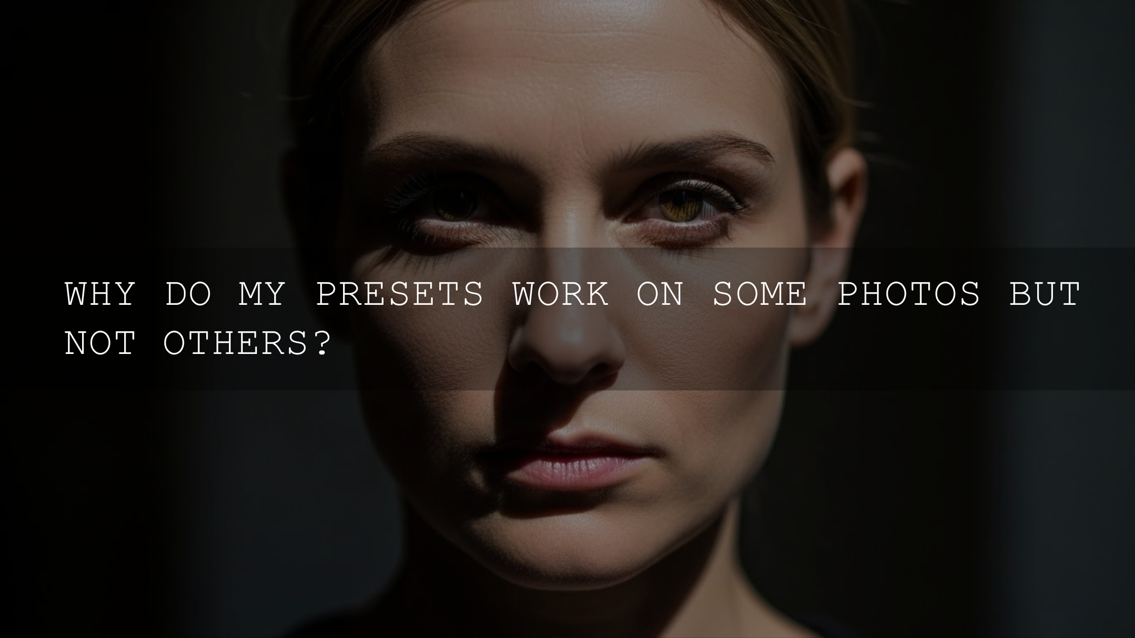
Why do my presets look flat on some photos but not others?
Presets assume a certain exposure, white balance, and color response. When your starting photo is brighter/darker or warmer/cooler than the preset expects, the same settings can lift shadows too much or mute contrast.
What’s the fastest way to add depth without ruining the image?
Set real black/white points, then add a very subtle S-curve. After that, use a subject mask to brighten and add texture locally instead of pushing global contrast.
Should I increase Saturation to fix a washed-out preset?
Usually no. Try Vibrance first, then adjust HSL luminance for the specific colors that look dull (often blues/greens). This keeps skin tones more natural.
How do I stop Clarity/Dehaze from making my photo look crunchy?
Use them lightly and prefer local masks when possible. If faces look harsh, reduce Clarity on skin areas and add Texture instead for a cleaner “detail” look.
What preset type is best for consistent contrast?
Choose presets designed for your lighting scenario (indoor window light vs street vs golden hour). A broad bundle gives you better starting matches, so you do less “rescue” work later.
Written by Asanka — creator of AAAPresets (10,000+ customers).
Leave a comment
This site is protected by hCaptcha and the hCaptcha Privacy Policy and Terms of Service apply.