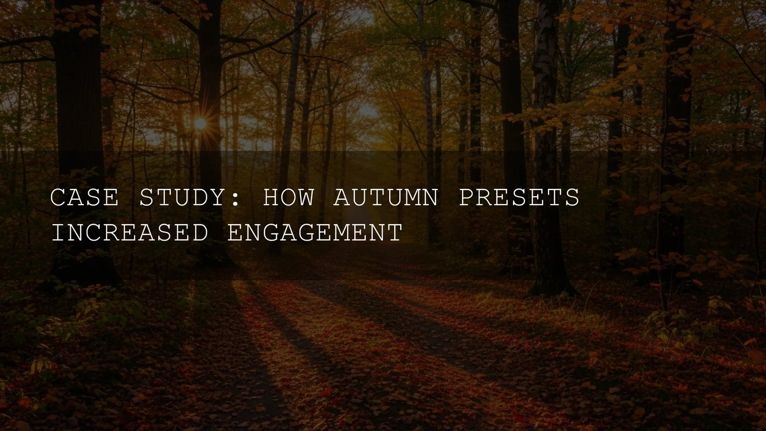
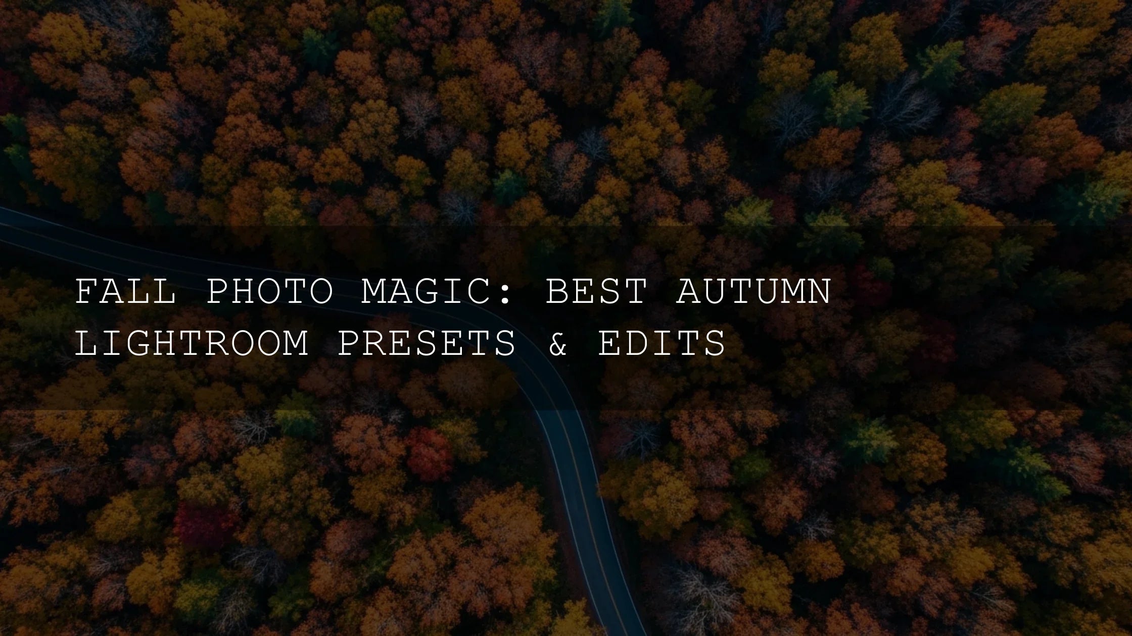
Autumn Lightroom Presets for Higher Engagement: A Practical, Creative Guide
Autumn is a gift to visual storytellers—crisp air, warm light, and foliage that begs to be photographed. But with so many fall photos flooding every feed, standing out takes more than a pretty scene. It takes purposeful editing. This guide shows how to use autumn Lightroom presets—especially AI-optimized presets—to craft a cohesive style, balance warm and cool tones, and spark real engagement. You’ll get a clear workflow, pro masking moves, and when to step beyond one-click edits.
If you want a head start with a look that’s consistent across a whole shoot, begin with a focused pack and customize from there. Try the AI-Optimized Autumn Gold Tones Lightroom Presets and browse the wider Fall Presets Collection—you can Buy 3, Get 9 FREE.
Why “pretty” isn’t enough: turn views into saves, comments, and clicks
Most fall photos are already colorful. What moves the needle is how those colors are shaped: believable skin tones against warm leaves, controlled highlights, detail in textures, and local contrast that guides the eye. Done well, your images feel cinematic—not overcooked—and people respond by saving, sharing, and asking questions. Here’s how to get there fast.
AI-optimized presets: what they do (and when to use them)
AI-optimized presets analyze subject, sky, and foliage to make smarter, adaptive adjustments. They’re fantastic for speed and consistency, especially with mixed lighting. Use them to set the base look, then refine with selective edits (masking) to keep faces, skies, and leaves exactly where you want them.
For selective control, see Adobe’s guide to masking in Lightroom Classic and Masking in Lightroom (Cloud + Mobile). For color planning and harmony, reference the Adobe Color wheel and harmony rules.
Editor-tested picks for autumn looks
- Warm & cinematic: AI-Optimized Autumn Gold Tones Lightroom Presets — glows in golden hour and shaded woodland, while keeping skin believable.
- Timeless matte: AI-Optimized Matte Autumn Film Lightroom Presets — soft highlights, gentle contrast, editorial mood for portraits and fashion.
- Classic, true-to-season: Autumn Fall Tones Lightroom Presets — balanced warmth that plays nicely with neutrals for all-day shooting.
- Bold and scroll-stopping: Autumn Fall Vibrant Lightroom Presets — amps reds/oranges for “wow” frames; perfect for covers and thumb-stoppers.


A fast, reliable workflow (Mobile, Classic, ACR)
- Choose intent first: Are you going warm and cinematic, matte and nostalgic, or bold and vibrant? Pick one preset pack to lead the look for the whole set.
- Set exposure & white balance: Keep skin tones honest. If foliage is glowing but faces lean orange, cool WB slightly or lower Orange Saturation in HSL.
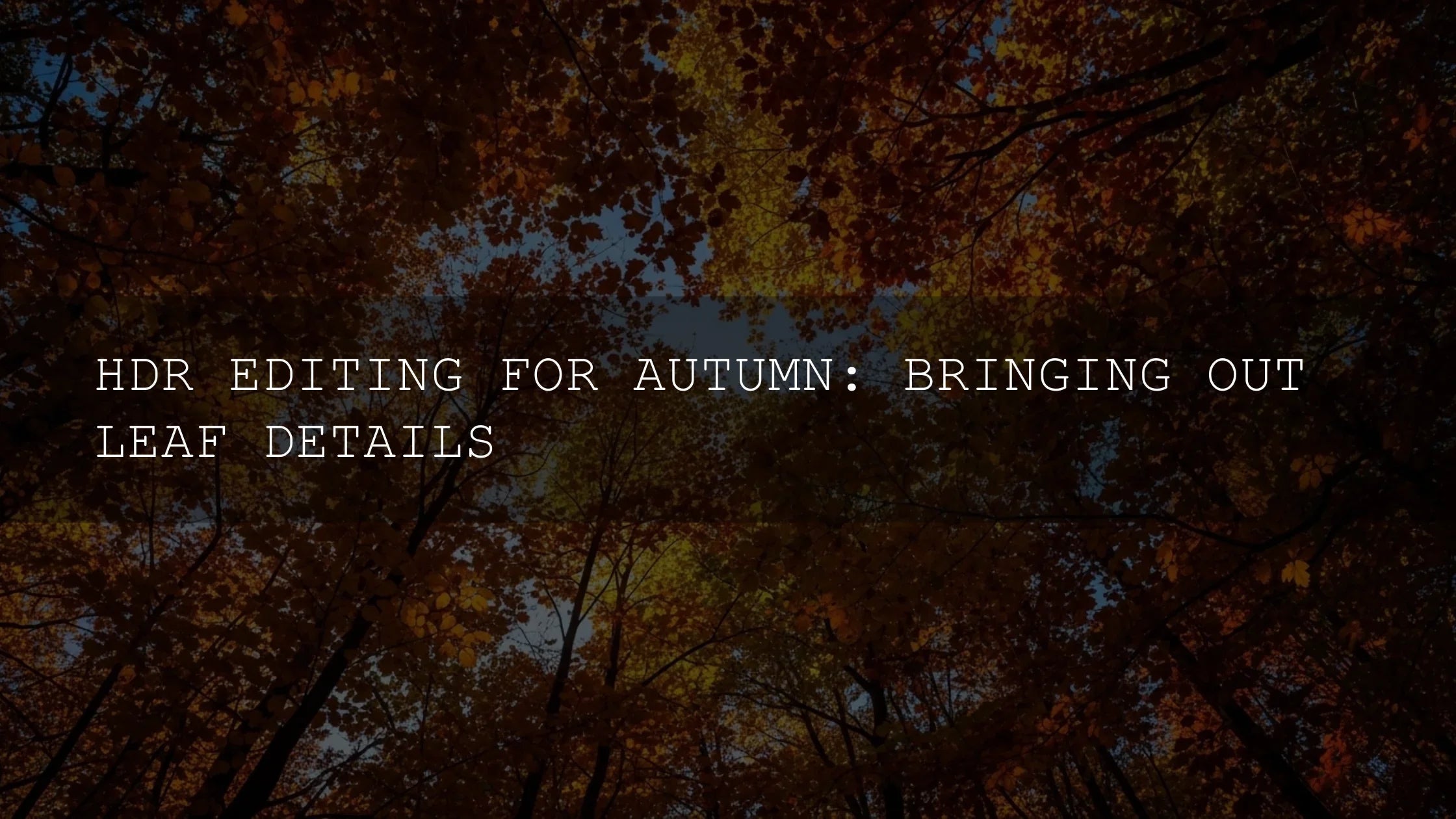
- Mask like a pro: Use Select Subject for faces, Select Sky for atmospherics, and Luminance/Color Range for foliage refinements. Deep dive: Lightroom Classic Masking and Lightroom Masking (Cloud/Mobile).
- HSL for believable color: Subtle shifts go far—lift Yellow Luminance for sunlight feel; tame Orange saturation for skin; nudge Red hue to avoid neon leaves.
- Color Grading: Warm highlights + slightly cool shadows create depth. Explore the Adobe Color harmony wheel for palettes that fit your story.
- Local contrast & texture: Add presence to trunks, coats, or cobblestones—but keep noise and halos at bay. If foggy, add contrast selectively, not globally.
- Consistency pass: Sync settings lightly across similar scenes. Then fine-tune per image for skin and sky.
- Export for platform: Prioritize sharpness for Instagram feed, a touch more punch for Stories/Reels covers, and restrained contrast for Pinterest.
Presets vs Manual Editing: when to choose which
- Presets = speed + consistency: Best for galleries, campaigns, and brand identity. Start here to lock a look.
- Manual = polish + control: After the preset, refine exposure, WB, and masked adjustments for faces/foliage/sky.
- Best results: Preset for the base, then manual tweaks—especially with mixed light or tricky skin tones.
Make it cohesive across platforms
- Instagram feed: Classic Autumn/Warm Gold looks, restrained saturation, clean skin.
- Stories/Reels covers: Vibrant pack for eye-catching first impressions.
- Pinterest/blog: Matte/editorial looks read beautifully on larger screens.
Real-world outcome (what improves when you edit with intent)
- Saves rise when color feels intentional and repeatable across a series.
- Comments grow when captions explain the edit (“used a matte autumn preset + a sky mask—want a breakdown?”).
- Reach expands as consistency signals quality to readers and algorithms alike.
- Clicks improve when you pair polished visuals with clear CTAs and helpful resources.
Helpful deep dives (internal guides)
Level up with these in-depth reads from our fall editing library:
- Golden hour in autumn: preset strategy for the “magic” look
- Vibrant orange & red tones: managing saturation with control
- Street photography in fall: grit, texture, and storytelling
- Why autumn reigns for photographers & editors
Quick troubleshooting (skin, reds, and tricky light)
- Orange skin: Cool WB slightly; reduce Orange Saturation (-5 to -10); lift Orange Luminance for softer faces.
- Neon reds: Shift Red Hue a touch toward orange; raise Red Luminance (+3 to +8) to keep detail.
- Muddy greens: Increase Green Luminance and reduce Yellow Saturation a touch for natural woodland color.
- Flat fog: Add local contrast via masks; avoid heavy global Dehaze to keep atmosphere intact.
Try this today
Build a dependable fall toolkit and edit faster with consistent results. Start with AI-Optimized Autumn Gold Tones or go matte with AI-Optimized Matte Autumn Film, then explore the full Lightroom Presets collection. Try them now—Buy 3, Get 9 FREE.
FAQ
Are presets enough on their own for autumn photos?
They’re an ideal starting point. For best results, pair a preset with selective masks for faces, sky, and foliage, then refine HSL and Color Grading.
How do I keep skin tones natural with warm foliage?
Balance global warmth with local masks on faces, reduce Orange saturation slightly, and add a subtle cool bias in shadow grading.
Which preset style should I choose for my brand?
Pick one lead look (Gold, Matte, or Vibrant) and stick with it across a project. Consistency builds recognition and trust.
What if my edits look oversaturated on mobile?
Lower Vibrance first (it’s gentler), then tweak individual HSL channels—especially Red/Orange. Check on multiple screens before publishing.
How do I install these presets?
Follow our step-by-step guide: How to install Lightroom presets (Mobile & Desktop).
Written by Asanka — creator of AAAPresets (10,000+ customers).
Leave a comment
This site is protected by hCaptcha and the hCaptcha Privacy Policy and Terms of Service apply.