
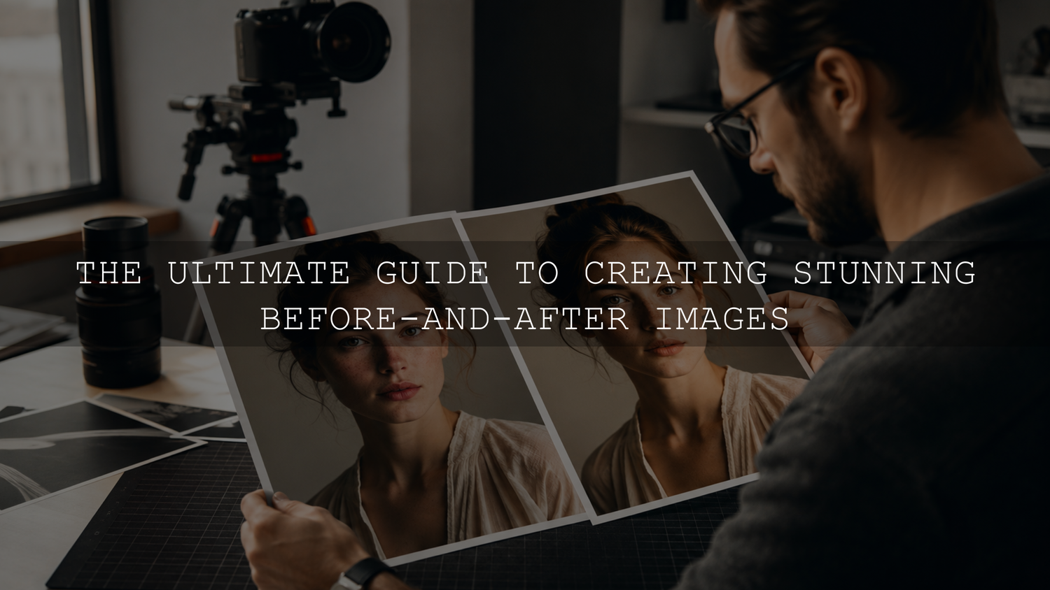
Before-and-after images work best when the reader can understand the transformation immediately and trust that the comparison is fair. That requires more than placing two photographs beside each other. The framing, scale, lighting, crop, labels, editing process, and export quality all affect how credible the result appears.
The most reliable method is to begin with two genuinely comparable images, align them carefully, label each version clearly, and export both sides under the same conditions. This guide explains how to create before-and-after images for blog posts without exaggerating the result or slowing down the page.
Why Before-and-After Images Work So Well
A written description can explain what changed, but a comparison image lets the reader inspect the difference directly. This is useful for photo editing tutorials, renovations, product demonstrations, design updates, beauty content, restoration projects, fitness progress, software redesigns, and other transformation-based topics.
A good comparison image can help a reader:
- Understand the result before reading the full explanation.
- Identify exactly which details changed.
- Evaluate whether the transformation supports the article’s claims.
- Follow a tutorial with a clearer visual reference.
- Decide whether a technique, product, or editing style is relevant to their needs.
The comparison becomes less useful when the after image has more flattering lighting, a different camera angle, a tighter crop, heavier sharpening, or another advantage unrelated to the actual transformation.
Decide What the Comparison Needs to Prove
Before taking photographs or opening an editing application, define the change you want the reader to notice. A comparison should normally demonstrate one clear outcome rather than several unrelated improvements.
For example:
- A Lightroom tutorial may compare the original photograph with the completed edit.
- A renovation article may compare the same room before and after the work.
- A product tutorial may show an item before and after cleaning or restoration.
- A web-design article may compare the same page before and after a layout update.
- A photography guide may compare an uncorrected image with a version that has improved exposure and white balance.
Defining the purpose also helps you choose the correct baseline. If you are demonstrating a Lightroom preset, decide whether “before” means the untouched imported photograph or a base-corrected image. Both can be useful, but the label should make the distinction clear.
Capture Comparable Before-and-After Photographs
When the comparison involves two separately captured photographs, consistency during capture is essential. Small changes in camera position, focal length, lighting, pose, or background can make the transformation appear larger or smaller than it really is.
Keep the camera position fixed
Use a tripod or another stable surface when possible. Mark the position of the tripod legs and record the camera height so that you can recreate the setup later.
For a room, product, garden, or restoration project, identify fixed landmarks near the edges and center of the frame. These landmarks make it easier to align the final photographs accurately.
Use the same focal length and camera orientation
Changing from a wide-angle view to a tighter focal length can alter the apparent size and proportions of the subject. Use the same lens, focal length, camera orientation, and approximate subject distance for both photographs.
Match the lighting where practical
Try to photograph both versions at a similar time of day or under the same controlled lighting setup. Check the direction and softness of the shadows, not only the overall brightness.
Some projects naturally involve a change in lighting. A room renovation may include new windows or light fixtures, for example. When lighting is part of the transformation, explain that clearly instead of trying to make the photographs appear identical.
Keep poses and expressions consistent
For portraits, beauty content, clothing comparisons, or fitness progress, keep the body position, camera angle, facial expression, distance, and posture as consistent as possible. A different pose or expression can create a visual change that did not come from the process being demonstrated.
How to Create a Before-and-After Image
- Select the most comparable files. Choose photographs with matching angles, scale, lighting, subject position, and background.
- Use identical canvas dimensions. Crop or resize both images to the same pixel dimensions before combining them.
- Align important landmarks. Match the eyes in a portrait, corners in a room, horizon in a landscape, or fixed interface elements in a software screenshot.
- Choose a presentation format. Use a side-by-side layout, stacked comparison, or interactive slider based on the subject and available page width.
- Add clear labels. Small “Before” and “After” labels prevent confusion, especially when the difference is subtle.
- Export both sides consistently. Use the same color space, output dimensions, compression method, and sharpening treatment.
- Inspect the uploaded version. Check the actual blog page on desktop and mobile for softness, cropping, alignment problems, or unreadable labels.
Side-by-Side, Stacked, or Interactive Slider?
Side-by-side comparison
A side-by-side layout is the simplest and most dependable option. It loads as one image, works without scripts, and lets readers see both versions simultaneously.
It works especially well when:
- The main difference remains visible at a smaller size.
- The subject is positioned similarly in both frames.
- You want a comparison that can also be reused on social media or Pinterest.
- Page speed and broad device compatibility are priorities.
Side-by-side images can become difficult to inspect on narrow mobile screens. Use a landscape source with enough detail and test the finished image at the width used by your Shopify theme.
Stacked comparison
Placing the before image above the after image gives each photograph more horizontal space. This can be more effective for detailed interiors, landscapes, interface screenshots, or images that become too small in a side-by-side layout.
Keep the crops identical and place the labels in consistent positions so that readers can compare the two images without searching for the relevant areas.
Interactive comparison slider
A slider can be effective when both images are aligned precisely. Moving the divider reveals changes in the same location, making it useful for photo retouching, restoration, color grading, design updates, and architectural transformations.
However, an interactive element should not be the only way to understand the result. Make sure it works with touch input, provide clear labels, and consider including a static comparison or explanatory text as a fallback. Too many interactive sliders on one article can also add unnecessary page weight and distract from the tutorial.
Create Honest Lightroom Preset Comparisons
A Lightroom preset before-and-after image should normally begin with the same source file. Do not use two separate photographs, because changes in exposure, focus, subject position, or lighting may be mistaken for preset improvements.
Lightroom Classic includes a Before/After view for comparing two states of the same photograph. Adobe explains that the Before view initially shows the photo as imported, including any preset applied during import, while the After view shows the current Develop adjustments in its guide to Lightroom Classic Develop module tools.
Use the following workflow:
- Import the original photograph.
- Record whether a camera profile or automatic correction is already active.
- Apply the selected preset.
- Refine exposure, white balance, highlights, shadows, skin tones, masking, or preset amount where available and necessary.
- Compare the final edit with the original at the same zoom level and crop.
- Export both versions using identical dimensions, color space, quality, and sharpening settings.
- Disclose meaningful manual corrections instead of suggesting the preset produced every change automatically.
If the original file is badly underexposed or has an incorrect white balance, you have two reasonable presentation options:
- Original versus final: Show the untouched file and disclose that the final version includes the preset and manual corrections.
- Base corrected versus styled: Correct technical exposure and white balance first, then compare that neutral version with the preset result. Label the first image “Base Corrected” rather than “Before.”
This distinction is important because presets apply saved adjustments to photographs that may begin with different exposure, white balance, camera profiles, lighting, colors, and dynamic range. Read more about why Lightroom presets look different on different photographs.
When comparing several creative styles, use the same source photograph and judge each option according to color, skin tone, highlight detail, shadow detail, contrast, and subject emphasis. The complete Lightroom preset comparison workflow explains this process in more detail.
Avoid Making the Before Image Look Artificially Bad
The purpose of a comparison is to document a genuine change, not to weaken the original deliberately. Avoid darkening the before image, reducing its sharpness, changing its white balance, adding clutter, using a less flattering pose, or selecting an inferior frame solely to make the final result more dramatic.
Be especially careful when the image relates to health, beauty, body transformation, property condition, product performance, or another decision where the visual evidence may influence expectations.
When the result developed over time, include the relevant time period. A garden renovation, restoration, fitness program, or long-term project may benefit from before, progress, and final images rather than a comparison that removes the process entirely.
Optimize Before-and-After Images for Search
Google recommends using high-quality images near relevant text and providing descriptive filenames and alt text. Its current Google Images SEO guidance explains that surrounding page content, filenames, captions, titles, and alt text can help search systems understand an image.
Use descriptive filenames
Rename the finished file before uploading it. The filename should describe the visible subject and transformation without becoming a list of keywords.
Useful examples include:
- living-room-renovation-before-after.webp
- lightroom-portrait-preset-before-after.webp
- wood-table-restoration-comparison.webp
- website-homepage-redesign-before-after.webp
Write alt text for the visible comparison
Alt text should explain the important visual information and the relationship between the two sides. Do not repeat surrounding text unnecessarily or stuff several keyword variations into the description.
For example:
Side-by-side comparison of an unedited outdoor portrait and the finished Lightroom edit with warmer color, recovered highlights, and brighter facial exposure.
When a comparison is truly decorative and adds no information, use empty alt text. When the image provides essential evidence, make the same information available in the article text so the reader does not need to see or operate the image to understand the result.
Place the image beside the relevant explanation
Do not collect every visual at the beginning or end of the article. Place each comparison close to the section that explains the process, setting, technique, or result it demonstrates.
Compress Images Without Hiding Important Detail
Before-and-after graphics often contain two high-resolution photographs, so an unoptimized file can become unnecessarily large. Modern formats such as WebP and AVIF can provide better compression than older formats in many situations, but quality should always be inspected after export. The web.dev image performance guide provides additional information about file formats and image loading.
A practical workflow is:
- Resize the comparison to the maximum dimensions needed by the blog layout.
- Export in sRGB for general web use unless a specific workflow requires another color space.
- Use WebP, AVIF, or a well-compressed JPEG according to what your website supports.
- Inspect gradients, skin, hair, fine text, straight edges, and shadow detail for compression artifacts.
- Upload a test and inspect the version delivered by the live website.
Do not assume that the largest possible file will look better. The correct pixel dimensions, sensible compression, responsive delivery, and careful quality review are more useful than uploading a full-resolution camera file.
For a more detailed Lightroom workflow, see the guide to Lightroom export settings for online photographs and the dedicated Shopify and Pinterest image export guide.
Common Before-and-After Image Mistakes
- Different framing: The camera moves or the crop changes between versions.
- Different focal lengths: One image exaggerates or reduces the apparent size of the subject.
- Unmatched lighting: The after image receives softer, brighter, or more flattering light.
- Unclear baseline: Readers cannot tell whether “before” means untouched, base corrected, or previously edited.
- Undisclosed manual editing: A preset or product receives credit for changes created through additional corrections.
- Excessive retouching: Texture, shape, color, or detail is changed beyond the process being demonstrated.
- Tiny labels: Before and after labels become unreadable on mobile devices.
- Heavy files: Large comparison graphics delay the page unnecessarily.
- No explanatory text: The reader sees a transformation but does not understand how it was achieved.
- Too many comparisons: Repetitive images interrupt the article instead of supporting its most important points.
Before Publishing, Check These Details
- The comparison demonstrates one clear transformation.
- The camera angle, subject scale, crop, and focal length match.
- Lighting differences are controlled or disclosed.
- The before version has not been deliberately weakened.
- Any base corrections or additional manual edits are explained.
- Before and after labels remain readable on mobile.
- The filename describes the actual visual.
- The alt text explains the meaningful difference.
- The image is positioned near the relevant article section.
- The exported file has been inspected for softness and compression artifacts.
- The live page has been tested on desktop and mobile.
Build a Repeatable Editing and Comparison Workflow
A good before-and-after image does not need an exaggerated transformation. It needs a consistent baseline, visible evidence, accurate labels, and enough explanation for the reader to understand what changed.
Bloggers who need a broader selection of editing styles can explore the Lightroom presets for mobile and desktop collection. The 1000+ Master Lightroom Presets Bundle includes DNG and XMP formats for mobile and desktop Lightroom workflows. Apply each style to the same source image, refine it where necessary, and present the result without implying that every photograph will respond identically.
Eligible creative products are also available through the Buy 3, Get 9 FREE offer. Add 12 eligible items to the cart and pay for only 3.
Written by Asanka — creator of AAAPresets, serving 10,000+ customers.


Leave a comment
This site is protected by hCaptcha and the hCaptcha Privacy Policy and Terms of Service apply.