
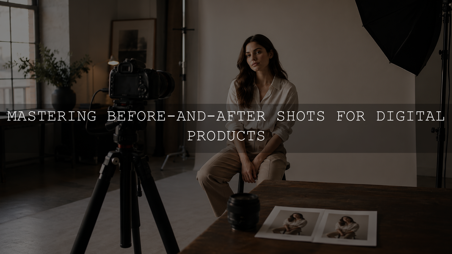
To create credible before-and-after images, keep the source, crop, scale, lighting, and presentation consistent while changing only what the digital product is meant to change. For Lightroom presets, use the same source photo for both versions. For templates, websites, and other digital tools, keep the content, screen size, and mockup perspective fixed. The goal is not to manufacture the biggest transformation. It is to show clearly and honestly what the product changes.
Start With a Comparison Standard, Not a One-Off Graphic
Before creating the first asset, define a visual specification that every future comparison will follow. This prevents each product launch from becoming a separate design project and helps the complete catalog feel connected.
- Master canvas: Choose a primary layout size, then create platform-specific versions from that master.
- Comparison format: Decide whether the default will be side by side, stacked, or an interactive slider.
- Subject position: Record where the face, product, or screen should sit within the frame.
- Background and lighting: Use the same surface, light direction, and color temperature whenever new photography is required.
- Label language: Use accurate labels such as “Original,” “Base Edit,” “Preset Applied,” or “Template Applied.”
- Brand treatment: Standardize typography, divider thickness, logo placement, margins, and corner spacing in the final marketing graphic.
A one-page specification is usually enough. Include an approved example, crop ratio, export dimensions, font choices, filename pattern, and a short quality-control checklist so another person can reproduce the same result without guessing.
Use the Same Source Image Whenever Possible
For photo presets, filters, retouching tools, and color workflows, the clearest comparison uses one source file duplicated into two versions. The first version shows the original or agreed baseline. The second shows the product applied. Reshooting the after image introduces new variables, so the viewer can no longer isolate whether the difference came from the product, lighting, camera angle, focus, or expression.
Choose the baseline carefully. If the first panel is the untouched camera file, label it “Original.” If you correct exposure, lens distortion, perspective, or white balance before applying the creative product, label it “Base Edit” or explain the preparation in the caption. Do not improve the baseline and continue calling it untouched.
Results can vary when source exposure, white balance, lighting, camera profile, or file type changes. Adobe defines Lightroom presets as predefined groups of editing settings that can combine adjustments such as exposure, color, contrast, and tone. Lightroom also provides an Amount control for changing the intensity of an applied preset. After applying a look, check the individual image instead of assuming every source file will respond identically. See the AAAPresets guide explaining why Lightroom presets look different on different photos, or review Adobe’s instructions for applying Lightroom presets.
Capture Matched Assets When a Reshoot Is Unavoidable
Some demonstrations require separate photographs or screen recordings. A physical setup may change, a workflow tool may require different application states, or a product may need to be shown before and after a real-world process. In those cases, control as many variables as possible.
- Lock the camera position. Use a tripod or fixed phone mount, and record the height, distance, orientation, focal length, and crop.
- Control exposure and white balance. Use a stable light source and avoid automatic settings that may shift between frames.
- Mark the scene. Use small removable marks for the product, chair, tripod, or background edge so the setup can be rebuilt accurately.
- Keep focus and depth of field consistent. A sharper after image can exaggerate the apparent effect of the product.
- Capture a reference frame. Save one approved image that shows the correct composition and use it during future sessions.
- Record the settings. Store the camera, light, background, and export details in the project folder rather than relying on memory.
When the two versions must be captured at different times, match the camera perspective before adjusting decorative details. Small changes in height, distance, or focal length can alter the apparent proportions of the subject.
Edit the After Image Without Hiding the Product’s Limits
The after image should demonstrate the product, not a collection of unrelated improvements. If the product is a Lightroom preset, avoid adding skin retouching, object removal, background replacement, or sharpening that is not part of the preset unless those additional steps are disclosed.
- Correct exposure and white balance when needed. Image-specific refinement may be necessary after applying a creative look.
- Protect skin tones and product colors. Check that the result remains believable and suitable for the subject.
- Keep texture visible. Excessive smoothing can imply that a preset performs retouching it does not include.
- Check highlights and shadows. Look for clipped highlights, blocked shadows, halos, or damaged detail.
- Review at two sizes. Inspect the asset at 100% for artifacts and at normal feed size for overall clarity.
- Document extra adjustments. Record any manual exposure, white-balance, masking, retouching, or cropping changes made after applying the product.
For a broader system that connects still images and video, read the guide to building a cohesive Instagram look with Lightroom presets and video LUTs.
Separate the Proof Layer From the Presentation Layer
Create the comparison in two stages. First, build a clean proof pair containing matched images, accurate labels, and any necessary disclosure. Then place that approved pair inside the branded marketing canvas.
This separation prevents decorative design choices from changing the crop, hiding details, or making one side appear larger. It also lets the same approved proof pair be reused in a Shopify product page, carousel, advertisement, email, or Pinterest graphic without recreating the underlying comparison.
Choose a Layout That Makes the Change Easy to Read
The layout should let the viewer understand the difference quickly. Decorative styling should support the comparison rather than compete with it.
- Side by side: Useful for product pages, carousels, and landscape graphics when both versions need equal weight.
- Stacked: Often easier to read on narrow mobile screens, especially when the subject needs more horizontal space.
- Interactive slider: Useful on a website when it is responsive, keyboard accessible, and supported by a visible fallback.
- Detail crop: Helpful as a secondary visual for skin texture, highlight recovery, typography, or interface details.
Keep both panels the same size, use a restrained divider, and place labels consistently. When the comparison will be reused across several channels, adapt the surrounding canvas instead of recropping the subject differently for every platform.
Create Fair Mockups for Templates and Digital Tools
A digital product may improve a presentation, website, social post, spreadsheet, code output, or user interface instead of transforming a photograph. The same comparison principles still apply.
- Use the same text, images, data, and content volume in both versions.
- Keep the device, browser frame, perspective, and screen size consistent.
- Show the actual product result rather than replacing it with an unrelated polished design.
- Keep important interface details large enough to read on mobile.
- Use shadows, reflections, and depth effects lightly and consistently.
- Include a close crop when the main mockup is too small to demonstrate the meaningful change.
A mockup should provide context while keeping the product result as the focal point. A single clear device scene is generally easier to evaluate than several devices repeating the same screen.
Turn the Workflow Into a Repeatable Production System
Create a master template in Canva, Photoshop, Figma, or another suitable design tool. Lock the elements that should not change, including margins, labels, divider placement, brand typography, and logo position. Leave only the image or screen placeholders editable.
A practical project folder can contain:
- The original source file
- The baseline or before version
- The final after version
- The editable master layout
- Platform-specific exports
- A text file containing the product name, applied settings, disclosure notes, filenames, and alt text
Use predictable filenames such as product-name-before.jpg, product-name-after.jpg, and product-name-comparison-4x5.jpg. This makes handoff, revision, quality control, and future reuse easier.
Export Matched Files for Shopify and Social Media
Export the complete pair from one canvas so the dimensions, crop, resampling, and output sharpening remain matched. Use sRGB for normal web delivery, keep labels and dividers readable at mobile size, and inspect the exported file instead of relying only on the design preview.
Shopify automatically optimizes storefront images through its content delivery network. Upload a clean, appropriately sized source and avoid destructive compression that visibly damages text, gradients, skin texture, or product details. For a more complete workflow, follow the AAAPresets guide to image export settings for Shopify and Pinterest.
Common Mistakes That Weaken Before-and-After Proof
- Using two different source images: The viewer cannot isolate the product’s contribution.
- Making the before image intentionally worse: Lowering exposure, adding blur, or increasing clutter damages credibility.
- Adding undisclosed retouching: The product appears to deliver effects that are not included.
- Changing the crop or subject size: The visual difference becomes harder to evaluate accurately.
- Using vague labels: “Before” may be misleading when the image has already received technical corrections.
- Overdesigning the mockup: Heavy shadows, flares, reflections, and extra devices can obscure the result.
- Ignoring mobile readability: Fine interface details and small labels may disappear in a feed.
- Exporting each side separately: Different resizing, compression, or sharpening may create false differences.
- Mixing proof and promotion: Decorative marketing effects should not alter the approved comparison itself.
Quality-Control Checklist
- Do both sides use the same source, crop, scale, and orientation?
- Is the intended product or workflow the only major change?
- Are the labels accurate?
- Are technical corrections and additional edits disclosed?
- Do skin tones, product colors, and important details remain believable?
- Is the comparison readable on a phone?
- Were both sides exported from the same canvas?
- Are the filename and alt text specific to what is visible?
- Does the asset match the rest of the catalog?
For a broad selection of editing styles, the 1000+ Master Lightroom Presets Bundle contains more than 1,000 DNG and XMP preset files for Lightroom mobile and desktop. Apply a suitable creative look, then assess exposure, white balance, skin tones, and important product colors for the source image. You can also browse the full Lightroom presets collection. The Buy 3, Get 9 FREE offer applies when 12 eligible items are added to the cart and the customer pays for 3.
Final Takeaway
A trustworthy comparison is a controlled demonstration rather than a dramatic marketing trick. Approve the proof pair first, disclose changes outside the product, and store the specifications with the source files. A documented system makes future assets easier to reproduce while helping customers judge what the product actually provides.
Frequently Asked Questions
Should a before-and-after comparison use the same photo?
Yes, whenever the product changes the photograph itself. Duplicate the source image, keep the crop fixed, and apply the product to only one version. Use separate photographs only when the product or process genuinely requires a reshoot.
Can I adjust exposure after applying a Lightroom preset?
Yes. Exposure and white balance may need image-specific refinement because source files and lighting conditions differ. Keep the adjustments appropriate to the image and disclose unrelated retouching that is not part of the preset.
What should I show as the before image?
Use either the untouched original or a clearly defined neutral base edit. Label it accurately. If lens correction, perspective, exposure, or white balance was adjusted before the creative product was applied, “Base Edit” is generally more transparent than “Original.”
How can I compare a Canva template or website design fairly?
Use the same content, device frame, screen size, and amount of information in both versions. Change the design system or template rather than the underlying material so the viewer can evaluate the product fairly.
Written by Asanka, founder of AAAPresets.



Leave a comment
This site is protected by hCaptcha and the hCaptcha Privacy Policy and Terms of Service apply.