
The Ultimate Guide to Color Grading Your Reels, Shorts, and TikToks in DaVinci Resolve
Hey there, content creators! Are you tired of your short-form videos looking a little... flat? In the hyper-competitive world of TikTok, Instagram Reels, and YouTube Shorts, visual appeal is paramount. You've got seconds to capture attention, and that's where color grading swoops in to save the day. Many creators shy away from color grading, thinking it's too complex or time-consuming, especially for rapid-fire vertical video production. But what if I told you that with a powerful, free tool like DaVinci Resolve, you can elevate your content from amateur to absolutely stunning? Today, we're diving deep into the art and science of color grading your vertical video content, specifically within the incredible capabilities of DaVinci Resolve. DaVinci Resolve, a name synonymous with Hollywood-level color correction and visual effects, might seem like overkill for a quick TikTok. However, its robust feature set makes it surprisingly adept at handling the nuances of mobile-first content. Think of color grading not as an afterthought, but as an essential part of your storytelling toolkit. It’s the silent narrator that influences mood, guides the viewer’s eye, and ensures your videos leave a lasting impression. Whether you're a vlogger, a product reviewer, a dancer, or a comedy sketch artist, mastering color grading will undoubtedly give your content the professional edge it deserves.
Why Color Grading is Non-Negotiable for Short-Form Vertical Video
In the blink-and-you'll-miss-it landscape of social media feeds, your video needs to command attention immediately. Color grading is your secret weapon for achieving this:
- Instant Visual Hook: A well-graded video simply looks more appealing and professional, drawing viewers in from the very first frame. It signals to the viewer that care and effort have been put into the production.
- Emotional Resonance: Color is intrinsically linked to emotion. A warm, golden hour look evokes nostalgia, comfort, and happiness, while cool, desaturated tones can create a sense of drama, introspection, or even isolation. Use color to amplify the emotional impact of your story and connect with your audience on a deeper level. Think about the psychological effects of color: blues can be calming, reds can be energetic or alarming, yellows can be cheerful.
- Brand Identity & Consistency: If you're building a personal brand or a business presence, consistent color grading across all your posts creates a recognizable aesthetic. This visual consistency builds trust, familiarity, and professionalism with your audience. People will start to associate your signature look with your content.
- Technical Correction: Beyond aesthetics, color grading helps fix fundamental issues like poor white balance (making whites look truly white and preventing color casts), underexposure (making dark footage brighter and more visible), or blown-out highlights (recovering detail in overly bright areas). This makes your raw footage look clean, polished, and ready for consumption.
- Highlighting Key Elements: You can subtly guide the viewer’s eye to important details in your video by adjusting the color and contrast of specific areas. For instance, you can make a product pop by giving it a slightly different color hue or boosting its saturation, or draw attention to a speaker's face by brightening their midtones.
- Aesthetic Enhancement: Even technically perfect footage can benefit from an artistic touch. Color grading allows you to create a specific mood, style, or 'look' that aligns with your content's theme or your personal artistic vision.
Setting Up Your DaVinci Resolve Project for Vertical Video Success
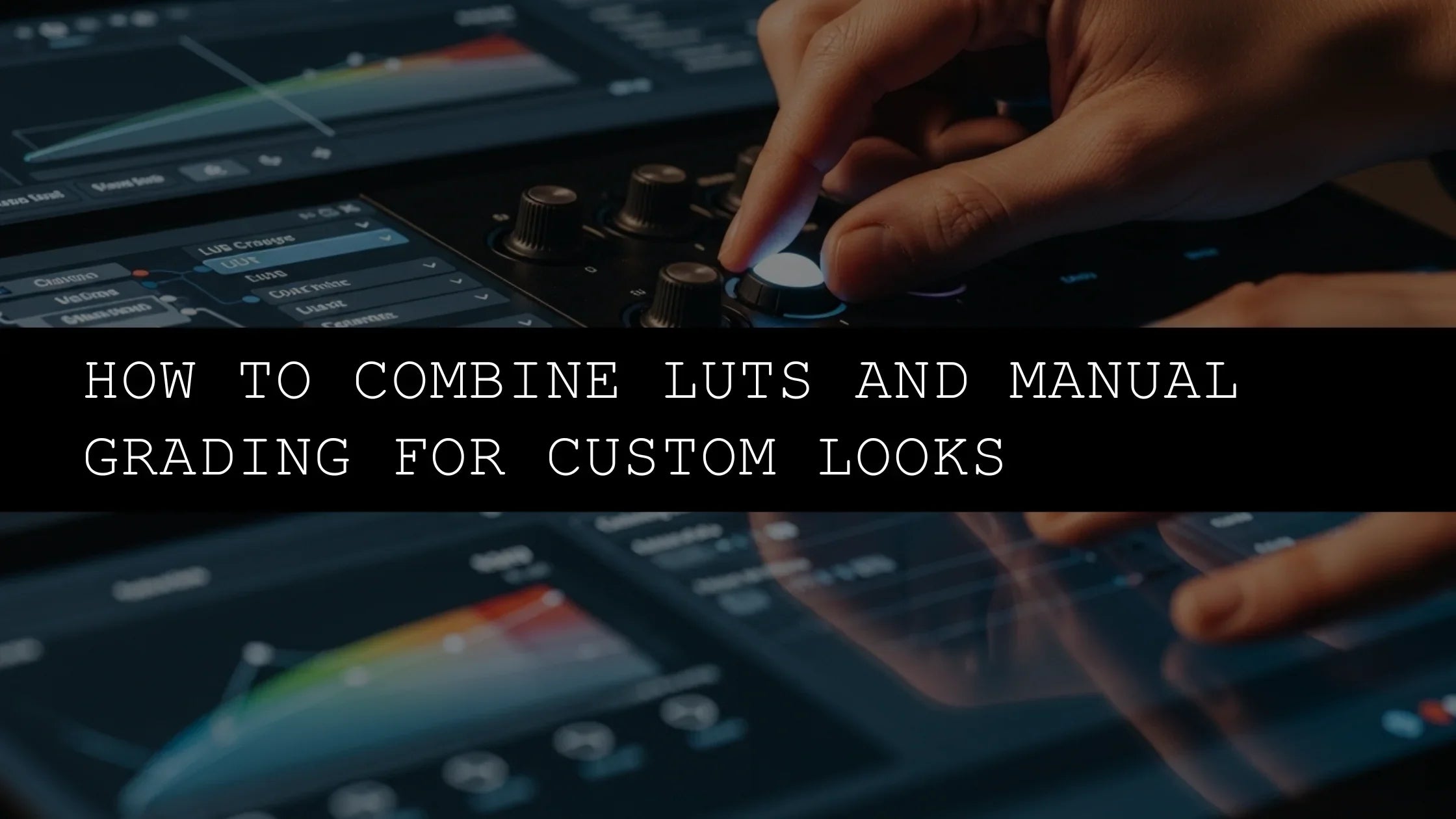
The first critical step in your vertical video DaVinci workflow is ensuring your project is configured correctly for the 9:16 aspect ratio. This is fundamental for ensuring your content looks its best on mobile devices. Head over to 'File' > 'Project Settings'. Within the 'Master Settings' tab, you'll find the 'Timeline Resolution' option. Change this from the standard 1920x1080 (16:9 widescreen) to 1080x1920 (9:16 vertical). This ensures that when you import your footage, it will be correctly framed for vertical viewing, and you won't encounter awkward black bars (pillarboxing) or stretched images due to incorrect aspect ratios. Now, let's talk about footage. While applying a LUT (Look-Up Table) might seem like a quick and easy fix, it's often a blunt instrument that can sometimes do more harm than good if not used correctly. Understanding and utilizing the foundational color grading tools within DaVinci Resolve will unlock far greater creative potential and allow for much more nuanced adjustments, especially for your TikTok grading DaVinci efforts. These tools give you precise control over every aspect of your image.
Essential Color Grading Tools in DaVinci Resolve for Mobile Content Creators
DaVinci Resolve’s Color page is a veritable treasure trove of grading capabilities, often compared to a professional colorist's suite. For short-form vertical video, we’ll focus on the most impactful and accessible tools:
- Primary Wheels (Lift, Gamma, Gain, Offset): These are your foundational controls, the bedrock of any color grade. The Lift wheel affects the shadows (the darkest parts of the image), Gamma affects the midtones (the middle range of brightness), and Gain affects the highlights (the brightest parts). The Offset wheel adjusts the overall brightness and color balance of the entire image simultaneously. Think of them as your primary paintbrushes, allowing you to sculpt the overall exposure and color balance of your footage. You can push them in any direction on the color wheel to introduce warmth (yellow/red), coolness (blue), or shift the hue.
- Curves (RGB, Hue vs. Sat, Hue vs. Hue, Hue vs. Luma): Curves offer a much more precise level of control than the Primary Wheels. The main RGB Curves allow for intricate contrast adjustments – a gentle 'S' curve is a classic technique to boost contrast and add a cinematic feel by slightly lifting the blacks and lowering the whites. The Hue vs. Saturation curves are fantastic for selectively desaturating or increasing the saturation of specific colors. For instance, you can target the blues to make skies richer and more vibrant, or target reds to make lips or clothing pop. The Hue vs. Hue curves let you shift colors without affecting their saturation or luminance, perfect for subtle color toning or correcting unwanted color casts. Hue vs. Luma allows you to adjust the brightness of specific colors.
- Saturation and Contrast Sliders: Sometimes, simplicity is the most effective approach. These sliders provide straightforward ways to enhance the overall vibrancy or 'punch' of your footage. The Contrast slider impacts the difference between light and dark areas, while the Saturation slider affects the intensity of all colors. Use them judiciously to avoid an unnatural, overly saturated, or flat look.
- Color Warper: This advanced tool offers granular control, allowing you to manipulate color and saturation across the entire color spectrum in a very targeted way. It’s incredibly powerful for creating unique, stylized looks or for very specific color correction tasks but requires a bit more practice and understanding of color theory to use effectively.
- LUTS (Look-Up Tables): As mentioned, LUTs can be applied as a starting point for a grade or as a final finishing touch. You can find a vast array of free and paid LUTs online, often designed to emulate specific film stocks or cinematic looks. However, always apply them before or after your primary adjustments, and consider using the 'Soft' or 'Low Contrast' versions of LUTs for a more flexible base that doesn't bake in too much contrast or saturation, allowing you to fine-tune afterward.
- Shot Matching: If you have multiple clips that need to look consistent, DaVinci Resolve’s shot matching features (like 'Apply Grade' or the 'Qualifier' tools in conjunction with other adjustments) are invaluable for achieving a uniform look across your entire video.
Crafting Your Signature TikTok Grading DaVinci Aesthetic
Let’s walk through a practical, step-by-step approach to achieving a killer, signature look for your short-form content. This is where we bring your vision to life for TikTok grading DaVinci:
- Foundation First: Balancing and Exposure Correction: Before you get creative with artistic looks, ensure your footage is technically sound. This is non-negotiable. Use the built-in scopes: the Waveform monitor is excellent for checking your exposure levels, helping you avoid clipped highlights or crushed blacks. The Vectorscope is your best friend for analyzing color saturation and white balance. Aim for a balanced image where shadows retain detail and highlights aren't blown out. Correct any obvious white balance issues using the temperature and tint controls in the primary correction section. If your footage was shot on a mobile phone, this step is crucial for making it look professional.
- Building Contrast and Mood with Primary Wheels: Now, let's start setting the mood and defining the core aesthetic. Use the Lift, Gamma, and Gain wheels. Want a bright, airy, and optimistic feel? Slightly lift the shadows (Lift) to open them up, and ensure your midtones (Gamma) and highlights (Gain) are well-defined. For a more dramatic, moody, or cinematic look, lower the Gamma to deepen the midtones and perhaps introduce a cooler tone (blue) into the shadows (Lift) while keeping highlights warm (yellow/orange). Experiment with pushing the wheels in different directions to see how they affect the overall image.
- Injecting Vibrancy with Saturation and Specific Hues: Gently boost the overall saturation. Mobile screens, especially those on smartphones, often have very vibrant displays, so a slight bump in saturation can make your colors pop and appear more lively. However, the key word here is 'subtle'. Excessive saturation can look garish, unnatural, and quickly date your content. Aim for a natural, pleasing vibrancy that enhances the image without overpowering it. You can also use the Hue vs. Saturation curves to selectively boost or reduce saturation for specific colors, like making greens more earthy or blues more electric.
- Adding Depth and Style with Curves: This is where the real artistic magic happens for creating specific, stylized looks. For example, to achieve a popular and versatile teal and orange cinematic look, you might use the Hue vs. Saturation curve to desaturate blues and cyans slightly, then use the Primary Wheels or the main RGB Curves to push the shadows towards blue and the midtones/highlights towards orange. Alternatively, use the Hue vs. Hue curve to subtly shift a particular color – perhaps make your greens lean more towards yellow for a sun-drenched look, or shift yellows slightly towards orange for a warmer, nostalgic feel. The RGB Curves allow for fine-tuning contrast and color balance on a deeper level.
- Fine-Tuning with Secondary Corrections (Qualifiers): For even more targeted adjustments, use the Qualifier tools. These allow you to select a specific color range, luminance range, or even specific areas using a custom picker, and then apply color adjustments only to that selection. This is incredibly powerful for isolating skin tones, making a specific colored object stand out, or correcting a minor color cast in a particular part of the frame without affecting the rest of the image.
- Adding Polish with Sharpening and Noise Reduction: A touch of sharpening can make details crisper, which is especially beneficial for viewers watching on smaller mobile screens where fine details can sometimes be lost. Be conservative with sharpening; over-sharpening creates an unnatural halo effect around edges and can accentuate noise. Find sharpening controls within the Color page's Detail Enhancer or under the 'OpenFX' library. Similarly, if your footage is noisy (grainy), judicious use of DaVinci Resolve's noise reduction tools (found in the Color page’s dedicated 'Noise Reduction' panel) can clean up the image without making it look overly plastic or smoothed out.
- Refining and Reviewing Across Devices: Always review your graded footage. Does it convey the intended mood and emotion? Are the colors pleasing and balanced? Does it look good on a phone screen, which is where most of your audience will see it? Make small, iterative adjustments as needed. Export short test clips and view them on your phone or tablet to ensure the colors translate well across different displays.
Remember, effective TikTok grading DaVinci isn't about applying the same preset to every video. It's about understanding your footage, your creative intent, and intentionally using color to enhance its message, mood, and overall aesthetic appeal. Each video is unique and may require a different approach.
Pro Tips for Vertical Video DaVinci Workflows
To truly master color grading for short-form content and make your vertical video DaVinci workflow seamless, keep these expert tips in mind:
- Monitor Matters, But Don't Let it Stop You: While not strictly necessary to start, a properly calibrated professional monitor will significantly improve your grading accuracy. Colors will appear more true-to-life. However, if you're just starting, don't let a lack of a high-end monitor deter you. Try to grade in a room with consistent, neutral lighting, and always test your footage on multiple devices (especially your phone) to ensure consistency. Learn to trust your eyes and the scopes.
- Study Color Theory and Psychology: Understanding basic color theory – concepts like complementary colors (colors opposite each other on the color wheel, which create high contrast, like blue and orange), analogous colors (colors next to each other, which create harmony), and the psychological impact of different hues – will profoundly elevate your grading decisions. Researching color psychology can help you choose palettes that evoke specific emotions in your viewers.
- Reference Your Favorites and Create Mood Boards: Find videos on Reels, TikTok, or even in movies that you admire visually. Analyze their color palettes, contrast, and overall mood. Save these clips or screenshots and use them as references. Creating a mood board of looks you want to achieve can be incredibly inspiring and helpful.
- Keep it Subtle for Maximum Impact: Often, the best color grading is the kind you don't consciously notice. Aim for enhancements that feel natural, organic, and elevate the existing image rather than completely transforming it, unless a highly stylized or abstract look is your specific creative goal. Subtle shifts in contrast, saturation, and hue can make a huge difference.
- Embrace the Node-Based Workflow: DaVinci Resolve uses a powerful node-based system in the Color page. Each node is a separate, independent step in your grading process. This allows for non-destructive editing, makes your grades highly organized, and enables you to easily add, remove, or adjust individual grading elements without affecting others. Learn to chain nodes together for complex looks and to isolate specific adjustments.
- Use Keyframes for Dynamic Grades: For short-form content, you might want the color to evolve or change throughout the video. DaVinci Resolve allows you to use keyframes within the Color page to animate color changes, saturation shifts, or even the intensity of a LUT over time, adding another layer of dynamism to your videos.
- Organization is Key: As you create more complex grades, keeping your nodes and clips organized is vital. Use labels, aliases, and color-coding for your nodes and clips to make your project manageable, especially if you're working on multiple videos.
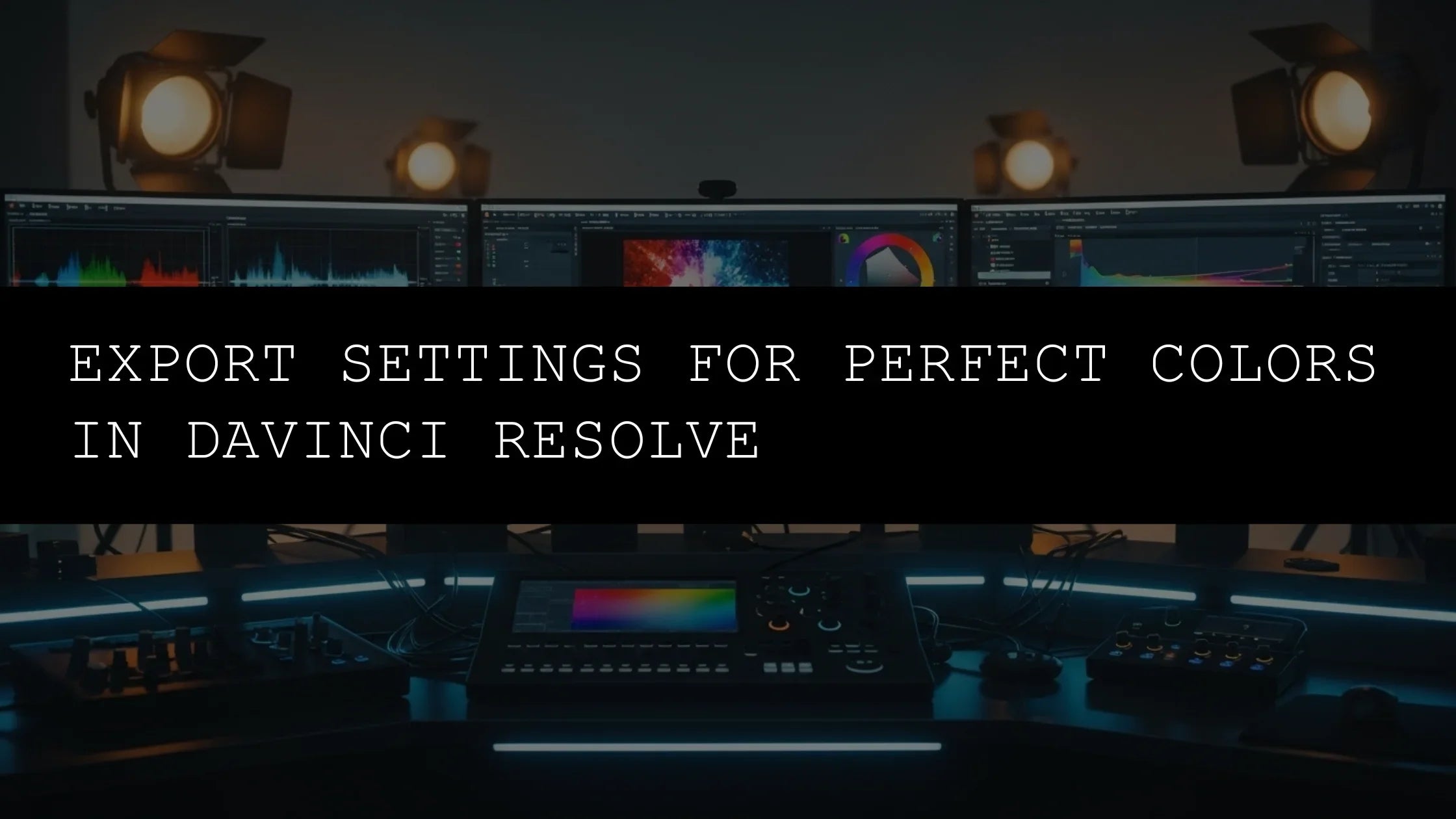
- Render in High Quality: When exporting, ensure you're using appropriate codecs and high bitrates to preserve the quality of your color grade. H.264 or H.265 with a bitrate of at least 10-20 Mbps for 1080p content is generally recommended for social media platforms.
Color grading is a journey of continuous learning and experimentation, not a destination. The more you practice, the more intuitive and natural it becomes. DaVinci Resolve, despite its professional pedigree and incredible depth, offers an accessible and powerful entry point for creators looking to seriously upgrade their visual game. By integrating these techniques into your vertical video DaVinci workflow, you’ll not only make your content more visually appealing and engaging but also more emotionally resonant and professionally polished. So, embrace the power of color, experiment relentlessly, and watch your short-form videos gain the attention and traction they truly deserve!
Leave a comment
This site is protected by hCaptcha and the hCaptcha Privacy Policy and Terms of Service apply.