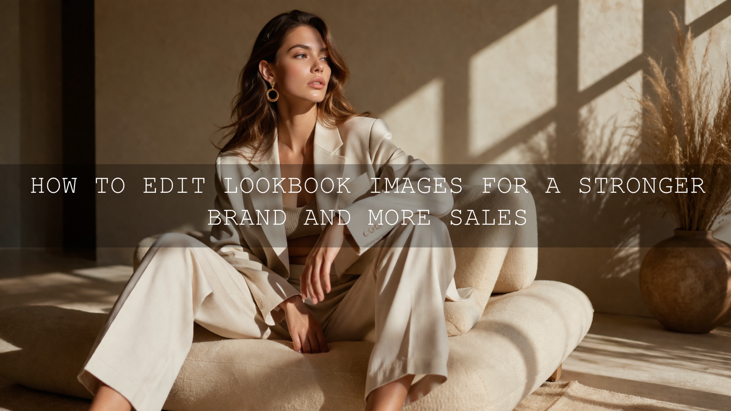
How to Edit Lookbook Images for a Stronger Brand and More Sales
If you want to know how to edit lookbook images in 2026, start with this idea: great lookbook photo editing is not about making every frame louder. It is about making your products look clear, true to life, polished, and consistent from the first image to the last. For online shops, fashion brands, and catalogs, strong lookbook image editing helps customers trust your colors, notice your textures, and feel the mood of your brand before they ever click Add to Cart.
That is why I usually recommend building your workflow around one reliable preset base and a few deliberate manual refinements. If you want a faster starting point for fashion and editorial-style images, try the Insta Fashion Blogger Lightroom Presets and browse the AI-Optimized Lightroom Presets collection. It is a simple way to speed up your editing while still keeping full control, and you can build your toolkit with Buy 3, Get 9 FREE.
Why lookbook photo editing matters more than most shops realize
When someone lands on your store, they are judging your product and your professionalism at the same time. A strong lookbook does both jobs well. It sells the item, and it sells the feeling of the brand.
- It improves color trust. If cream fabric turns yellow or black clothing turns flat gray, the image creates doubt.
- It highlights product quality. Texture, stitching, shape, and finish need to stay visible after editing.
- It creates a premium storefront. Consistent tones across the gallery make the whole shop feel more established.
- It supports conversions. Clean, believable photos reduce hesitation because customers feel like they know what they are buying.
Here is why this matters: a lookbook is often where style and commerce meet. You are not editing random photos. You are shaping buying confidence. A linen shirt needs to look soft but structured. A necklace needs contrast without harsh glare. A blazer needs accurate neutrals without losing depth in the shadows.
I have tested this workflow on fashion sets where one image looked slightly cool, the next looked warm, and the product page felt disconnected. After matching white balance, exposure, and crop rhythm across the gallery, the full set immediately looked more expensive and much easier to shop.
A practical Lightroom workflow for lookbook image editing
Adobe Lightroom is still one of the best tools for fashion photo editing and e-commerce work because it is fast, non-destructive, and ideal for batch consistency. Adobe’s own resources on tone and color adjustments in Lightroom Classic, masking in Lightroom Classic, and color management in Lightroom Classic are worth bookmarking if you want a cleaner technical foundation.
1. Start by editing the set, not just the hero image
One of the biggest mistakes in lookbook image editing is making one photo amazing and letting the rest of the gallery drift. Before you move sliders, review the full set side by side.
- Pick the strongest frames first.
- Group similar lighting together.
- Flag duplicate poses and weak expressions.
- Choose a consistent crop style for the whole series.
If one frame is very warm, one is flat, and one is high contrast, do not solve them in isolation. The goal is visual rhythm across the gallery.
2. Fix white balance before you chase mood
This is the step that protects product color. Before presets, before HSL, before cinematic styling, make sure whites feel neutral and skin tones feel believable. A cool white shirt should stay cool white. A brown leather bag should not shift orange. A gold accessory should glow without becoming neon.
In practice, that usually means:
- Correcting temperature first
- Using tint carefully to remove green or magenta casts
- Checking fabric and skin together instead of separately
- Comparing neighboring frames so the whole set feels unified
When a shoot has mixed light, local corrections matter. Lightroom masks are especially useful when the background is cooler than the subject or when one side of the product needs different treatment than the other.
3. Balance exposure for both skin and product detail
Good lookbook editing is about balance. You want the face bright enough to feel polished, but you also need texture in the garment. You want contrast, but not so much that black fabric loses separation. You want highlights, but not at the cost of detail in silk, satin, jewelry, or makeup.
A simple sequence works well:
- Set exposure so the subject feels naturally lit.
- Lower highlights if bright fabrics or skin are clipping.
- Lift shadows only enough to reveal shape and texture.
- Add contrast slowly.
- Use whites and blacks to control punch without crushing detail.
I usually tell teams to zoom out and ask one question: does this still look like the product in real life, just better lit and better presented?
4. Use presets for speed, then personalize the result
This is where presets save serious time. For online shops, presets are not a shortcut because you are lazy. They are a system for consistency. A good preset gives you a dependable starting point so you are not rebuilding the same style from zero on every shoot.
For social-friendly fashion campaigns and polished storefront imagery, the Insta Fashion Blogger Lightroom Presets are a strong base. If your shoot needs a more editorial portrait finish with clean skin tones and refined contrast, the FASHION Portrait Lightroom Presets fit beautifully. If your brand leans warm, premium, and slightly luxurious, the AI-Optimized Golden Fashion Lightroom Presets can create that radiant fashion look without forcing every frame too far.
I tested a golden fashion-style preset on a lookbook set with neutral outfits and soft afternoon light, and the best results came from applying the preset lightly, then pulling the warmth back just a little on the white garments. That is the real secret: presets work best when you treat them as a base, not a finish line.
5. Fine-tune HSL and masks for premium results
Once the overall look is in place, the premium feel usually comes from selective refinements.
- Use HSL for fabric accuracy. Adjust specific color ranges instead of pushing global saturation.
- Use masks for faces and products. Brighten a face slightly, recover a jacket texture, or soften a background without flattening the whole image.
- Control highlights on shiny surfaces. Jewelry, satin, and polished packaging often need local highlight recovery.
- Refine skin without plastic texture. Beauty and fashion images should look polished, not airbrushed into wax.
If you want help thinking through palette direction before you edit, Adobe’s Color Wheel and harmony tools are useful for planning warm, cool, monochrome, or complementary looks before you build the full campaign.
6. Crop and straighten with merchandising in mind
Great composition in a store lookbook is not only artistic. It is functional. The crop should help shoppers understand fit, shape, scale, and styling.
That usually means:
- keeping verticals straight in architectural or studio backgrounds
- avoiding awkward crops at joints
- leaving enough breathing room for the product silhouette
- using a repeatable aspect ratio across related images
If you are editing for Shopify, product pages, and social at the same time, it helps to create one master crop and then export variants for each platform instead of rethinking composition every time.
7. Sharpen carefully and export for the web properly
Sharpening should make the image feel crisp, not harsh. In lookbook work, the best places to sharpen are usually product edges, texture, hair detail, accessories, and important facial features. Background walls, smooth skin, and negative space usually need much less.
For export, keep your web workflow clean and predictable. Use JPEG when appropriate, keep file sizes efficient, and export in sRGB for dependable online color. That gives you a better chance of keeping your edits consistent across browsers and devices.
Presets vs manual editing for lookbook photos
This is where many creators get stuck, so let’s break it down clearly.
When presets win
- You need speed across a large gallery.
- You want a recognizable brand style.
- You are editing repeatable product categories.
- You want your first pass to feel organized instead of random.
When manual editing matters most
- Lighting changed significantly from frame to frame.
- Product color accuracy is critical.
- Skin tones vary across the set.
- Reflective materials, makeup, or mixed backgrounds need precision.
The strongest workflow is usually both: preset first, manual refinement second. That is why so many good fashion and e-commerce edits feel fast without looking generic.
Common mistakes that make lookbook images feel cheap
- Over-warming neutrals. Beige, white, gray, and black products need restraint.
- Too much saturation. Bold color can work, but fake color breaks trust quickly.
- Inconsistent skin tones across the gallery. This makes the whole storefront feel uneven.
- Heavy clarity on faces or fabric. Texture should feel refined, not crunchy.
- Ignoring comparison view. A good single image can still fail inside a mismatched gallery.
If you want a helpful companion piece for product-focused workflows, read The Best Lightroom Presets for E-commerce & Product Photography. For color accuracy on fashion content, this true-to-color outfit photo editing guide is especially useful.
Do not ignore video in your lookbook workflow
Modern online shops often mix still images with short motion clips, product reels, or campaign videos. If your stills feel premium but your video color feels disconnected, the brand experience becomes uneven. That is where a LUT workflow helps.
For fashion films, branded reels, or behind-the-scenes campaign clips, the Golden Fashion Cinematic LUTs Pack is a strong match when you want warmth, elegant contrast, and a polished editorial feel that connects naturally with warm fashion photography.
A repeatable editing checklist for every lookbook shoot
- Cull for the strongest frames and build a logical sequence.
- Correct white balance before adding style.
- Balance exposure for both product detail and skin.
- Apply one preset base across similar frames.
- Refine HSL for fabric and product accuracy.
- Use masks for faces, highlights, garments, and backgrounds.
- Crop for consistency and merchandising clarity.
- Sharpen selectively.
- Export for web in sRGB.
- Review the full gallery together before publishing.
If you want to build a more complete workflow, you can pair a portrait-friendly preset pack with the Portrait Photography Lightroom Presets collection and then explore help through the contact page if you need guidance choosing the right style for your shop.
Related reading
- The Best Lightroom Presets for E-commerce & Product Photography
- Beyond the Filter: Mastering True-to-Color Outfit Photo Editing in 2026
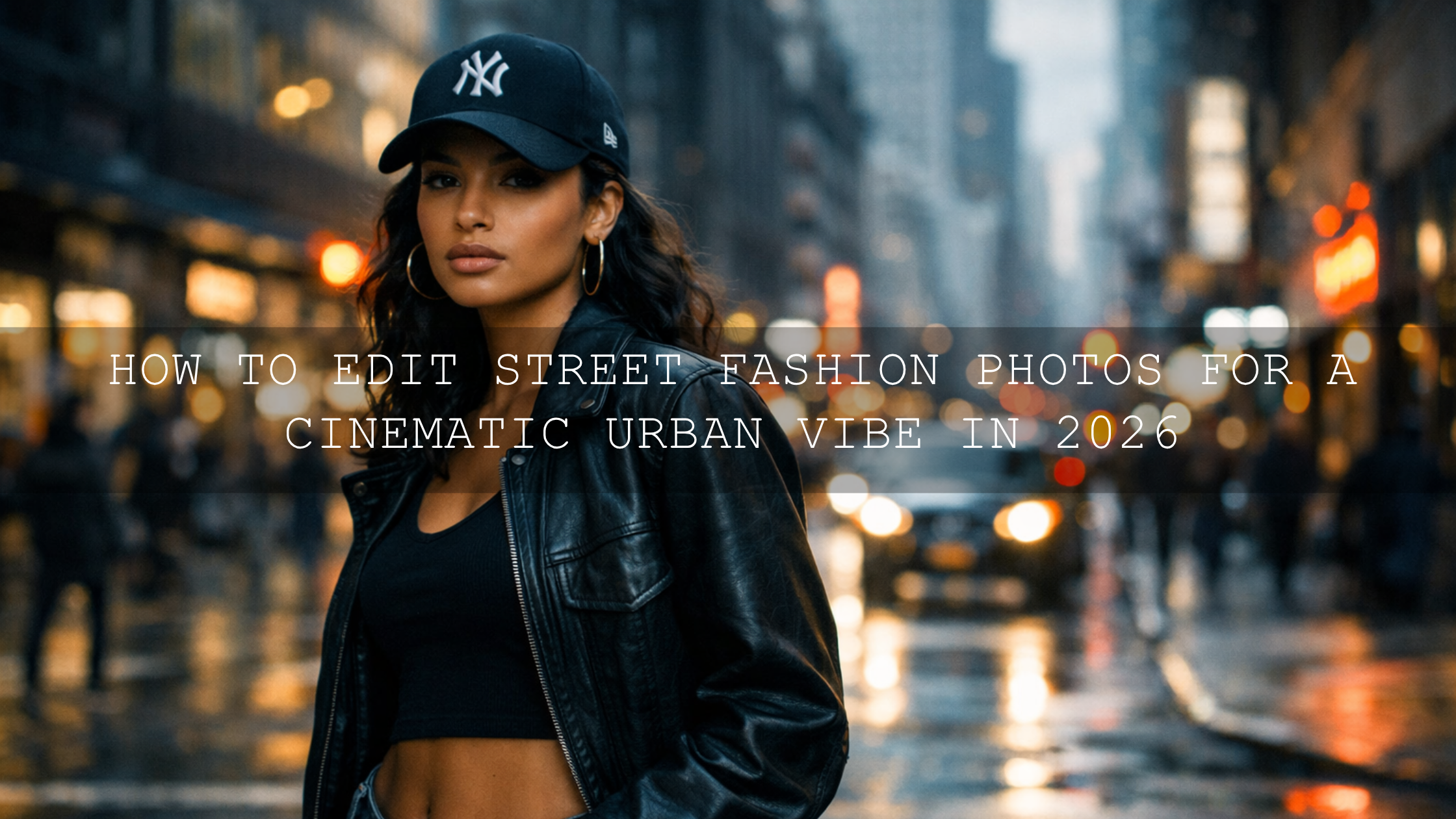
- Editing Influencer Content for a Flawless Instagram in 2026
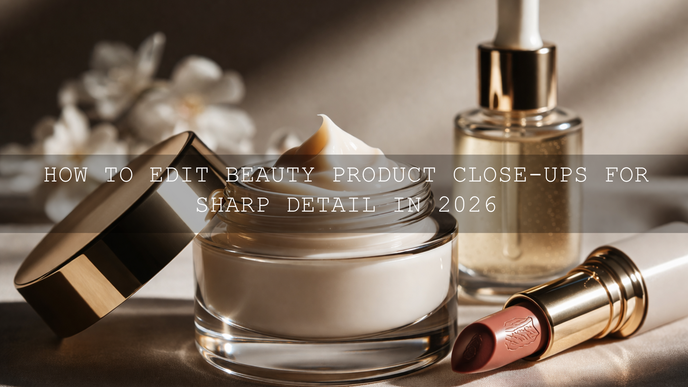
- How to Edit Beauty and Makeup Photos for Clean, Perfect Skin
If your goal is a cleaner, faster, more premium lookbook workflow, start with the FASHION Portrait Lightroom Presets for polished editorial portraits, or use the AI-Optimized Golden Fashion Lightroom Presets when you want warmth and luxury in the final set. Then browse the Lightroom Presets for Mobile & Desktop collection to expand your options and build a stronger visual system for your shop. Buy 3, Get 9 FREE makes it easier to test multiple looks without rebuilding your workflow from scratch.
Frequently asked questions
What is the most important first step when editing lookbook images?
White balance is usually the most important starting point because inaccurate color makes clothing, skin, and product materials feel wrong immediately. Once the color base is right, exposure and contrast become much easier to control.
Are presets enough for professional lookbook photo editing?
Presets are the fastest starting point, but the best results come from small manual refinements afterward. Use presets for consistency and speed, then fine-tune white balance, HSL, masking, and crop for each frame.
How do I keep product colors accurate in an online shop lookbook?
Correct white balance first, compare neighboring images side by side, avoid over-saturating fabric colors, and export in a web-friendly color space like sRGB. Always check neutrals, skin, and product material together.
What should I sharpen in a lookbook image?
Sharpen garment edges, texture, accessories, and key facial detail lightly. Avoid strong sharpening on smooth skin or plain backgrounds because that can make the image feel harsh and less premium.
Can the same editing style work for both product photos and lookbook videos?
Yes, but it helps to build a matched system. Use a consistent color direction for stills and a complementary LUT for video so your storefront, reels, and campaign clips all feel like the same brand.
Written by Asanka — creator of AAAPresets (10,000+ customers).
Leave a comment
This site is protected by hCaptcha and the hCaptcha Privacy Policy and Terms of Service apply.