
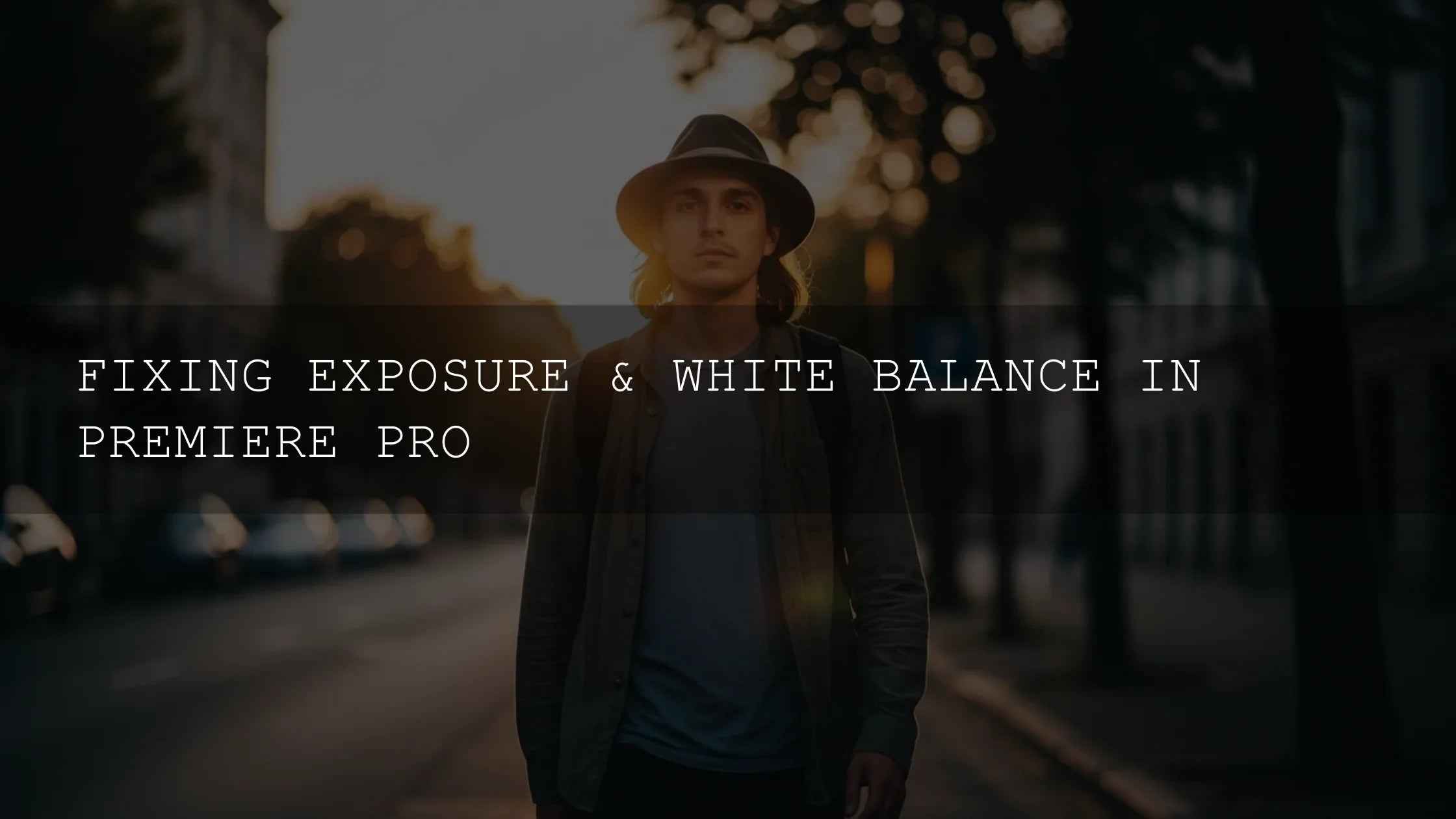
What Is Color Grading? A Beginner’s Guide
If you’re new to color grading for beginners, think of it as the stage where your edit stops looking “okay” and starts feeling cinematic. Tools in Premiere Pro, DaVinci Resolve, and even mobile apps make pro results realistic for first-timers. Below you’ll get a clean, repeatable workflow, when to use LUTs, how to check accuracy with scopes, and a quick comparison of presets vs manual editing. I tested this process on a beach wedding doc and a moody studio interview—simple steps, big difference.
Want a fast head start while you learn? Build a baseline look with the 1000+ Master Lightroom Presets Bundle and explore the Cinematic LUTs for Premiere Pro collection—mix, match, then tweak to your taste. Buy 3, Get 9 FREE.
Color Correction vs. Color Grading
Color correction: the technical bedrock
Correct first, then get creative. Correction aims for a neutral, consistent starting point by fixing white balance, exposure, contrast, and saturation. It’s where you make skin tones believable and restore detail in shadows/highlights. If you want a walkthrough inside Premiere, this companion read helps: Premiere Pro Color Grading — Pro Cinematic Workflow.
Color grading: the artistic layer
Once your footage is accurate, grading shapes mood. Warmer highlights for joy, cooler shadows for tension, lifted blacks for a “filmic” softness, or rich contrast for drama. Use grades to reinforce story beats and keep a consistent identity across your channel or brand.
Why Color Grading Matters
- Emotional impact: Color sets tone before dialogue does.
- Visual identity: A consistent look is your signature across videos and thumbnails.
- Perceived production value: Clean correction + tasteful grading reads as “pro.”
- Camera/lens consistency: Grade smooths mismatches from multi-cam or changing light.
Step-by-Step Beginner Workflow
Step 0 — Shoot for the grade
If available, use Log or a Flat profile for extra dynamic range and color latitude. It’s fine if you can’t—this workflow still works. Keep exposure references on set and try a gray card for easier WB later.
Step 1 — Organize like a pro
- Consolidate footage into a project folder and back it up (ideally twice).
- Label clips by scene or lighting condition. You’ll match them faster later.
Step 2 — Build the correction (scopes on!)
Turn on scopes for objective feedback. In Premiere Pro, the Lumetri Scopes panel shows Waveform, Parade, Vectorscope to judge exposure, channel balance, and saturation. Adobe’s overview of color workflows is also useful: color correction and color workflows in Premiere Pro.
- White balance: Nuke color casts first. Use WB sliders or an eyedropper.
- Exposure: Adjust overall brightness until Waveform shows healthy distribution (avoid clipping).
- Contrast: Add separation between shadows/mids/highlights without crushing blacks.
- Saturation: Bring color to a natural baseline; leave stylization for the grade.
Tip: If you’re new to scopes, scan this section in our companion article for a quick primer: Premiere Pro Color Grading — Pro Cinematic Workflow.
Step 3 — Choose a direction (LUTs as a starting point)
LUTs are great for exploring looks quickly—treat them as a base, not a final. Apply, then refine with color wheels/curves. For a deeper look at options in Resolve, skim Best LUTs for Cinematic Color Grading in DaVinci Resolve (2025). If you’re installing LUTs for Premiere, use this practical guide: How to Use LUTs in Premiere Pro.
Step 4 — Primary adjustments (global shaping)
- Lift/Shadows: Controls depth and black floor.
- Gamma/Midtones: Where faces live—keep them natural.
- Gain/Highlights: Overall “shine” and perceived brightness.
- Temperature/Tint: Subtle pushes create emotional warmth or cool restraint.
Adobe’s “basic correction & LUT” overview is a helpful refresher if you’re inside Lumetri: basic color correction options in Premiere Pro.
Step 5 — Secondary adjustments (targeted finesse)
- HSL: Isolate and nudge a single color range (e.g., tame oversaturated greens).
- Masks/Power Windows: Gently lift a subject’s face or darken a distracting corner. For precision stills work, see Lightroom Classic Masking or Lightroom (cloud) Masking.
Step 6 — Shot matching & consistency
- Match exposure first, then color casts, then saturation.
- Compare by scene, not clip-by-clip—aim for flow across the sequence.
- Check on a typical screen, and keep scope windows visible as you fine-tune.
Step 7 — Tasteful stylization
Curves are your best friend for “feel.” Try a soft S-curve for punch, cool off shadows a touch, lift blacks a hair for filmic rolloff, or add warm highlights for “golden” nostalgia. Use Adobe Color’s harmony rules to plan palettes and keep complementary tones in balance.
Step 8 — Export sanity checks
- Preview at 100% zoom to spot noise/banding.
- Compare a few hero frames on phone + desktop.
- Keep a neutral reference still to recalibrate your eye mid-session.
Presets vs. Manual Editing (Quick Comparison)
- Presets/LUTs = speed + consistency. Great for ideation, matching a “series” look, or batch workflows. Still needs small tweaks for skin and scene.
- Manual grading = precision + uniqueness. More time-intensive, but you can tailor to story/lighting and avoid the “one-size-fits-all” trap.
Best of both: Start with a LUT that fits your vibe, then tailor with wheels/curves/HSL. This hybrid approach is how most pros work.
Tools You Can Trust
- DaVinci Resolve: Deepest color feature set; the free version is powerful.
- Adobe Premiere Pro: Lumetri is intuitive and integrated; scopes and curves are excellent for beginners. See Adobe’s color workflow overview and Lumetri Scopes.
- Final Cut Pro: Streamlined tools; great on Apple silicon.
Real-World Tips (From Projects I Graded)
- Correct skin early. If faces look right, the grade reads “natural.”
- Pull back 5%. When you think you’re done, reduce intensity slightly—it often looks more premium.
- Create a look preset. Save a reusable base (contrast curve + gentle color bias) to keep your channel cohesive.
- Keep a “day/night” pair. Two starting looks cover most lighting scenarios for faster turnarounds.
Try This Starter Workflow On Your Next Edit
For a friendly first pass: correct WB/exposure → add a LUT that matches mood → soften with curves → fine-tune skin via HSL → match shots → export and review on phone/desktop. Need ready-to-use looks? Explore 700+ Cinematic Video LUTs, the 300+ Music Video LUTs Pack, or a stylized set like the Wildlife Landscape Cinematic LUTs Pack. If you’re working mostly with photos, build your cross-platform aesthetic with the Lightroom Presets for Mobile & Desktop collection. Buy 3, Get 9 FREE.
Related Reading
- Premiere Pro Color Grading — Pro Cinematic Workflow
- What Is Color Grading in DaVinci Resolve? A Beginner’s Guide
- DaVinci Resolve vs Premiere Pro — Color Grading Prowess in 2025
- How to Use LUTs in Premiere Pro
Helpful Adobe References
- Monitor accuracy with Lumetri Scopes in Premiere Pro
- Adobe’s overview of color correction & grading workflows
- Plan palettes with Adobe Color harmony rules
FAQ
What’s the difference between color correction and color grading?
Correction fixes technical issues (WB, exposure, contrast, saturation) to create a neutral base. Grading adds mood and style to support story and brand.
Should I always use a LUT?
No. LUTs are a fast starting point. Apply one that fits your vision, then refine with wheels/curves/HSL. Many pros use a hybrid approach.
How do I keep shots consistent across a scene?
Match exposure first, then white balance/tint, then saturation. Compare hero frames side-by-side and keep scopes visible while you tweak.
Is Premiere Pro enough for serious grading?
Yes. Lumetri offers powerful tools and solid scopes. Resolve is deeper for advanced color work, but Premiere is excellent for most creators.
Where can I get help installing presets or LUTs?
Check our FAQ & Help page for install instructions and quick troubleshooting.
Written by Asanka — creator of AAAPresets (10,000+ customers).

Leave a comment
This site is protected by hCaptcha and the hCaptcha Privacy Policy and Terms of Service apply.