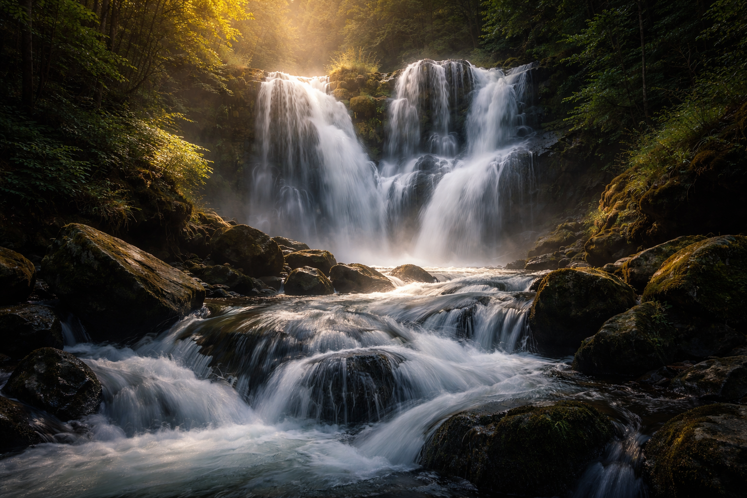
How to Edit Waterfall, River, and Lake Photos for More Motion, Detail, and Atmosphere
Waterfall photo editing works best when you protect what makes water beautiful in the first place: movement, contrast, reflected light, and depth. Whether you are working with moving water photography from a river, a calm lake at sunset, or a dramatic waterfall shot, the goal is not to over-process the scene. The goal is to make the water feel alive while keeping the rocks, trees, sky, and surrounding texture believable. The strongest water photo editing usually comes from balancing shutter-driven motion, local contrast, color control, and a clean finishing look rather than forcing heavy clarity on the entire frame.
I have tested this kind of workflow on waterfall images with bright mist, river scenes with dark shadows, and lake photos where the water looked flat straight out of camera. In most cases, the biggest problem was not “not enough color.” It was that the water, highlights, and land were all fighting for attention at the same time.
If you want a faster starting point, try the AI-Optimized Vivid Motion Lightroom Presets and then browse Lightroom Presets Collection for more one-click looks that fit nature, travel, and cinematic landscapes. That is an easy way to move faster while still keeping room for manual refinement, and it fits naturally with Buy 3, Get 9 FREE.

Why Water Scenes Often Look Flat Before Editing
Water is visually complex. It reflects the sky, picks up color from nearby trees and rocks, changes texture from one second to the next, and can contain both bright highlights and deep shadows in the same frame. That is why a beautiful real-life scene can look dull, muddy, or overly harsh in the raw file.
Here’s why this matters: if you raise clarity everywhere, the water can turn crunchy. If you push saturation too far, lakes and rivers can look electric blue or green. If you brighten the whole frame, the mist around a waterfall can lose shape. Good editing solves these problems selectively.
A strong workflow usually comes down to four priorities:
- Separate the water from the background
- Control highlights before adding color
- Add motion feel through tone and texture, not just sharpness
- Finish with a style that matches the story, whether clean cinematic or vintage
Adobe’s guide to masking in Lightroom Classic and Lightroom masking tools for desktop and mobile are especially helpful here because local adjustments let you treat the water differently from the rocks, vegetation, and sky. When you want a more stylized color direction, Adobe Color harmony rules can help you keep cool blues, neutral grays, and warmer highlights working together instead of clashing.
A Simple Step-by-Step Workflow for Waterfall Photo Editing
1. Start with exposure and white balance
Before you think about style, fix the foundation. Bring exposure to a natural level, recover blown highlights in the water, and correct the white balance so the scene does not lean too blue, too cyan, or too green. Water usually looks better when the temperature is slightly more neutral than your first instinct.
Pro tip: if the scene has heavy shade, do not warm the whole image too much. Warm rocks and skin can look great, but overly warm water quickly loses its clean, fresh feeling.
2. Shape the highlights
The sparkle on water is often what makes the frame feel alive, but it can also become distracting. Pull the highlights down enough to restore detail, then bring whites back carefully if the image starts looking dull. This gives the water shape without turning it gray.
3. Use local masks on the water
This is where waterfall photo editing and moving water photography usually improve the most. Mask the water separately, then make small targeted adjustments such as:
- Lower highlights to keep texture in bright flow areas
- Add a little contrast so the motion has more definition
- Increase texture slightly for crisp splashes, or reduce texture slightly for silkier long-exposure water
- Shift color subtly if the water is picking up too much green or muddy brown
On many images, I have found that a small local contrast increase on the water works better than global clarity. It gives movement more shape without making everything else look harsh.
4. Balance the land around the water
Once the water looks stronger, the rest of the frame can start feeling too dark or too busy. Lift nearby rocks, forest detail, or shoreline shadows just enough to support the subject. The water should feel like the visual center, but it should still belong to the environment around it.
5. Add your final style
This is the point where a preset can save time. A good preset should not replace judgment, but it can give you a polished direction quickly. For brighter energy and stronger movement, the AI-Optimized Vivid Motion Lightroom Presets are a strong fit for water scenes because they help push clarity, contrast, and color in a more dynamic direction without forcing you to build the look from scratch.
If you also shoot moody weather, mist, or wet travel scenes, Rainy Travel Photo Editing and Forest Photo Editing Without Neon Green Leaves would be useful next reads because the same principles of highlight control and selective color apply.
Presets vs Manual Editing for Water Photos
Both methods work. The best choice depends on your time, your experience level, and how consistent you want the final gallery to feel.
Presets are better when:
- You want a fast starting point for a full shoot
- You need visual consistency across multiple waterfall or river images
- You already know the style you want
- You are editing for blog, Instagram, Pinterest, or client delivery on a deadline
Manual editing is better when:
- The lighting is difficult or mixed
- The water reflects strong unwanted colors
- You need exact control over mist, highlights, and shadow separation
- You are preparing hero images or portfolio work
The strongest approach is usually both. Start with a preset for direction, then refine manually with masks and small tonal changes. That gives you speed without losing control.
I have had water scenes look average with manual global edits alone, then come together in minutes once I applied a strong base preset and refined only the masked areas. That combination is usually faster and better than trying to do everything from zero.
How to Make Water Feel More Dynamic Without Overediting
A lot of creators try to make water feel more powerful by pushing clarity, dehaze, and saturation too hard. That usually backfires. Instead, use these more controlled choices:
- Increase contrast selectively: this creates separation in waves, ripples, and splashes
- Use cooler shadows and cleaner highlights: this keeps the water feeling fresh
- Protect the brightest whites: bright foam and reflections should still keep some detail
- Keep surrounding greens and browns realistic: natural support tones make the water look better
- Crop for flow: remove dead space so the viewer’s eye moves with the water
If your image includes people, boats, bridges, or shoreline structures, make sure those elements are not edited so aggressively that they compete with the water. In most successful compositions, the water is the motion and the surroundings are the frame.
Turning Water Photo Sequences Into Better Reels, TikToks, and Shorts
If you are not just editing stills but also turning water images or clips into short-form videos, the second half of the workflow matters just as much. A beautiful set of waterfall or lake photos can become a much stronger story when you present them with intentional rhythm, motion, and style.
This is where Premiere Pro effects can help. Adobe’s Premiere Pro guide to effects, transitions, and animations is useful if you want to understand the basics of motion styling, timing, and how visual transitions change the feel of a sequence.
For a handcrafted animated look, the Stop Motion Effect in Adobe Premiere Pro can turn a sequence of water photos or environmental clips into something more playful and eye-catching. This works especially well when you want to show a river journey, a travel montage around a lake, or a before-and-after edit sequence in a more engaging way.

When a Vintage Look Makes Water Content More Memorable
Not every water scene needs a clean modern finish. Some stories feel stronger with a little nostalgia. Vintage styling can work beautifully for waterfalls, riverside travel, lakes at sunset, rainy boardwalk footage, or memory-driven travel content because it adds emotion, softness, and a sense of time.
That is where these effects fit naturally:
- Vintage Stop Motion Photo Effect for Premiere Pro for vertical storytelling
- Vintage Zoom Old Stop Motion Effect in Adobe Premiere Pro For Reels TikTok Shorts for stronger retro movement
- Vintage Zoom Old Stop Motion Photo Effect in Adobe Premiere Pro when you want a higher-end analog feel in a more polished format
The reason these effects work so well is simple: water already has natural rhythm. Vintage stop motion and zoom movement give that rhythm a stylized presentation without making the sequence feel too corporate or too clean. For travel creators, photographers, and editors posting vertical content, that handmade feeling can help your reel stand out faster in a crowded feed.


A Practical Editing Formula for Stills and Short Video Together
If you want one repeatable content workflow, this is the formula I recommend:
- Edit the hero water photo first and lock the overall mood
- Apply the same base look to supporting images
- Refine water, sky, and land with masks instead of global overcorrection
- Export 5 to 12 strong frames for social storytelling
- Build a vertical sequence in Premiere Pro with stop motion or vintage motion effects
- Use transitions and zoom rhythm to emphasize flow, not distract from it
- Keep the story short and visually consistent
This works especially well when one shoot needs to feed a blog post, product page, Instagram carousel, Pinterest pin, and a short-form video at the same time.
If you want to keep exploring similar workflows, How to Build a Fast Travel Preset Workflow, How to Edit Sunrise and Sunset Landscape Photos, and Rainy Travel Photo Editing Can Create Stronger Mood Than Perfect Weather would all pair well with this topic.
Common Mistakes to Avoid
- Over-sharpening the water: motion starts looking brittle instead of natural
- Too much blue or cyan: the scene loses realism fast
- Ignoring the environment: water never looks great if the rocks, trees, and sky feel disconnected
- Using one heavy preset and stopping there: even the best preset usually needs local refinement
- Adding vintage effects without story logic: nostalgia works best when it supports the mood of the scene
The main goal is not just to make water brighter or more dramatic. It is to make it feel believable, dimensional, and emotionally connected to the rest of the frame.
If you are ready to turn your still water scenes into stronger final edits, start with the AI-Optimized Vivid Motion Lightroom Presets, then explore the Stop Motion Effect in Adobe Premiere Pro or the Vintage Stop Motion Photo Effect for Premiere Pro when you want to turn those edits into more memorable Reels, TikToks, and Shorts. You can also continue browsing Premiere Pro Transitions Collection or Lightroom Presets Collection to build a more complete creative workflow, and the Buy 3, Get 9 FREE offer makes it easier to mix styles without overspending.
Related Reading
- Forest Photo Editing Without Neon Green Leaves
- How to Edit Rainy Travel Photos for More Mood
- How to Edit Sunrise and Sunset Landscape Photos
- How to Build a Fast Travel Preset Workflow for a Quick Trip Turnaround
FAQ
What is the best way to edit waterfall photos without losing detail?
Start by lowering highlights, correcting white balance, and masking the water separately from the rest of the frame. Small local adjustments usually work better than heavy global clarity.
Are Lightroom presets enough for moving water photography?
They are a great starting point, but the best results usually come from combining presets with manual masking and highlight control.
When should I use a vintage stop motion effect on water content?
Use it when you want your reel or short video to feel more nostalgic, handcrafted, or story-driven instead of purely clean and modern.
Can I use the same water editing workflow for rivers, lakes, and waterfalls?
Yes, but each scene needs small adjustments. Waterfalls usually need more highlight control, rivers often need better color cleanup, and lakes usually benefit from stronger depth and reflection management.
What makes water edits look fake?
The most common problems are too much blue or green saturation, over-sharpening, excessive dehaze, and failing to balance the water with the surrounding land and sky.
Suggested Image Alt Texts
- Waterfall photo editing before and after with cinematic motion and clean highlight detail
- Moving water photography edited in Lightroom for richer contrast and natural color
- River photo editing workflow with masked water, rocks, and forest background
- Water video editing for Reels using stop motion and vintage Premiere Pro effects
- Lake sunset photo edited with vivid motion Lightroom presets for more atmosphere
Written by Asanka — creator of AAAPresets (10,000+ customers).
::contentReference[oaicite:0]{index=0} ::contentReference[oaicite:0]{index=0} ::contentReference[oaicite:0]{index=0}
Leave a comment
This site is protected by hCaptcha and the hCaptcha Privacy Policy and Terms of Service apply.