
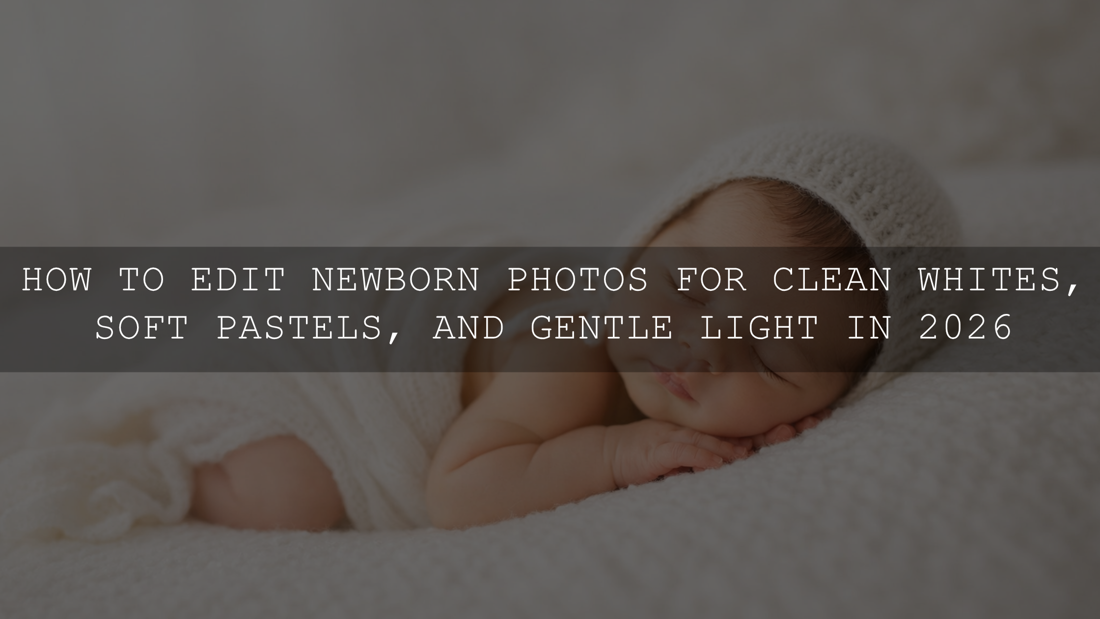
Working With Color in Children’s Photography Without Losing the Joy
Working with color in children’s photography can feel tricky in 2026. Bright shirts, loud toys, colorful books, playground equipment, and bold walls can all look fun in real life, yet turn into visual clutter once you open the image to edit. The goal is not to remove that energy. The goal is to shape it. Good kids photo editing keeps the scene playful while making sure the child’s face, expression, and personality stay at the center of the frame.
If you want a faster starting point for family sessions, baby portraits, and colorful everyday moments, try the 150+ First Years Baby & Newborn Lightroom Presets and browse the Lightroom Presets for Lightroom Mobile & Desktop collection. They give you a clean base for color harmony, natural skin tones, and soft contrast, and you can still fine-tune every image to match the scene. Try them in your workflow and keep the offer simple: Buy 3, Get 9 FREE.
I have tested this kind of workflow on real family and child sessions where one toy was neon, the shirt was bright red, and the background had three competing colors at once. The files that looked the busiest straight out of camera often became the most emotional final images once the color was guided instead of flattened.
Why Color Matters So Much in Kids Photos
Children respond to color naturally. Their clothes, rooms, toys, and play spaces are often filled with saturated tones because that is part of how childhood feels: alive, playful, curious, and fast-moving. That is exactly why color deserves care in post-processing.
When color supports the subject, the photo feels energetic and memorable. When color competes with the subject, the viewer sees the background before they see the child. That is the difference between a good frame and a strong photograph.
Here’s why this matters:
- Color guides attention. The eye usually goes to the brightest or most saturated part of the image first.
- Color shapes mood. Warm tones can feel joyful and cozy, while cooler tones can feel calm, airy, or slightly distant.
- Color affects skin tones. Bright greens, reds, and magentas around a child can reflect into skin and create strange color casts.
- Color helps storytelling. A child with colorful blocks, crayons, balloons, or a bright raincoat can look amazing when the palette feels intentional.
The Real Problem: Bright Clothes, Toys, and Busy Backgrounds
The challenge is rarely “too much color” by itself. The real problem is competing color. A yellow dress can be beautiful. A red toy can be perfect. A blue wall can work. But when all three are equally strong, your photo loses hierarchy.
In child photography, the most common color distractions come from:
- Clothing: neon fabric, heavy patterns, mixed primary colors, logos, and cartoon graphics.
- Toys: plastic reds, blues, yellows, and greens that pull attention away from the eyes and expression.
- Backgrounds: murals, play mats, bedroom clutter, or playground gear with many saturated colors in one frame.
- Mixed light: window light plus indoor bulbs can shift whites and create uneven skin color.
I usually tell photographers to think in layers. First, look at the child. Second, look at the brightest object near them. Third, look at the background. If the second and third layers scream louder than the first, the edit should restore balance.
A Simple Lightroom Workflow for Better Color Harmony
When you are editing colorful children’s images, a clean workflow matters more than dramatic sliders. I recommend this order because it keeps the file controlled from the start:
- Correct exposure first. If the image is too bright or too dark, every color decision becomes harder.
- Neutralize white balance. Skin tone should feel believable before you push any creative look.
- Apply a preset as a starting point. Treat the preset as a foundation, not a final answer.
- Use HSL or Color Mixer to calm problem colors. Reduce only the colors that fight for attention.
- Mask the subject. Give the child a gentle lift in exposure, clarity, or warmth if needed.
- Check the background last. Small saturation or luminance changes often clean up the frame.
Adobe’s official tools make this process easier. For targeted color control, Lightroom’s Color Mixer guide is one of the most useful places to start. For local corrections that keep the child separate from the environment, Adobe’s Lightroom masking guide shows how to isolate the subject and background. And if your file starts with a color cast, Adobe’s Camera Raw guide to white balance and tonal adjustments is a solid reference for getting neutral color before creative grading.
Step by Step: How I Edit a Colorful Children’s Portrait
Let’s break it down with a realistic example. Imagine a child in a bright orange shirt, holding a blue toy, sitting on a green play mat near a warm window.
1. Fix the base exposure
I start by checking whether the face is correctly exposed. If the shirt is bright and the face is slightly dark, I do not boost the whole image too much. I protect highlights first, then open shadows carefully.
2. Get the skin tone right before stylizing
This is where many edits go wrong. If the room has warm indoor light, the skin can drift too yellow or orange. I neutralize that first. In children’s photography, believable skin tones are more important than aggressive color mood.
3. Apply a preset for direction
For baby and early childhood images, the Lightroom Presets for Newborn Photography pack is useful when you want soft whites, smoother tonal transitions, and calm skin color. For a wider variety of looks across baby galleries, milestone sessions, and cozy indoor family images, I like the flexibility of the First Years Baby & Newborn Lightroom Presets. Both work best when you still adjust the file afterward instead of stopping after the preset is applied.
4. Reduce only the distracting colors
If the play mat is too strong, I usually pull back green saturation slightly and sometimes raise green luminance so it feels softer. If the blue toy steals attention, I lower blue saturation just enough that it still reads as blue without becoming the focal point.
5. Mask the child
This is often the finishing move. A subtle subject mask can brighten the face, bring back natural warmth, and create separation from the background without making the edit obvious.
6. Check for consistency across the gallery
Kids move fast, and family sessions often include shifting light and mixed colors from frame to frame. I compare a few edited images side by side so the gallery feels cohesive, not random. If you are building a more unified look across full sessions, this guide on creating a consistent family photography style is a helpful companion read.
Presets vs Manual Editing: Which Works Better?
This is where many photographers get stuck, especially when editing colorful photos of kids.
- Manual editing gives maximum control. You can correct each hue, each cast, and each problem area with precision.
- Presets give speed and consistency. They help you establish a mood quickly, especially across a larger set of images.
The best answer is not presets or manual editing. It is both.
A strong preset saves time on tone curve, contrast balance, and overall mood. Manual tweaks finish the job by adjusting exposure, white balance, skin tone, and distracting colors for that specific file. That is why I rarely recommend using a preset untouched on children’s portraits. A child in soft window light and a child under mixed indoor bulbs will not respond the same way.
If you have ever wondered why one preset looks amazing on one file and strange on another, this article on why Lightroom presets look different on every photo explains the issue clearly. And if skin tones feel inconsistent across children, parents, and siblings in the same gallery, this breakdown of making presets work across every skin tone is worth reading.
How to Keep Bright Colors Fun Without Making the Photo Look Cheap
One of the biggest mistakes in kids photo editing is trying to make every color louder. More saturation is not the same as better color. In fact, many children’s images look stronger when saturation is a little more selective.
Here are the adjustments that usually work best:
- Lower global saturation before lowering vibrance. This keeps the edit from feeling harsh.
- Target specific colors instead of the whole frame. Reds, greens, and blues are common troublemakers in toys and clothes.
- Use luminance to soften color. Sometimes raising luminance in greens or yellows makes the frame feel cleaner without killing the color.
- Protect skin first. If skin looks healthy, viewers forgive a lot in the background.
- Let one or two colors lead. Not every item in the image needs equal strength.
Here’s a practical rule I use: if the toy is the first thing I notice at thumbnail size, it needs less saturation or less contrast.
When Seasonal Color Can Actually Help
Not every colorful scene needs to be toned down. Sometimes a controlled seasonal palette can turn busy color into a stronger story. Autumn is a good example. Warm leaves, knit outfits, and natural golden light can make children’s portraits feel rich and cohesive instead of chaotic.
That is where a dedicated seasonal tool can help. The Vibrant Fall Presets for Lightroom Autumn Photos work well when you want to pull warmth and earthy depth out of outdoor sessions without making the edit muddy. If you are planning a broader browsing path for seasonal work, the Fall Presets for Lightroom Autumn Photos collection is also useful.
For portraits beyond baby sessions, the Portrait Photography Lightroom Presets collection can also help when your main priority is flattering skin, gentle contrast, and cleaner subject separation.
Fast Shooting Tips That Make Editing Easier Later
Editing gets much easier when the capture is cleaner. You do not need a perfect set. You just need a little intention.
- Choose one hero color. Let one main color dominate the outfit or prop choice.
- Move distracting toys out of frame. Keep only the toy that supports the story.
- Watch reflective color casts. Bright grass, painted walls, and colored blankets can shift skin tones.
- Shoot RAW whenever possible. You get more freedom to recover whites, highlights, and color balance.
- Keep the background simpler than the subject. Even a small camera angle change can clean up the composition.
I have seen parents worry that a simple background will make the photo less fun. In practice, the opposite is usually true. When the background is calmer, the child’s energy feels even bigger.
Using Lightroom Mobile for Fast Family Edits in 2026
Mobile editing is much stronger now than it used to be, especially for quick family galleries, social posts, and same-day previews. If you edit on your phone or tablet, you can still build a clean color workflow with presets, Color Mix, and masks. For a broader view of where mobile editing is heading, take a look at the future of Lightroom Mobile presets in 2026.
If your focus is newborns and early childhood storytelling, you can also explore this newborn presets guide for more ideas on soft editing and gallery consistency.
Related Reading
- How to create a consistent family photography style across different sessions
- How to make Lightroom presets work across every skin tone
- Why Lightroom presets look different on every photo and how to fix it
Final Thoughts
Working with color in children’s photography is not about muting childhood. It is about organizing it. The best edits still feel playful, bright, and full of life, but they also feel clear. You notice the eyes first. Then the expression. Then the story. That is what strong color editing should do.
If you want a faster workflow for baby portraits, milestone photos, and family sessions with bold wardrobes and busy environments, start with the 150+ First Years Baby & Newborn Lightroom Presets, explore the Lightroom Presets for Lightroom Mobile & Desktop collection, and refine your final choices with the Lightroom Presets for Newborn Photography pack when you want especially soft and calm skin tones. If you need help choosing the right set for your workflow, you can also contact AAA Presets for guidance.
How do I keep skin tones natural in colorful kids photos?
Start with white balance before applying creative edits, then reduce the saturation of nearby distracting colors like greens, reds, and magentas. Skin should look believable before the style is pushed.
Are presets enough for children’s photography?
Presets are a great starting point, but the best results come when you fine-tune exposure, white balance, and problem colors for each image.
What colors usually cause the biggest editing problems?
Bright greens, strong reds, neon clothing, and mixed indoor lighting are the most common sources of color casts and distraction in kids photos.
Should I desaturate the whole image if the photo feels too busy?
No. It is usually better to target only the distracting colors so the image still feels lively and natural.
Is Lightroom Mobile good enough for family and children’s edits?
Yes. Lightroom Mobile now offers strong tools for presets, color adjustments, and masking, making it a practical option for quick family edits and social-ready images.
Written by Asanka — creator of AAAPresets (10,000+ customers).
Leave a comment
This site is protected by hCaptcha and the hCaptcha Privacy Policy and Terms of Service apply.