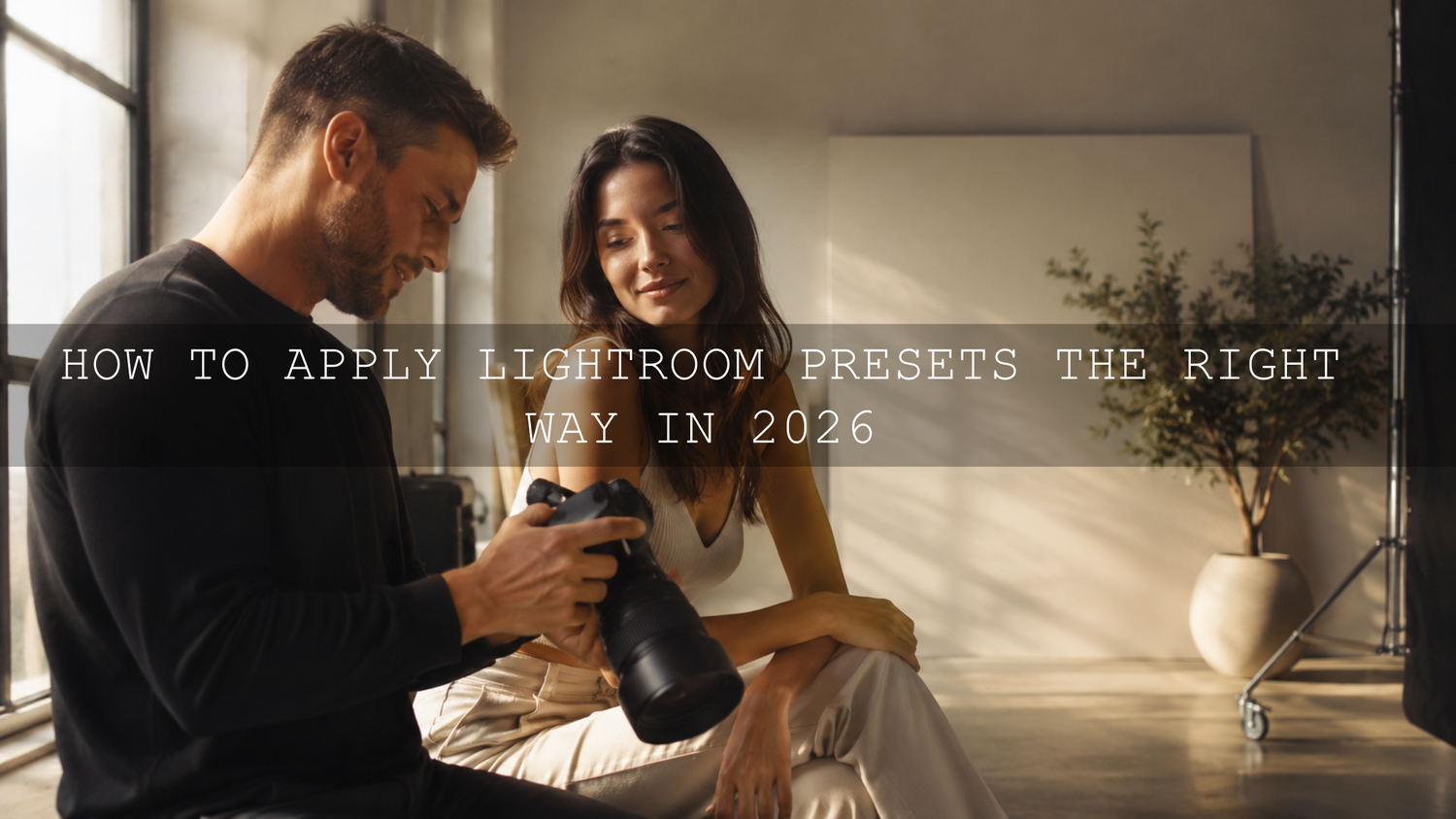
How to Apply Lightroom Presets the Right Way in 2026
Learning how to apply Lightroom presets the right way is one of the fastest ways to create cleaner, more consistent, and more professional photo edits in 2026. Presets can save hours, build a signature style, and help you edit wedding, portrait, travel, product, street, or social media photos faster. But the best results rarely come from one click alone. The real skill is knowing when to apply a preset, what to adjust after applying it, and how to make the final image still feel natural.
Here’s why this matters: a Lightroom preset is a creative starting point, not a guaranteed final edit. Adobe explains that presets apply saved editing settings inside Lightroom, which means the original exposure, white balance, lighting, and subject still affect the result. You can learn more from Adobe’s guide to editing photos with presets in Lightroom.
For a flexible preset workflow, start with the 1000+ Master Lightroom Presets Bundle and browse more styles in the Lightroom Presets for Lightroom Mobile & Desktop collection. Build your base edit first, apply your preset second, then fine-tune the mood. Try these presets today — Buy 3, Get 9 FREE.
What Lightroom Presets Actually Do
A Lightroom preset is a saved group of editing adjustments. Depending on how it was created, it may change exposure, contrast, highlights, shadows, whites, blacks, tone curve, color mix, color grading, sharpening, noise reduction, grain, vignetting, or other creative settings.
Think of a preset like a recipe. It gives your photo a direction, but the final result depends on the ingredients. A bright outdoor portrait, a dark indoor café shot, and a backlit sunset photo will not respond the same way to the same preset. That is why two photographers can use the same preset and get very different results.
Good Lightroom presets help with:
- Speed: You can apply a polished editing direction in seconds instead of building every adjustment from zero.
- Consistency: Your photos can share a similar tone across Instagram, Pinterest, wedding galleries, portfolios, and client work.
- Creative direction: Presets help you test cinematic, bright, moody, vintage, warm, pastel, film, or black and white looks quickly.
- Learning: By studying the preset settings, you can understand how exposure, color, contrast, and tone curve changes work together.
Why One-Click Preset Editing Often Fails
The biggest mistake is applying a preset and assuming the edit is finished. A preset may look amazing on the sample image, but your photo may have different light, color temperature, skin tone, dynamic range, background distractions, or camera settings.
For example, a warm cinematic preset may look beautiful on a golden hour portrait but too orange on an indoor photo taken under yellow lamps. A moody preset may add depth to a street photo but crush detail in a dark wedding reception image. A bright preset may lift a lifestyle photo nicely but blow out a white dress or bright sky.
If your Lightroom presets look different on every photo, the issue is usually not the preset alone. The starting image needs preparation. This is why I always check exposure, white balance, highlights, shadows, and skin tones before judging whether a preset works. For a deeper troubleshooting guide, read why Lightroom presets look different on every photo and how to fix it.
Step-by-Step Lightroom Preset Workflow
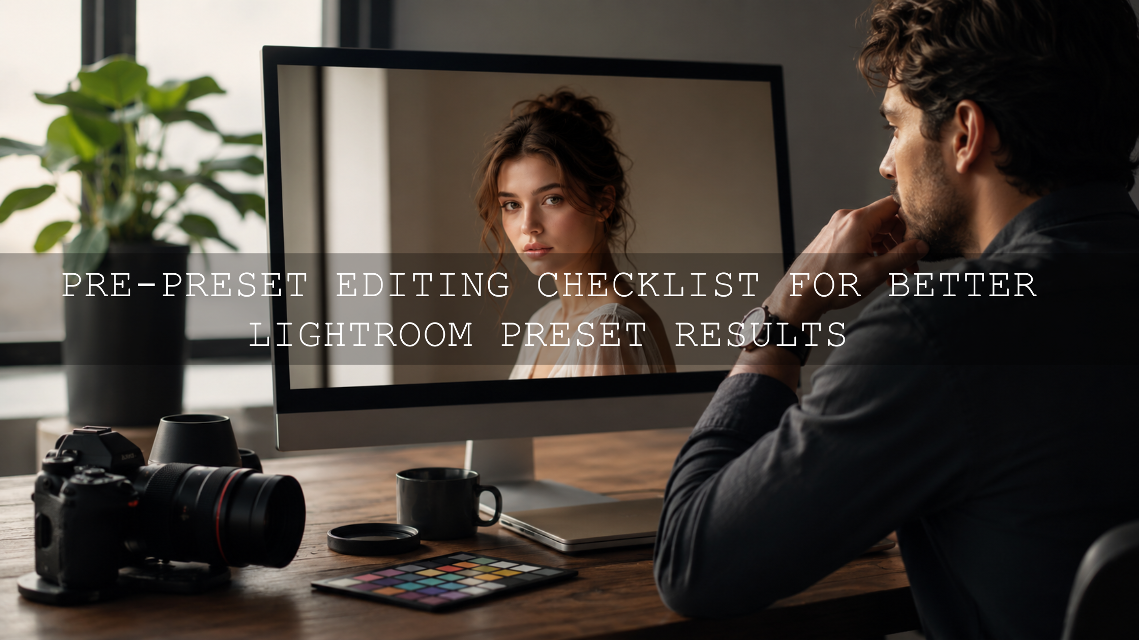
Step 1: Start With a Clean Base Edit
Before applying any preset, make sure the image is technically usable. This does not mean you need to fully edit the photo first. It simply means you should give the preset a balanced foundation.
Start with these basic checks:
- Exposure: Make sure the photo is not too dark or too bright.
- White balance: Correct strong yellow, blue, green, or magenta color casts.
- Highlights: Recover detail in skies, white clothing, windows, and bright reflections.
- Shadows: Lift important dark areas without making the image look flat.
- Crop and straighten: Remove distractions and fix tilted horizons before judging the style.
- Lens corrections: Correct distortion or edge darkening when needed.
I tested this workflow on a small wedding portrait set where the bride stood near a bright window. When I applied a warm preset before correcting the highlights, the dress looked too bright and flat. After lowering highlights first and balancing white balance, the same preset looked soft, clean, and much more premium.
Step 2: Choose a Preset That Matches the Lighting
Preset selection should not be random. Look at the original photo first and ask: what kind of light is in this image? Soft daylight, harsh sun, overcast sky, flash, neon light, indoor yellow light, backlight, or golden hour?
Then match the preset style to the scene:
- Bright daylight photos: Try clean, airy, minimal, or natural presets.
- Golden hour photos: Try warm film, honey, cinematic, or sunset presets.
- Street photos: Try cinematic, moody, black and white, or urban film presets.
- Wedding photos: Try soft, elegant, skin-tone-safe, warm, or timeless presets.
- Indoor lifestyle photos: Try warm, cozy, neutral, or soft contrast presets.
If you want a soft clean look for portraits, content creation, or lifestyle photos, the Bright and Minimal Lightroom Presets can be a useful starting point. If you want stronger movie-style tones, the Cinematics Look Lightroom Presets Pack is better for dramatic edits, street images, and creative storytelling.
Step 3: Apply the Preset and Check the Important Areas
After applying the preset, do not judge the image only from the small preview. Zoom in and check the parts that matter most.
Look closely at:
- Skin tones: They should not look too orange, red, yellow, gray, or muddy.
- Highlights: Bright areas should still hold detail where possible.
- Shadows: Dark areas should have depth without losing important detail.
- Background colors: Greens, blues, and warm lights should support the subject, not overpower it.
- Sharpness and noise: If the preset adds contrast or lifts shadows, check for unwanted grain or rough texture.
Here’s a simple before-and-after example: before the preset, a travel photo may look flat and cool. After applying a cinematic preset, the sky may become richer, the shadows deeper, and the warm tones more emotional. But if the subject’s face becomes too dark, the preset still needs adjustment. The preset gave the direction; your fine-tuning makes it professional.
How to Fine-Tune Lightroom Presets After Applying Them
Adjust Exposure First
Exposure is usually the first slider to check. If the image feels too dark, lift exposure slightly. If the image feels too bright, lower exposure before changing too many other settings. Small changes often work better than dramatic corrections.
Fix White Balance for Natural Color
White balance can make or break a preset edit. If the image looks too warm, move Temperature slightly cooler. If it looks too cold, add warmth. If skin looks too green or too magenta, adjust Tint carefully.
Expert tip: do not chase perfectly neutral white balance in every creative edit. A sunset photo can stay warm. A blue-hour city photo can stay cool. The goal is believable color, not lifeless color.
Recover Highlights and Shadows
Highlights and shadows control how much usable detail remains in the bright and dark areas. If clouds, windows, wedding dresses, or bright shirts lose detail, pull Highlights down. If hair, clothing, or background details disappear into darkness, lift Shadows carefully.
For advanced local control, use masking instead of changing the whole image. Adobe’s Lightroom masking guide explains how masks can target specific areas for more precise adjustments.
Control Color With the HSL Panel
The HSL or Color Mix panel is one of the most important tools after applying a preset. It lets you adjust individual color families instead of changing the whole image.
Useful examples:
- Lower orange saturation slightly if skin looks too strong.
- Raise orange luminance if skin looks too dark.
- Shift green hue for cleaner landscape tones.
- Lower blue saturation if skies look unrealistic.
- Reduce yellow saturation in indoor photos with strong lamp light.
This is where presets become personal. Two photographers can start with the same preset, but the final image becomes unique through these small color choices.
Use Texture, Clarity, and Dehaze Carefully
Texture, Clarity, and Dehaze can add detail and drama, but they can also make photos look harsh. Use them with restraint, especially on portraits. Too much Clarity can make skin texture look rough. Too much Dehaze can make shadows heavy and colors unnatural.
If your preset feels too intense, reduce contrast, lower saturation, soften clarity, or follow this guide on taming overly powerful presets for subtle edits.
Presets vs Manual Editing: Which Is Better?
Presets and manual editing are not enemies. The best workflow uses both.
Presets are best for speed, consistency, and creative direction. They are perfect when you need a repeatable look across many photos, such as wedding galleries, product batches, Instagram feeds, or travel albums.
Manual editing is best for correction and precision. It helps you fix exposure, white balance, masking, retouching, cropping, and image-specific problems.
The strongest workflow is simple: use manual edits to prepare the photo, apply a preset to create the mood, then manually refine the final result. This gives you the speed of presets without losing the control of professional editing.
For a faster editing system, you can also study a full step-by-step Lightroom workflow for faster photo edits and adapt it to your own presets library.
How to Organize Your Lightroom Presets Library
A messy preset library slows down your workflow. If you have hundreds or thousands of presets, organize them by use case instead of randomly scrolling through everything.
Create preset groups such as:
- Portraits and skin tones
- Wedding and couple photography
- Street and urban film
- Travel and lifestyle
- Food and product photography
- Golden hour and warm tones
- Moody, cinematic, and dark edits
- Black and white looks
Adobe also provides instructions for adding and managing presets through Adobe’s guide to installing custom presets and profiles in Lightroom. Once your library is organized, you spend less time searching and more time editing.
When to Save Your Own Custom Preset
After fine-tuning a preset for a specific style, save your version as a new custom preset. This is useful when you repeatedly edit similar images, such as studio portraits, wedding receptions, drone landscapes, café lifestyle shoots, or product images.
For example, if you apply a warm film preset and then always reduce highlights, soften clarity, brighten skin, and lower green saturation, save that adjusted version. Name it clearly, such as “Warm Portrait Soft Skin” or “Golden Hour Travel Clean.”
In my own editing workflow, I like saving custom variations only after testing them on at least five different photos. One image can be misleading. A strong custom preset should work across several real-world lighting situations, not just one perfect sample.
Common Lightroom Preset Mistakes to Avoid
- Applying presets to poorly exposed photos: Fix the base image first.
- Ignoring skin tones: Beautiful color grading is not worth unnatural skin.
- Overusing saturation: Strong colors can look cheap if they overpower the subject.
- Using one preset for every photo: Different lighting needs different presets.
- Skipping masking: Sometimes the subject and background need separate adjustments.
- Exporting too quickly: Always zoom in and check detail, color, and noise before finishing.
Best Preset Types for Different Photo Styles
If you are unsure which preset direction to choose, start with the mood of the photo.
- Clean brand photos: Bright, minimal, soft contrast presets.
- Emotional portraits: Warm velvet, soft cinematic, skin-tone-safe presets.
- Street photography: Moody film, black and white, neon, or urban cinematic presets.
- Travel photos: Golden hour, cinematic landscape, vintage, or natural color presets.
- Social media content: Bright, polished, consistent presets that look good on mobile screens.
If you want elegant warmth for lifestyle, wedding, portrait, and cozy indoor images, try the AI-Optimized Warm Velvet Lightroom Presets. For mobile creators, the Lightroom Mobile Presets collection is helpful when you want a fast workflow on the go.
Related Reading
- Mastering Lightroom Mobile presets for different lighting situations
- 5 presets that can help your photos stand out on Pinterest
- The best street photography Lightroom presets guide
Final Thoughts on Applying Lightroom Presets the Right Way
Lightroom presets are powerful because they speed up your workflow and help you build a recognizable style. But the most professional edits happen when you treat presets as a starting point, not a shortcut around good editing judgment. Prepare the image, choose the right preset, check the important details, and fine-tune exposure, white balance, color, and contrast until the photo feels intentional.
If you want a complete toolkit for portraits, weddings, travel, lifestyle, street, and creative edits, explore the 1000+ Master Lightroom Presets Bundle and browse the full Lightroom Presets for Lightroom Mobile & Desktop collection. Build your signature editing style faster, keep your photos consistent, and make every preset work for your image — Buy 3, Get 9 FREE.
FAQs
What is the best way to apply Lightroom presets?
The best way to apply Lightroom presets is to correct the basic exposure, white balance, crop, highlights, and shadows first. Then apply the preset and fine-tune the result so the photo still looks natural and professional.
Why do Lightroom presets look different on every photo?
Lightroom presets look different because every photo has different lighting, color temperature, exposure, camera settings, and subject matter. A preset applies the same saved settings, but the starting image changes the final result.
Should I edit before or after applying a preset?
You should make small technical corrections before applying a preset, then do creative fine-tuning after applying it. This gives the preset a clean foundation while still letting you customize the final look.
Can Lightroom presets replace manual editing?
No. Presets speed up the creative process, but manual editing is still important for exposure, white balance, masking, skin tones, crop, and image-specific corrections.
Are Lightroom presets good for beginners?
Yes. Lightroom presets are helpful for beginners because they provide a ready-made editing direction and help users learn how different Lightroom settings affect color, contrast, tone, and mood.
Written by Asanka — creator of AAAPresets (10,000+ customers).

Leave a comment
This site is protected by hCaptcha and the hCaptcha Privacy Policy and Terms of Service apply.