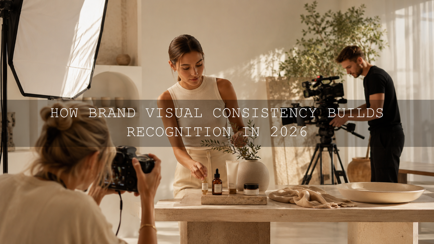
How Brand Visual Consistency Builds Recognition in 2026
Brand visual consistency means making your photography, video, social content, advertisements, and website imagery feel as though they belong to the same creative world. In 2026, consistent photo and video editing is especially important because audiences may encounter your brand through a product photo, Reel, YouTube video, Pinterest pin, or website banner before they ever read your name. A recognizable visual identity helps those separate touchpoints feel connected, professional, and trustworthy.
The goal is not to make every image identical. It is to repeat a clear visual language through color, contrast, lighting, composition, texture, and movement. When those elements stay connected, viewers can begin recognizing your content before they see your logo or username.
Ready to build a repeatable look across stills and moving footage? Start with the 1000+ Master Lightroom Presets Bundle for photography and explore the cinematic LUT collection for Premiere Pro, DaVinci Resolve, Final Cut Pro, and more. Try these creative tools today with the Buy 3, Get 9 FREE offer.
Why Brand Visual Consistency Matters More Than Ever
People move quickly between platforms. Someone may discover your business through a short video, visit your profile, browse a carousel, and then open your website. If every format uses a completely different color palette, lighting style, and emotional tone, the experience can feel fragmented.
Here’s why this matters: consistency reduces visual confusion. A warm, natural lifestyle brand should not suddenly publish cold, heavily saturated videos unless the change serves a deliberate campaign. Similarly, a bold technology brand may feel disconnected if its product videos are energetic and contrast-rich while its photography looks soft, faded, and rustic.
A cohesive visual system can support:
- Recognition: Repeated colors, tones, and compositions help audiences identify your work more quickly.
- Trust: Thoughtful presentation signals that the brand pays attention to detail.
- Stronger storytelling: Photos and videos feel like chapters of one larger narrative.
- Faster production: A defined style reduces unnecessary experimentation during every edit.
- Better teamwork: Photographers, videographers, designers, and social media editors can follow the same creative direction.
For a deeper introduction to this idea, read the guide to building visual consistency across photos and videos.
Define Your Brand’s Visual North Star
Before opening Lightroom or a video editor, decide what your brand should feel like. Your visual North Star is a short creative direction that guides every production and editing decision.
For example, a travel brand’s North Star could be: warm natural light, cinematic greens, realistic skin tones, gentle contrast, and a sense of quiet adventure. A sports brand may choose: deep blacks, crisp whites, controlled saturation, sharp detail, and fast movement.
Let’s break it down into practical decisions.
Choose a Core Color Palette
Select a small group of colors that supports your brand personality. You do not need to force those colors into every frame, but the dominant hues should remain compatible.
- Warm gold, cream, and brown can communicate comfort, heritage, or luxury.
- Blue, cyan, white, and neutral gray can feel clean, technical, or modern.
- Muted greens and earthy highlights can support travel, wellness, and sustainable brands.
- Strong reds, dark shadows, and bright highlights can create energy and urgency.
Pro tip: Save reference frames showing your preferred skin tones, greens, blues, whites, and blacks. These references are often more useful than a list of color codes because they show how colors should behave inside real photographs and footage.
Define Your Contrast and Dynamic Range
Decide whether your brand should feel soft and airy, dark and dramatic, or clean and balanced. Look at the relationship between highlights, midtones, and shadows rather than judging brightness alone.
A soft lifestyle brand may use lifted shadows and gentle highlight roll-off. A cinematic fashion brand may use deeper blacks, stronger separation, and controlled highlights. Both can be professional, but mixing them randomly weakens the visual identity.
Choose a Texture Strategy
Texture includes grain, sharpness, clarity, glow, lens softness, and digital noise. A small amount of consistent grain can help modern video footage sit naturally beside edited photography. However, heavy grain on one asset and clinically sharp detail on the next may create an unintended mismatch.
Set Rules for Skin Tones and Product Colors
Creative grading should not make people look unhealthy or products look inaccurate. Document acceptable ranges for skin warmth, white balance, saturation, and important brand colors.
When I test a warm photo preset beside a cinematic video LUT, I first compare skin tones and neutral objects. If those two areas match, the rest of the palette is usually much easier to refine.
Create a Simple Visual Style Guide
Your visual style guide does not need to be a complicated brand manual. A one-page document can be enough if it gives creators clear answers.
Include the following:
- Three to five reference images: Show the desired mood, light, composition, and color treatment.
- Preferred white balance: State whether the brand leans warm, cool, or neutral.
- Contrast direction: Define whether shadows should be deep, lifted, faded, or natural.
- Saturation limits: Identify colors that should remain muted or vibrant.
- Skin-tone rules: Include examples of natural and unacceptable results.
- Composition rules: Document preferred framing, negative space, camera height, and subject placement.
- Video movement: Specify whether footage should feel smooth, handheld, energetic, minimal, or cinematic.
- Editing references: Name the primary Lightroom presets, video LUTs, and finishing adjustments used by the team.
The guide should establish boundaries without removing creativity. Different campaigns can have different moods while still sharing the same underlying visual DNA.
A Step-by-Step Workflow for Consistent Photo and Video Editing
The most reliable workflow separates technical correction from creative styling. Correct the image first, apply the brand look second, and refine individual details last.
Step 1: Capture Consistent Source Material
Editing cannot completely repair inconsistent production. Whenever possible, use the same lighting direction, camera profile, frame-rate strategy, and white-balance method across a campaign.
- Use manual or custom white balance instead of allowing the camera to change color continuously.
- Avoid mixing daylight and artificial light unless it is part of the creative concept.
- Use matching picture profiles when multiple cameras support them.
- Photograph a neutral gray card or color reference at the beginning of important shoots.
- Protect highlights and avoid severely underexposing faces.
Adobe’s guide to adjusting image tone and white balance in Lightroom Classic explains how temperature, tint, highlights, shadows, and related controls affect the image.
Step 2: Normalize Every Photo and Clip
Normalization means creating a technically balanced starting point before adding the creative style. Correct exposure, white balance, contrast, and color-space interpretation first.
For photographs, check:
- Exposure and midtone brightness
- White balance and tint
- Highlight recovery
- Shadow detail
- Lens corrections
- Camera profile
For video, check:
- Input color space or log profile
- Exposure using scopes
- Neutral white balance
- Highlight clipping
- Black level and shadow detail
- Shot-to-shot consistency
Premiere Pro users should also review Adobe’s overview of color management in Premiere. Correct color-space interpretation is essential because the same LUT can behave very differently on Rec.709, log, and wide-gamut footage.
Step 3: Apply the Photo Preset as a Starting Point
Apply your chosen Lightroom preset after the photograph has a reasonable exposure and white balance. Adobe describes presets as predefined combinations of adjustments, including exposure, contrast, saturation, and color grading. You can learn more in Adobe’s official guide to editing photos with Lightroom presets.
Do not expect one preset to produce identical results on every photograph. Lighting, camera profiles, subject colors, and exposure all affect the result. The guide explaining why Lightroom presets look different on every photo provides a useful troubleshooting workflow.
Pro tip: When creating a reusable brand preset, avoid saving exposure and white-balance values unless the source photographs were captured under nearly identical conditions. Let the preset control the creative style while you adjust technical corrections for each image.
Step 4: Apply a Matching Video LUT
Choose a LUT with similar contrast, highlight warmth, shadow color, saturation, and skin-tone treatment to your photo preset. Apply it at a controlled intensity rather than assuming 100 percent strength is always correct.
If you are new to installation, follow the AAAPresets guide to importing and applying LUTs.
After applying the LUT, compare a video frame with your hero photograph. Place them side by side and evaluate:
- Are faces equally warm or cool?
- Do white objects remain neutral?
- Are greens leaning toward the same hue?
- Do shadows have similar depth?
- Are highlights soft, bright, golden, or neutral in both?
- Does the overall saturation feel balanced?
Step 5: Refine the Look Manually
A preset or LUT establishes direction, but manual editing makes the result fit the actual scene. Adjust exposure, curves, HSL controls, color wheels, masks, and LUT intensity until the photo and video feel related.
One of the most reliable checks I use is temporarily reducing saturation. In black and white, differences in contrast and brightness become easier to notice. After the tonal structure matches, restore the color and refine individual hues.
Step 6: Test the Assets Together
Do not approve photos and videos in isolation. Preview them in the order your customer will see them: website banner, product image, Reel, story, advertisement, and landing page.
A photograph may look excellent by itself but feel too dark beside a bright video. A cinematic video may look impressive in full screen but overpower a clean product page. The sequence matters.
Presets vs Manual Editing: Which Is Better for Brand Consistency?
Using Presets
Presets are useful for speed, repeatability, and creative direction. They allow multiple images to begin with a similar tone curve, color palette, and finishing style.
- Faster for large batches
- Helpful for teams
- Easy to test different brand directions
- Useful for repeating a signature look
The limitation is that a preset responds to the image it receives. An underexposed photograph, incorrect white balance, or unusual camera profile can still produce an inconsistent result.
Using Manual Editing
Manual editing gives you precise control over every frame. It is especially valuable when lighting, cameras, subjects, and locations change significantly.
- Better control over difficult lighting
- More accurate skin tones and product colors
- Greater flexibility for unusual scenes
- More time required for every asset
The Best Approach Is a Hybrid Workflow
Use manual adjustments for technical correctness and presets or LUTs for creative consistency. In simple terms:
- Manual correction: Exposure, white balance, highlight recovery, shadows, and color-space setup
- Preset or LUT: Color mood, contrast character, tone curve, and visual personality
- Manual refinement: Skin tones, product colors, masks, saturation, and shot matching
This hybrid approach is also useful when working across different photography genres. The guide to using genre-specific presets without losing your brand style explains how to preserve a signature look across weddings, portraits, travel, street, and lifestyle photography.
A Practical Before-and-After Brand Example
Imagine a skincare brand producing a launch campaign. The still photographs were captured beside a warm window, while the video was recorded later under cooler LED lighting.
Before the Consistency Workflow
- Product photos have creamy whites and warm skin tones.
- Video clips have blue shadows and neutral highlights.
- Greens in the packaging appear muted in photos but highly saturated in video.
- Photography feels soft and premium, while the Reel feels sharp and technical.
After the Consistency Workflow
- The video white balance is corrected before creative grading.
- A gentle LUT adds warmth to highlights without turning whites yellow.
- Green saturation is reduced to match the photographed packaging.
- Contrast is softened slightly to match the photo preset.
- A small amount of grain is added to the finished video.
- Both formats retain accurate skin tones and readable product labels.
The final photographs and Reel do not look identical, but they clearly belong to the same campaign. That is the goal of brand visual consistency.
Match Composition, Movement, and Pacing
Color is only one part of visual identity. Composition and motion also shape how people experience your brand.
If your photography uses clean negative space, include breathing room in your video framing. If your product images rely on macro details, capture close-up video shots of texture, materials, packaging, and movement.
Match video pacing to the brand personality:
- Luxury: Slower camera movement, deliberate cuts, controlled highlights, and uncluttered frames
- Wellness: Natural motion, soft light, gentle transitions, and calm pacing
- Sports: Faster cuts, directional movement, stronger contrast, and energetic framing
- Technology: Precise movement, clean geometry, cool neutrals, and detailed close-ups
- Travel: Wide establishing shots, environmental details, natural transitions, and atmospheric color
Audio should support the same rhythm. Slow, elegant visuals paired with frantic music can create the same kind of inconsistency as mismatched color grading.
Build Reusable Hero Assets for Every Platform
A practical way to improve consistency is to create one main campaign and adapt it across platforms. Capture photography and video during the same production whenever possible.
You can then create:
- A website hero image
- A horizontal promotional video
- Vertical Reels and short-form clips
- Square product posts
- Pinterest graphics
- Email campaign images
- Video thumbnails
- Behind-the-scenes content
Because the assets share lighting, wardrobe, locations, props, and creative direction, maintaining a unified look becomes much easier. You can also export still frames from high-quality video when appropriate, although dedicated photographs usually offer more flexibility and resolution.
Create a Final Visual Quality-Control Checklist
Before publishing a campaign, review the complete asset set and ask:
- Do the photos and videos share a recognizable color mood?
- Are skin tones believable across every format?
- Do product and brand colors remain accurate?
- Are the darkest and brightest assets reasonably balanced?
- Does the contrast feel intentional rather than random?
- Are grain, sharpness, and texture consistent?
- Do composition and camera movement support the brand personality?
- Does one asset feel as though it came from a different campaign?
- Do the visuals remain consistent on both mobile and desktop screens?
- Can someone recognize the brand without seeing the logo?
Reviewing common problems can save time during this stage. The guide to common LUT mistakes and how to correct them covers issues such as skipping basic correction, applying excessive intensity, and expecting one LUT to work perfectly on every shot.
Let Your Visual Identity Evolve Without Losing Recognition
Consistency should not become creative stagnation. A brand can evolve its colors, lighting, typography, and editing style as its audience and products change.
The safest approach is gradual evolution. Keep several recognizable elements while introducing one or two new ideas. For example, retain your warm skin tones and soft contrast while slowly adding cooler backgrounds or cleaner compositions.
Review your style guide at least once a year or before a major rebrand. Remove references that no longer represent the business, add examples from successful campaigns, and update technical instructions for new cameras, editing software, and delivery formats.
Your brand style is successful when it is flexible enough to support new ideas but specific enough to remain recognizable.
Related Reading
- How to match Lightroom presets with video LUTs for a cross-platform aesthetic
- How to fix exposure and white balance in Premiere Pro
- What LUTs are and how they support a consistent video style
- How to build a consistent Instagram aesthetic with Lightroom presets
Build a Recognizable Look Across Every Frame
Strong brand visual consistency comes from a repeatable system, not from applying the same filter to everything. Begin with consistent capture settings, correct each asset, apply a controlled creative look, refine important details, and review photos and videos together before publishing.
To create a flexible brand editing library, combine the 1000+ Master Lightroom Presets Bundle with the 700+ Cinematic Video LUTs Bundle. You can also browse the complete Lightroom presets collection for mobile and desktop to find styles that fit your brand direction. Try these presets and LUTs today — Buy 3, Get 9 FREE.
Frequently Asked Questions
What is brand visual consistency?
Brand visual consistency is the use of a recognizable color palette, contrast style, lighting approach, composition, texture, and emotional tone across photography, video, websites, advertisements, and social media content.
How can I make my photos and videos look consistent?
Use similar production settings, correct exposure and white balance before styling, select Lightroom presets and video LUTs with compatible color characteristics, and compare finished photo and video frames side by side.
Can I use a Lightroom preset directly in Premiere Pro?
Lightroom presets and Premiere Pro LUTs use different formats and editing systems, so a Lightroom preset cannot normally be applied directly to Premiere Pro footage. Choose or create a LUT that reproduces a similar contrast, palette, and mood.
Should I correct color before applying a preset or LUT?
Yes. Correct major exposure, white-balance, and color-space problems first. The preset or LUT can then create the intended style without exaggerating technical issues.
Does every brand need one fixed editing style?
No. A brand can use several related looks for different campaigns. The important part is maintaining shared visual characteristics such as skin-tone treatment, contrast, dominant colors, lighting, and composition.
Written by Asanka — creator of AAAPresets (10,000+ customers).
Leave a comment
This site is protected by hCaptcha and the hCaptcha Privacy Policy and Terms of Service apply.