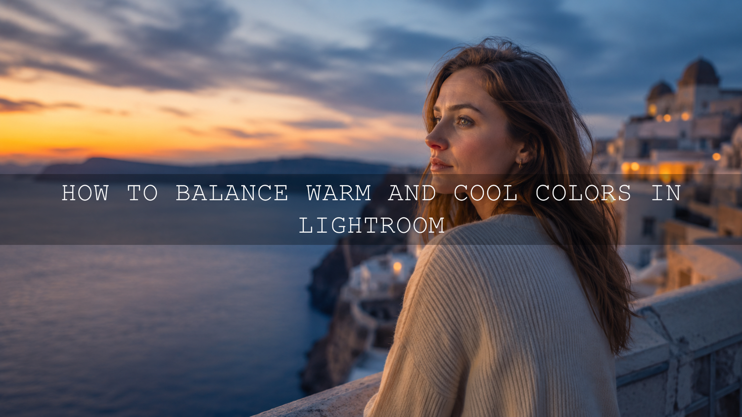
How to Balance Warm and Cool Colors in Lightroom
Learning how to balance warm and cool colors in Lightroom is one of the fastest ways to make your photos look polished, natural, and emotionally clear. Warm tones can add golden-hour glow, comfort, romance, and energy. Cool tones can create calm, depth, freshness, and cinematic mood. The real skill is not choosing one over the other. The real skill is knowing when to warm the highlights, cool the shadows, protect skin tones, and keep the whole image believable.
Here’s why this matters. A sunset that turns too green, a portrait with blue-looking skin, or a travel photo that feels too yellow can make a strong image look unfinished. When I test Lightroom presets for AAAPresets, I always check how the same preset reacts to portraits, landscapes, indoor light, golden hour, and shade because warm and cool color shifts can completely change the feeling of a photo.
For a faster starting point, explore the 1000+ Master Lightroom Presets Bundle and browse more creative looks from the Lightroom Presets for Mobile and Desktop collection. Try these presets today — Buy 3, Get 9 FREE — then use the workflow below to fine-tune warm and cool colors so every edit feels intentional.
Why Warm and Cool Color Balance Matters
Warm and cool colors are not only technical settings. They shape emotion. Warm tones like orange, yellow, and red often make an image feel inviting, romantic, sunny, nostalgic, or energetic. Cool tones like blue, aqua, and green can make an image feel calm, clean, modern, peaceful, or dramatic.
A good Lightroom edit usually needs both. For example, a wedding portrait may need warm highlights to keep the golden-hour feeling, but slightly cooler shadows to create depth. A city street photo may need cool blue shadows for cinematic contrast, but warm skin tones so the subject still looks alive and natural.
If you want a deeper mood-based comparison, read Warm vs Cool Tones: Which Presets Tell Your Story Best? after this guide.
Start With White Balance Before Creative Color
Before you touch HSL, Color Mixer, or Color Grading, fix the foundation first: white balance. Adobe explains that Lightroom’s basic color controls help correct white balance, tone, and color before you move into more detailed adjustments. You can review the official Adobe guide to image tone and color in Lightroom Classic for the technical foundation.
In Lightroom, the two main white balance controls are Temperature and Tint.
- Temperature: Controls the blue-to-yellow balance. Move left to cool the image. Move right to warm the image.
- Tint: Controls the green-to-magenta balance. Move left to add green. Move right to add magenta.
Think of Temperature as the overall mood control and Tint as the color cast fixer. If a portrait looks too yellow, reduce Temperature slightly. If the shadows look green, add a little magenta with Tint. If a blue-hour city image feels too cold and lifeless, add a small amount of warmth without removing the evening mood.
Pro Tip: Fix Accuracy First, Then Add Style
Do not start by making the image “cinematic.” First, make the image believable. Skin should look natural, whites should not look green or blue, and the main subject should feel clean. After that, you can add creative warmth or coolness with intention.
Use the White Balance Selector for Fast Correction
The White Balance Selector tool is useful when your image has a clear neutral area, such as a white shirt, gray wall, neutral paper, or clean highlight. Click the eyedropper on a neutral area, then let Lightroom adjust Temperature and Tint automatically.
This works especially well for indoor photos, product shots, wedding details, and mixed-light images where your eyes may struggle to judge the color cast. If indoor photos often look strange after presets, this guide may also help: Why Do My Presets Look So Bad Indoors?
Presets vs Manual Editing: Which Is Better for Color Balance?
Presets and manual editing are not enemies. They work best together.
- Presets are best for speed and style: They help you apply a consistent mood, contrast, tone curve, and color direction quickly.
- Manual editing is best for correction: It helps you adjust each photo’s unique white balance, exposure, skin tones, greens, blues, and color casts.
- The best workflow uses both: Apply a preset for the look, then adjust Temperature, Tint, HSL, and Color Grading to match the real photo.
For example, if you apply a warm film preset to a café portrait, the preset may create a beautiful cozy look. But if the café lights are already yellow, the skin may become too orange. In that case, keep the preset style, reduce Temperature slightly, lower Orange saturation a little, and lift Orange luminance if the skin looks heavy.
If you want a preset that is designed with more natural portrait color in mind, try the AI-Optimized Skin Tone Safe Pro Portrait Lightroom Presets.
Fine-Tune Warm and Cool Colors With HSL and Color Mixer
Once white balance feels close, move to HSL or Color Mixer. This is where you correct specific colors without changing the entire photo. Adobe’s Lightroom documentation explains that the Color Mixer gives targeted control over specific colors, including hue, saturation, and luminance.
Here is the simple way to think about it:
- Hue: Changes the color direction. Example: shift yellow-green foliage toward a more natural green.
- Saturation: Changes color intensity. Example: reduce overly strong blues in shadows or orange in skin.
- Luminance: Changes brightness. Example: darken blue skies for drama or brighten orange skin tones for a softer look.
Warm Color Fixes
- If skin looks too orange, reduce Orange saturation slightly.
- If golden-hour highlights look too yellow, move Yellow hue slightly toward orange or reduce Yellow saturation.
- If warm shadows look muddy, reduce Orange saturation in shadows with a mask instead of cooling the whole image.
Cool Color Fixes
- If skies look too cyan, shift Aqua hue toward Blue.
- If shadows look too blue, reduce Blue saturation slightly or warm the shadows in Color Grading.
- If greens look electric, reduce Green saturation and adjust Green hue carefully.
For more detailed color correction after presets, read how to use Color Mixer when presets look different across camera brands.
Use Color Grading to Create Mood
After white balance and HSL corrections are clean, use Color Grading for style. This is where you can add warmth to highlights, coolness to shadows, or a soft global tone across the image. Adobe notes that Lightroom’s Color Grading tools can add color tints to shadows, midtones, and highlights to create mood and harmony.
A popular cinematic approach is to keep highlights slightly warm and shadows slightly cool. This works because the warm areas feel alive and emotional, while the cool areas add depth and separation. You can also use Adobe Color’s color wheel to understand complementary color relationships before building a stronger color grade.
Simple Cinematic Color Grading Recipe
- Add a small amount of warm yellow or orange to highlights.
- Add a small amount of blue or teal to shadows.
- Keep saturation low so the effect feels premium, not artificial.
- Use Balance to decide whether the image should feel more warm or cool overall.
- Check skin tones before exporting.
I tested this approach on warm outdoor portraits and travel photos, and the best results came from very small adjustments. The image should feel better before the viewer notices the color grade.
For a ready-made cinematic starting point, explore the AI-Optimized Aesthetic Cinematic Movie Look Lightroom Presets.
A Practical Warm and Cool Color Workflow in Lightroom
Use this workflow every time a photo feels too warm, too cool, too green, too magenta, or simply “off.”
- Check the photo before editing: Ask what the image should feel like. Warm and cozy? Cool and clean? Balanced and natural?
- Correct exposure first: If the image is too dark or too bright, color decisions become harder to judge.
- Fix Temperature and Tint: Make the overall image believable before adding creative color.
- Check skin tones: Skin should not look orange, red, gray, blue, or green. If needed, use Orange and Red controls in HSL.
- Refine key colors: Adjust greens, blues, oranges, and yellows using HSL or Color Mixer.
- Add Color Grading: Warm highlights and cool shadows can add depth, but keep the effect subtle.
- Compare before and after: Toggle the edit on and off to make sure the photo improved, not just changed.
- Sync carefully: For a full gallery, sync base settings only when lighting conditions are similar.
If your presets look different from photo to photo, this guide explains the bigger reason: Why Lightroom Presets Look Different and How to Fix It.
Before and After Example: Fixing a Warm Portrait
Imagine a sunset portrait edited with a warm preset. The background looks beautiful, but the subject’s face looks too orange. Instead of removing the preset, do this:
- Reduce Temperature slightly to pull back excessive yellow warmth.
- Add a tiny amount of magenta if the shadows look green.
- Go to Color Mixer and reduce Orange saturation slightly.
- Increase Orange luminance a little to make skin feel cleaner.
- Add subtle warmth back to highlights using Color Grading instead of warming the whole image.
This keeps the golden-hour mood while making the portrait look natural. For more portrait-specific advice, read Master Lightroom Presets for All Skin Tones.
Before and After Example: Fixing a Cool Landscape
Now imagine a mountain or lake photo that looks too blue after editing. The cool tone may feel peaceful, but if everything becomes blue, the photo can look flat.
- Warm the Temperature slightly until whites and rocks look more natural.
- Reduce Blue saturation if shadows feel too intense.
- Lower Blue luminance for a deeper sky, but avoid crushing shadow detail.
- Add a little warmth to highlights so sunlight feels believable.
- Keep greens controlled so the landscape does not become neon.
For nature and travel edits, the Professional Lightroom Presets for Landscape Photography collection is a useful place to browse styles that can be adjusted with the same workflow.
Common Mistakes When Balancing Warm and Cool Colors
- Over-warming everything: Warmth looks good until skin, whites, and shadows all turn yellow.
- Making shadows too blue: Cool shadows can look cinematic, but too much blue can make portraits feel lifeless.
- Ignoring Tint: Many “warm vs cool” problems are actually green or magenta cast problems.
- Overusing Saturation: Strong saturation can make photos look cheap, especially in skies, grass, and skin.
- Blindly applying presets: A preset gives the style, but each image still needs white balance and color checks.
If you like warm lifestyle, café, and indoor images, the AI-Optimized Aesthetic Coffee Shop Warm Film Lightroom Presets can give you a cozy base while still leaving room for manual white balance correction.
Related Reading
- Mastering Lightroom Mobile Presets: Adapting to Any Lighting
- Why Lightroom Presets Act Up After Updates and How to Fix It
- How to Tame Overly Powerful Lightroom Presets
Final Thoughts on Warm and Cool Color Balance
Balancing warm and cool colors in Lightroom is part correction, part storytelling. Temperature and Tint help you fix the base. HSL and Color Mixer help you refine problem colors. Color Grading helps you create mood. When all three work together, your photos look more professional, more consistent, and more emotionally clear.
The goal is not to make every image perfectly neutral. The goal is to make every color decision feel intentional. A warm photo should still have clean skin and believable shadows. A cool photo should still have life, depth, and natural highlights. Once you understand that balance, your Lightroom edits start to feel more polished and personal.
To speed up your workflow, start with the 1000+ Master Lightroom Presets Bundle, try a portrait-safe option like the AI-Optimized Soft Cinematic Contrast Beauty Lightroom Presets, or browse the full AI-Optimized Lightroom Presets for Mobile and Desktop collection. Try these presets today — Buy 3, Get 9 FREE — and use the warm and cool color workflow above to make each edit look clean, cinematic, and natural.
FAQ
How do I balance warm and cool colors in Lightroom?
Start with Temperature and Tint to fix the overall white balance. Then use HSL or Color Mixer to correct specific colors like orange skin, blue shadows, green foliage, or yellow highlights. Finish with subtle Color Grading for mood.
Should I edit white balance before or after applying presets?
For most photos, get exposure and white balance close before applying a preset. After applying the preset, make small Temperature, Tint, HSL, and Color Grading adjustments so the final image fits the real lighting.
Why do my Lightroom edits look too orange?
Your image may be too warm, or the Orange and Yellow channels may be too saturated. Reduce Temperature slightly, lower Orange saturation in HSL, and lift Orange luminance a little if skin looks heavy or overcooked.
Why do my shadows look too blue in Lightroom?
Blue shadows usually happen when Temperature is too cool, Blue saturation is too strong, or Color Grading adds too much cool tone to shadows. Warm the white balance slightly, reduce Blue saturation, or lower shadow color grading intensity.
Are warm or cool presets better?
Neither is always better. Warm presets are great for golden hour, weddings, lifestyle, and cozy edits. Cool presets work well for city, winter, water, moody portraits, and clean modern looks. The best choice depends on the story and lighting of the photo.
Written by Asanka — creator of AAAPresets (10,000+ customers).

Leave a comment
This site is protected by hCaptcha and the hCaptcha Privacy Policy and Terms of Service apply.