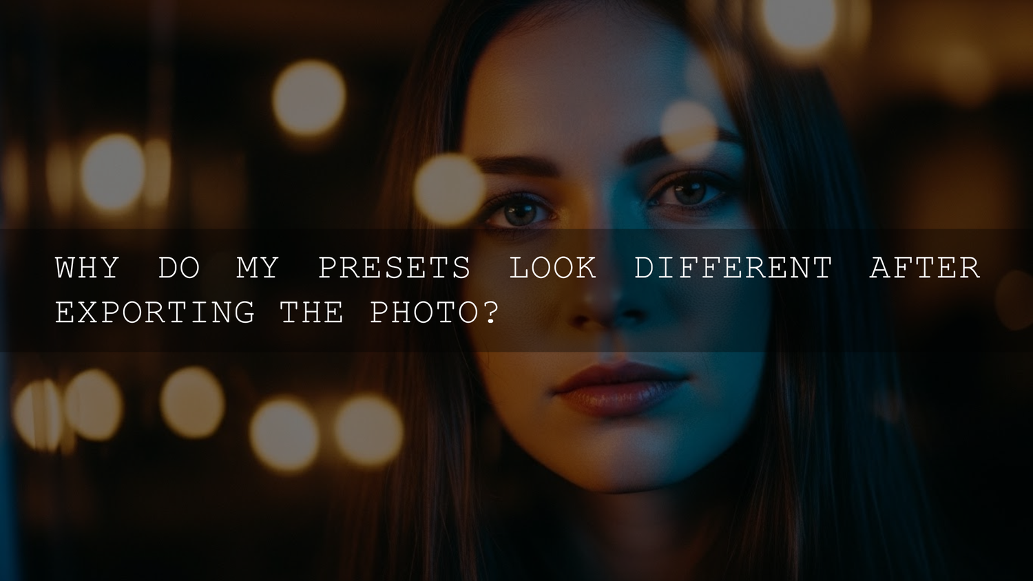
Lightroom Export Looks Different? How to Keep Your Preset Look Consistent in 2026
You finally nailed the edit. The tones feel right, skin looks clean, the vibe is perfect—and then you export… and suddenly your Lightroom export looks different. Colors shift, contrast feels harsher, and the Lightroom presets you trusted suddenly look “off.” If you’ve ever wondered why exported photos look different than Lightroom, it usually comes down to a few predictable things: color space (sRGB vs Adobe RGB vs ProPhoto RGB), monitor calibration, and compression (especially JPEG and social apps). Let’s break it down in a way you can actually use—so what you export matches what you meant.
If you want a fast, consistent starting point for edits that hold up on export, take a look at the 1000+ Master Lightroom Presets Bundle and browse the full Lightroom Presets for Mobile & Desktop collection. If you’re ready to try this look on your own images, explore our presets—you can Buy 3, Get 9 FREE when you add 12 to your cart.
Why the Export Can Change Your Look (Even If Your Edit Didn’t)
Think of your edit as “instructions,” and your export as “translation + packaging.” Your preset isn’t disappearing—your image is being converted into a final file that must make sense to browsers, phones, apps, and screens that all interpret color a little differently.
- Your working color space vs your output color space can shift saturation, hue, and brightness.
- Your monitor might be lying (too bright, too warm/cool, wrong gamma).
- JPEG compression can break smooth gradients and subtle tones your preset created.
- Social platforms often recompress and sometimes alter color/contrast.
- Different viewers (Safari vs Chrome, iPhone vs Android, HDR vs SDR) can display the same file differently.
Once you know which “bucket” your issue is in, fixing it becomes simple.
Quick Diagnosis: Find the Real Cause in 60 Seconds
- If it looks wrong only after uploading to Instagram/Facebook/TikTok: it’s mostly platform compression + resizing.
- If it looks wrong in some apps but fine in Lightroom: it’s usually color profile handling (embedded profile + viewer behavior).
- If it looks wrong everywhere except your monitor: your monitor brightness/gamma is likely misleading you.
- If bright gradients (sky, walls) look banded or crunchy: JPEG quality/resizing/sharpening is too aggressive.
Pro tip: Export one test image in sRGB at high quality, then view it in 2–3 places (browser + phone + social draft upload). If it matches in browser but changes on social, your export is fine—your platform is the culprit.
Color Spaces in Plain English (sRGB vs Adobe RGB vs ProPhoto RGB)
Color spaces are the “range of colors” your file can describe. A wider range isn’t automatically better—especially if the place you’re posting can’t display it properly.
sRGB
Best for web and social. It’s the safest, most widely supported standard. If your goal is “looks consistent on most phones and browsers,” sRGB wins.
Adobe RGB
Useful for some print workflows because it holds more color range than sRGB (especially in greens/cyans). But if you export Adobe RGB and then view it in an app that assumes sRGB, colors can look flat, shifted, or weird.
ProPhoto RGB
Great for editing headroom (especially when working with RAW), but it’s huge. If you push intense colors with a preset and then convert down to sRGB at export, those out-of-gamut colors get “squeezed,” which can change the look.
What to do (simple rule)
- Posting online? Export sRGB.
- Sending to a lab/printer? Use the printer/lab’s recommended profile (often they’ll tell you what they want).
- Archiving masters? Keep a high-quality master (TIFF/PSD) and export web versions separately.
If you want Adobe’s official guidance on color management behavior in Lightroom Classic, you can reference Adobe’s guide to color management in Lightroom Classic.
Your Monitor Might Be the Problem (Brightness Is the #1 Trap)
Most people edit on a screen that’s too bright. So they darken the image to “look right,” and later the export looks darker or moodier than intended on normal screens.
- Too bright monitor: You underexpose edits → exports look dark on phones.
- Warm/cool shift: You compensate white balance incorrectly → exports look tinted elsewhere.
- Wrong gamma: Midtones don’t match other devices → contrast feels off.
Even if you don’t own a calibration tool, you can still improve consistency by doing this:
- Lower your monitor brightness until a pure white page isn’t “glowing.”
- Edit in consistent room lighting (avoid editing in total darkness).
- Use a quick phone check before exporting a whole batch.
First-hand note: I tested this on a low-light wedding set where skin tones looked perfect on my monitor—but exports felt too contrasty on an iPhone. Dropping my monitor brightness and rechecking the midtones fixed it immediately.
Export Settings That Preserve Your Preset Look
This is the part that saves you hours: a repeatable export preset you trust.
Lightroom Classic “Web & Social” export checklist
- File format: JPEG
- Color space: sRGB
- Quality: 85–100 (start at 90 if you want a good balance)
- Resize: Export close to your platform needs (don’t let social apps do all the resizing)
- Output sharpening: Low/Standard for Screen (avoid “High” unless you really need it)
- Grain/texture heavy presets: watch for banding in smooth areas (sky, walls)
If you want the official reference for export behavior and options, see Adobe’s Lightroom Classic export settings documentation and Adobe’s guide to export presets in Lightroom Classic.
Lightroom Mobile “Social upload” export checklist
- Export at high quality, but test 90% vs 100% if file size is huge.
- Don’t over-sharpen in export—mobile screens already look “crispy.”
- Keep highlights controlled; social compression can make highlight rolloff look harsh.
For a platform-focused workflow, this internal guide helps: Lightroom Mobile export settings for TikTok, Instagram & Pinterest.
Presets vs Manual Editing: Which Exports More Consistently?
This is the honest answer: both can be consistent, but presets are faster—if you finish with a few manual “stability checks.”
Presets (fast and consistent when used right)
- Pros: Speed, repeatable look, great for batches, consistent brand style.
- Cons: If a preset pushes colors near the edge of gamut, conversion to sRGB can change the look more noticeably.
Manual editing (maximum control, slower)
- Pros: You can tailor each image for export limits (especially tricky lighting).
- Cons: Harder to keep a consistent “signature look” across a large set.
The best hybrid: Apply a preset, then manually adjust white balance, exposure, highlights, and HSL just enough to keep colors safe for sRGB export.
If you want a versatile base set that still leaves room for fine-tuning, start with a broad toolkit like 1000+ Master Lightroom Presets Bundle.
JPEG vs PNG vs TIFF: When the File Type Changes the Look
Most “my preset disappeared” complaints are actually compression artifacts.
- JPEG: Small and web-friendly, but can create banding in gradients and reduce subtle transitions.
- PNG: Great for graphics and lossless needs, but huge for photos (often unnecessary).
- TIFF: Excellent master/archive and print workflows, but too big for everyday sharing.
Actionable pro tip: If your preset uses smooth cinematic shadows or soft pastel gradients, export one “problem image” at JPEG 90 and JPEG 100. If banding improves at 100, keep 100 for that specific set (especially skies, backdrops, and studio walls).
Real-World Use Case: “It Looked Great in Lightroom… Then Instagram Ruined It”
A common scenario: a creator edits a portrait, applies a warm preset, exports, and it looks perfect on desktop—then Instagram compression makes skin look oversharpened and shadows get blocky.
Here’s the fix flow that works in practice:
- Export sRGB, JPEG quality 90–100.
- Resize closer to the platform’s typical display size (so the app does less work).
- Use lighter output sharpening (or none) if the preset already adds clarity/texture.
- Upload and check in a draft/post preview before publishing.
First-hand note: When I pushed a warm golden preset on a sunset travel shot, the export looked slightly more saturated on some phones. Reducing vibrance a touch and keeping sRGB for web made it consistent across devices.
Create Two Export Presets You’ll Use Forever (Web + Print)
Instead of guessing every time, build two saved exports:
Preset A: Web/Social
- JPEG, sRGB, quality 90–100
- Resize for web (your usual platform)
- Output sharpening: Low/Standard for Screen
Preset B: Print/Client Delivery
- TIFF or high-quality JPEG (depending on client/lab)
- Use the profile your printer/lab requests
- Minimal sharpening (or tailored to print)
If you also work across mobile + desktop looks, this article helps keep consistency between tools: Matching Lightroom presets with LUTs for a cohesive aesthetic.
Common “Preset Looks Different” Problems (and the Fix)
Problem: The export is more contrasty than Lightroom
- Lower output sharpening
- Check tone curve extremes (lift blacks slightly)
- Verify you’re exporting sRGB for web
Problem: Skin tones shift after export
- Confirm white balance is stable (don’t rely only on the preset WB)
- Reduce overly saturated oranges/reds in HSL
- Check the file on a phone before exporting a whole batch
Problem: The export looks “flat” in some apps
- Make sure you export with an embedded profile (and stick to sRGB for web)
- View in a color-managed browser/app when possible
Related Reading (Internal)
- How to install Lightroom presets (quick & easy)
- Using Lightroom presets in Photomator (workflow differences)
- Lightroom Mobile export settings for social platforms
- Why photographers love the 1000+ presets bundle
- How to use presets for clean black & white edits
Pick the Right Preset for the Job (So Exports Don’t Surprise You)
If you’re editing different genres (weddings, travel, drone, portraits), it helps to start with presets designed for that lighting style—because extreme pushes are more likely to shift during export conversion.
- For all-around flexibility: 1000+ Master Lightroom Presets Bundle
- For skin and ceremony lighting: 150+ Wedding Presets Bundle
- For high-dynamic-range outdoor shots: 50 Drone Photography Lightroom Presets
- For warm luxury color vibes: AI-Optimized Luxury Golden Tones Lightroom Presets
To browse by style and keep everything compatible across Lightroom Mobile and Desktop, explore Lightroom Presets for Mobile & Desktop and our Bundles collection. If you need quick answers on compatibility and usage, the AAAPresets FAQ is a handy reference.
If you’re ready to lock in a consistent export workflow, grab the presets that match your style and build your two export presets (Web + Print). You can Buy 3, Get 9 FREE when you add 12 to your cart—so it’s easy to build a full toolkit without overthinking it.
FAQ
Why does my Lightroom export look different than the preview?
Most of the time it’s a color space or display issue—your preview is optimized for your editing environment, while export must translate colors for web/apps/devices. Exporting in sRGB for online sharing and checking monitor brightness usually fixes it.
What color space should I use when exporting photos for Instagram?
Use sRGB for web and social. It’s the most widely supported and reduces unexpected color shifts when platforms recompress your file.
Does JPEG quality really change how my preset looks?
Yes—especially in smooth gradients and subtle tones. Lower JPEG quality can introduce banding and muddy transitions, making presets feel harsher or “different.”
Why does my exported photo look different on iPhone vs Android?
Different screens have different brightness, contrast, and color handling. The best defense is exporting sRGB, avoiding extreme saturation, and doing a quick phone check before final posting.
Should I edit in ProPhoto RGB if I’m exporting to sRGB?
You can, but be careful with extreme color pushes. Wide-gamut editing is great for headroom, but the final conversion to sRGB can change out-of-gamut colors—so keep an eye on overly intense hues.
Written by Asanka — creator of AAAPresets (10,000+ customers).
Leave a comment
This site is protected by hCaptcha and the hCaptcha Privacy Policy and Terms of Service apply.