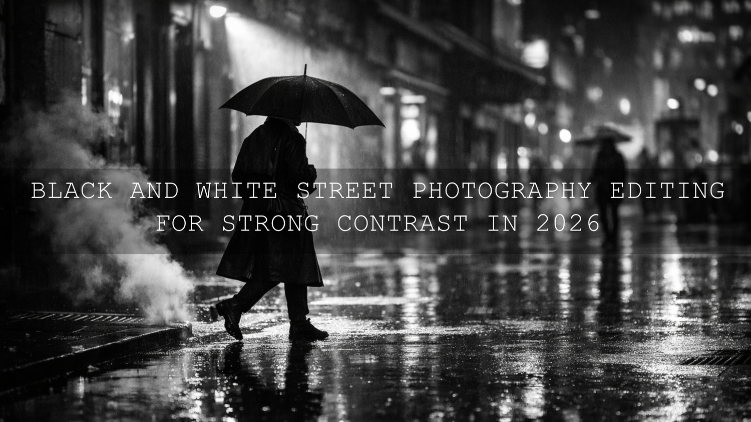
Black and White Street Photography Editing for Strong Contrast in 2026
Black and white street photography works best when the frame has clear emotional weight, strong shapes, and contrast that feels intentional. In 2026, black and white street photography editing is less about pushing every slider hard and more about controlling tone with purpose. If your monochrome street photos look flat, muddy, or lifeless, the answer is usually not more drama everywhere. It is better separation between blacks, midtones, and highlights, plus smarter local adjustments. That is where a clean Lightroom workflow, a few thoughtful masking choices, and the right Lightroom presets can make a huge difference.
If you want a faster starting point, try the AI-Optimized Street Cinematic Lightroom Presets and browse the Street Photography Lightroom Presets collection. They are a strong foundation for contrast-rich urban edits, and you can still shape each frame around your own taste with Buy 3, Get 9 FREE.
Why Strong Contrast Matters in Black and White Street Photography
In color photography, separation can come from hue. In black and white street photography, separation has to come from tone, light, texture, gesture, and composition. That is why contrast matters so much. It tells the viewer where to look first, what feels important, and what mood the image should carry.
A street frame with stronger tonal separation often feels more confident. A person crossing through a beam of light becomes the story. A shadow cutting across a wall becomes structure. Steam, rain, smoke, pavement texture, wrinkles in clothing, and reflections all become more expressive when the contrast is handled well.
- High contrast gives you drama, punch, graphic shapes, and bold mood.
- Medium contrast gives you depth and clarity without making the image feel harsh.
- Lower contrast can work beautifully for fog, rain, soft window light, or quieter documentary moments.
The key is not always to make the image darker or more intense. The goal is to make the right parts feel important.
Start on the Street, Not Just in Lightroom
Strong black and white street photography editing starts before the file ever reaches your screen. If you shoot with contrast in mind, your edits become cleaner and more believable.
- Look for directional light. Side light, backlight, harsh noon sun, and isolated pools of streetlight often create more usable contrast than flat overcast light.
- Watch the background. A dark subject against a dark background will disappear in monochrome. Try to place your subject against lighter pavement, a lit shop window, or a bright wall.
- Prioritize shape and gesture. In black and white, posture, hands, movement, and silhouette often matter more than color styling.
- Use reflections and shadows as design tools. Wet streets, windows, subway entrances, and striped light can all become part of the storytelling.
- Expose with highlights in mind. Protect bright signs, white shirts, and reflective pavement first, then open the shadows carefully in editing.
I have tested this approach on busy street crossings, alley portraits, and rainy-night frames, and the files that edit best are almost always the ones where the light pattern was already doing half the storytelling. Editing becomes faster when the scene already has shape.
Presets vs Manual Editing for Black and White Street Photography
One of the most common questions in black and white street photography editing is whether presets actually help or whether manual editing is always better. The truth is that both matter.
- Presets are faster. They give you a strong tonal direction in seconds and help you stay consistent across a series.
- Manual editing is more precise. It lets you adapt to each frame, especially when one image has hard sun and another has night reflections.
- The best workflow combines both. Start with a preset for mood and structure, then fine-tune exposure, black point, highlights, masks, and texture for that specific scene.
That is the approach I recommend most. A preset should not replace your eye. It should give your eye a better starting point.
A Step-by-Step Lightroom Workflow for Strong Monochrome Contrast
1. Start with a preset or profile that gives you shape
For daytime city scenes, the AI-Optimized Street Cinematic Lightroom Presets are a strong first pass because they help build mood and structure quickly. If the frame is more travel-oriented with layered streets, signage, or architectural rhythm, the AI-Optimized Cinematic Travel Street Lightroom Presets can give you a polished baseline before converting and refining in black and white.
Do not stop after one click. A preset should get you into the right neighborhood, not finish the job.
2. Set the global tonal structure first
Before you touch anything advanced, fix the overall tonal skeleton of the image.
- Adjust Exposure until the frame feels balanced.
- Pull down Highlights if bright pavement, sky, windows, or signs are dominating.
- Lift or lower Shadows depending on whether you want more detail or more mystery.
- Set Whites so the brightest areas feel alive but not empty.
- Lower Blacks until the image gets depth, but stop before coats, hair, pavement, and shadows merge into one heavy block.
Adobe’s guide to tone, Tone Curve, and B&W Mix in Lightroom Classic is especially useful if you want a clearer understanding of how these controls shape tonal range.
3. Convert to black and white with intention
Many photographers simply press the black and white button and move on. That leaves a lot of quality on the table. A stronger approach is to convert, then use the B&W Mix to decide how each original color should translate into gray.
For example, you might darken blues to make the sky moodier, lift oranges slightly for more flattering skin, or deepen reds to make signage and clothing feel heavier in tone. This is one of the biggest reasons a good black and white edit feels thoughtful instead of generic.
If you want the technical reference behind that process, Adobe explains the grayscale workflow clearly in its official Lightroom Classic tone and black and white controls guide.
4. Use the Tone Curve for the real contrast shaping
The Contrast slider is fine for quick movement, but the Tone Curve is where black and white street photography starts to feel refined. A subtle S-curve often works well: lift the lighter tones slightly, anchor the midtones, and deepen the darker tones just enough to create separation.
This is where many strong edits come alive. Instead of flattening everything into one dramatic look, the Tone Curve lets you keep faces readable, shadows rich, and bright edges crisp.
Pro tip: If the image starts looking crunchy, do not keep adding curve. Instead, back off and use masking to create local contrast only where it helps the story.
5. Guide the eye with masks
Masking is one of the best ways to improve street photography contrast without making the entire frame too aggressive. I often use a light mask on the subject, then a gentle darkening mask on distracting backgrounds or bright corners. That kind of small control can change the whole image.
Adobe’s guide to masking in Lightroom Classic is useful here because it shows how to apply local adjustments without affecting the whole frame.
- Brighten a face, hand, bicycle, or umbrella if it is the emotional center of the frame.
- Darken bright sidewalks or windows that are pulling attention away.
- Add clarity or texture only to walls, coats, brick, or pavement.
- Keep skin and sky smoother than hard surfaces unless you want a rough documentary feel.
6. Add texture carefully
Black and white street photography loves texture, but too much texture makes the photo feel brittle. Use Texture and Clarity sparingly. A little can bring out concrete, rain streaks, wrinkles, and city grit. Too much can make people look overprocessed and old too fast.
I tested this on a backlit pedestrian frame with wet pavement and a dark coat. A modest texture increase on the street and wall worked beautifully, but the same amount on the entire image made the face look harsh. Local control matters.
7. Finish with detail, not over-editing
At the end, zoom out and ask one question: does the contrast feel like part of the story, or does it feel like an effect? If it feels like an effect, pull it back slightly. The best monochrome street photos still feel photographed, not overbuilt.
Which Preset Direction Works Best for Different Street Scenes
Not every street file needs the same tonal approach. Matching the preset direction to the scene saves time and produces more natural results.
- Everyday daytime streets: Start with AI-Optimized Street Cinematic Lightroom Presets for a clean cinematic base and then refine into monochrome.
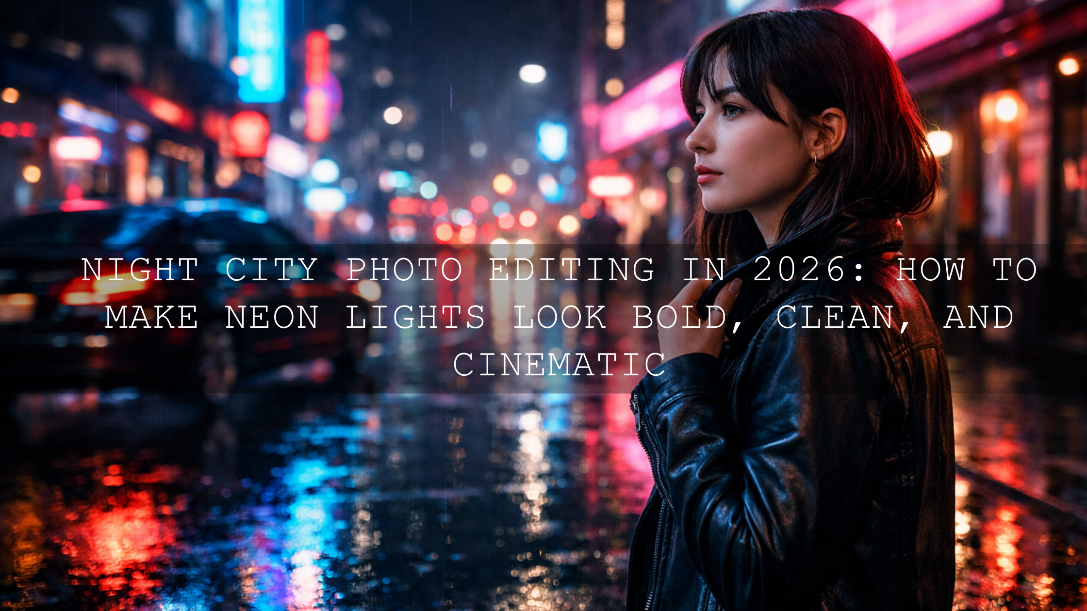
- Night streets, flash, and neon: The AI-Optimized Midnight Flash Street Lightroom Presets are especially useful when the frame has harsh highlights, nightlife energy, or deep urban shadows.
- Rain, reflections, and mood: The AI-Optimized Rainy Street Film Lightroom Presets are ideal when you want reflective streets, layered grays, and a more cinematic atmosphere.
- Movie-inspired urban storytelling: The AI-Optimized Cinematic Street Movie Lightroom Presets can be a great base when you want a more dramatic narrative feel before fine-tuning the monochrome conversion.
Common Mistakes That Make Black and White Street Photos Look Weak
- Crushing blacks too early. Deep blacks look great until you lose the coat texture, the doorway detail, and the mood in the pavement.
- Using one contrast recipe for every image. Soft fog, hard sun, and rainy nights need different handling.
- Ignoring the B&W Mix. This is one of the easiest ways to improve tonal separation, yet many people skip it.
- Overusing clarity. Sharp and gritty is not always the same as powerful.
- Editing without a focal point. If the viewer does not know where to look, stronger contrast alone will not save the frame.
If your preset results feel inconsistent from one file to the next, it is worth reading why Lightroom presets look different and how to fix it. It is especially useful when different cameras, light conditions, or exposures are causing unpredictable results.
Real-World Editing Example
Imagine a street photo taken just after rain: one person walking under an umbrella, bright reflections on the road, dark storefronts, and a pale sky. Straight out of camera, the image might feel flat because the brightest tones are spread everywhere and the subject does not separate well.
Here is a practical fix:
- Lower highlights to control the sky and wet pavement.
- Drop blacks slightly for depth.
- Lift the subject with a local mask.
- Darken the top corners to keep attention in the center.
- Use the B&W Mix to deepen blues and refine skin tones.
- Add a subtle S-curve for punch.
That kind of edit creates a before-and-after difference that feels meaningful. The subject becomes readable, the reflections become dramatic, and the image tells a clearer story without looking fake.
Related Reading
- The Best Street Photography Lightroom Presets
- Elevate Your Street Photography with These Cinematic Lightroom Presets
- Top 5 Street Lightroom Presets for Captivating Cityscapes
- How to Install Lightroom Presets in a Quick and Easy Way
If you want to build a stronger black and white street photography workflow without spending too long on each file, start with the AI-Optimized Street Cinematic Lightroom Presets, add the AI-Optimized Midnight Flash Street Lightroom Presets for night scenes, and explore the broader AI-Optimized Lightroom Presets collection for more looks. If you need help choosing the right pack or want to learn more about the brand behind the tools, you can also visit About Us or reach out through the Contact page. Buy 3, Get 9 FREE makes it much easier to build a complete editing toolkit around your style.
FAQ
How do I make black and white street photos look more dramatic?
Focus on tonal separation first. Set clean whites, rich blacks, and controlled midtones, then use masking to brighten your subject or darken distractions instead of pushing global contrast too far.
Should I edit street photography in color first and then convert to black and white?
Usually, yes. It often helps to balance exposure and tonal structure first, then convert and use the B&W Mix to control how original colors translate into grayscale.
Are presets enough for black and white street photography editing?
Presets are excellent for speed and consistency, but the best results usually come from combining a good preset with manual refinements like Tone Curve, masking, and local texture control.
What is the best Lightroom tool for improving contrast in monochrome street images?
The Tone Curve is usually the most powerful tool for shaping contrast with control. The B&W Mix and Masking panel are also essential when you want cleaner separation and better subject emphasis.
How do I avoid making my black and white street photos look too harsh?
Be careful with clarity, texture, and crushed blacks. Keep some detail in shadows, protect highlight texture, and add local contrast only where it improves the story.
Written by Asanka — creator of AAAPresets (10,000+ customers).

Leave a comment
This site is protected by hCaptcha and the hCaptcha Privacy Policy and Terms of Service apply.