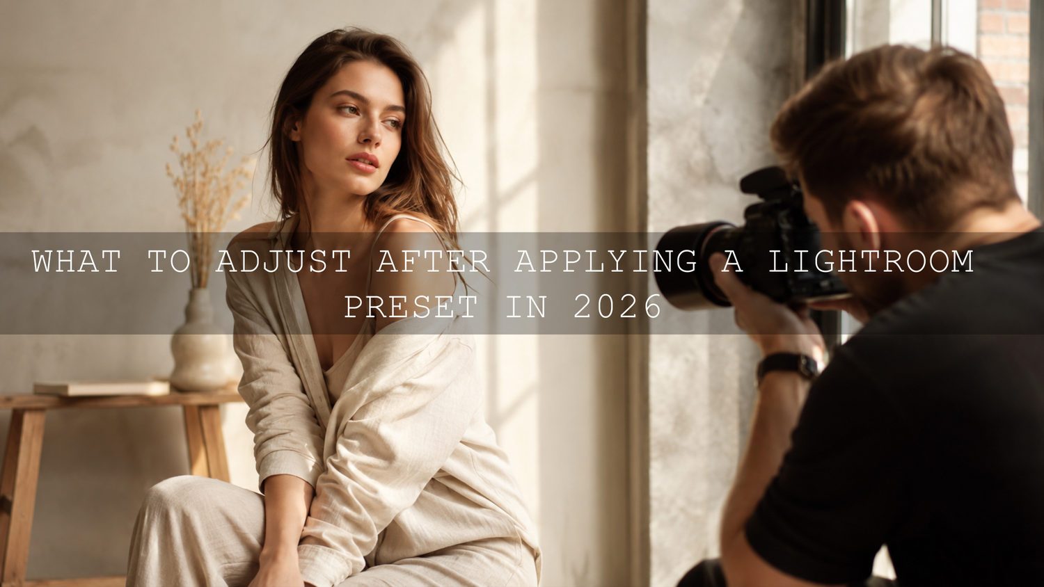
What to Adjust After Applying a Lightroom Preset in 2026
Knowing what to adjust after applying a Lightroom preset is the difference between a quick edit and a professional-looking final image. A preset can give your photo a strong creative direction, but exposure, white balance, contrast, skin tones, color mixer settings, sharpening, masking, and lens corrections usually need small refinements before the image feels finished.
Here’s the quick answer: after applying a Lightroom preset, start with exposure and white balance, then refine highlights, shadows, contrast, saturation, HSL/color mixer, sharpening, noise reduction, masking, and final crop or lens corrections. Adobe explains that Lightroom presets apply saved editing settings such as exposure, contrast, saturation, and color grading, which is why every photo still needs a little personal adjustment after the preset is applied. You can learn more from Adobe’s guide to editing photos with presets in Lightroom.
For a flexible editing workflow, start with the 1000+ Master Lightroom Presets Bundle and browse more styles in the Lightroom Mobile Presets collection. Apply your preset first, then use the steps below to make the final image look natural, balanced, and truly yours. Try these presets today — Buy 3, Get 9 FREE.
Why Presets Need Adjustments After One Click
A Lightroom preset is not a magic finish button. It is a creative starting point. The preset does not know whether your photo was captured in bright sun, window light, shade, indoor tungsten light, neon street light, cloudy weather, or golden hour. It simply applies a saved look to whatever image you give it.
That is why the same preset can look beautiful on one photo and too dark, too warm, too flat, or too saturated on another. A wedding portrait, a street photo, a drone landscape, and a food photo all have different lighting conditions and color priorities. The preset gives you the style, but your post-preset adjustments make the edit fit the actual photo.
I have tested cinematic presets on bright outdoor portraits where the result needed only a tiny white balance correction. I have also tested the same style on indoor portraits where the shadows, orange skin tones, and background color needed more careful work. That is normal. The goal is not to fight the preset. The goal is to guide it.
For more help understanding why the same look changes from photo to photo, read why Lightroom presets look different on every photo and how to pick photos that work well with presets.
Presets vs Manual Editing: Which One Should You Use?
Presets and manual editing are not enemies. The best workflow usually uses both.
- Presets are best for speed and consistency. They help you apply a polished style across wedding galleries, travel albums, social media shoots, product photos, or lifestyle images faster.
- Manual editing is best for precision. It helps you fix exposure, skin tones, background distractions, uneven light, blown highlights, crushed shadows, and small color problems.
- The strongest workflow combines both. Apply a preset for the mood, then manually refine the image so the final edit looks intentional instead of automatic.
Think of presets like a professional base recipe. Manual editing is the final seasoning. A good preset can bring the mood close in seconds, but your final slider adjustments decide whether the photo looks natural, premium, and finished.
Step 1: Adjust Exposure First
Exposure is usually the first slider to check after applying a Lightroom preset. If the preset makes the image too bright, pull the Exposure slider down slightly. If the subject looks too dark, raise Exposure until the face, product, landscape, or main subject feels balanced.
Here’s why this matters: many presets include contrast, tone curve, and color grading. If the original photo is underexposed, those edits can make shadows look heavy and noisy. If the original photo is overexposed, the preset can make highlights look harsh or flat.
Pro tip: adjust exposure while looking at the main subject, not only the background. In portraits, skin should feel believable. In product photography, the product should be clear. In landscapes, the scene should keep enough highlight and shadow detail to feel natural.
Step 2: Fix White Balance and Tint
White balance is one of the most important post-preset adjustments. A preset can push your photo warmer, cooler, greener, or more magenta depending on its creative style. That may look great on some images, but it can also make skin tones, white clothing, walls, food, or skies look unnatural.
Start with the Temperature slider. Move it warmer if the image feels too blue. Move it cooler if the image feels too yellow or orange. Then use Tint to correct green or magenta color casts.
For portraits, look closely at the skin. For food photography, check whether whites, creams, greens, and reds still look appetizing. For street photography, decide whether you want realistic color or a stylized cinematic mood. If you want deeper creative direction, explore the Golden Film Cinematic Lightroom Presets for warm film-inspired edits or the AI-Optimized Street Cinematic Lightroom Presets for urban tones.
Step 3: Recover Highlights and Shadows
After exposure and white balance, check Highlights and Shadows. These sliders help you recover detail that may have been pushed too far by the preset.
- Lower Highlights if skies, white clothing, windows, or bright reflections look too strong.
- Raise Shadows if hair, clothing, trees, buildings, or background areas look too dark.
- Lower Shadows slightly if the image looks too flat after applying a bright preset.
- Raise Highlights carefully if the image needs more glow or brightness.
The goal is not to make every part of the image equally bright. The goal is to keep important detail while preserving the mood of the preset. A cinematic edit can still have deep shadows. A bright edit can still have soft highlight roll-off. The key is control.
Step 4: Refine Contrast, Whites, and Blacks
Contrast gives your image structure. Whites and Blacks define the brightest and darkest points of the edit. After applying a preset, these settings can make a photo feel either polished or overcooked.
If the image looks harsh, reduce Contrast slightly. If it looks flat, increase Contrast or adjust Whites and Blacks in small steps. Be careful with crushed blacks. Deep blacks can look cinematic, but if you lose too much detail, the image can feel heavy and unfinished.
Pro tip: make small changes. Moving Whites or Blacks too far can create clipping, where bright or dark areas lose detail. A subtle adjustment often looks more professional than a dramatic one.
Step 5: Fine-Tune Color With Vibrance, Saturation, and HSL
Color is where many preset edits either become beautiful or fall apart. A preset may add warmth, deepen blues, shift greens, soften reds, or create a film look. That style is helpful, but it still needs to match the photo.
Start with Vibrance before Saturation. Vibrance usually gives a more controlled color boost because it protects already strong colors better than a global Saturation increase. Saturation affects all colors more evenly, so it can quickly make skin, skies, grass, or clothing look too intense.
Then move into HSL or the Color Mixer. Adobe’s editing tools include controls for adjusting individual colors, and this is where you can make the preset feel custom to your image. You can also review Adobe’s Lightroom desktop editing controls for more detail on Lightroom’s main editing panels.
- Orange: useful for skin tone brightness and warmth.
- Yellow: helpful for grass, warm walls, sand, and golden light.
- Green: important for trees, fields, outdoor portraits, and travel photos.
- Blue: useful for skies, water, denim, shadows, and cool cinematic looks.
- Red: important for lips, clothing, flowers, food, and warm signs.
If your preset looks too strong overall, read how to tame overly powerful presets for subtle edits.
Step 6: Use Tone Curve for a More Professional Finish
The Tone Curve is where you can make your preset feel more refined. Many presets include a curve to create contrast, matte blacks, lifted shadows, bright highlights, or a film-inspired fade. But the curve may need small changes depending on the image.
If the preset makes shadows too heavy, slightly lift the lower part of the curve or reduce the strength of the shadow contrast. If the image looks too faded, lower the black point or add a gentle S-curve. If the highlights feel too sharp, soften the upper part of the curve.
The Tone Curve is powerful, so avoid big moves unless you are creating a dramatic style. For most photos, small adjustments create the cleanest result.
Step 7: Adjust Sharpening and Noise Reduction
Presets can sometimes make texture, grain, or noise more visible. This is especially common with low-light photos, high ISO images, dark shadows, or heavily stylized edits.
Use Sharpening to improve detail, but do not overdo it. Too much sharpening can create crunchy edges, rough skin, and halos around high-contrast areas. Use Noise Reduction if shadows look grainy or color noise appears in dark areas.
Adobe explains that sharpening controls affect edge definition, while noise reduction helps manage unwanted grain and artifacts. For a deeper technical reference, see Adobe’s guide to sharpening and noise reduction in Camera Raw.
Pro tip: if you are editing portraits, keep skin natural. Texture should look clean, not plastic. For landscapes or street photos, preserve important texture in buildings, trees, roads, clouds, and clothing.
Step 8: Use Masking for Local Adjustments
Global sliders affect the whole photo, but not every part of the image needs the same correction. Masking lets you adjust only the subject, sky, background, face, clothing, product, or other specific areas.
For example, after applying a cinematic preset, the overall mood may look great, but the subject’s face may be slightly too dark. Instead of raising exposure for the entire image and ruining the background, use a subject mask or brush mask to lift the face only.
Adobe explains that Lightroom masking allows local color and tone corrections when you do not want to adjust the entire image globally. You can learn more from Adobe’s guide to masking in Lightroom Classic.
- Subject mask: brighten or separate the main subject.
- Sky mask: reduce highlights, deepen blue, or add drama.
- Brush mask: fix small areas like faces, hands, clothing, or product labels.
- Linear gradient: balance bright skies, windows, or foregrounds.
- Radial gradient: guide attention toward the subject with subtle light.
Step 9: Check Lens Corrections, Crop, and Geometry
Lens corrections and geometry may not feel exciting, but they make a big difference in professional editing. A beautiful preset can still look unfinished if the horizon is tilted, vertical lines are leaning, or lens distortion makes the scene look warped.
Enable lens corrections when needed, especially for wide-angle lenses, drone photos, architecture, real estate, interior photos, and travel shots. Then check crop and straighten the horizon. For buildings and interiors, use geometry tools carefully so vertical lines look cleaner.
If you edit landscapes, drone shots, or outdoor photography often, browse the Professional Lightroom Presets for Landscape Photography collection for styles that work well with nature, travel, and wide scenic images.
A Simple Post-Preset Lightroom Workflow
Here is a simple workflow you can follow every time you apply a preset:
- Apply the preset and look at the photo for a few seconds before touching sliders.
- Fix exposure so the main subject feels properly bright.
- Correct white balance so the image does not look too warm, cool, green, or magenta.
- Recover highlights and shadows to protect important detail.
- Adjust contrast, whites, and blacks for clean tonal balance.
- Fine-tune color with Vibrance, Saturation, and HSL/Color Mixer.
- Use Tone Curve only after the basic tonal balance feels right.
- Apply sharpening and noise reduction carefully.
- Use masking for subject, face, sky, background, or product corrections.
- Finish with crop, lens corrections, and geometry for a cleaner final image.
This workflow works for portraits, weddings, street photography, food photography, travel, drone images, lifestyle content, and social media edits. It also helps you stay consistent when editing a full gallery instead of guessing on every photo.
Real Editing Examples: What to Adjust After a Preset
Wedding Portrait Example
After applying a warm cinematic preset to a wedding portrait, the dress may look beautiful, but the skin may become too orange. In this case, reduce Temperature slightly, lower Orange Saturation in the Color Mixer, and raise Orange Luminance a little to keep skin soft and natural. If the face is still too dark, use a subject mask instead of raising global exposure too much.
Street Photography Example
After applying a moody street preset, the shadows may look cinematic, but the image may lose detail in black clothing or buildings. Raise Shadows slightly, adjust Blacks carefully, and use the Blue or Aqua color controls if the shadows feel too cold. For more help with urban edits, check the guide to making one preset work across different camera brands.
Landscape Example
After applying a vibrant landscape preset, the sky may look strong but the greens may become too neon. Lower Green Saturation, shift Green Hue slightly toward a more natural tone, and reduce Highlights if the clouds look too bright. A small linear gradient over the sky can help preserve drama without affecting the foreground.
Food Photography Example
After applying a bright preset to a food photo, the dish may look clean but the whites may turn too yellow. Cool the Temperature slightly, reduce Yellow Saturation, and increase Texture carefully only on the food, not the background. This keeps the dish appetizing without making the entire image harsh.
When Should You Save Your Adjustments as a New Preset?
If you keep making the same changes after applying a preset, save those refined settings as a new preset. This is especially useful when you shoot the same type of content often, such as indoor portraits, golden hour weddings, restaurant food, street photography, drone landscapes, or product images.
Use clear preset names so you can find them later. Instead of naming a preset “Edit 1,” use a practical name like “Warm Wedding Indoor Soft Skin,” “Street Night Blue Shadows,” or “Golden Hour Portrait Low Contrast.” Good names save time when editing large galleries.
For a deeper look at preset behavior after software or profile changes, read why Lightroom presets can act differently after updates.
Common Mistakes to Avoid After Applying a Lightroom Preset
- Do not judge the preset too fast. Many presets look better after exposure and white balance are corrected.
- Do not overuse Saturation. Strong color can quickly make edits look artificial.
- Do not ignore skin tones. Skin should look believable, especially in portraits, weddings, and lifestyle photos.
- Do not sharpen everything. Skies, skin, and smooth backgrounds usually need less sharpening than edges and textures.
- Do not skip masking. Local adjustments often fix problems that global sliders cannot solve cleanly.
- Do not forget the final crop. Composition is part of the edit, not an afterthought.
Related Reading
- Why Lightroom presets look different on every photo
- How to choose photos that work well with presets
- How to soften overly strong Lightroom presets
- How to make old presets work with newer cameras
Final Thoughts
Lightroom presets are powerful because they help you edit faster, create consistency, and build a recognizable style. But the best results come when you treat the preset as the starting point, not the final step. After applying a preset, adjust exposure, white balance, highlights, shadows, color, sharpening, masking, and lens corrections until the image matches your subject, lighting, and creative goal.
To build a faster and more polished editing workflow, try the 1000+ Master Lightroom Presets Bundle, explore cinematic options like the AI-Optimized Street Cinematic Lightroom Presets, and browse more styles in the Lightroom Presets for mobile editing collection. Use the preset to create the mood, then use your adjustments to make the photo feel premium, natural, and complete.
FAQ
What should I adjust first after applying a Lightroom preset?
Start with Exposure and White Balance. These two settings usually have the biggest impact on whether the preset looks natural, especially for portraits, wedding photos, product images, and indoor edits.
Why does my Lightroom preset look too strong?
Your photo may have different lighting, color, exposure, or contrast than the image the preset was designed for. Reduce Saturation or Vibrance, soften Contrast, adjust Highlights and Shadows, and use HSL/Color Mixer to control specific colors.
Should I edit before or after applying a preset?
Do a basic correction before applying the preset if the photo is very dark, too bright, or has a strong color cast. Then apply the preset and fine-tune the final look with exposure, color, masking, and detail adjustments.
How do I keep skin tones natural after using presets?
Correct White Balance first, then adjust Orange and Red tones in the Color Mixer. If only the face needs work, use a mask instead of changing the entire image globally.
Can I save my post-preset adjustments as a new preset?
Yes. If you regularly make the same refinements for a certain camera, lighting condition, or photo style, save those settings as a new custom preset with a clear descriptive name.
Written by Asanka — creator of AAAPresets (10,000+ customers).


Leave a comment
This site is protected by hCaptcha and the hCaptcha Privacy Policy and Terms of Service apply.