
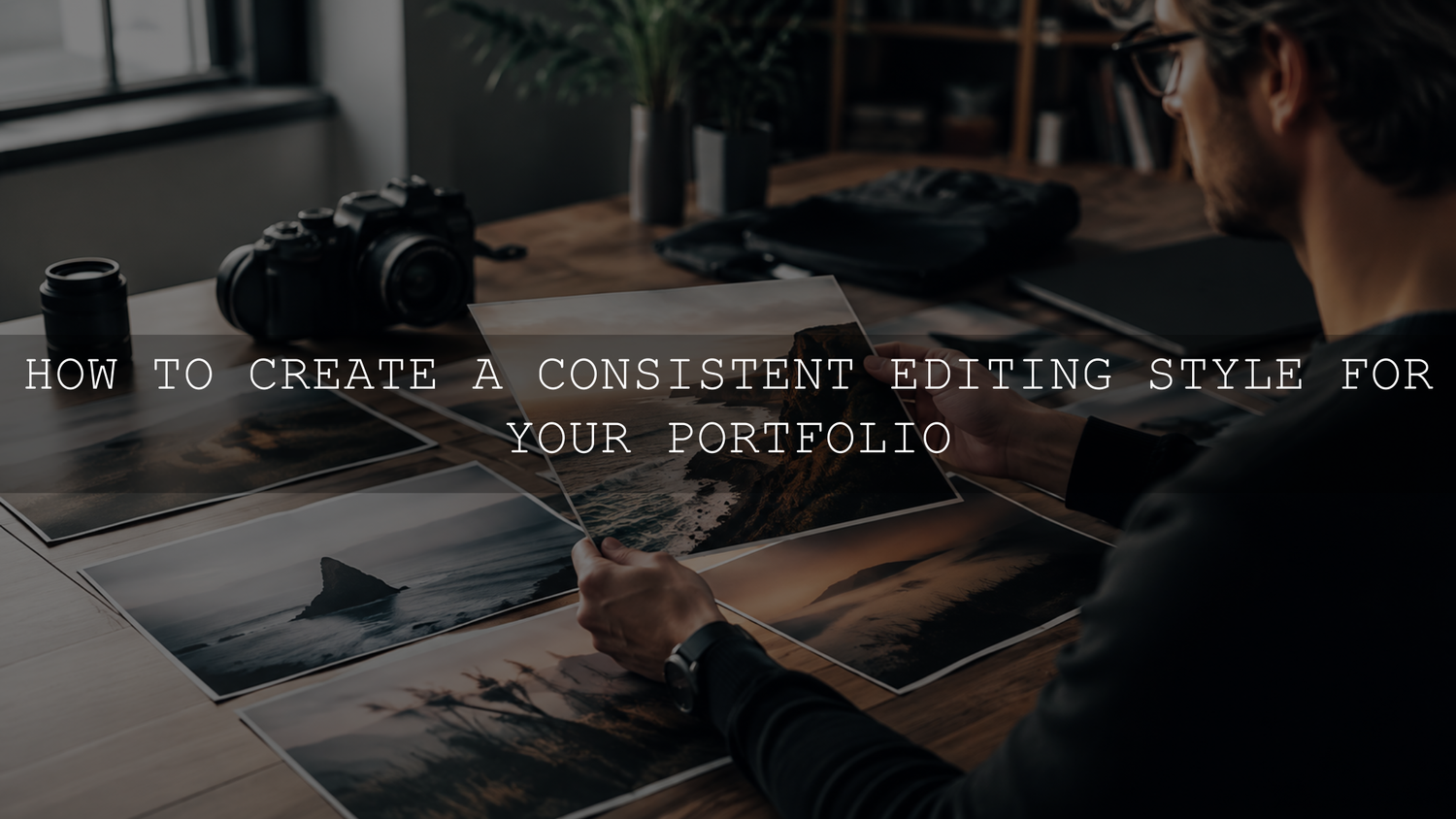
A consistent editing style for your portfolio comes from repeatable decisions, not from applying one filter to every image. Start by studying your strongest work, define the color and contrast rules that should stay recognizable, build reusable presets or actions, then review the full portfolio as one body of work before publishing.
The goal is not to make every photograph, video frame or design look identical. The goal is for your work to feel connected. A client, art director or follower should be able to move from one project to another and recognize the same creative point of view, even when the subjects, locations and lighting conditions change.
Start With a Portfolio Audit
Before creating a new style from scratch, review the work you have already made. Pull together your best images, edits, videos or design projects from the last one to two years and look for patterns you naturally repeat.
Pay attention to the files you still like after time has passed. These usually reveal your strongest visual instincts more honestly than the work that only felt exciting on the day it was edited.
- Do you prefer warm, cool or neutral color?
- Are your shadows deep and dramatic, or soft and lifted?
- Do your highlights feel clean, bright, faded or glowing?
- Do you often choose muted color, rich saturation, soft pastels or cinematic contrast?
- Are your strongest images simple and minimal, or layered and energetic?
- Do your skin tones, product colors or brand colors stay believable?
After this review, choose 10 to 20 images that best represent the direction you want your portfolio to follow. These become your reference set. They do not need to be perfect, but they should show the mood, color, contrast and subject treatment you want people to associate with your work.
Define the Editing Rules That Matter Most
Consistency becomes easier when you stop judging every image from zero. Write down a short set of editing rules that guide your decisions. This can be as simple as a one-page portfolio style card.
Your style card should include:
- White balance direction: warm, cool or neutral.
- Shadow behavior: deep black, soft matte, lifted, clean or high contrast.
- Highlight behavior: bright and airy, controlled and detailed, soft glow or film-inspired fade.
- Saturation level: realistic, muted, pastel, rich or bold.
- Skin-tone rules: how warm, neutral or natural people should look.
- Important color protection: colors that should not shift too far, such as products, clothing, interiors or brand colors.
- Texture and detail: crisp, soft, grainy, polished or natural.
- Cropping habits: clean negative space, tight editorial crops, centered compositions or cinematic framing.
These rules are more useful than vague words like “professional” or “aesthetic.” They give you something specific to check when an edit feels wrong but you cannot immediately explain why.
Use Presets as a Starting System, Not a Final Answer
Presets can help you build a consistent editing style, but they should act as an editable foundation. Adobe describes Lightroom presets as predefined settings that can include adjustments such as exposure, contrast, saturation and color grading. You can also create your own user presets after refining an edit in Lightroom. For current interface guidance, see Adobe’s guide to editing photos with presets in Lightroom.
A practical portfolio preset system might include:
- One core preset that defines your main look.
- One daylight variation for outdoor or bright natural light.
- One indoor or window-light variation.
- One low-light or evening variation.
- One softer version for portraits, skin tones or product color accuracy.
Avoid building a huge library of unrelated looks for your portfolio. Too many choices can make your editing less consistent. A small group of related presets is easier to repeat and refine.
Exposure and white balance often work best as image-specific corrections unless the whole project was captured under controlled lighting. If you save a fixed exposure or white balance into every preset, the same preset may make one image too bright, another too dark and another too orange.
Build Repeatable Actions for Retouching and Design Work
If your portfolio includes Photoshop retouching, product mockups, thumbnails or design assets, use repeatable actions for common steps. Adobe’s Photoshop documentation explains that actions can record a sequence of steps and play them back later through the Actions panel. See Adobe’s guide to recording actions in Photoshop if you need current steps.
Actions are useful for repeatable tasks such as resizing, sharpening, adding controlled grain, preparing web exports or applying a consistent finishing pass. They should not replace careful image-by-image review, but they can reduce random changes caused by mood, fatigue or rushing.
If your portfolio includes video edits, you can also save reusable effect presets in Premiere. Adobe’s current Premiere documentation explains how to create and save effect presets from selected effects in the Effect Controls panel. For video workflows, see Adobe’s guide to creating effect presets in Premiere.
Correct the Technical Base Before Applying the Style
A strong editing style works best on files that are technically prepared first. If the exposure, white balance or profile is not prepared correctly, a preset may exaggerate the problem instead of solving it.
Use this order before judging the final style:
- Choose the right camera or Adobe profile when relevant.
- Correct exposure enough that the image has a usable tonal base.
- Adjust white balance and tint before making final color decisions.
- Recover important highlight and shadow detail where possible.
- Fix obvious crop, straightening, lens or perspective problems.
- Apply your base preset, action or color grade.
- Refine the image manually for skin tones, product colors, contrast and local details.
This workflow helps you separate correction from style. Correction makes the file usable. Style gives it your recognizable point of view.
Edit by Lighting Group Instead of One Huge Batch
Batch editing can protect consistency, but only when the images are similar enough. Do not apply one exact setting set to a mixed folder of daylight, indoor, flash, low-light and backlit images without review.
Instead, divide the portfolio or shoot into lighting groups:
- Direct sunlight
- Open shade
- Golden hour
- Window light
- Warm indoor light
- Flash photography
- Low-light or high-ISO files
- Mixed-light scenes
Choose one strong representative image from each group, create the best edit for that group, then sync only the settings that genuinely belong together. Tone curve, color grading, Color Mixer adjustments, grain and some detail settings may copy well across similar files. Exposure, white balance, crop, masks, healing and perspective usually need individual review.
Protect Skin Tones, Product Colors and Important Neutrals
A portfolio can lose trust when important colors shift too far. A dramatic teal-and-orange grade might look stylish on a city image but make skin appear too orange or make a product color inaccurate. A soft pastel look might feel beautiful on lifestyle photos but weaken the color of clothing, packaging or interior materials.
Before approving an edit, check:
- Faces and hands for unnatural orange, yellow, red, gray or magenta shifts.
- White clothing, walls, paper, teeth or neutral backgrounds for color casts.
- Products, logos, furniture, cars or packaging where color accuracy matters.
- Greens and blues, which can become too neon, muddy or overly cyan.
- Shadow areas, where strong color grading can become distracting.
A consistent editing style should support the subject, not damage it. If one color range is the problem, use targeted adjustments instead of changing the entire image.
Curate Ruthlessly
Not every strong image belongs in the same portfolio. Sometimes an image is technically good but visually unrelated to the body of work you want to show. Leaving it out can make the portfolio stronger.
Review your portfolio as a complete sequence. Look for images that feel too bright, too dark, too warm, too saturated, too clean, too grainy or too different in mood from the rest. If an image breaks the visual flow and cannot be edited naturally into the system, remove it or place it in a separate project category.
This is especially important if you shoot multiple niches. Wedding, real estate, product, travel and portrait work can have different editing needs. If one style cannot serve all of them, separate the portfolio into clear categories rather than forcing everything into one visual feed.
Create a Final Portfolio Review Checklist
Before publishing new portfolio work, review it outside the editing software. Export a small test set and compare the finished images together at the size people will actually see them.
Use this checklist:
- Does the portfolio feel like one body of work?
- Do any images look noticeably warmer or cooler than the rest?
- Are shadow depth and contrast reasonably consistent?
- Do skin tones stay believable across different people and lighting?
- Do product, clothing or brand colors remain accurate enough?
- Are any images over-edited compared with the others?
- Do crops and compositions create variety without feeling random?
- Does the exported version still match the edit you approved?
For portfolio publishing, visual consistency also depends on export quality, sizing and color space. If you are preparing images for a website, read the AAAPresets guide to preparing edited photos for your portfolio website.
Let Your Style Evolve Slowly
Your editing style should not stay frozen forever. Your taste, audience, equipment, subjects and confidence will change over time. The key is to evolve in a controlled way.
Instead of changing everything at once, adjust one or two characteristics at a time. For example, you might keep the same warm color direction while softening contrast. Or you might keep the same black-point depth while reducing saturation. Gradual evolution keeps your work fresh without making your portfolio look like several unrelated creators made it.
If you also publish across Instagram, TikTok, YouTube, Pinterest, LinkedIn or a website, connect your portfolio style to a broader brand system. The AAAPresets guide to creating a recognizable visual style across every platform can help you extend the same visual direction beyond the portfolio itself.
Use a Small Editing Toolkit
If you are still building your starting library, browse the Lightroom presets for mobile and desktop collection or the 1000+ Master Lightroom Presets Bundle. Use any preset as an editable base, then refine it for your camera, lighting, subject and portfolio direction. Eligible products can be combined through the Buy 3, Get 9 FREE offer.
The best preset for a portfolio is not the most dramatic one. It is the one you can apply, adjust and repeat across real work while keeping your subjects believable and your visual identity recognizable.
Related Reading
- Mastering consistent visual aesthetics
- Create a recognizable visual style across every platform
- Prepare edited photos for your portfolio website
FAQ
Should every image in my portfolio use the same preset?
No. One preset can be a helpful foundation, but every image still needs individual review. Exposure, white balance, lighting, skin tones, subject color and crop can all require manual adjustment.
How many presets should I use for a consistent portfolio?
Most creators only need a small family of related presets. One core look with a few lighting-based variations is usually easier to manage than a large library of unrelated styles.
What if one project does not match my portfolio style?
If the project is strong but visually different, consider placing it in a separate category. If it does not support the type of work you want to attract, leave it out. A focused portfolio is often stronger than a complete archive.
Can I change my editing style later?
Yes. A style can evolve as your work grows. Change it gradually by adjusting one or two characteristics at a time, such as contrast, warmth, saturation or grain, instead of rebuilding the entire look every few months.
Build a Portfolio People Can Recognize
A consistent editing style is built from decisions you can repeat: the way you handle light, color, contrast, skin tones, texture and curation. Start with the work you already love, define the rules behind it, create reusable tools, edit by lighting group and review the portfolio as a complete body of work.
When your style is clear, your portfolio becomes easier to trust. It shows not only what you can create, but also the kind of visual direction clients, collaborators and followers can expect from you.
Written by Asanka — creator of AAAPresets, serving more than 10,000 customers.


Leave a comment
This site is protected by hCaptcha and the hCaptcha Privacy Policy and Terms of Service apply.